this is your map's testing channel! Post map updates here and remember to follow our mapper rules: https://ddnet.tw/rules
decline

same thing as
#❌👶trap_you_1pls read it
@火锅DioDesign: Okay to start off with this map. I appreciate and like the idea in mind when designing this map. The Logo is cool and fits the topic, the spawn has a decent enough adjustment of a matte color scheme that makes sense but it can be cleaned up a lot. The Idea is definitely there but needs work. Sadly you changed tile set and colors completely in the part the design, the transitions of quads that fade seem out of place and overused, it doesn't make sense in the maps "nature"-like design of the spawn, at least not in the way you did it. It becomes extremely bright in the parts which makes it confusing to say the least. Over all much cleanup required but nice twist and idea in color scheme and design.
Parts: I honestly don't know where to start here. It's always hard to judge novice maps, especially when you barely ever play any. Yet I believe a good map makes a unique, functioning part, that either has a cool setup, nice flow or trick to accompany (preferably all three). The parts on this map don't hit either of these things, at least not for me. Many parts or a large majority can be skipped with simple setups and others outright don't function or are incorrectly mapped in design (at least as far as I believe). Just because it is novice these points of critique shouldn't be looked over, they should be toned down and adjusted, yes, but not ignored. I strongly believe most people that test maps regularly can see that you have near to no experience in mapping ddrace, yet you do bring basic aspects and Ideas compared to some of the stuff I recently have seen and tested that was declined.
I'm no official tester, just a private mapper that enjoys others work. So I hope you take my critique with a grain of salt. I do sadly believe that the parts in current form are not fun or unique enough to be considered releasable.
You are right, there is indeed a lot of room for improvement in some areas

thank you so much for your suggestion

I can only back up the things
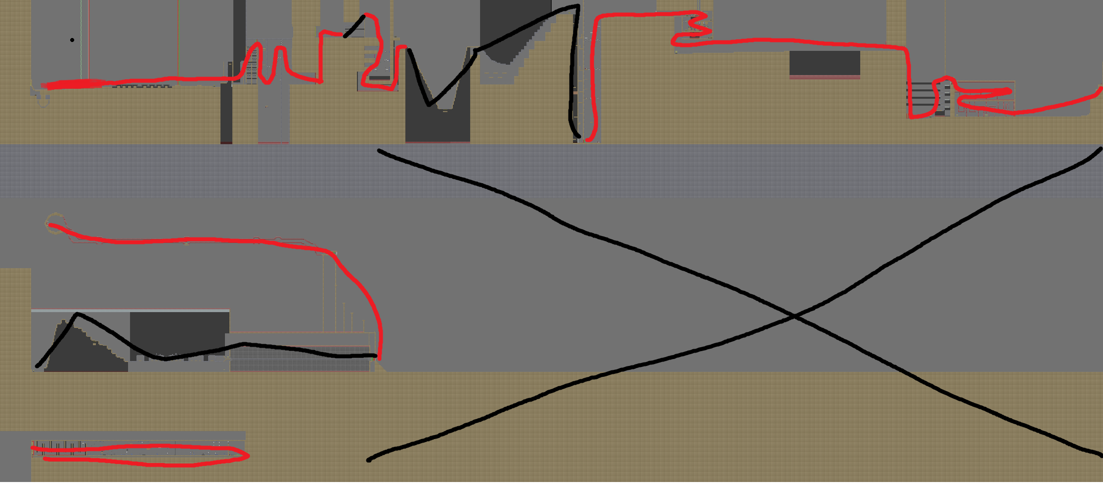
@OneLimeyBoimentioned. I am not going to fully talk about the design since its a complete disaster. I dont know any other way to put it. Calling the gameplay "outdated" would be an understatement as you took repetitive and basic movements to the extreme. Try to rely more on parts that require more brain. That is what novice is more about nowadays. As already mentioned, most parts are skippable and overall the map has way too many solo parts. Try to make it more cooperative. Try to get some ideas of newly released noviced maps. I have marked in red all the parts of the map which u can possibly do alone without a partner. As you can see, its way too much. Also, dont leave so much empty space. The worst thing is that i wasnt able to find a finish line =]

Good luck in future mapping attempts
$decline
