
this is your map's testing channel! Post map updates here and remember to follow our mapper rules: https://ddnet.tw/rules

This is a brutal map not moderate

?XD
should be
sign
I don't understand but it's to keep the team from dying
yes, but convention is to not place team unlock except for dummy server
rather you should make it clear for them to understand the part so they do not die
e.g. by marking the infos on wall, and making this more clear to understand
I looked at the rules again and here's what I read wrong Thanks for reminding me
ok
maybe only use 1 hookable tile
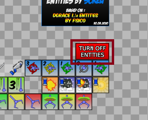
I'll add the physical logo
I can't find a good physical logo is that ok (((XDDD
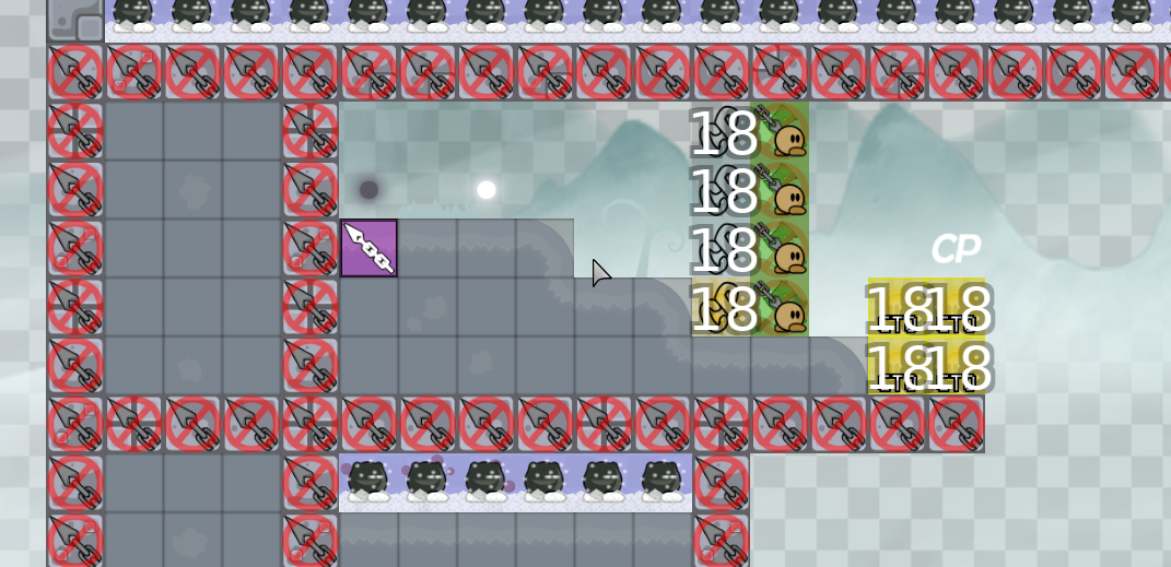
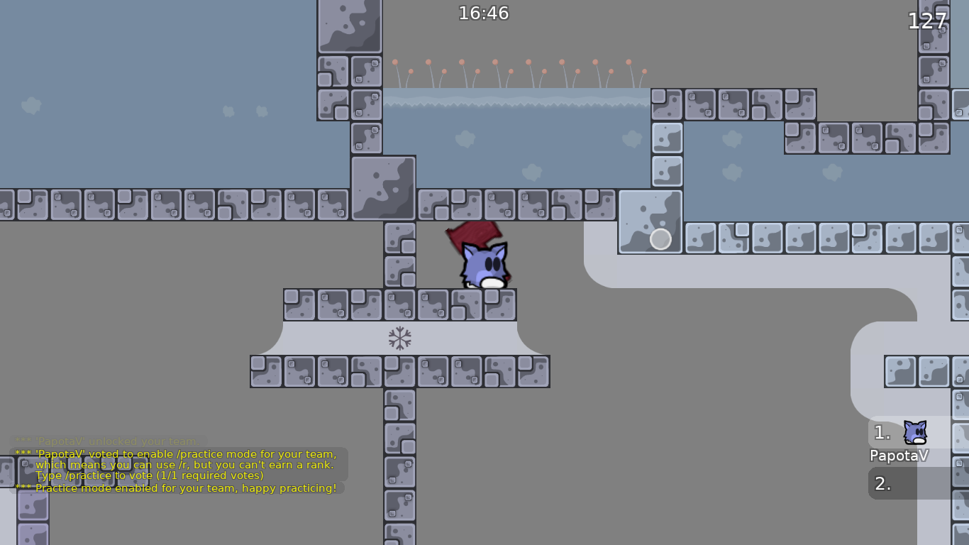
you should mark important infos in entities with this tile
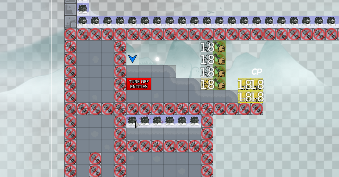
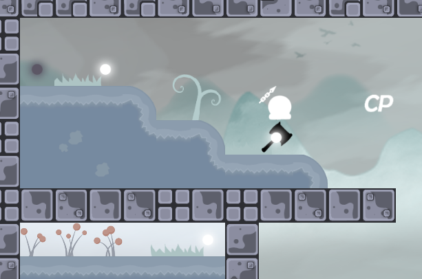
it is better ti oleave only 1 hookable exposed for this precise swings, such as this part in back in time
then u will not need info
It's two-sided
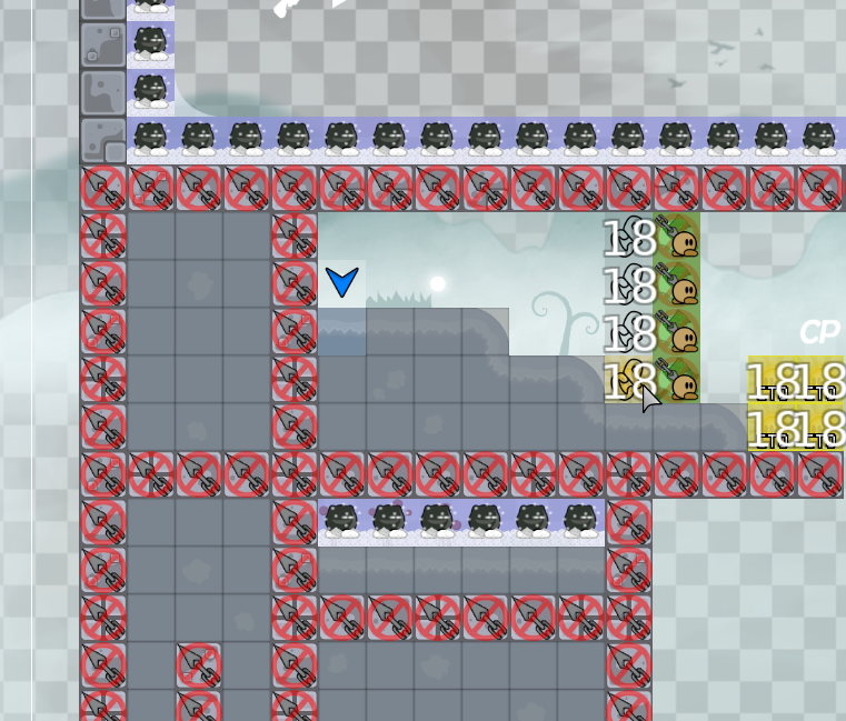
like this, yes?
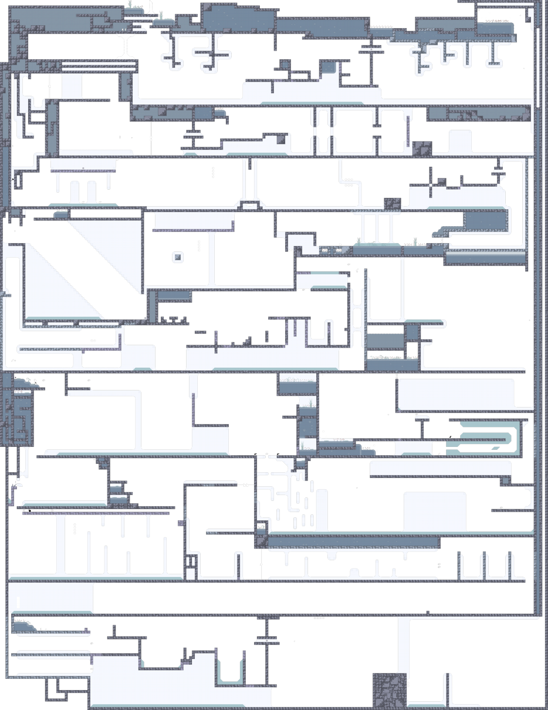
this map has nice design but very many skips,,
There is a risk of death
This is not a beautiful texture change ☹
I want to make sure that its corresponding entities are consistent
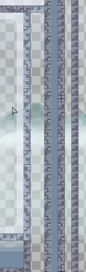
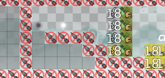
this map have a lot of bad corners, pls do something about that and the color of the corners arent the same as freeze
Ok, I'm working on it
 1
1
Color problem solving
missing freeze tiles
and design
and some corners still being diferent color
our best corner hunter
 1
1
yes

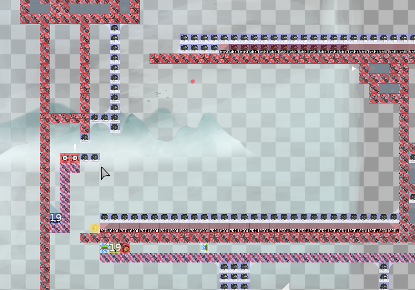
and also i saw some missing corners
like this one

make it bigger, some parts rlly unbalanced and some parts are easily skippable
Thanks for pointing out, but some stickers are for decoration, so I didn't put the corresponding entity. I can change it if necessary. Thanks again
1
Thank you for your advice. I'll consider it

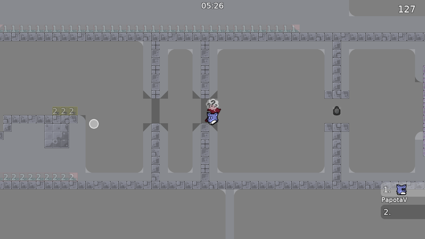
blue: spawns not organized
red: first parts are too close to spawn
yellow: there is not enough room to get deeped guy, imagine multiple t0 tees there (it would be messy)
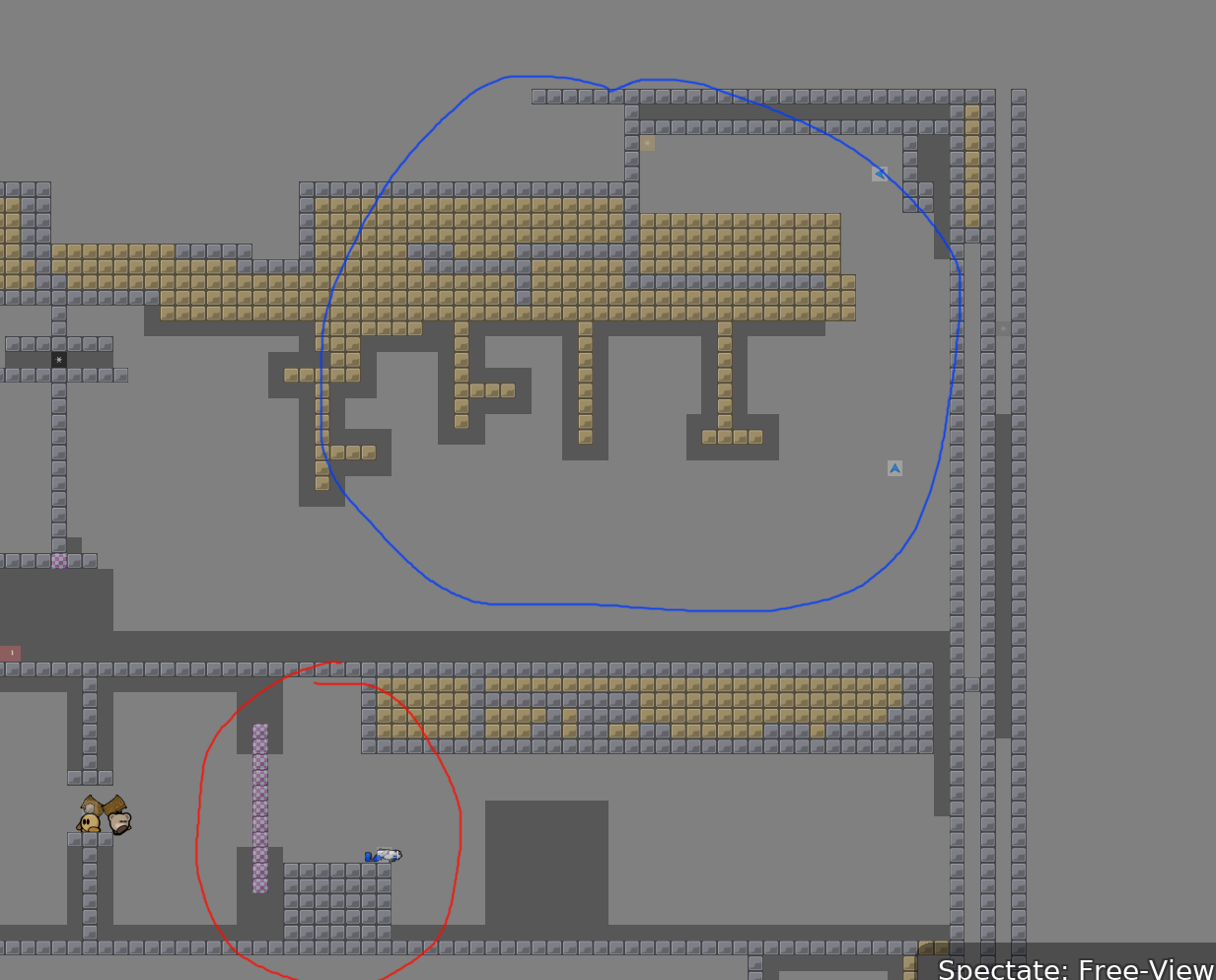
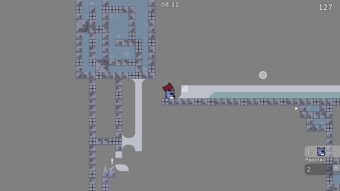
blue: lazy undeep
red: laser is only for 1 part here, which isnt rly good practice
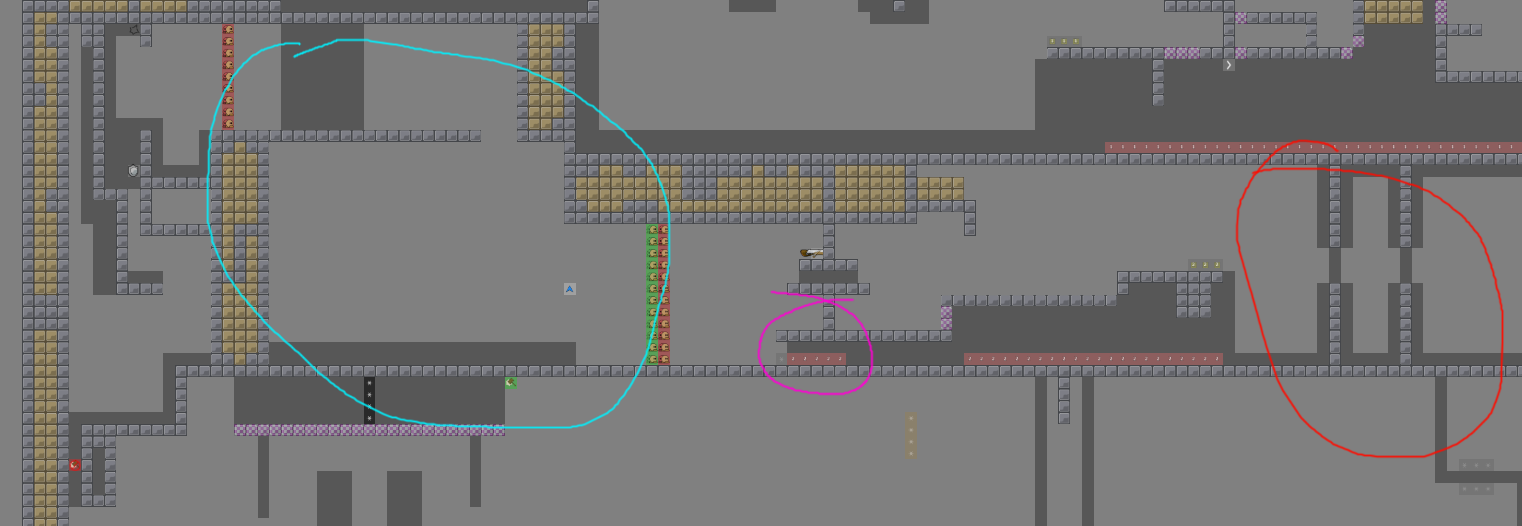
red: kinda boring filler, its just 2 edges and faily and blocky in t0
purple: unbalanced part (this was also in first drag part), groundhammers are pretty tough compared to rest of map
and your parts need more space to hook and move as well in general
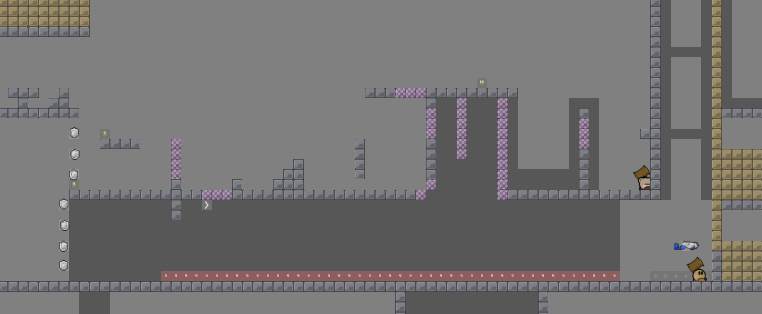
cyan: solo is a little boring, its just 1/2 ceiling shotguns and 1 floor shotgun which could be improved
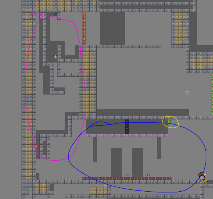
pink: unbalanced and tight
blue: weird random part, doesnt fit with rest of map
yellow: weird spot for re hammer
$decline
in my opinion i think the map should have more of a "theme", it seems like just some unrelated parts put into a box
and i think it can be less tight, you should put more space in each of the parts and in between parts
and parts should be balanced within them
these 2 parts were neat imo:
or at least balanced
ok
Thanks for correcting so many problems