this is your map's testing channel! Post map updates here and remember to follow our mapper rules: https://ddnet.tw/rules
huh
thank you for making a map dedicated to Spooky

🤤
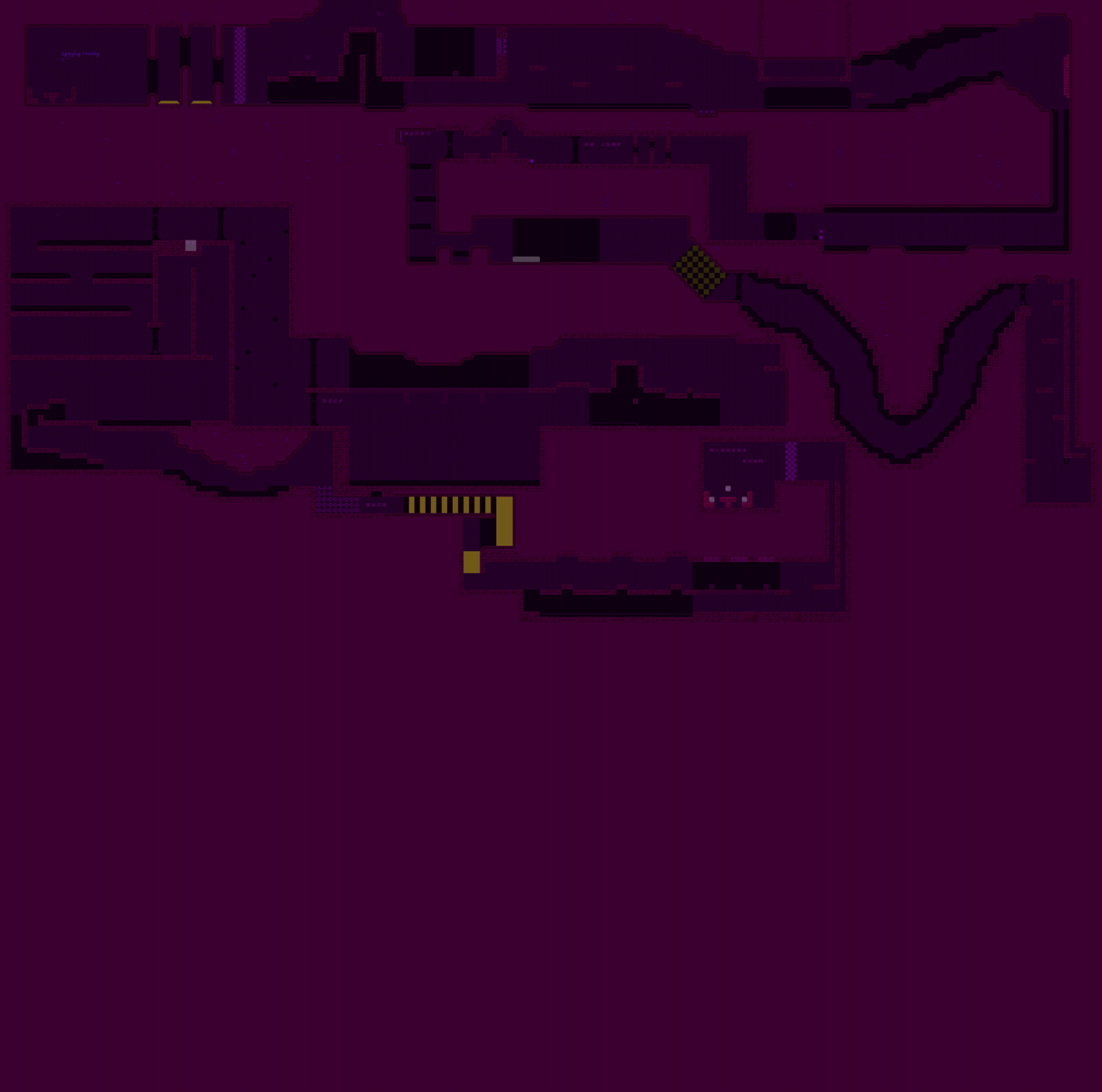
Logo is hard to read, tele 9 is unmarked, most of the parts are taken straight out of Kobra, the others are simple drag parts which are not accepted by common map standards, and the design overall is problematic; you use the same color for indicators as freeze and the icons are very hard to read.
imo not worth reworking this map, you should take a look at more modern novice maps for a better idea of acceptable design/parts
Agree with lynn's feedback. I'll also add that there is very little space between parts which makes gameplay uncomfortable.
$decline
thanks fixing that rn
prob just starting over again is easier
