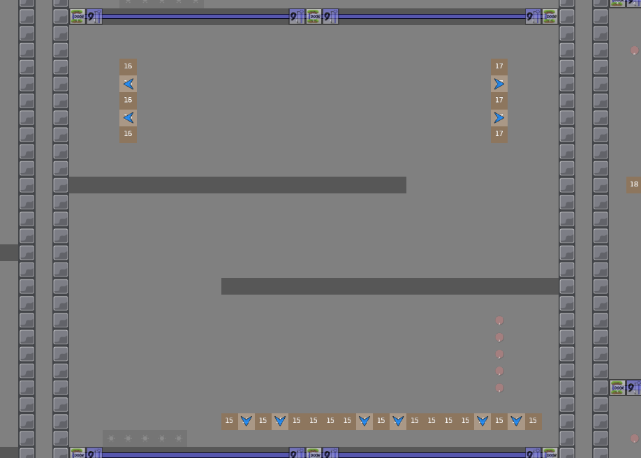
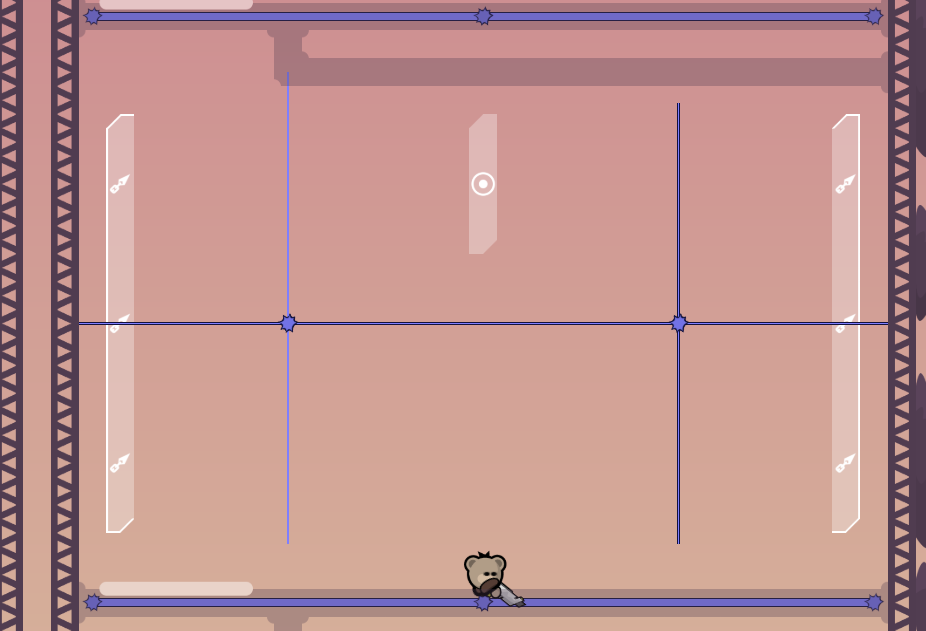
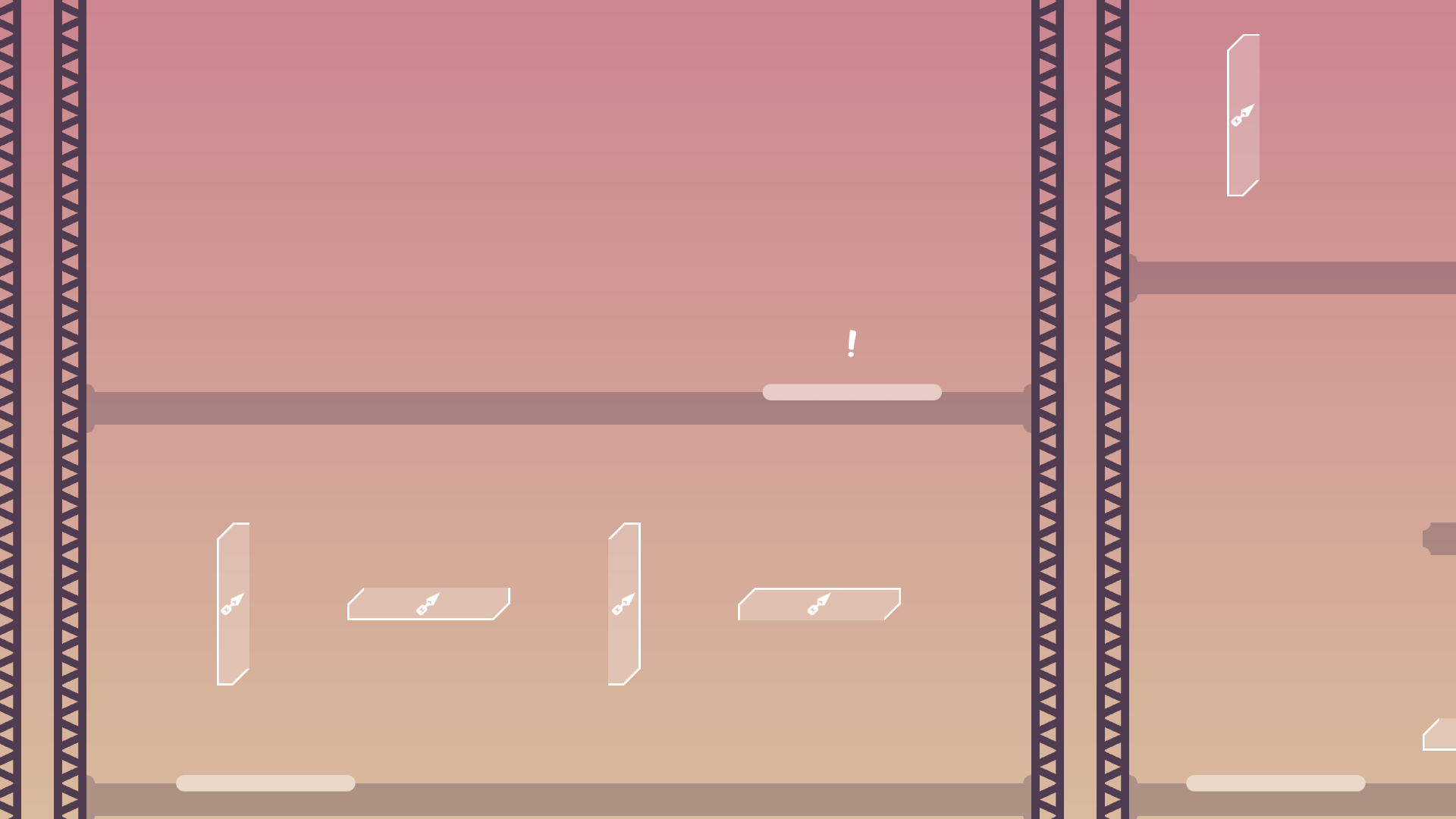
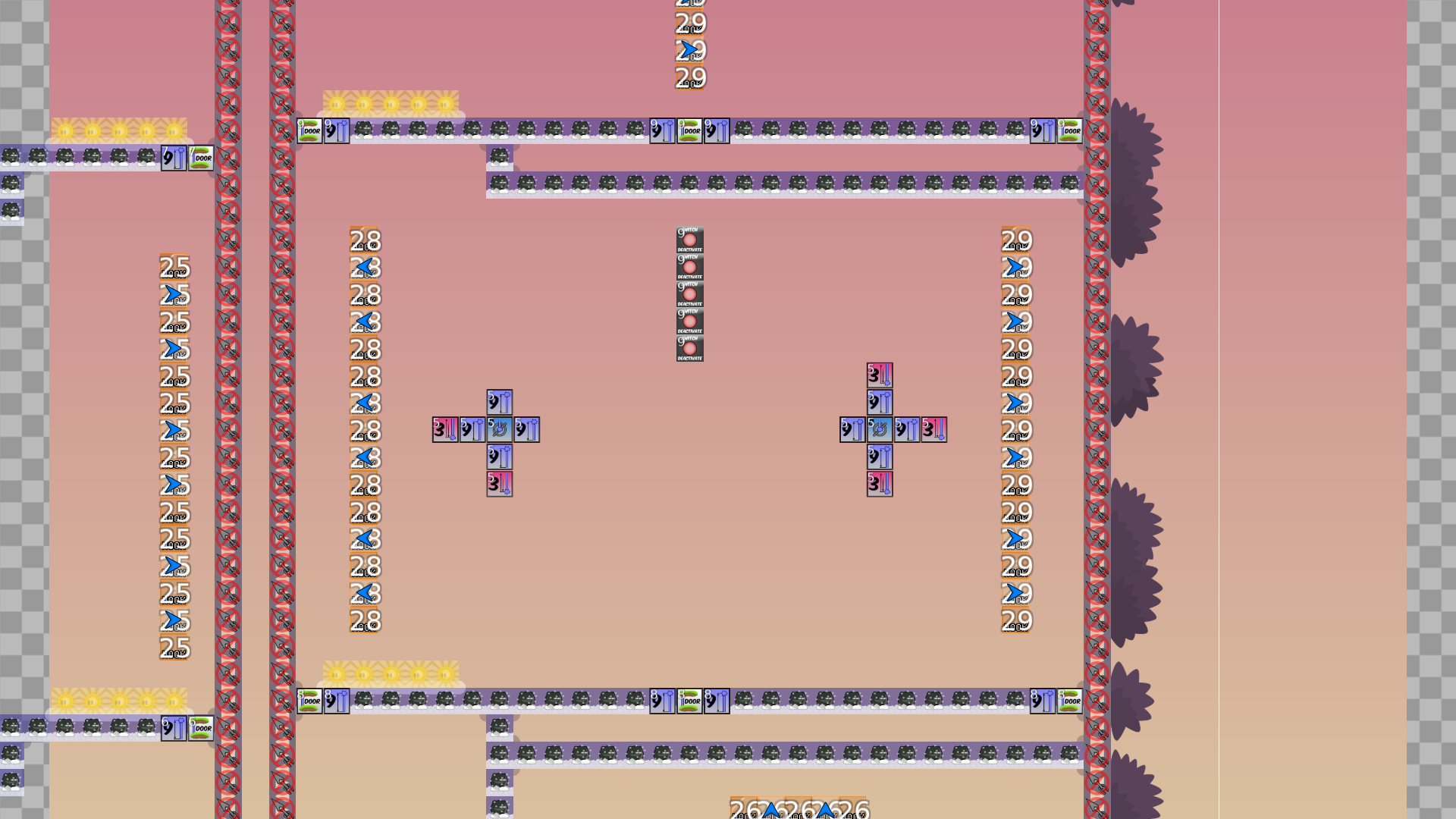
this is your map's testing channel! Post map updates here and remember to follow our mapper rules: https://ddnet.tw/rules
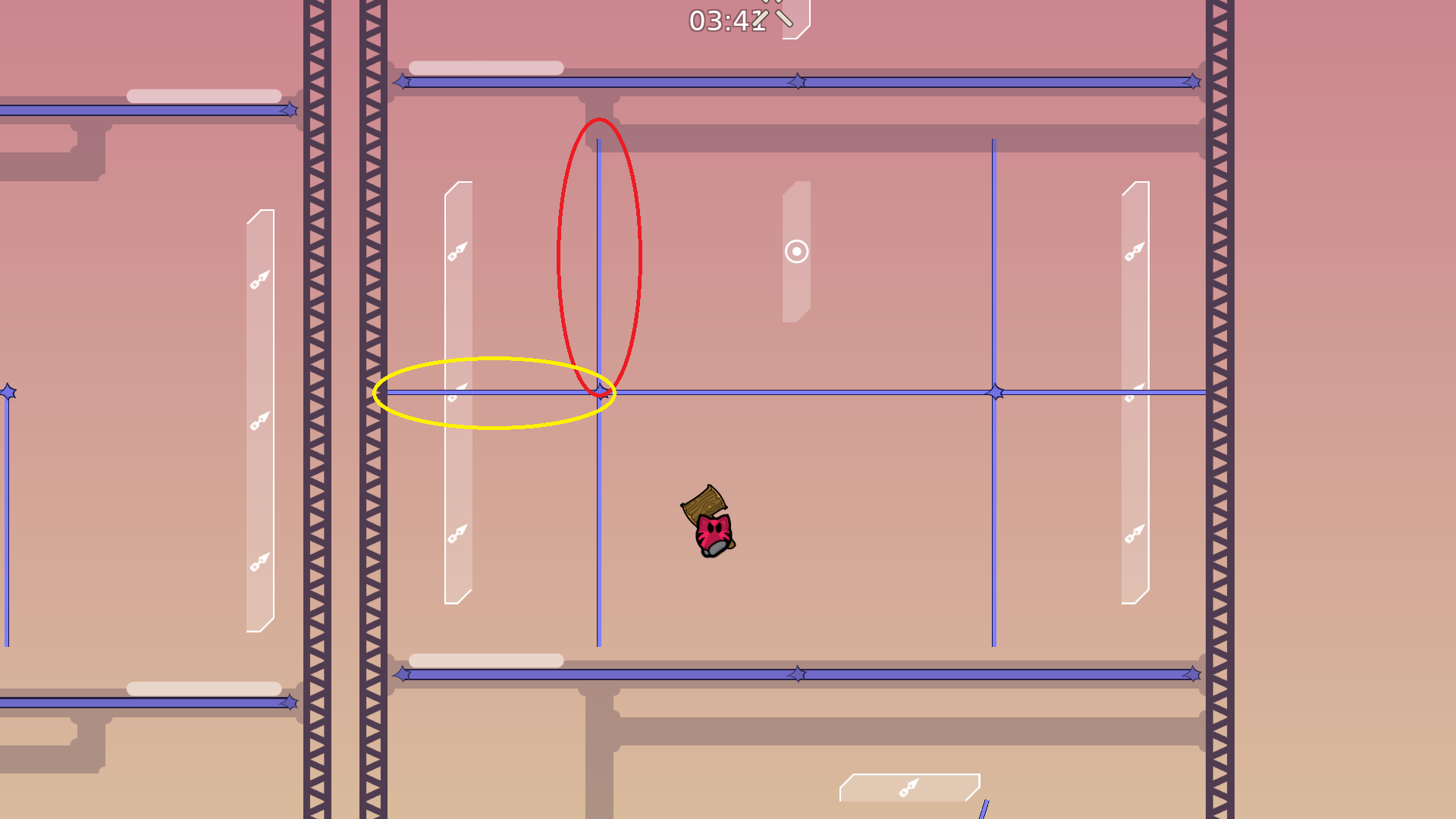
yo freeze tileset is bugged mah boi
nice map tho
really?
yeah
oh thx
ah sheeet
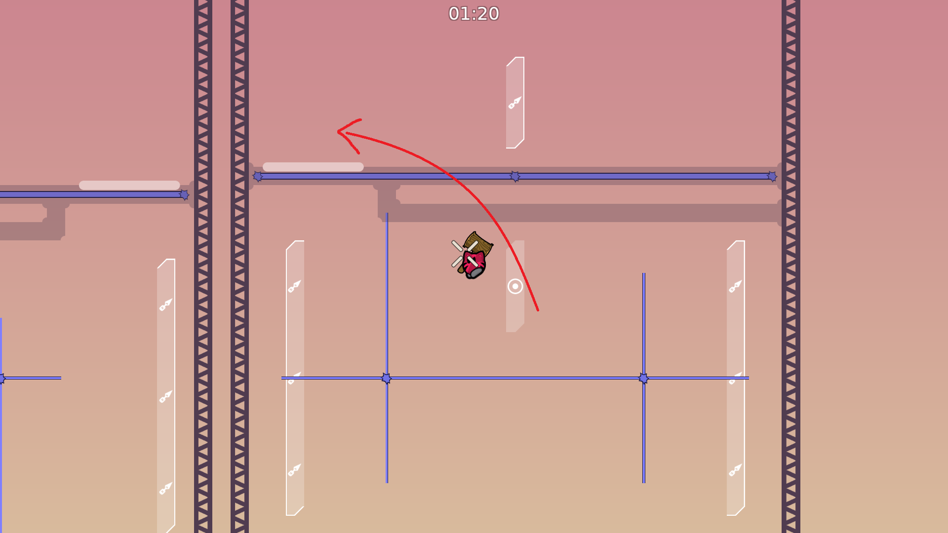
altho it would be nice if hook tele was predicted better

thats not smth u can control tho
i feel like you played this on lan and it was a lot easier than reality because ping makes the tight hooks a lot harder
i played on both lan and another persons server
its a huge difference
maybe use a different marking (like put a bold line on the sides you cannot hook from)
like this
i can help u make a tileset for that if u dont have one
ah ok
that would be great
and entities marking like that perhaps
not sure
or put it on the sides
I thought about that but it looks kinda weird tbh
il change it to the first one
yeah bugged tileset
its fine i can fix that all if map is rls
well
cool map imo
i think u can lessen some of the tighter hook spams
thanks 😄
like make more space or change the moves?
also the fact that there are kinda multiple parts in a single "checkpoint" is sorta weird to me
both maybe
like i would suggest doing it 1 part at a time
and i think u can make a lot more cool parts with this thing
for example i feel like more swings would be good
maybe u could make parts where it revolves around a hook going to the center of the room instead of straight up
etc
Im thinking of make another one of these in the future if this one passes
but yeah theres tons of stuff with hook tele
idk about single parts though, I think that would be too easy
my complain was that it feels weird that on some parts, failing only sends u back 1 or 2 sections while if u fail near the top you get sent back all the way to the first "part" of the section
its better for it to just be easier in general than to have an irregular fail pattern
i think some players would get annoyed by that
hmm
just my opinion tho, maybe u can wait for other testers or players (but i'm quite against it :p)
i know what you mean but it was kind of intended to be that way
like jump king i guess
thanks for the feedback though 😄
ya u can wait for more opinions
btw i probably would be against readying this until hook tele prediction gets fixed
when will that be? lol
idek some dev would have to do it
and even then i think you should balance the map out a bit and maybe explore new ideas at least
cus rn the map feels kinda incomplete, like u have a cool idea and a lot of good parts but there isn't much expansion on the idea
alright
il keep experimenting with it
fixed freeze bug
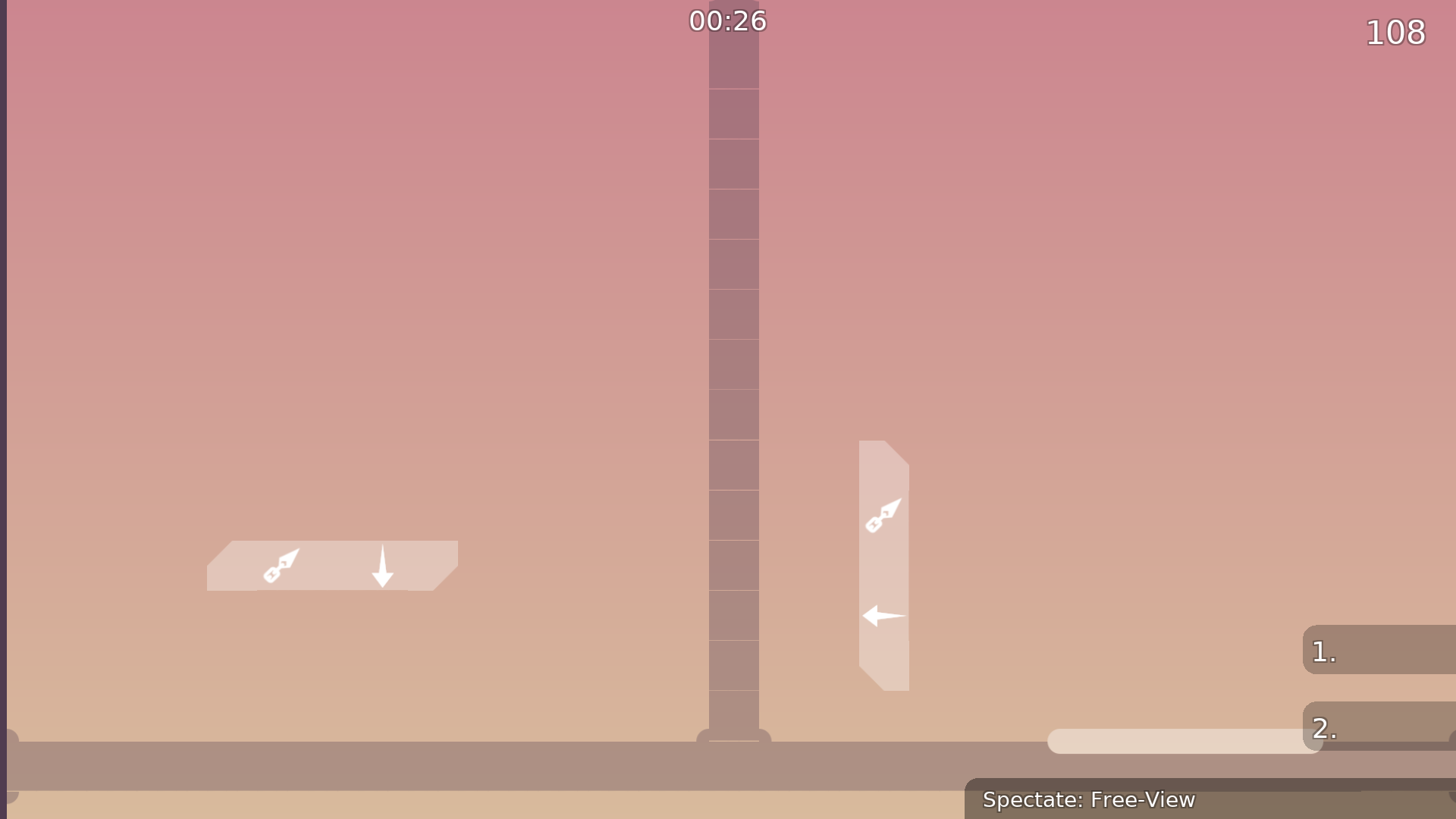
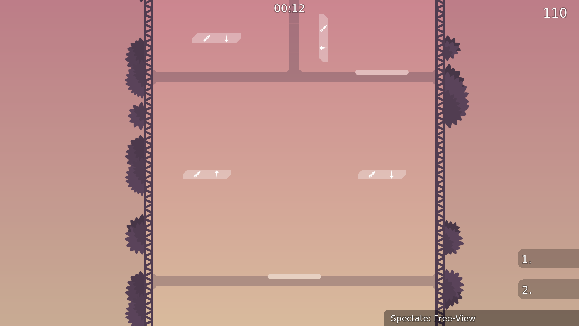
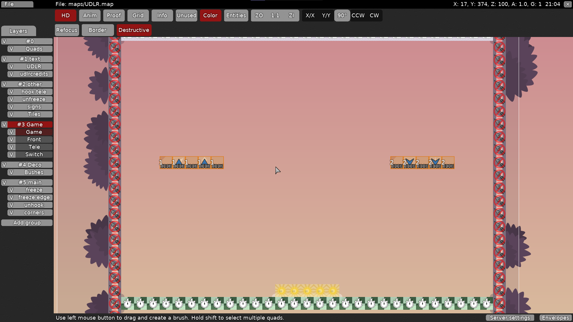
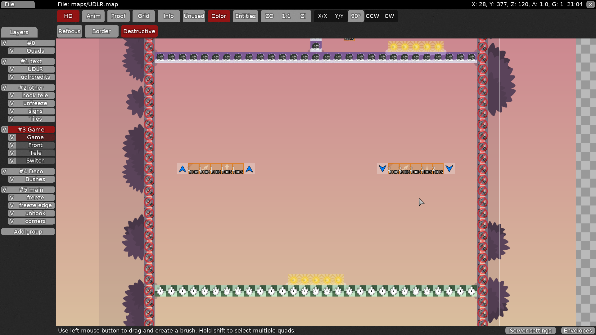
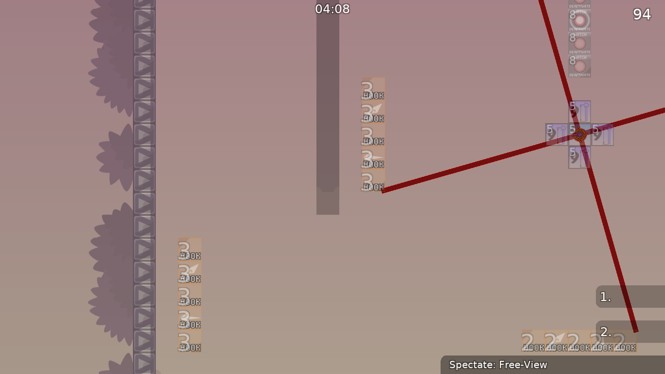
added arrow game tiles to hook tele (for entities players)
Any reason why its not bugged for me? I dont see the lines in the freeze when I zoom in...
enable openfl
opengl
how i do that o:
nvm i found it
fixed tileset
I hope that fixed it
oh and also should I keep the arrows or make it so its jsut the hook
looks good and u should rmove arrkw
alright
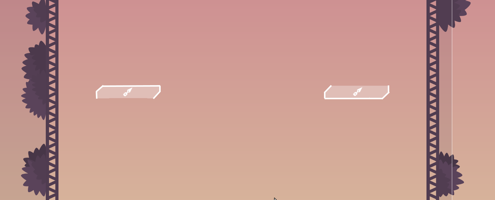
added borders, removed arrow signs (from tileset as well)
fixed incorrect arrows and borders
changed last part of last section
added a cp after every 2 parts, some slight tweaks
moved game layer in front of tele layer so that arrows show more clearly in entities
like this? I dont know if it really fits with the rest of the map though..
it looks nice to be tbh
and yeah it won't fit with the tower map but u can always make more parts with that sorta layout
should find some way to make the hookable box better tho but i think there's an easy way
also ur mac bar is in a cursed location
maybe jsut surround the hook with unhookable? not sure if that would work. I jsut chose the anti hook so i dont have to texture it
how is border + no arrow more clear than no border + arrow
what they teaching u in school
I actually agree with louis, I think in the moment its easier to see the border vs read the arrows
rly?
why not both anyway
or simplify arrow icon
I think it looks cleaner with just the border
I can add back tho both feel fine to me
u can maybe make the hook symbol point in nesw directions and point towards where to hook
u blind
my glasses are so thick
they barely help
Each section now has its own hook block, and each hook block is equally spaced based on the height of the section (at a value of 100 blocks currently) Layout of the map changed to allow for this change.
are you happy
@lynn
the wonk is fixed
i am so happy rn like im crying
Did they fix hook tele prediction? tested on different server and it felt much smoother than last time
fixed game tile error in section 5, added border to normal tele, fixed some bush bugs
nerf this just a bit
THIS FUCKING PART
i agree with this
this part is p hard to cross bottom path
maybe u can move the hook teles like 1 tile closer to inside
and hooktele still broken so we're waiting on that
i found a lot of the parts to be anti-flow or artificially difficult just by the tightness of the parts. imo it should be about "hooking in the right directions" only, not combined with "how long to hook, how precise to aim" etc
but the idea is amazing, so i think no matter what im excited for it
this criticism is pretty opinionated ofc, it can be whatever the mapper wants
$waiting
i agree
i would like to see more speed-centered parts rather than accuracy but the map style is up to mapper
yes i agree. also with the idea of speed checks you're nearly guaranteed to have good flow that way.
Thanks for all the feedback
@lynnand
@louis. I will nerf the above parts tomorrow and consider changing a few others
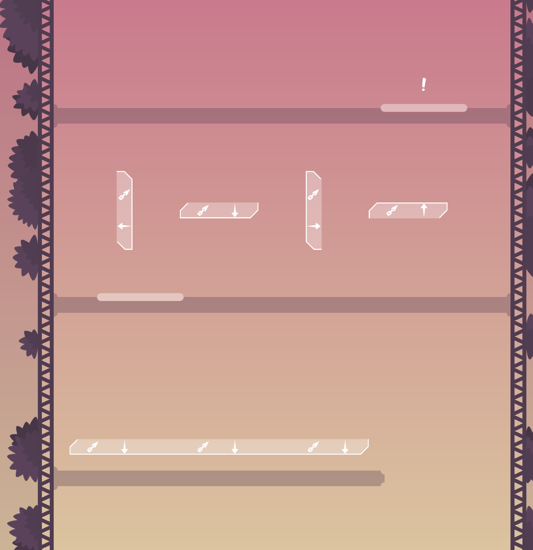
In design I still feel its sometimes hard to tell from which direction to hook especially while moving. Idk but maybe you could change the border color from the hook teleports? So it displays which section of the teleport is "closed off" so to speak. Maybe just a darker grey so its not too intruding but still clarifies the difference. Entity design is really clear, definitely helped me understanding the directions when I first played it. Cool solo map, I like it. Not too much of a solo player myself but unique twist on a long established mechanic.
Il consider changing the outline. Thanks 😄
Nerfed previously explained parts. lowered opacity of "Hook TP"
Changing the color didn't seem to make much of a difference to me while testing. Instead of changing the color of the border, I kept the white and changed the hook tp to be a little bit more opaque so that the border is more visible.
Like a timed gate right before the tele at the top?
Maybe I’m interpreting that wrong

no
like parts where u go fast
well u cant rly do it with this tower style
like that clip u sent before
Oh ok
Yeah that’s not really the goal of this map. I might explore more ideas with this mechanic in a different map, but the goal was to display a simple idea in varying degrees of difficulty.
Agree with you on this one. I like pushing simple concepts to its limits and this map does it in an interesting way. I still hope you explore the idea of speed and or swings in another map. The clip you posted a while ago makes a unique and really cool part.
if u put it there requires more movements by the player which will make the part funnier imo
Cool map
Will do
what a cool idea and nice design
I wonder why you didn't use the hook blocker tiles? it would be clear in entities too
I think it's rare example of a map that is better playable with design than with entities
I don't see a good valid way to mark it, blue arrows aren't perfect, some people have custom entities
but it will be always too messy
anyway, I would make the white border just a little bit thicker
you should put it in every part then xd
after opening the door
is it fine?
the skip looks kinda risky, so I think it should be fine (Il test it before I upload the reworked version) Having the red one move instead of yellow would defeat the purpose of having to go backwards, so I may as well just leave the skip. Hook blocker tiles look kinda messy imo, so im just going to leave the entities as they are. If custom entities obscure arrows enough to make it a problem, then idk how I could do much about that. Il make the white border a tad thicker and take the "!" out. Medium speed would make the part slower and harder, so Im gonna leave it at fast.
Thanks for the feedback and suggestions!
the skip is super easy because you don't use doublejump before
@FJPah goo point
good*
il try and work something out

reworked last part, made border thicker
I tried to keep the difficulty the same as much as possible, but it might be a tad harder now

ah i saw it almost half a year ago but its not release yet
ye i guess we dont have to wait for any predictions and can just ready sometime
but i would recommend doing less tight parts because of the lack of prediction
at least less tight hook parts
ill check sometime in the future if another tester doesnt
il make some of the cramped parts a little more open, i don't want to change too much tho
are you going to do it? if u are should i put it on waiting or what ? 😄
Yeah put in waiting I’m out of town rn
Ok
$waiting

I left in one tap-style part at the end. If it's too much il change it
In whole run i didn't pressed space bar xD
2 star map
Jump isn’t needed but it’s a nice handicap to save yourself (landing in unfreeze) if you fall. I’ll take it out if more people or a tester thinks it’s necessary
It's not necessary, just as suggestion
maybe do like little 1/5 2/5 3/5 4/5 5/5 on each spawn of the tower
so u know how far u are in the map
i would decorate these a little if they are the winner room
or make a separate winner room
u can do some nice decorations and finishing touches if u want, i mean map is essentially $ready 2 in terms of gameplay
small things like
shifting these so they're center aligned / slightly misaligned just for a stylistic element
little things like that if you want
i mean you can also ignore everything im saying since its technically not required for a map but its just my advice
and if u wanna change some stuff go ahead if u dont then its fine but either way i'll ready it 2*
I’ll do the fixes when I get back in a couple days thanks for feedback
$waiting
minor changes and design overhall

are time cps now a requirement for new maps?
for all, including old maps
dang i didn't even realize that
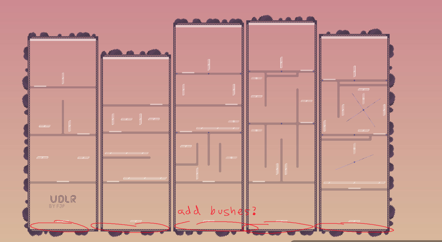
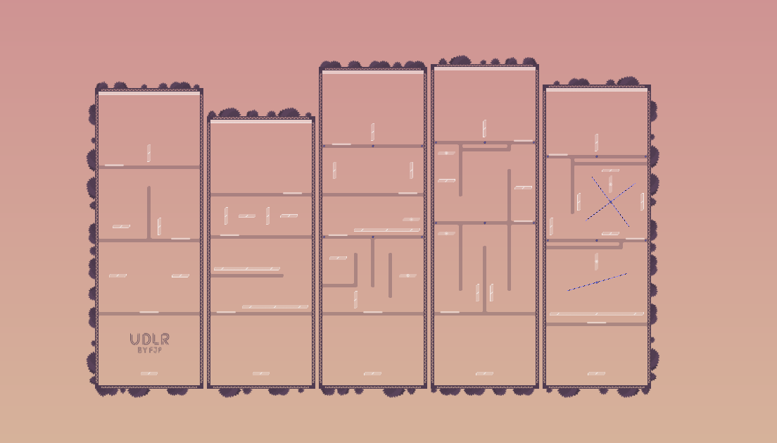
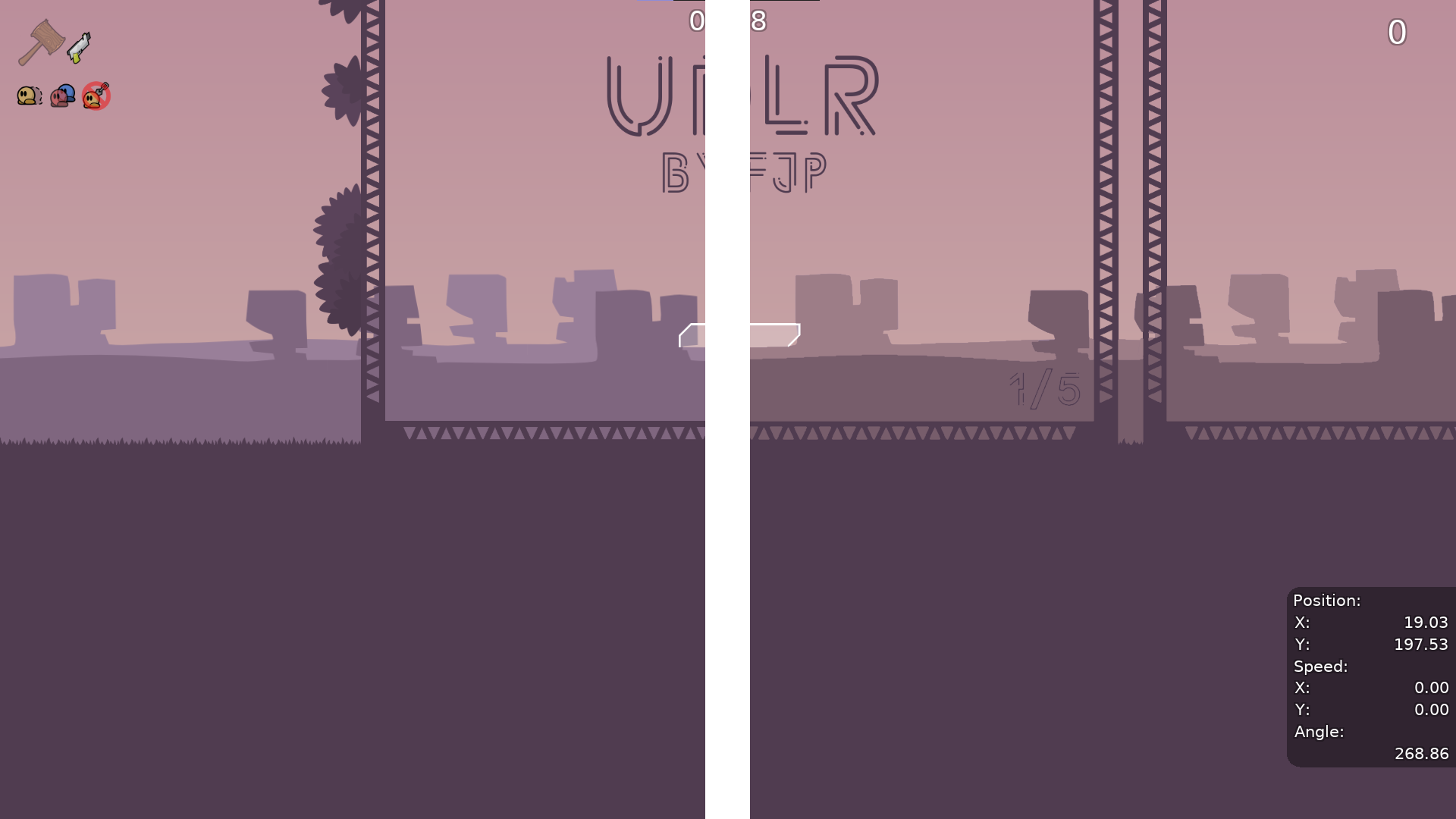
i would remove the background desert mountain things, honestly it looked better with a blank bg
but the rest is good, and i guess if you want to remove dj its fine as well since its not required
or alternatively match the colors better
left side original right side with interpolated color values
775D6B (far) and #9D7D87 (close) if you want to use them
Wh.. w.. whe. E... nn.. when.. ri.. re...lea.. release
yea i forgot about this ill ready it later if i remember
Which begs the question: How many stars?
I’d say 2
15
Agree
$optimize
$ready 2
Sadly im not able to play and make rank one 😔
are u gonna be able to map ur maps in testing then lol
I sold pc
Today
rip
you can re download latest uploads xD
gg
@FJPnot problem for him
he has me

My boys everywhere 🥷

