this is your map's testing channel! Post map updates here and remember to follow our mapper rules: https://ddnet.tw/rules
wat
ddnet sus
fixed :^)
dude do you test your own maps?
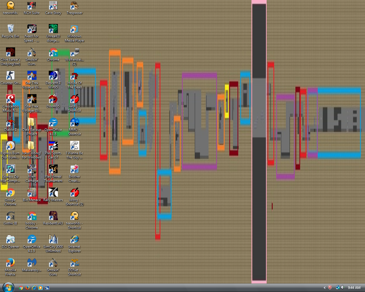
as u can already see, ive once again taken out my beautiful paint color palette to flawlessly illustrate my reason for declining this map. the meaning behind the colors is that all parts with the same color are really similar and almost share no difference as if u almost copy pasted the idea behind them. yellow: thats the worst start in ddrace history, it just a 1 tile freeze and u know that u should have WAY more space in the beginning of a map than that and also repeated that little move towards the middle of the map. dark red: i colored those parts dark red where i dont even know where to begin why u even implemented them in the map in the first place. the first one is just a jump for a weapon and it like disrupts the flow and even my grandma could clear that part. the second one is just an area with a lot of space i guess with nothing to do there is no challenge in that part and even as a filler there is nothing to do. the third one is a jump, just a jump into unfreeze and i dont need to add anything to that. the last dark red part is legit just a tiny hole. blue: i marked parts blue which are boring fillers where the only obstacle is just a freeze wall and u repeated that move too many times red: red are parts which are nothing else than just going or falling down, like nothing really happens there orange: all the parts that have the exact same principle: do one hook to ur mate -> he hooks u out; which happens so many times its really boring and they are way too similar
green: there is only one green part cause that one is actually unique on this map, its almost like u tried to think of something nice. u should do more interesting parts more. purple: brainless fillers where u just need to hug the ceiling pink: this part is also unique but in a bad way xd noobs wont anticipate to fall out of the map and die unexpectedly lmao
and once again ur map is wayyyyy to tight to actually play it well on a full server! try to imagine a whole ass server would switch to this ungodly tiny map and all of em would want to squeeze through the start
$decline
i want this printed on canvas and in a gold frame
or ill just buy a 1000:9 monitor and use that as my background

picasso

you can also get a windows vista :3
you ruined it with vista
but i appreciate the effort
this looks kinda cool in its own way


