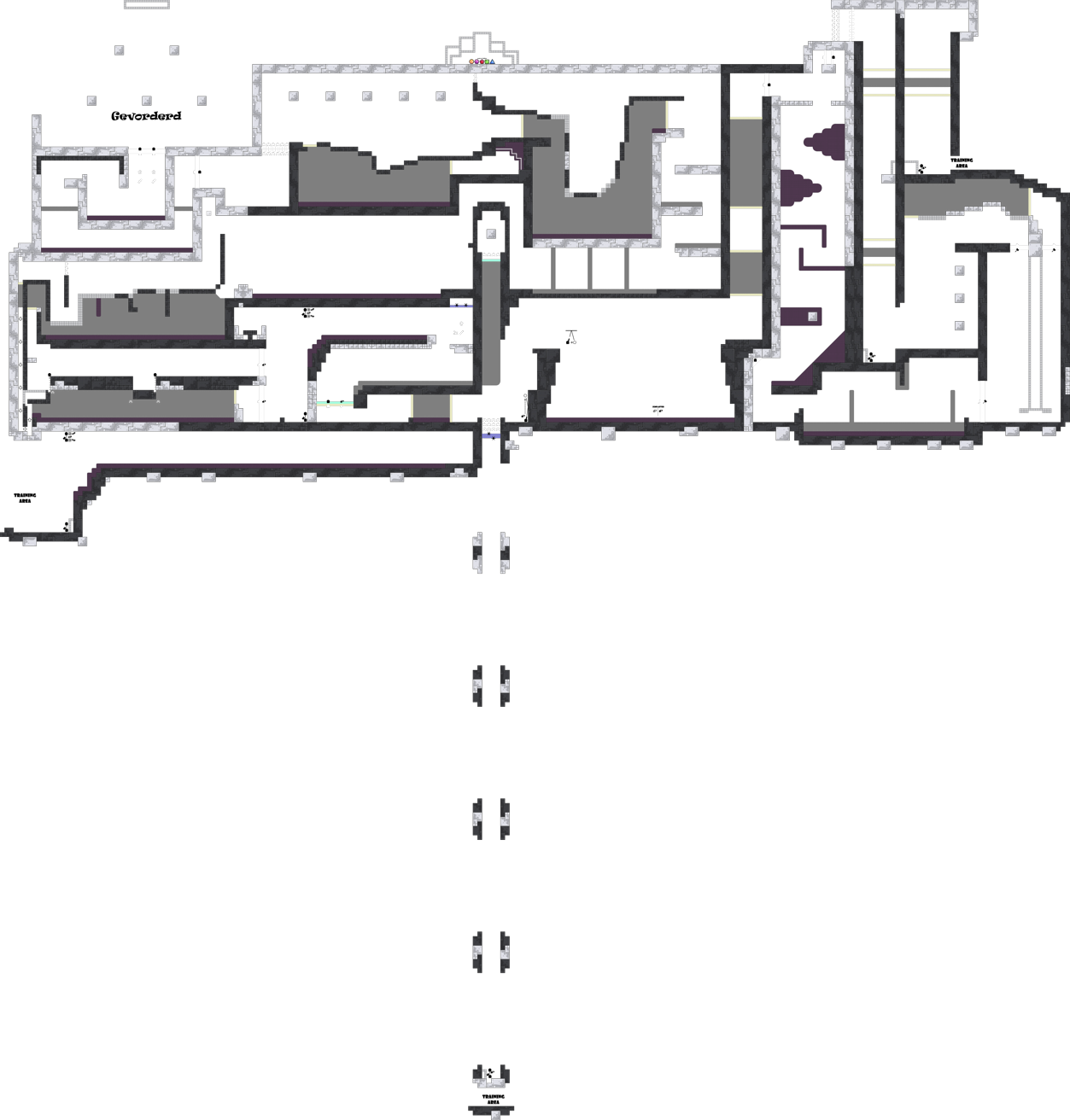
this is your map's testing channel! Post map updates here and remember to follow our mapper rules: https://ddnet.tw/rules
Map Showcase: https://youtu.be/sfhg7d07vKs
pretty unbalanced
good map still
horizontal flying seems too hard
why is laser up there
idk if they accept this basic drags hm... example "floating_islands"
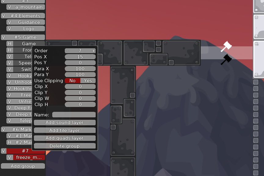
just by playng with Pos X or Y of a group
V1.0.1 Patch Notes:
Gameplay: Auto gain Laser and you start at the top 1#Drag; difficulty increase 1#Drag; going back is a teleport instead of a one way 2#Laser; added a variation 3#Drag; difficulty increase 4#Drag; reset frequency increase Deep Drag; slightly more interesting Gores; difficulty slight increase Gores; possibility to skip it, added
Added more teleports "to"
Visuals: Graphical bug underneath trophy display fixed Centralized hammer indicators near hookfly Centralized Freeze indicator near training speedfly Freeze artefacts in teleports removed
V1.1.0 Patch Notes: added a new layer: non freeze freeze
Gameplay: 3#Drag; difficulty decrease Deep Drag; reworked Kinta flying; moved to end of the map & added a possibility to throw one tee across Speedfly; difficulty increase
My materless opinion about this map:
I find it cool as it allows you to train some mechanics which might be helpfull for new players. In my opinion it can work as a good moderate 1* map, as an transition from novice to moderate.
Why? Simple parts and not too complex, easily can be trained hh due to lasers which makes that unfailable.
Although, i really don't like that on a mod 1-2* map is a kintafly part, speedfly part which definetely aren't something to be taught on this difficulty of map and makes the map strictly unbalanced

But unfortunately it have a possibility to lead into a decline bcs of ddmax-ish parts, which nowadays aren't that loved

gevorderd, prima naam
@Gulikerkon ik om lachen
i dont rly like this map, its kinda all over the place imo
its like a traininng map but u also have ddmax drags at the beginning
also its unbalanced, u cant have kinta and speedfly in a moderate
I agree with louis, + there almost no parts, so ddmax parts taking half of even more in the map
the other parts is just way too simple
- try to map clean, nobody likes to see 5000 switches in 1 part
the map is not bad, but also not very good. the 3 drag parts are oldschool, ddmax drags with tight tele and corners. then you have short parts that showcase an element. what's good about it is that you have a nice range of different parts, but they don't connect well into each other. overall the parts feel isolated and the map therefore has no flow. the map could also need more room to breathe, I felt it was slightly too tight. like all parts need about 50% more scale. your design nice and clean, but you use 3 kinds of corner styles so that should be more consistent. look at the recent maps "Olymp" and "Pyramids" they are a good example of what a modern moderate should feel like. good luck 🙂
$decline
Thanks for all the feedback, think i will abandon this project and work on a new map instead of trying to fix this map. I will have a look into how to connect different parts together, but for now i think i will work on a new map where i try to work with one core gameplay mechanic.
Try to make what all stuff what
@174sayd not one
Yes, i saw he liked the variety but i mean it as one core concept with lots of secondary concepts, those secondary concepts will constantly interact with the main concept.
I'm looking forward for your next attempt

