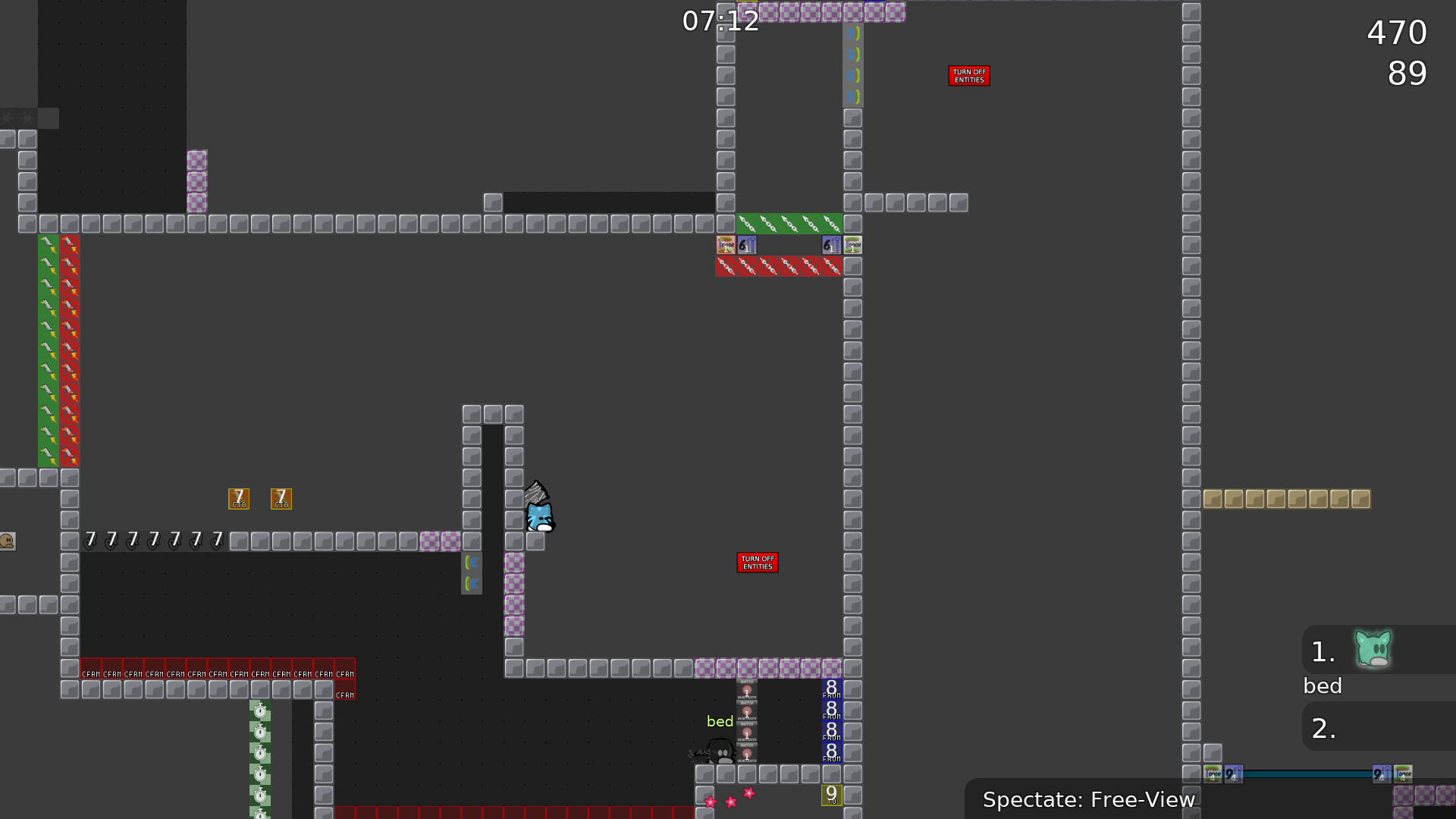
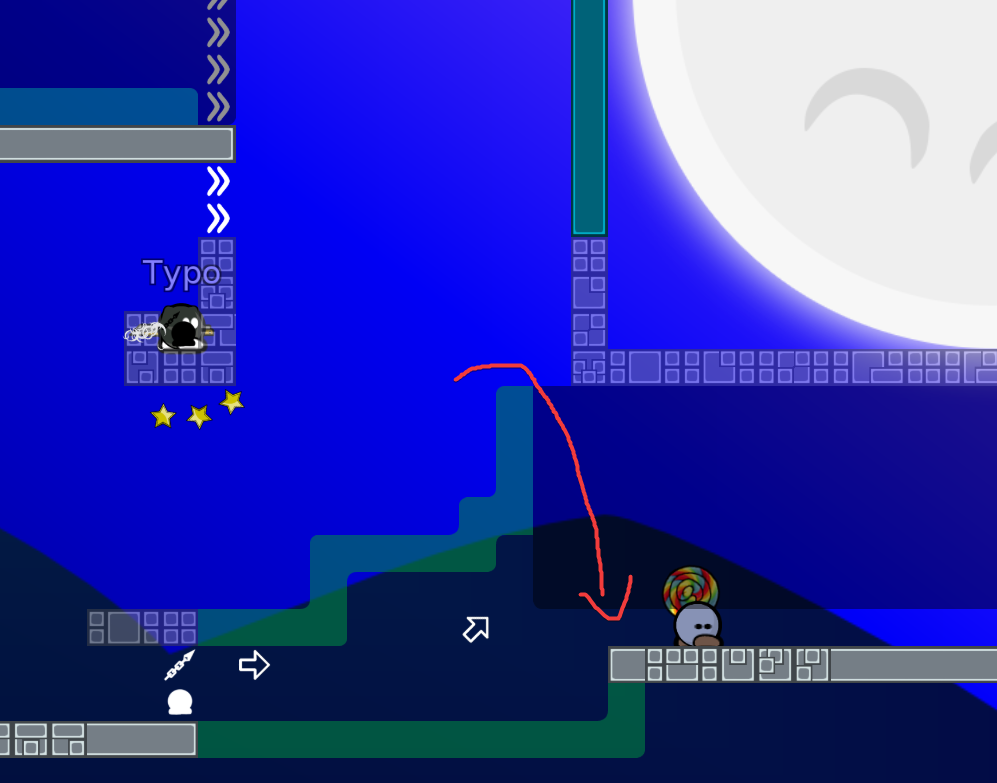
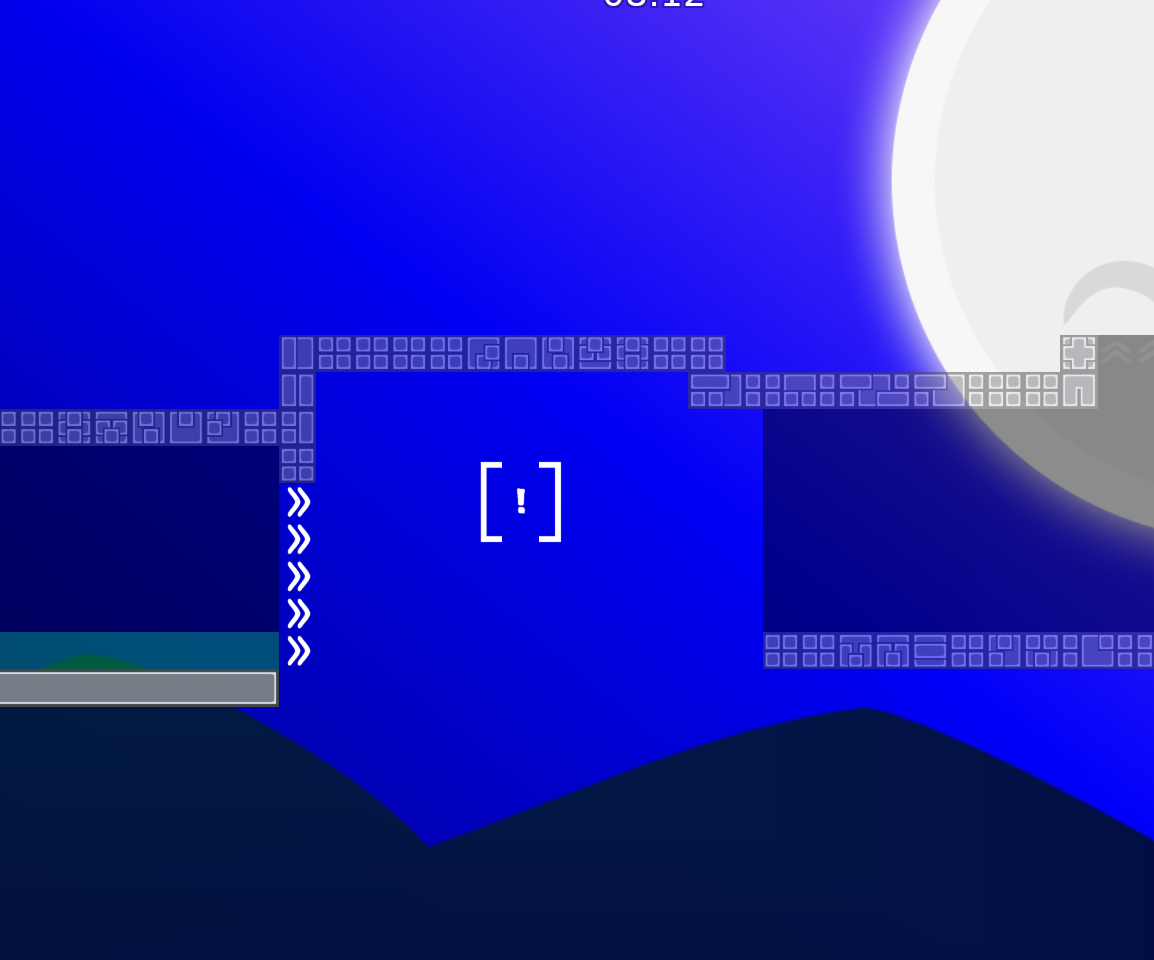
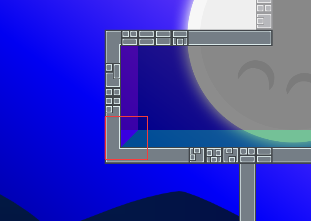
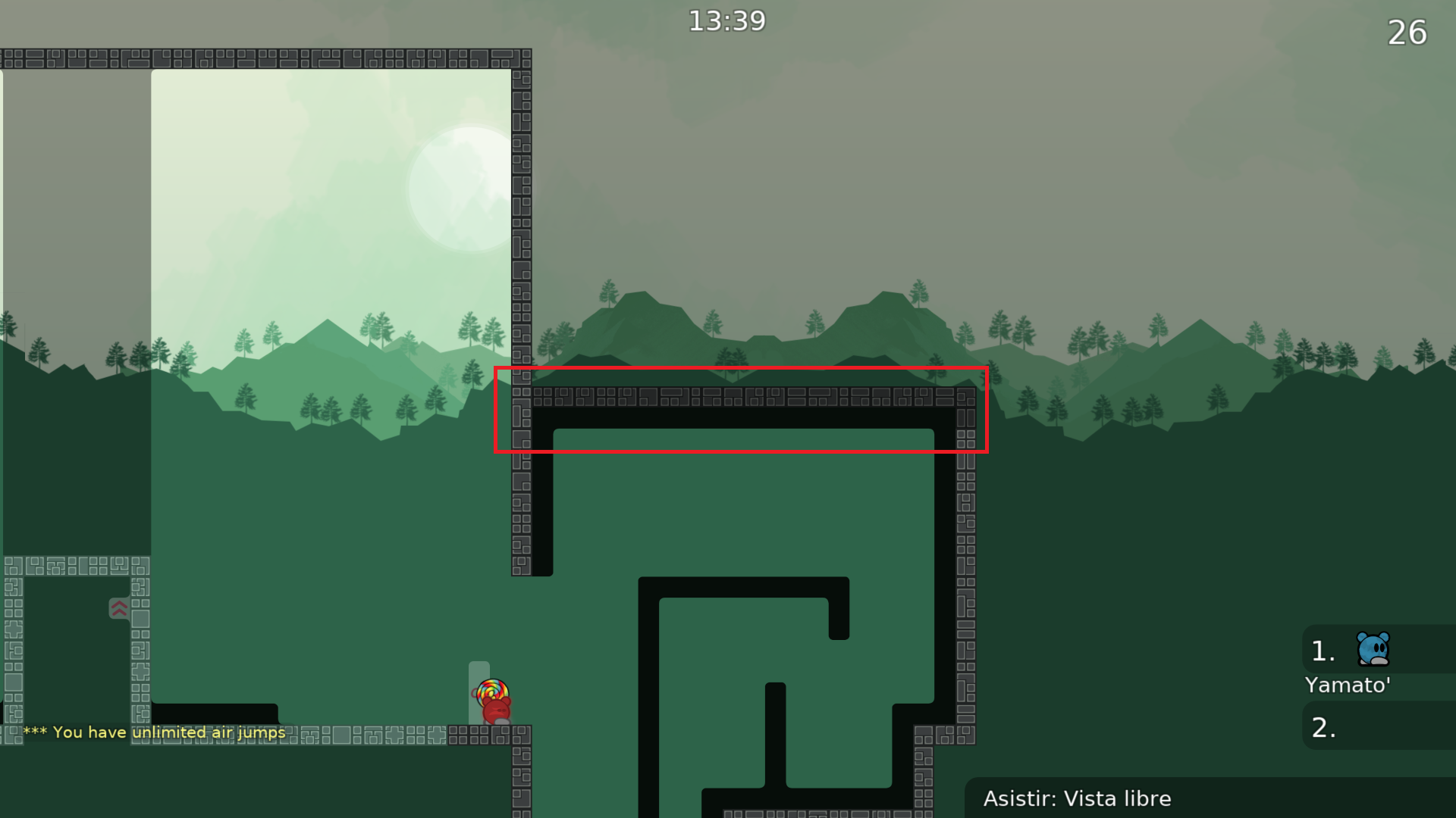
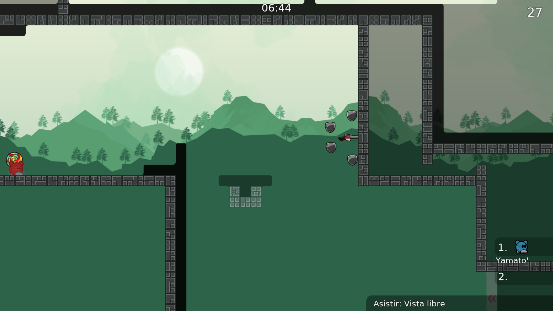
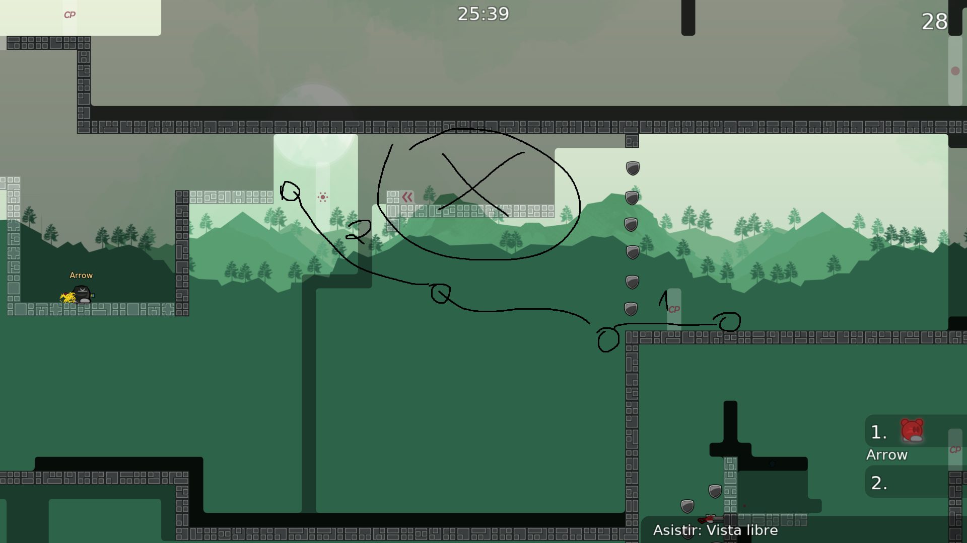
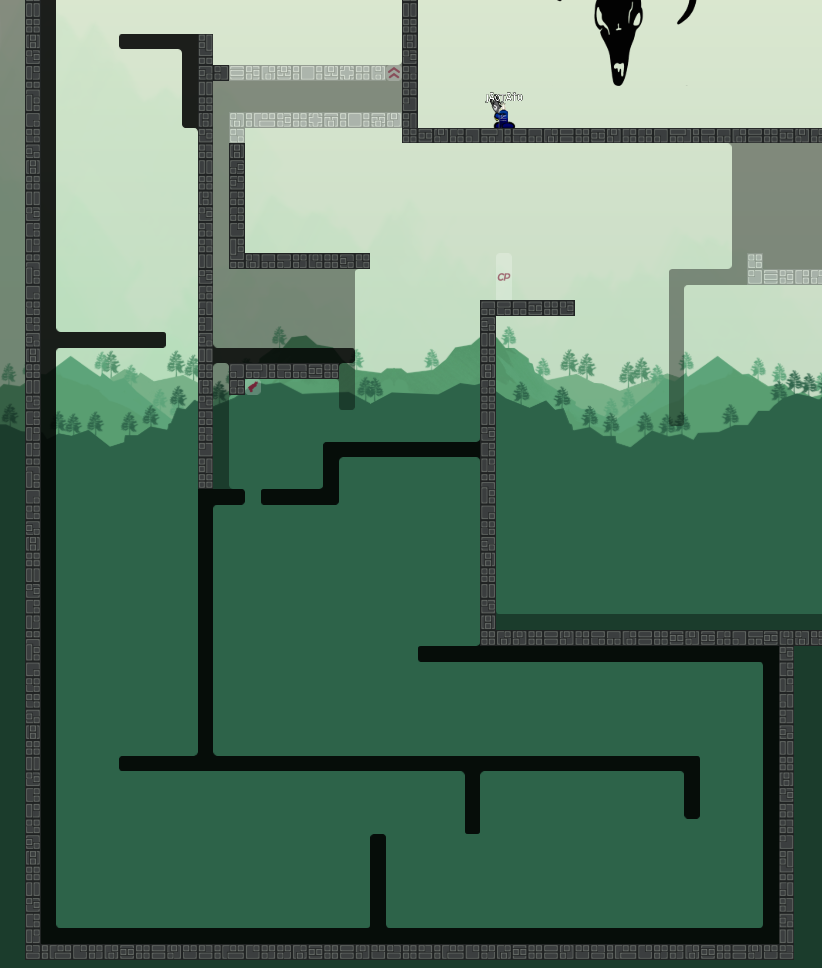
this is your map's testing channel! Post map updates here and remember to follow our mapper rules: https://ddnet.tw/rules
did a mistake forgot to add the deep that coulda been bad lmao (got rid of it earlier
saw another cheat but won't update yet since I feel like Im doing too many of them in short succession
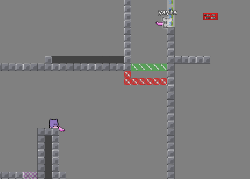
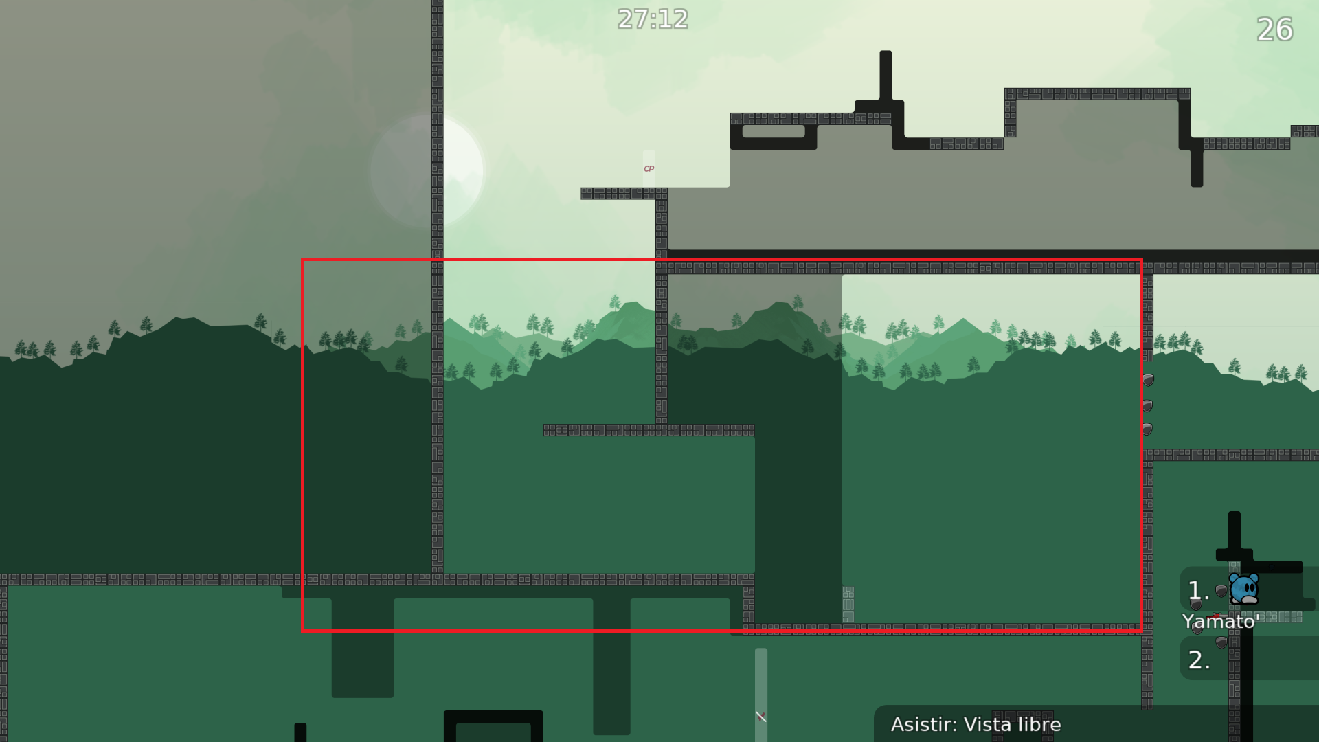
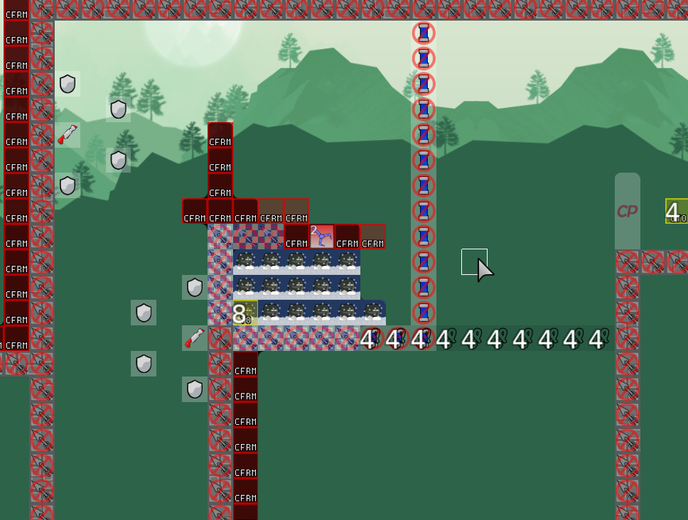
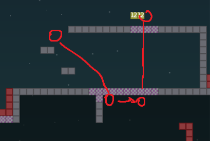
used doors to fix skips
you mean you can just jump across and get him after?
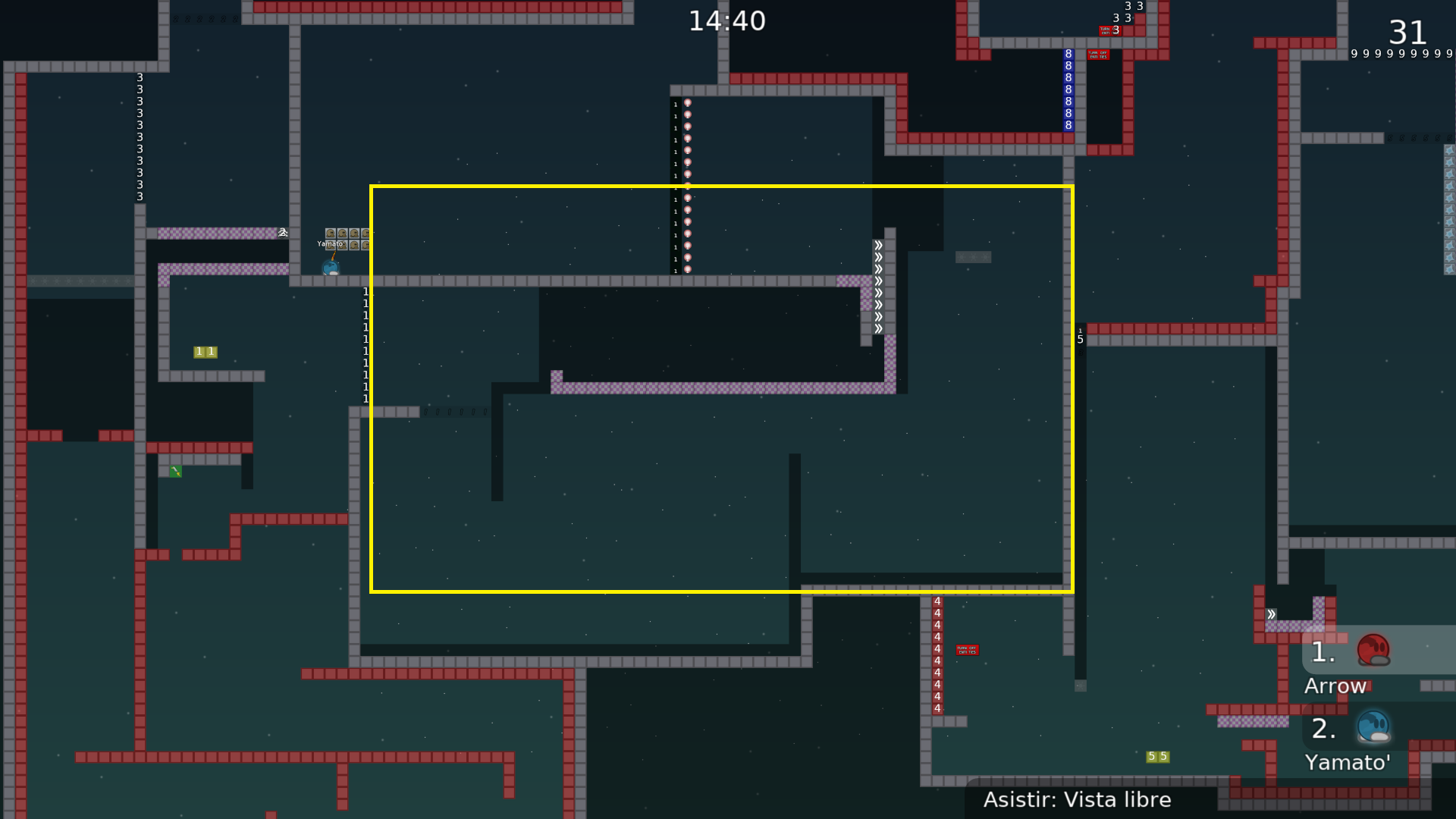
forgot off switch 4
lol
yes
did u put door on the finish line?
no
put it
alright
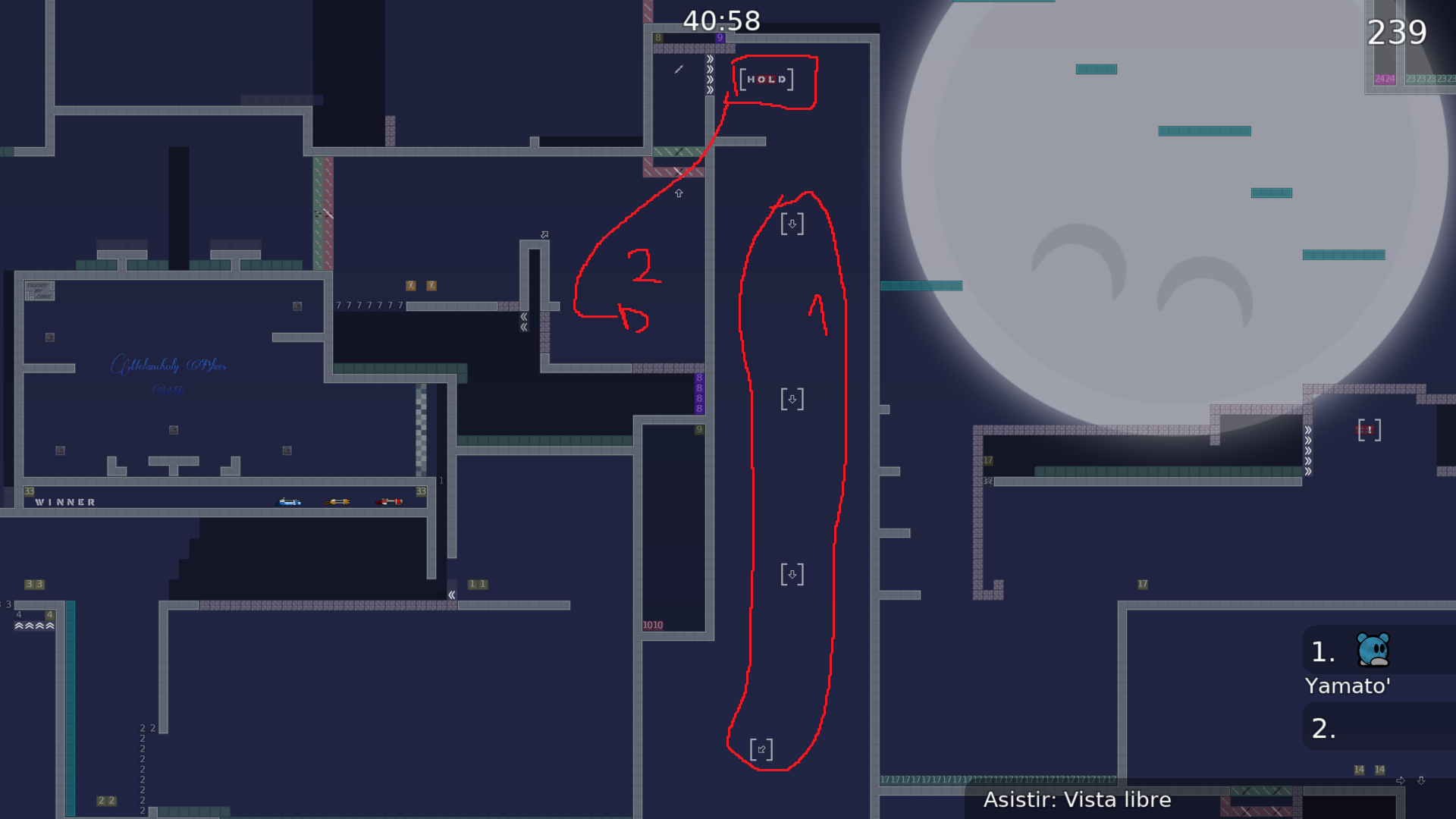
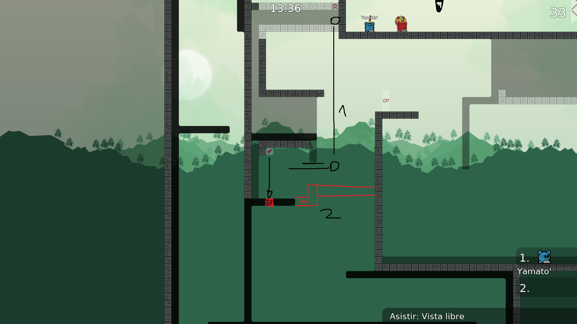
the idea behind that part is that the dummy shouldn't go down until the player's gone into the teleport. will add a door to further solidify that idea.
alright. first time making a map by myself so there might be more errors like that from inexperience sorry
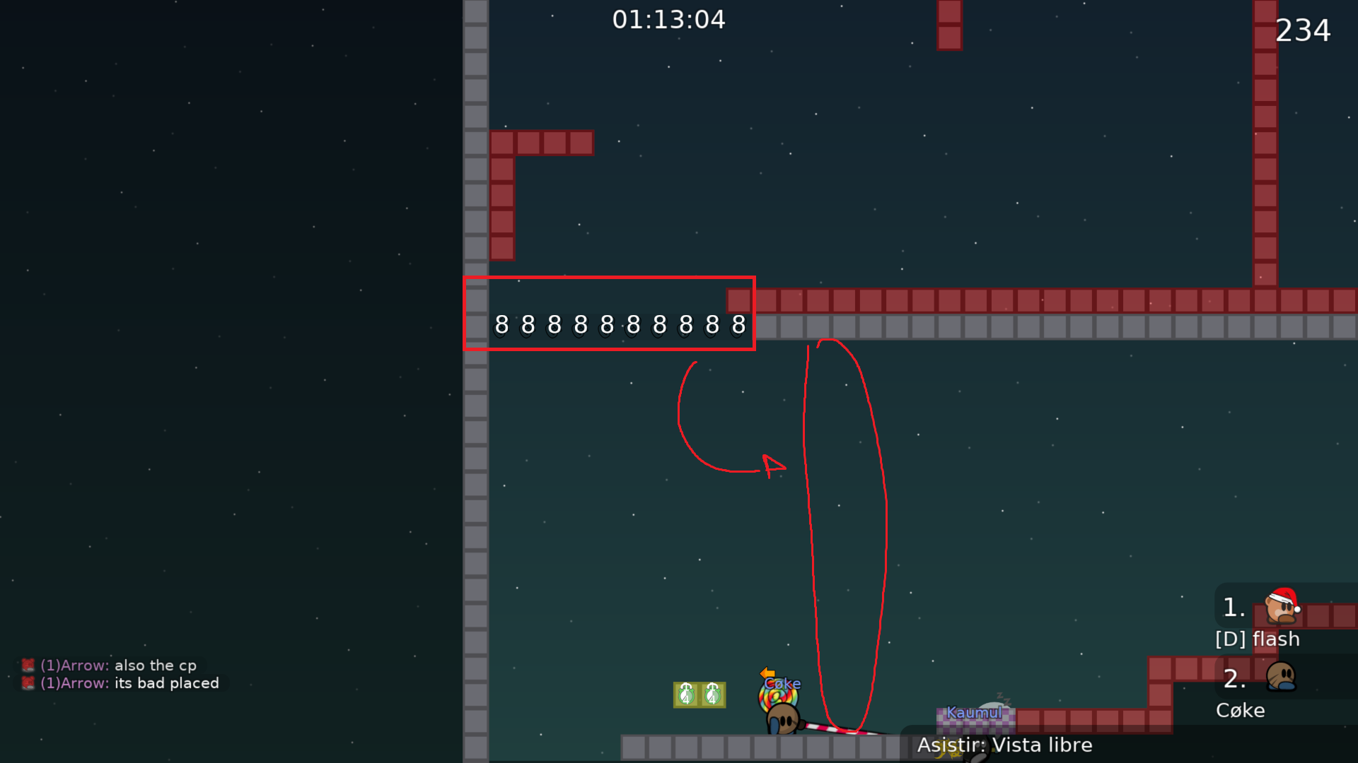
just there aren't freeze in design
OH
lmao
mb
is not necessary mark everything just relevant things, specially in dummy maps due is not for new players and they should know what to do
alright
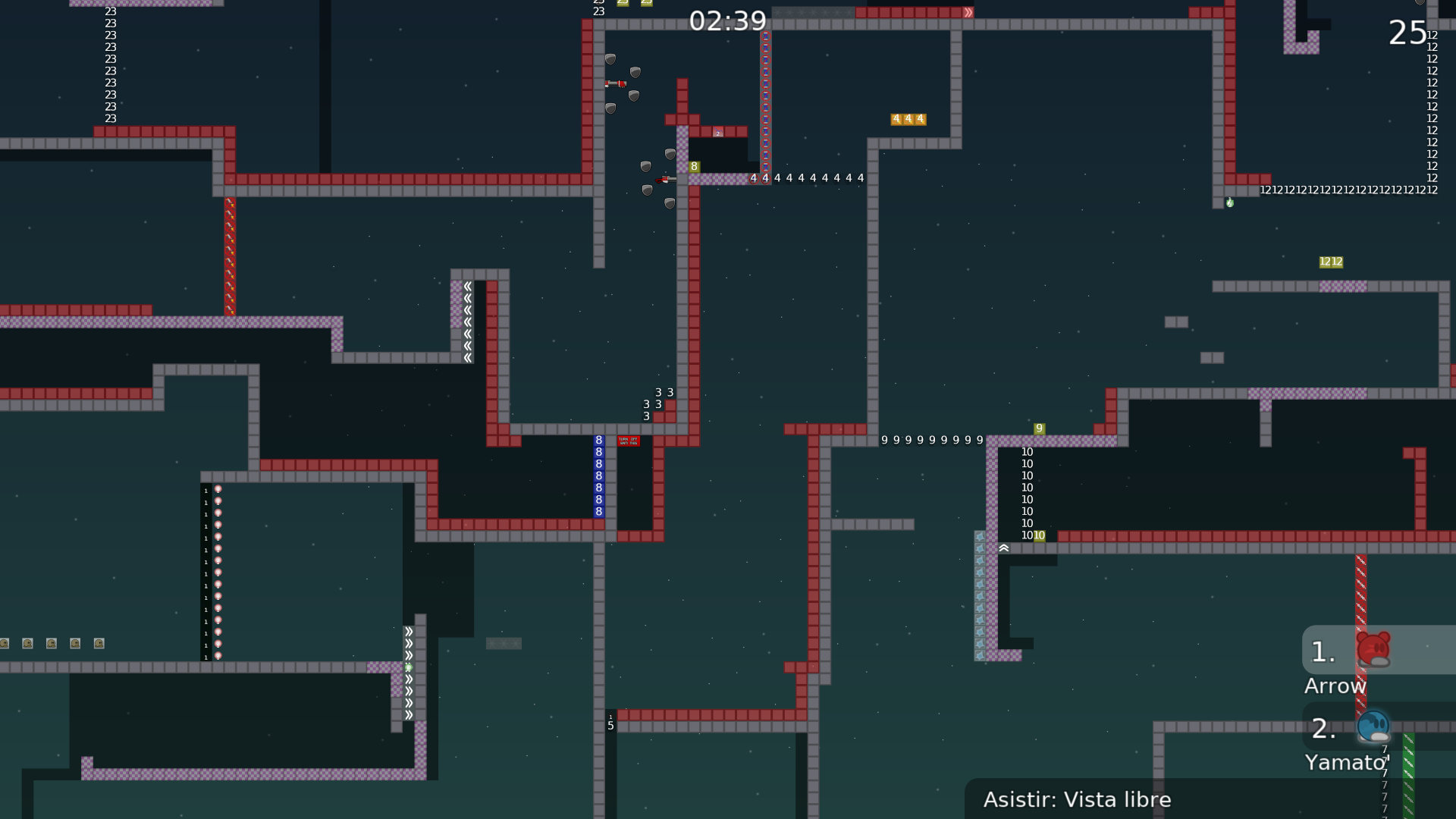
struggling a bit on how to fix this
Also unsure whether it's fine for me to keep sending the updates so regularly
u can send as quickly as u want, but make sure to explain changes so it helps out testers
what u should do is test everything and re test it
look for cheats, bugs etc b4 submit
yeah that's how I realized I forgot to put the door close 4 :')
And alright tks lynn!
ik that its hard do a 1 star map, but try to make the map more interesting, bcs as it is is not releasable
how do you change the colour of the bg? also had the other one because the tile Im using for the ht has a small white outline inside each of the 4 blocks (for hookthrough). admittedly after looking at them side by side the difference isn't so big that it bothers me so Ima work on that one sec
also sorry for bombarding you with question
A=alpha= transparency
its ok, you cant know everything if u start mapping yesterday u know
highly improved the hookthrough tiles, also added text that I thought was funny among other fixes
You've given me too much power
fixed literally one block that was bugging me (it had a continuation that I didn't include so it was open ended)
<3
changed design of unhook a bit, making it look less uniform
fixed that part, also got rid of the jump part, currently empty as I try to think of something else to do with that section
fixed an issue with checkpoints that could result in a fail
complicado mapear
fun tho
various fixes for map size
as in kb size
uncramped a few parts to give more breathing space
I couldnt find any but there might be visual bugs with entities because of this
fixed an issue and added a placeholder part for the part that had to be replaced
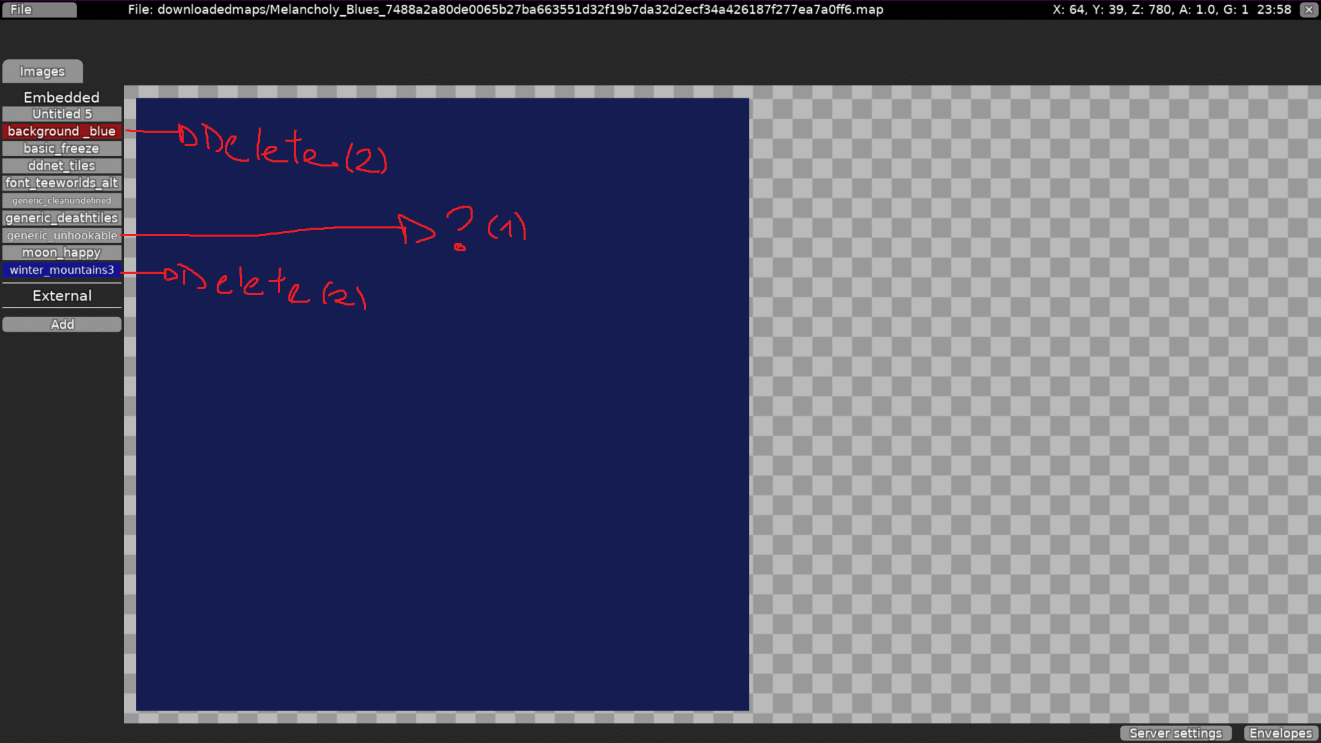
forgot to remove generic unhookables from the embedded section thing
few tele fixes
Ill chillax a bit now
few fixes to freeze make the map not feel as cramped in a part as well as entities fix
added time checkpoints
the background hurts my eyes. make it less bright and desaturate a bit
the map is too short in my opinion
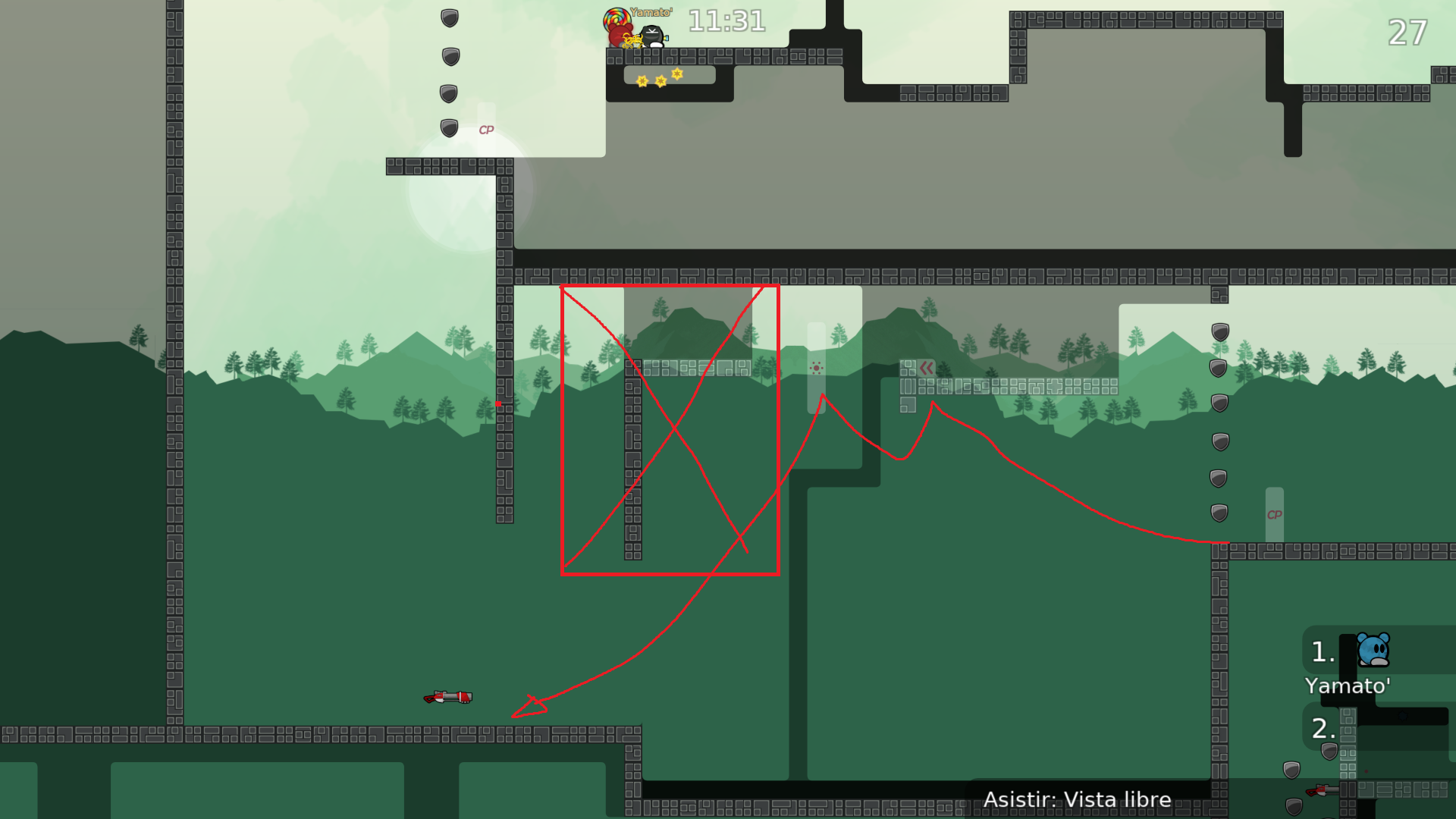
not a skip but unintended way
quality of life changes following insertkeys suggestions
ngl no clue what to do ab this
Just saying that if the dummy falls there you have to go back and redo the throw thing as well.
Admittedly after that this you can do this cheat again but also don't know how to fix that
Wait I know how to fix that
did the fix
Can fix that, it's gonna take a bit of time tho
Most likely the length won’t change that much tho
use a speedup going left at 2 force (no max speed)
added a bunch of doodads cause the map was looking kind of empty imo
changed a fail option that while not very common, plausible, to be nonfail since tbf it is walking into the corner of a teleport before touching checkpoint
also would like to add a midi tune of the song in repeat in the background
how to add sound?
since it's clearly an option
changed the last change to make ti look a bit prettier cause it looked really ugly admittedly
changed stopper at beginning to avoid someone just suiciding by running straight left into the freeze
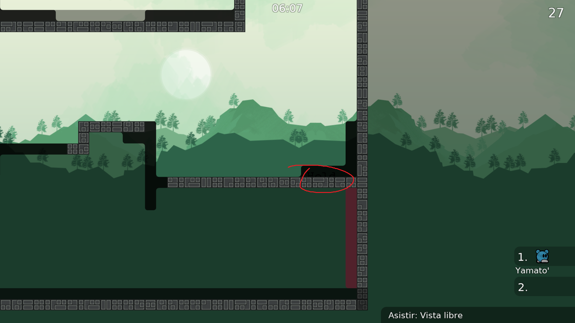
saw a entities thing I forgot to get rid off, and readded a hold message
moved a switch that was overlapping with one of the doodads
added a few checkpoints to make the map better overall
added a b teleport for a part in case u didnt hold for some reason
added a few more things
had a visual bug after the last update
added corners to a freeze that didnt have them
more visual bugs
labelling
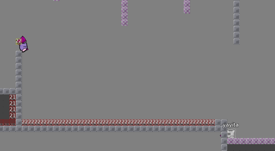
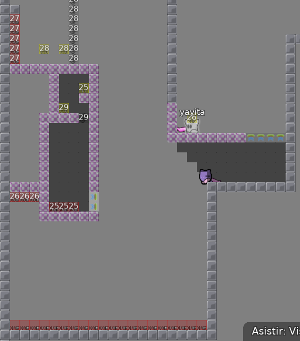
cleaned up teleports with checkpoints and stuff, cp 18 was kind of useless where it was, so I fixed that as well. In theory there shouldn't be checkpoints for parts that dont need checkpoints
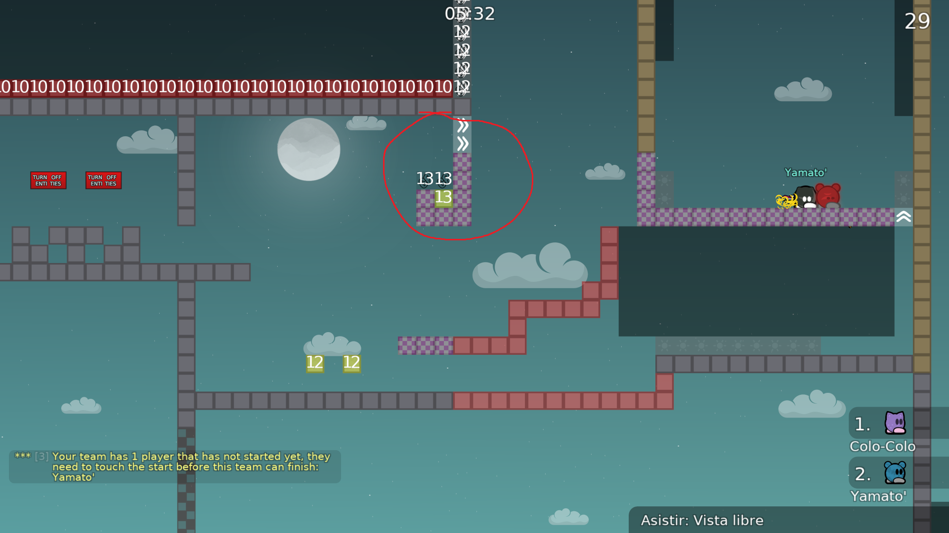
cp 12 could be moved to a different place to lower file size
well it barely lowered it but :p
essentially just made cp 12 be 4 blocks instead of 10
forgot to get rid of a single checkpoint block
Wait Im dumb I forgot 2 cps I need to fix
there boom
Also I never mentioned why I didn’t change this, u can hook while going right and then press left and keep dj. The main reason I’m keeping it is cause it feels and looks cool imo despite it being easy
Im also reaching a wall dunno what else I can do to improve the map
it seems like a tester hasn't checked this map yet, i would just wait until someone could take a look, otherwise your hard work might be for nothing

alright!
i would recommend you start a new map, this one has to be rework entirely
Gonna wait for that decline before starting on that
i love this map
dont decline
i dont agree, maps in easy dummy category arent often released
simple gameplay isnt bad either
Any map can be released as long as it's good
Map looks all squarish ... :/
if its fun to play then why not?
Wdym squarish?
Like the design?
the order I mean
I mean I feel like info and submit maps should be at the top of the section for map testing

its a known issue


my map is just more important than other stuff here!
Lol
Wait was this shade
Ohh I understood. Yes I’m slow shush
Gonna give it a new logo
Actually
Maybe not
Ayo can this be put in waiting for a bit
$waiting
waiting for big changes
yo, can we change the map name?
to Wendigo
$change name "Wendigo"
Ty man
its more smooth
hi coke
hi
no need high quality infos xd
you can use a low resolution (adjusted to the size of the text ingame)
map very unbalanced, u mixed up easy and harder parts
try to follow one difficulty level
$waiting
Ight, so changed the start stoppers but left the hookthrough anyways, that way you can do it as coke suggested, but can still use the old way if preferred, added 2 quads "by welshi" and "special thx to arrow" both much lower quality than the rest, I don't feel like the difference is that noticeable, but if it is I can change quality of everything a bunch. Also moved the checkpoint 8 and the corner arrow pointed out as well as changed most of the drags that were on the easier side to be a bit more difficult + creative, except for one which might be the most uninspired thing Ive ever seen, but it does seem to work. If any part is not that good (Im new to mapping so it's probably very likely) just tell me and I'll do my best to improve it! I did leave the fall of checkpoint 4 cause I kind of liked it though.
The map is still essentially the same tho, and there are probably still some super easy parts, Im sorry please have patience with me
Not very big, just did a bit of what arrow was suggesting and changed the part, it no longer uses switches
some drags still boring
and also u could add thing to make the map cooler in design like trees
etc
im rooting for u welshnya
Aaaa I need to do this
did changes
lots of changes
ik it went less than .50 kb up but trust did changes ;-;
did the changes here, the previous way is still an option but the window to jump is much smaller so I'm okay with it
didn't really change any drags either cause dunno which should have like an upgrade which a makeover in a way and if any are okay as is, plus tired and new years so ye
fix above
$waiting
Did the changes above. Also planning on changing the logo, but haven't done that yet
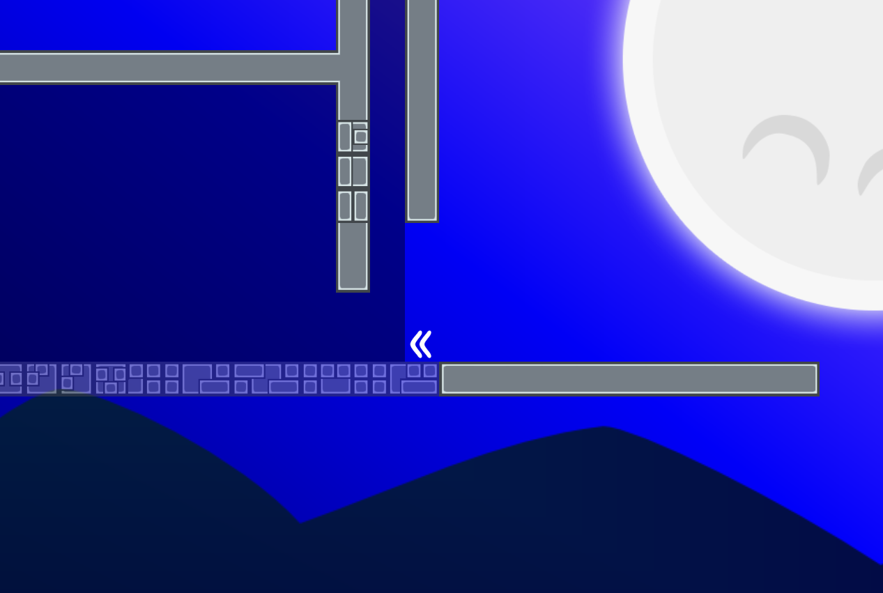
u didnt fix this
I’m ngl I have no clue what you’re telling me here, is the tileset wrong?
I figured you were saying that the jump on top is awkward so I tried giving it more space as an answer but yeahhhh
as for the getting speed here's the issue with that
Ive already reached a couple of times
so like, i was thinking of adding tp in the wall but that won't work
I feel like the only way to solve it is to either get rid of the part and do something else there or to make that the intended way
only solution that keeps it as is that I can think of is using doors but that's gonna be hella cringe
Im probably gonna just make it the intended way
unless someone can think of something else
cause the part it skips is admittedly kind of awkward
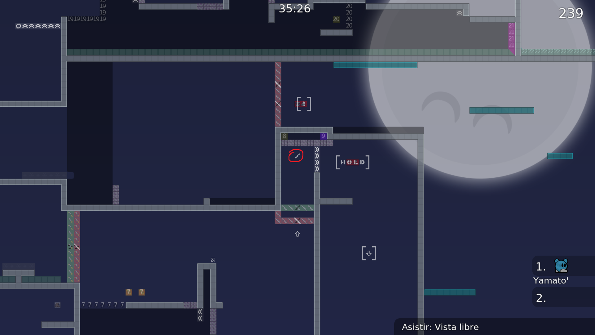
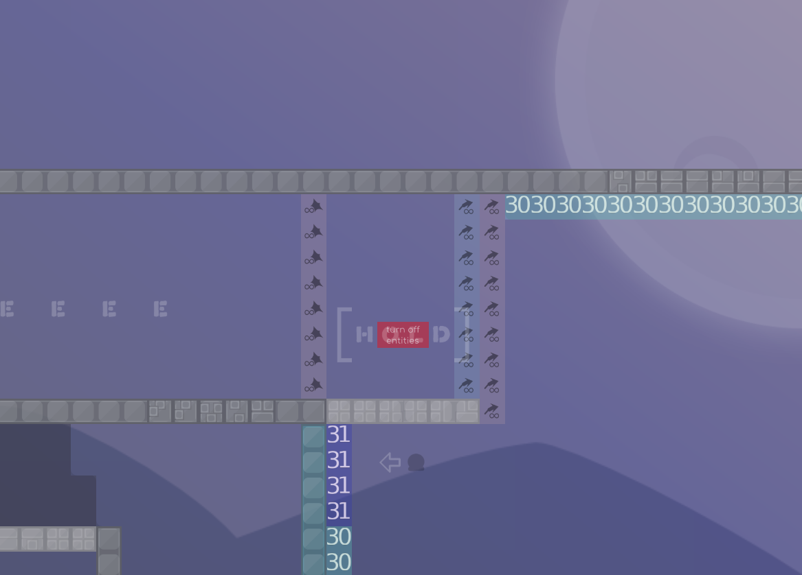
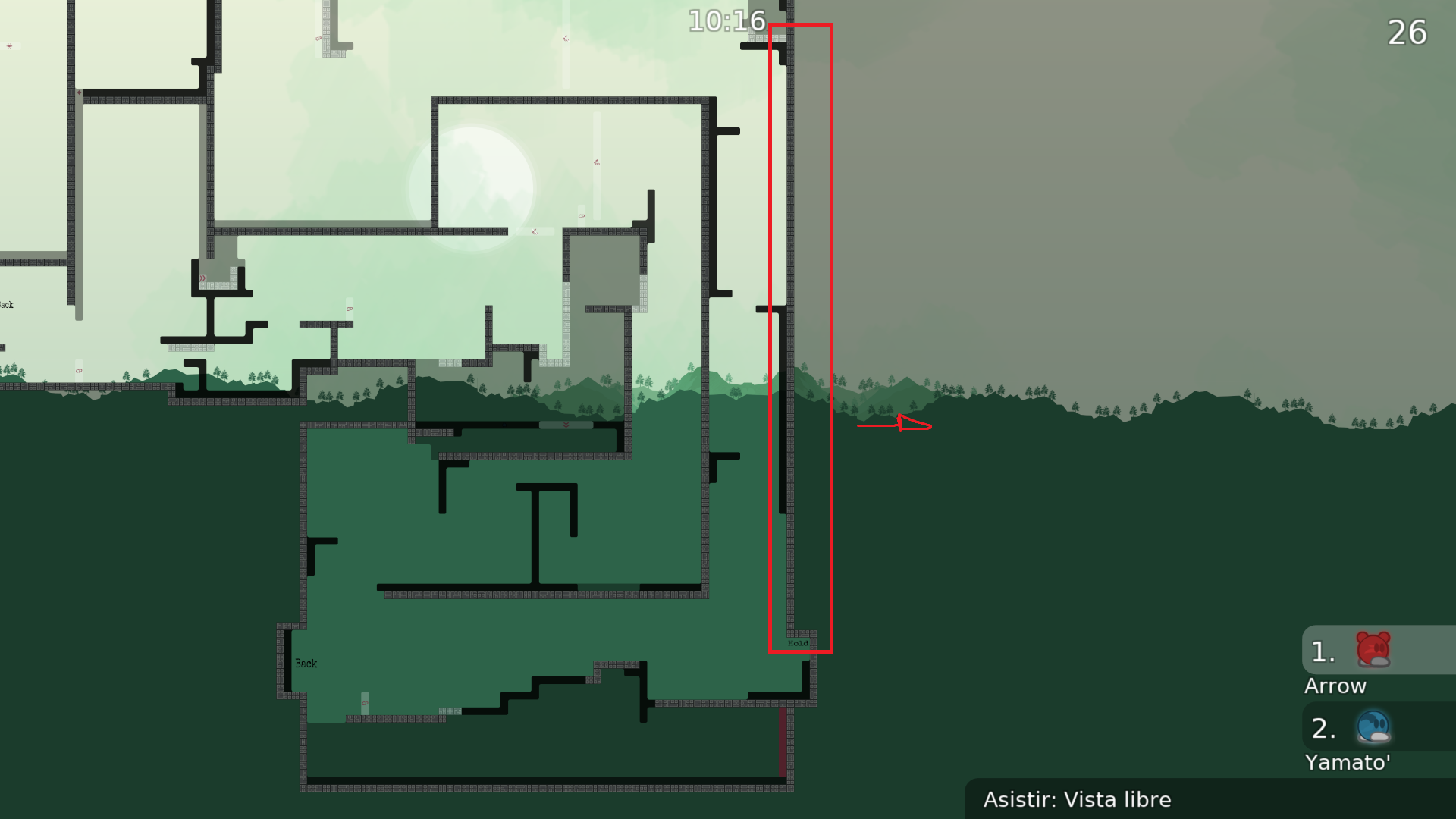
Wtf welshi blind, is the sign that says HOLD
OMG I REALLY DIDN’T SEE IT TF
SO! Did changes above, by making using the rocket mandatory and by making the throw the intended way, also decided to keep logo cause I finally found the picture and apparently its free to use which solves my issue with it which was wanting to change it cause maybe it wasnt a free to use image. Also moved the hold to be seen again lolol
WAIT
START POSITION IS WRONG
there
Omagad
Omaigot

All in all. Is not a map that I personally enjoy. The parts are sometimes boring or you know many from other maps. Not much new and not so creative. Rating: 2 stars dummy.
reminds me map ( old parts that i changed ) . amazing map can't wait release .
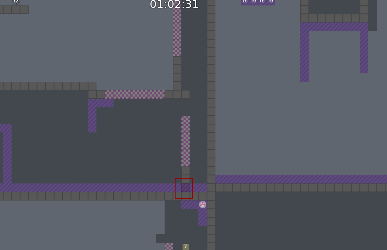
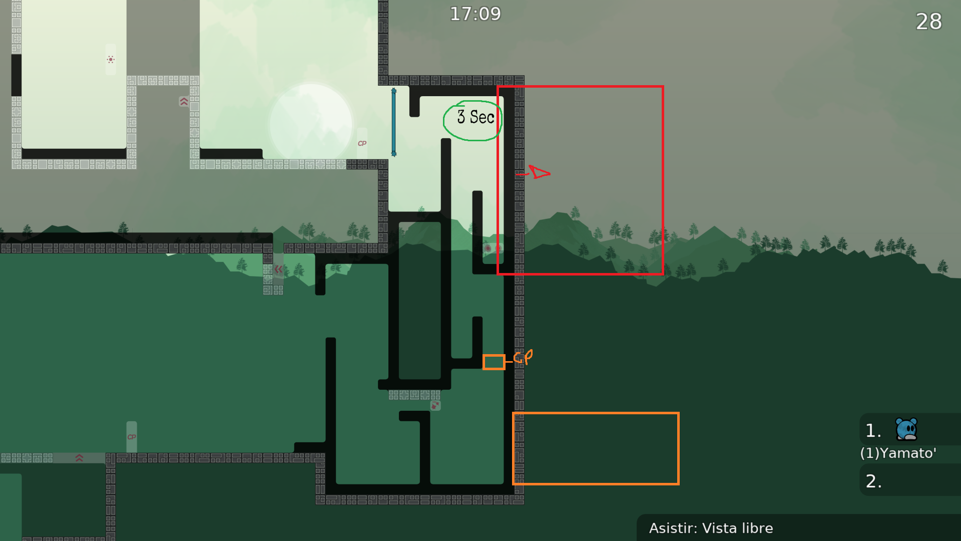
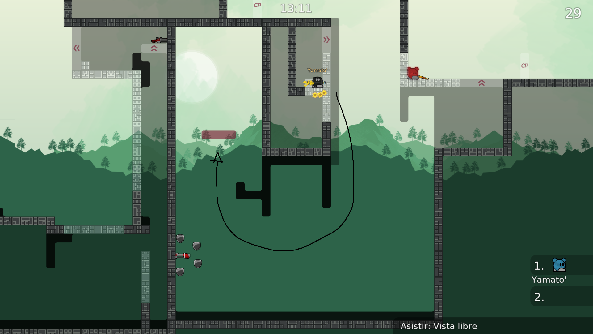
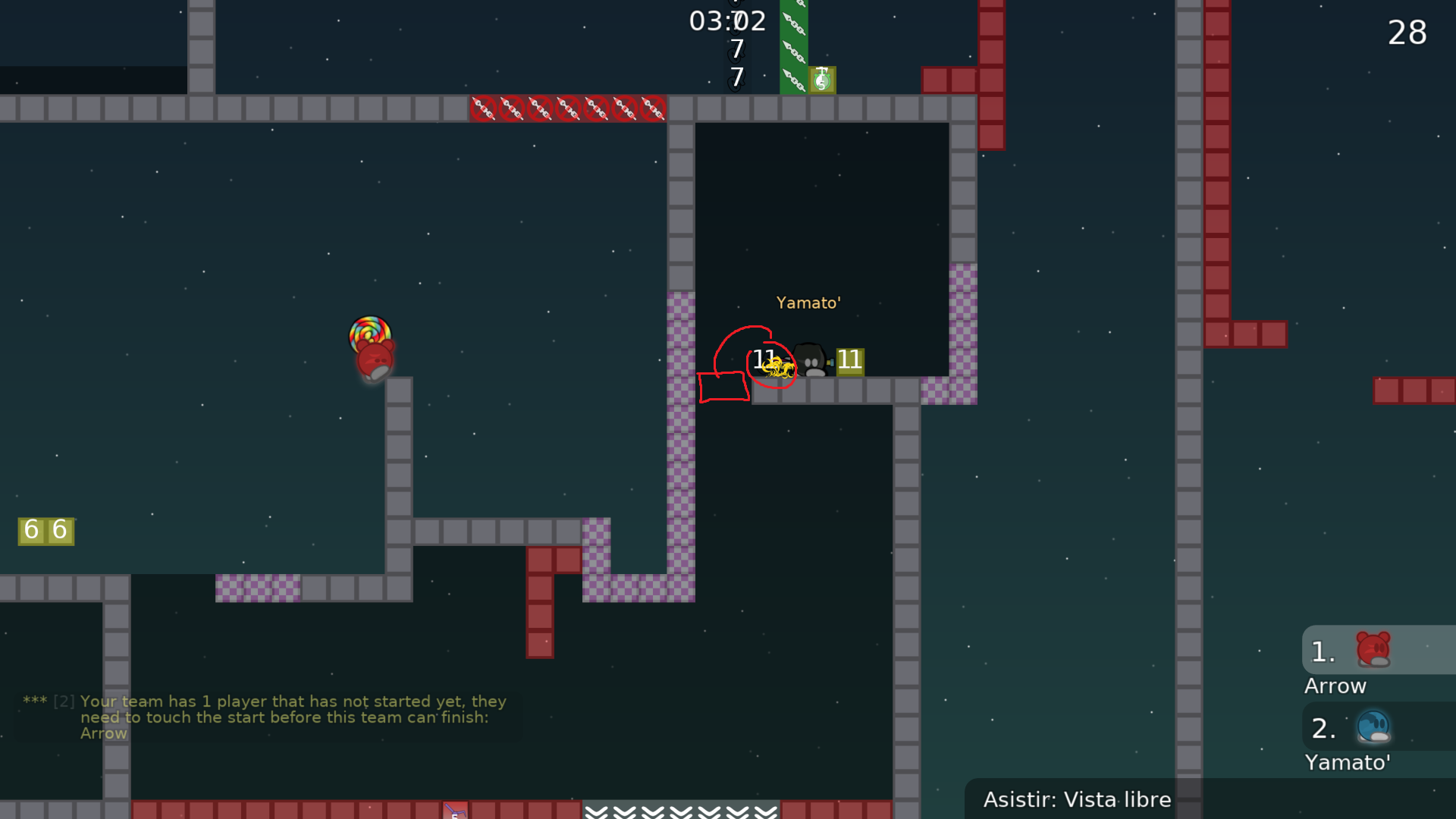
Dummy will always touch the checkpoint in this part as you drag him left to go to next part, even if it was 1 block of checkpoint cause even if he ends up edge on the left you’ll immediately move him right a bit when hook from the right.
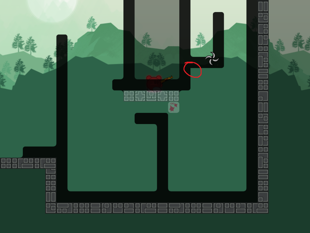
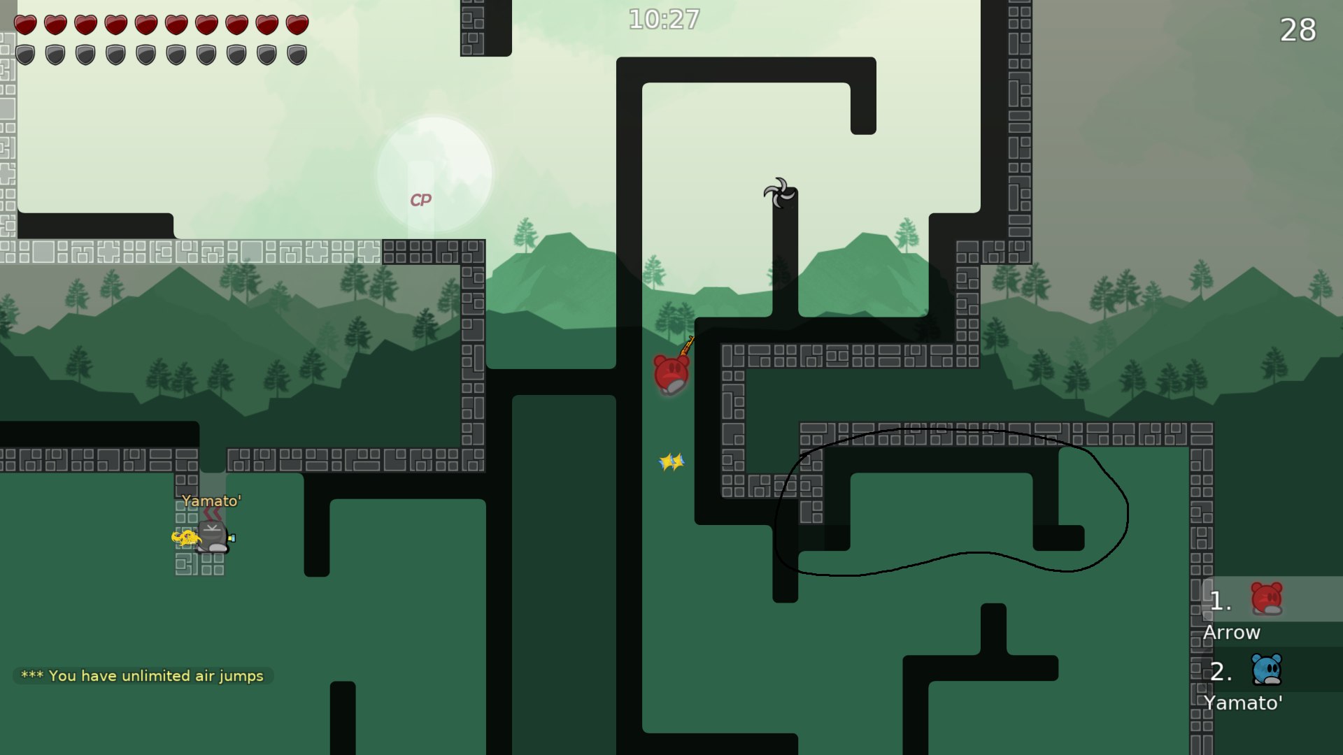
I’m ngl I’m confused on how to get to cp 23 without rocket. The idea of the part there is to hammer the dummy who throws a rocket whcih you use for speed, can you get there by hooking dummy for speed or something?
I’ll try modifying after some tests ^^
Tbf I sort of agree, part kinda sucks
Thank you for testing! It’s my first map so I understand it’s not that good
Ooo that looks really good, I’ll try it out, maybe do some changes based on how it feels
I’m kind of confused on what you mean sorry- You mean like, add a big chunk of freeze you need to get through with speed at the end of the part?
Thank you!
update, getting through to checkpoint 23 is possible without rocket, gonna change that rq
it's tight enough to where adding one extra block of checkpoint seems to make it impossible
Yes and unfreeze on top . But its just suggestion .
$waiting
SO! I finally got rid of that stupid jetpack filler and replaced it with something I like a bit more, did the changes above as well, also found a skip which allowed the person to keep jetpack which is why cto4 has jetpack deactivated. Overall the map didn't have a lot of changes further ahead, however I changed the drag of teleport 3 to include the revamped jetpack filler.
added a back
maybe add there just unhook
switches on by default, dont need switch 6 on at the start + u can delete the ht at the start
What happend to your hair?
its drawn now
$waiting
wait
didnt change button
idk, its kinda too far or smth
did all those changes above
I didn’t actually test my solution for this one I’ll do that later
Also forgot to change this to ht
But u have to b4 submit xD
True
Already did that one
But what I’m saying is it’s likely that one is still kind of awkward
The rest I did my best to fix
yoo, added time cps, also forgot to mention that I tried it and I don't find it awkward at all
Because u are used to it but kinda is
maybe, also had the spawn in the wrong place
I havent played the map in 3 months tho
hook before jumping, and then jump, u have more htan enough time and height to reach the next hook
wena wena has been a long time... well in my honest opinion i think its time to let the map go, we tried to fix it but its wasnt enough, has really serious problems with the gameplay in some points, including weird mapping bcs everything is too tight, for example cp 4 or 9, lack of creativity that wont let the map to get released, and its funny that testers let this map for so long.
wena wena, you’re telling me as if I have the power to let it go lmao
But yeah map kinda sucks
I think some cool ideas are there, but it was the first map I ever mapped so I’m not that disappointed
well you could tell some tester to decline the map if u want
yee i screenshotted the parts that you could use for next time
I agree with Arrow, map is honestly not that awful but has some bad stuff that would be difficult to fix
$decline

