this is your map's testing channel! Post map updates here and remember to follow our mapper rules: https://ddnet.org/rules
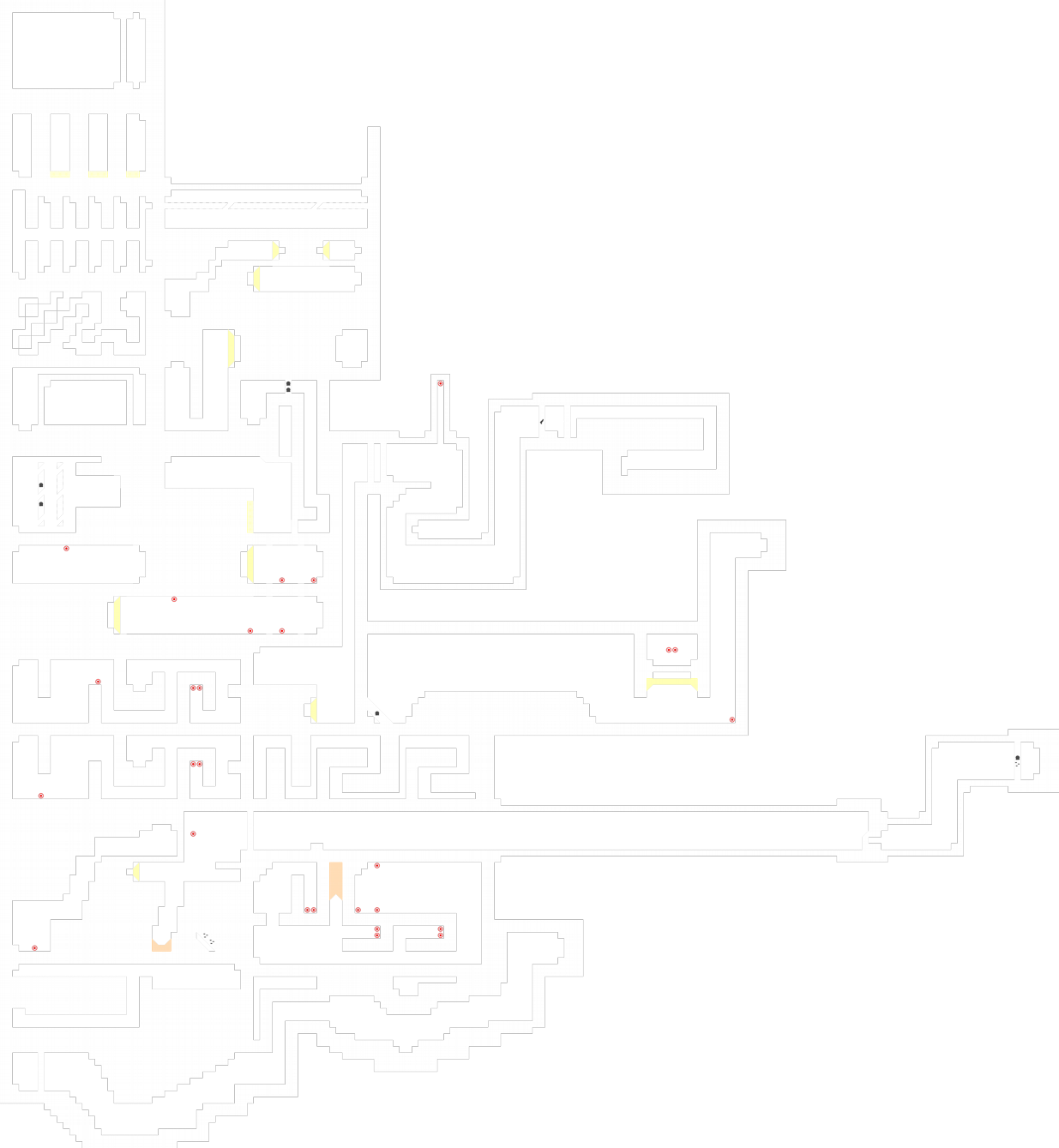
Map seems unbalanced, and some parts don't seem fun to play.
But maybe it could be released if you want to try and change the decoration and some parts, since it's an early novice map.
Almost everywhere
And the weapons dont have to stacked eachother. Just put only 1 but in the right spot whre enable to pick it up
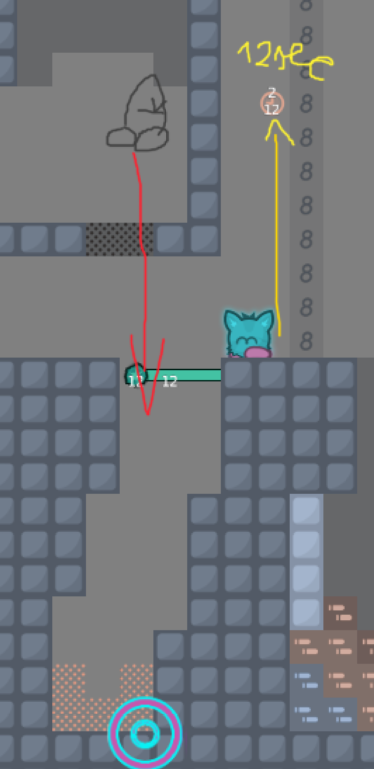
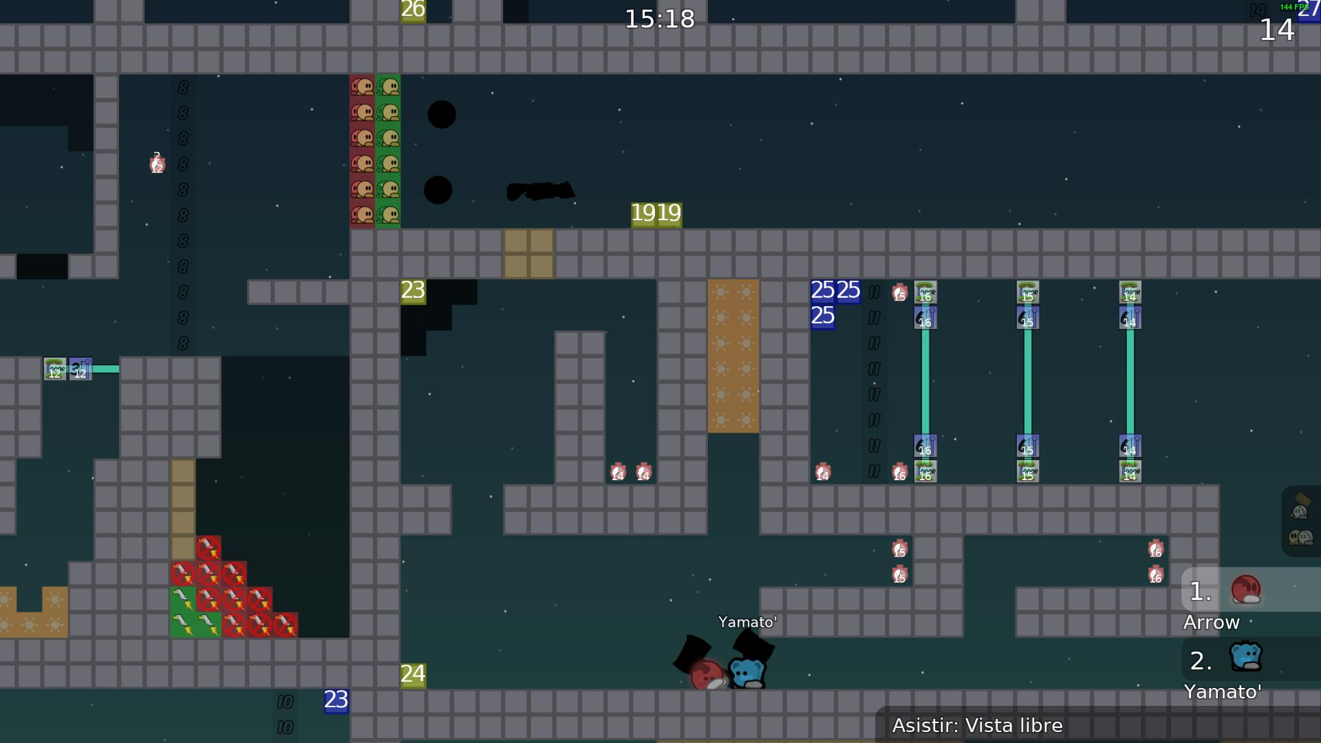
The jetpack part is way too difficult in novice
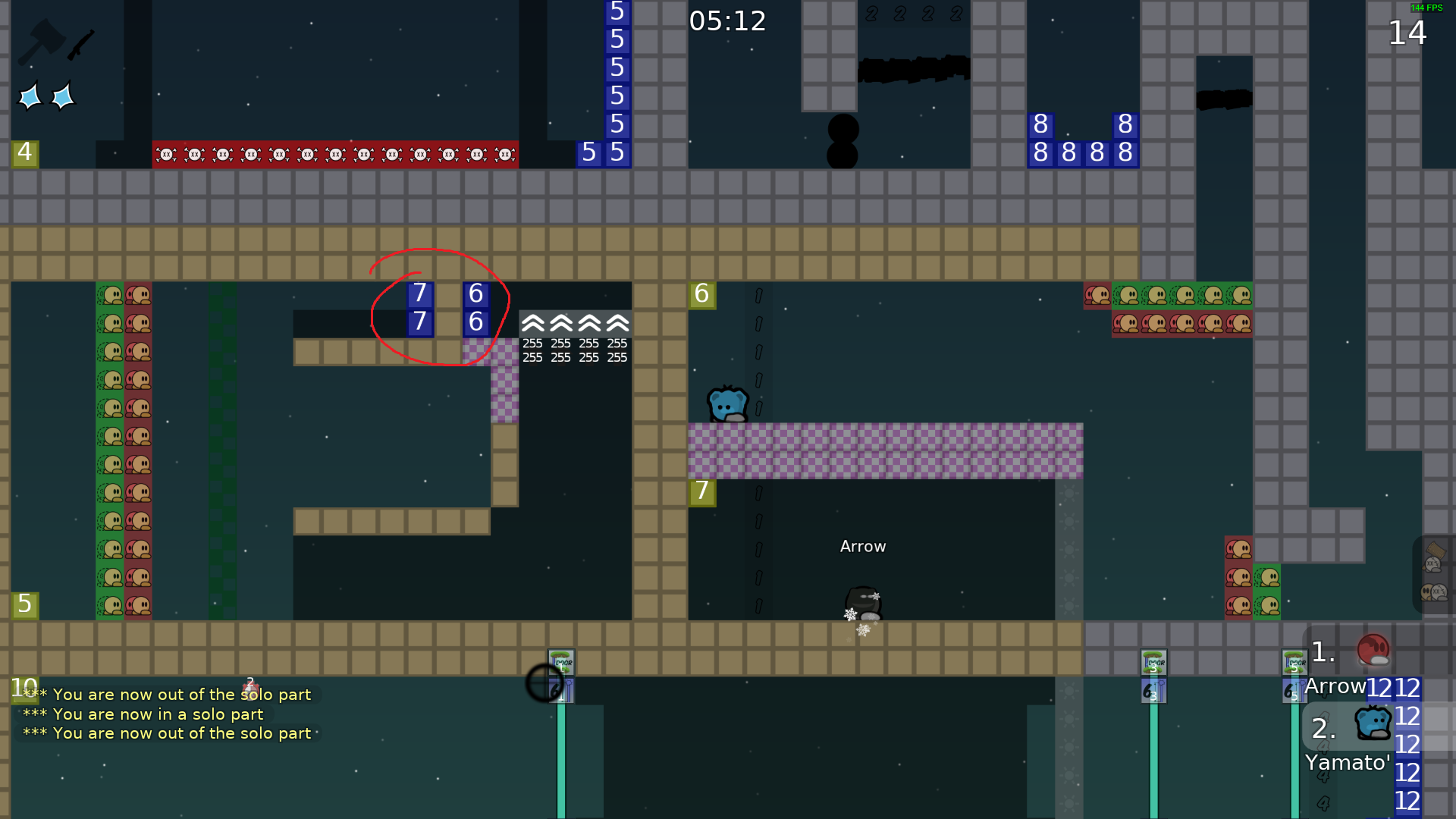
The solo parts way too difficult for novice
faily.
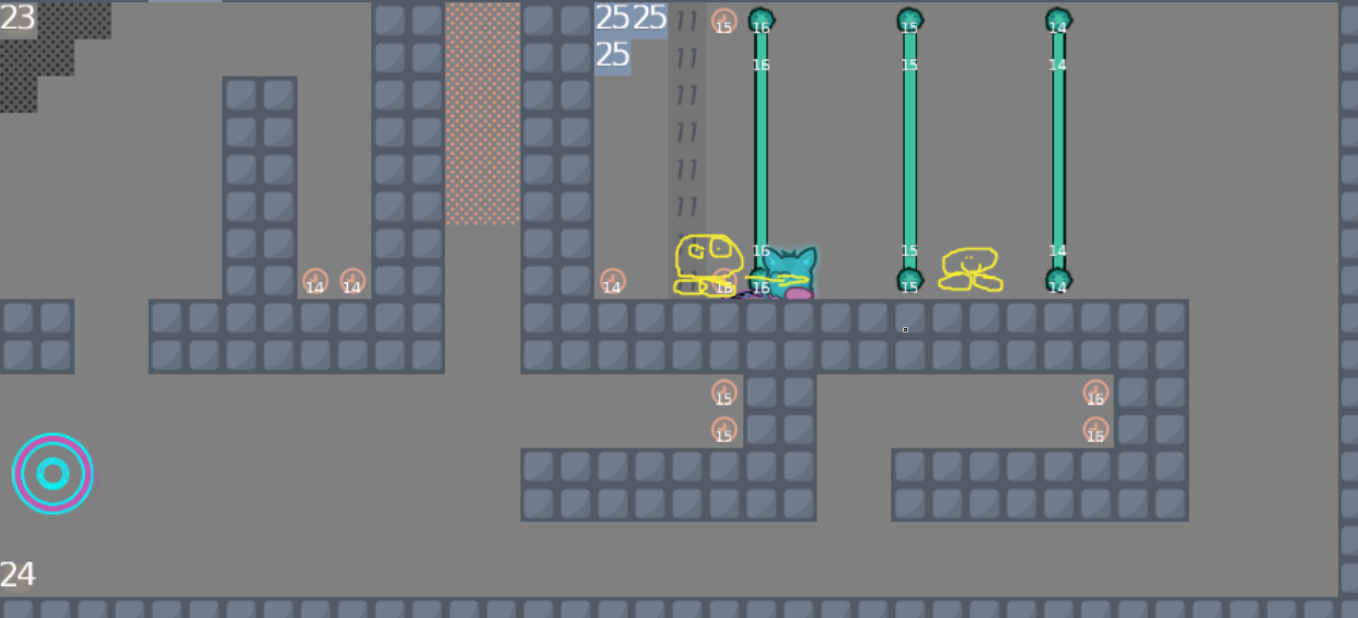
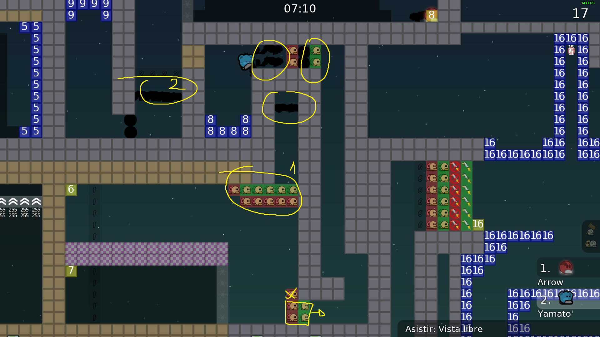
At this solo part the teleports in show entities just messy
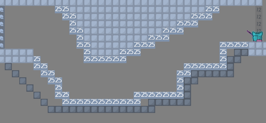
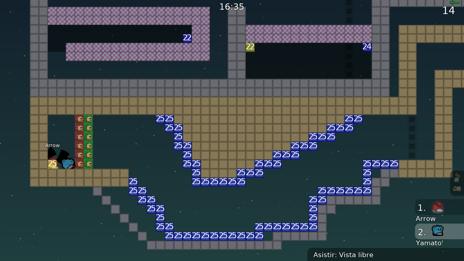
The yellow marked stuff its just a no
dont use it like that
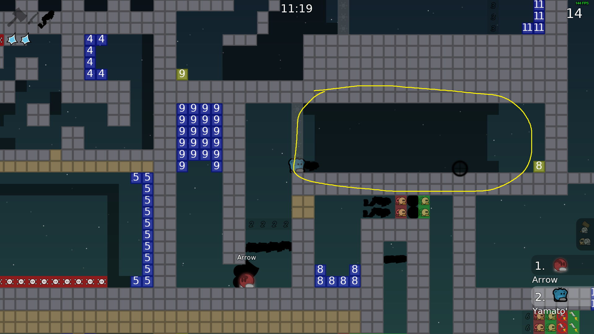
and also dont make little holes like the blue markings
And maybe dont build a map like this, be creative and make it looks comfort also nice
I dont mean like a beautiful art just look more pretty
Goodluck with mapping and dont give up!
Good test
@RaksThe filters on novice shouldnt exist anymore, just make a long enough way to miss players on the road, avoid repetitive/boring stuff
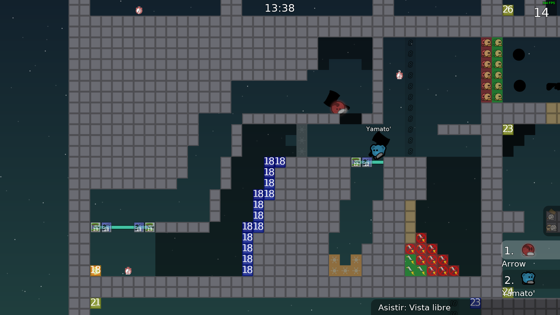
up to this, the parts should be done with enough space, imagine in china 64/64 players playing this xD
well, this map cant be released because the gameplay has a lot of flaws that even with fixes cant be fixed, the parts are not interesting at all are more annoying than other thing, structural speaking is more of the same is too small sometimes to do things comfortably, pls take a look on recent novice map or recent maps in general to get an understanding on today standards. If you have any question dont hesitate in doing in his respective channels
#questions#mappingand pls read
#📌infowhich contains rules of mapping
$decline
