this is your map's testing channel! Post map updates here and remember to follow our mapper rules: https://ddnet.tw/rules
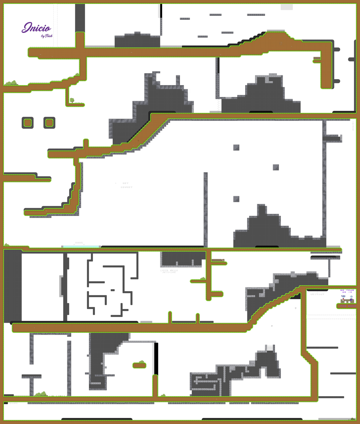
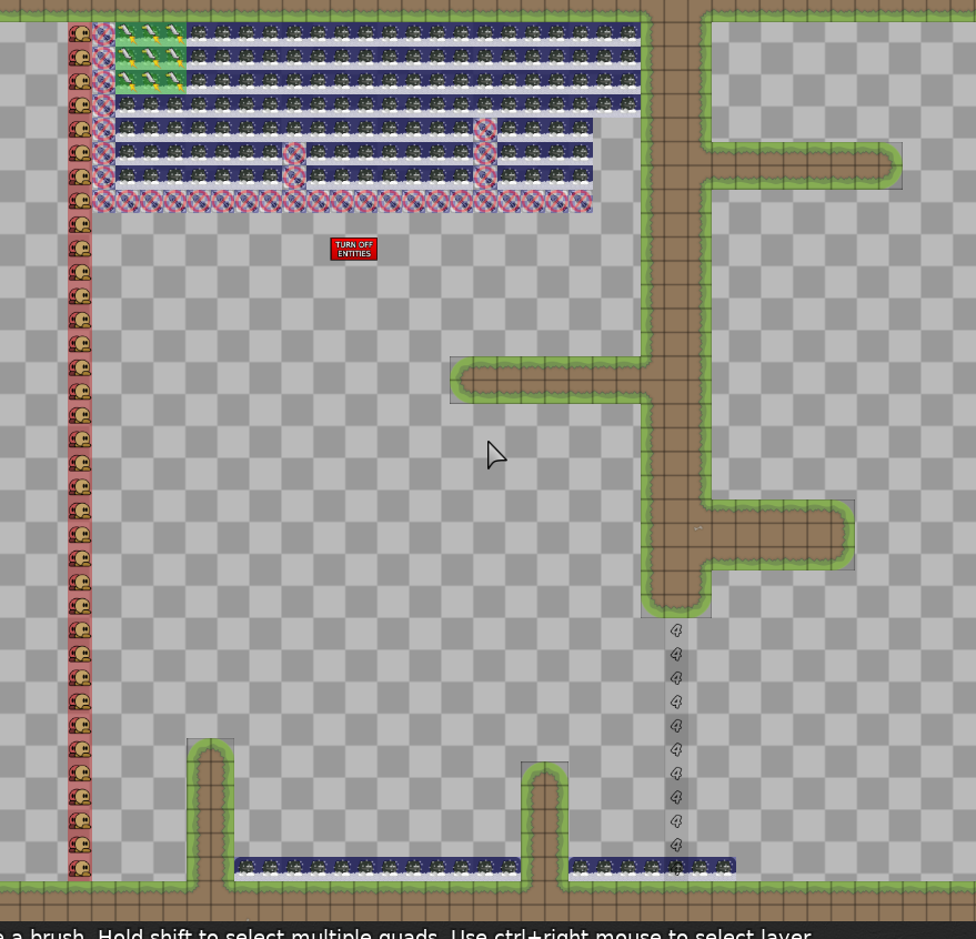
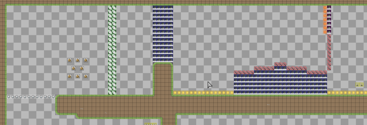
map is mostly simple drag parts, i don't think any of these parts represent a releasable map
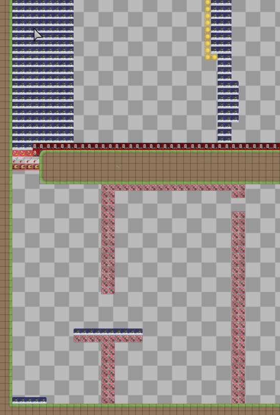
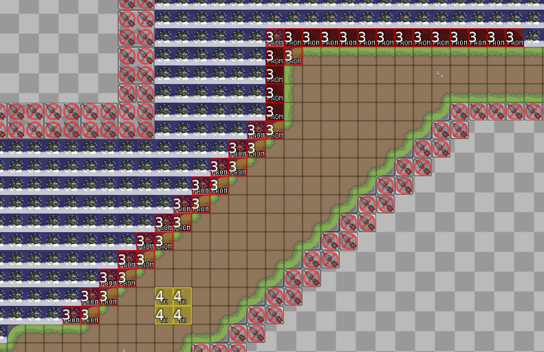
also the entire section here being mapped this way means you could edge the dragged tee at any point on the floor
that's actually the right way to do it
imo i think you should take a look at newer novice maps for better ideas. as it stands i don't think this map would be a good release because all of the parts are uninspired. here are some examples of good novice maps that i like:
5 https://ddnet.tw/maps/SeMang-32-1/ https://ddnet.tw/maps/SeMang-32-2/ https://ddnet.tw/maps/Sketch/ (im not joking) https://ddnet.tw/maps/Lavender-32-Forest/ https://ddnet.tw/maps/Orion/ 4 https://ddnet.tw/maps/Harvest/ (except for 1 part, where you can easily walk into freeze) https://ddnet.tw/maps/Pounamu-32-2/ 3* https://ddnet.tw/maps/Inure/ https://ddnet.tw/maps/Pounamu/ https://ddnet.tw/maps/Sunny-32-Side-32-Up/
hope this helps :)
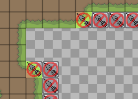
most people familiar with the grass_main tiles wouldnt expect this imo but it may have been common in the old days... i will trust u though
a lot of people make those hookable but the bit that your hook hits is actually unhook so
if you REALLY look at it yeah but novice players are going to see a 90% green tile and try to hook it. this seems like a troll argument lol
the way I see it, only the very edge matters and not the whole tile
novice players do not have existing expectations for this game, we shouldn't allow stuff like this when it can be made more clear for a fresh player
sorry i forgot to ping for all of this
@tricia_takanawaooh okay i see, thank you for the advice. should I make the changes?
so it's like too simple map? i tried to put together parts that i enjoy playing
parts are too simple, almost every part has been mapped before
the walljump tile was new to me but imo still doesnt change the part much
I know maybe is not so original but isn't it enjoyable to play all that together?
i won't argue about if testing standards are good or bad, i am just telling you what will happen to the map probably
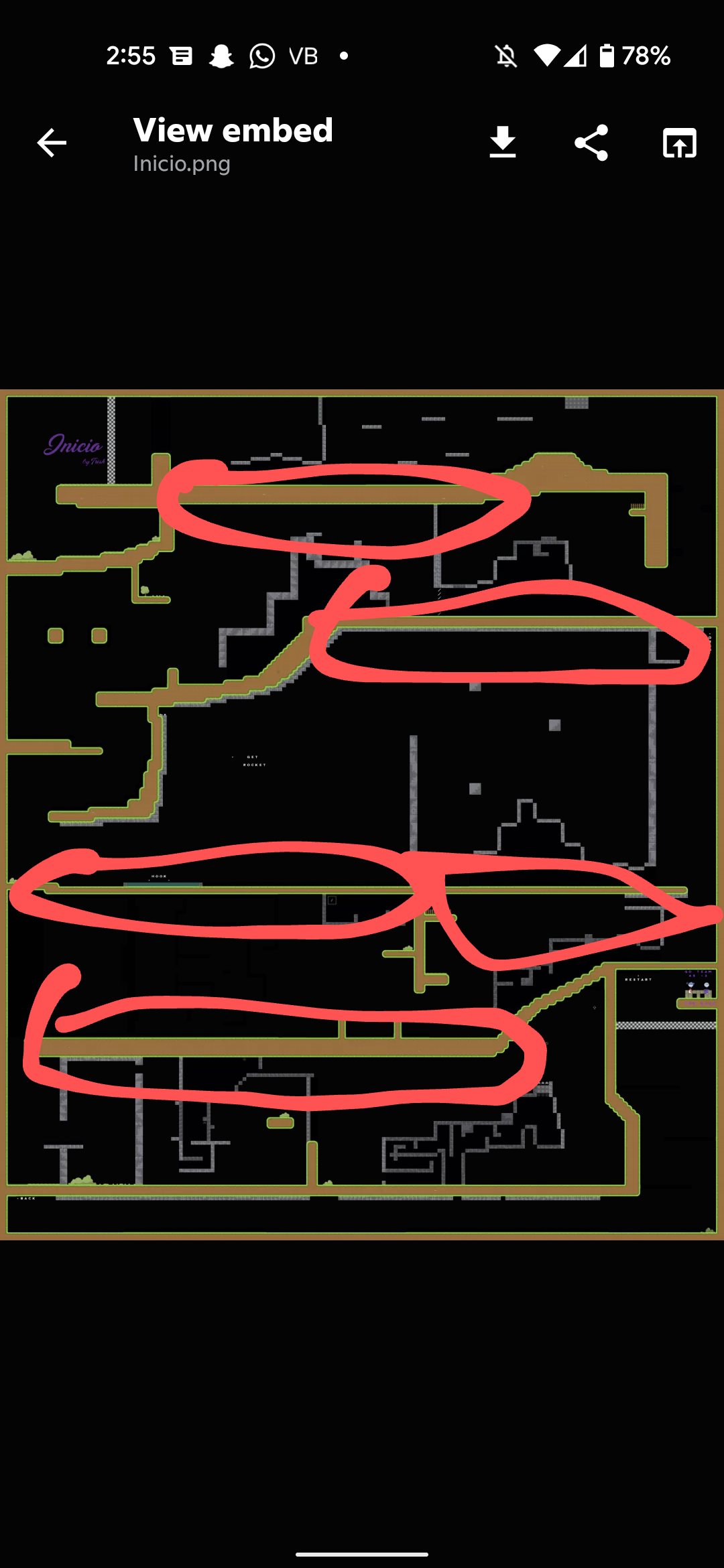
flow could be improved since lots of the map is straight lines
and we dont release extremely basic parts like this even if it is neat to play
since there are a lot of novices etc that play similarly
look at these straight lines, it is not good to have these
because they just create large spaces
try to add some structure and life to the block layout
and dont border the whole map w a rectangle
i will decline this since it doesnt meet ddnet standards today, feel free to ask any questions about mapping in
#mappingand take a look at recently released novices to get a feel of what we look for
$decline
okay i understand, thank you for the feedback
any help in how could i try it with my friends?
using trashmap is the easiest way
thank you very much
