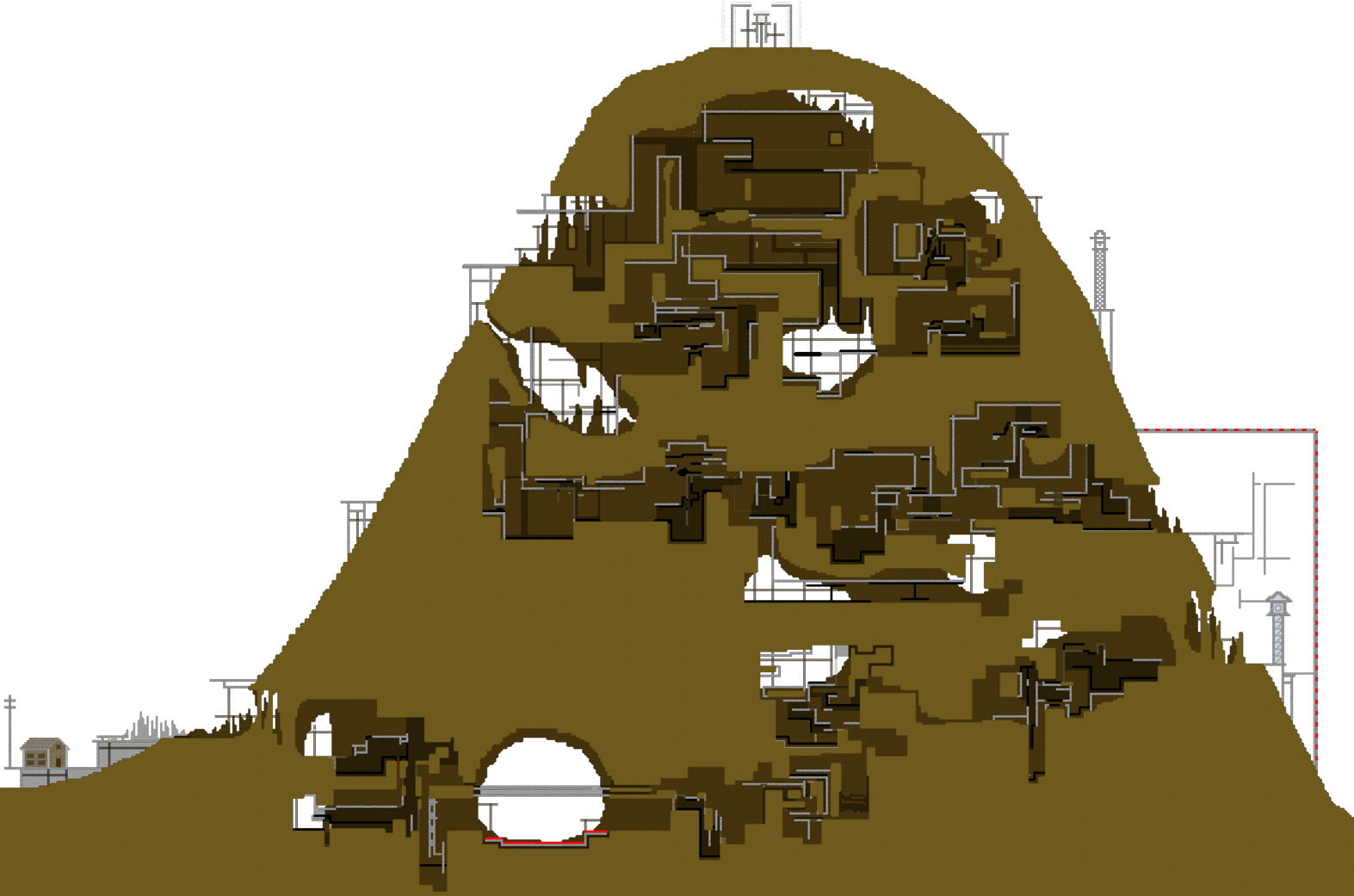
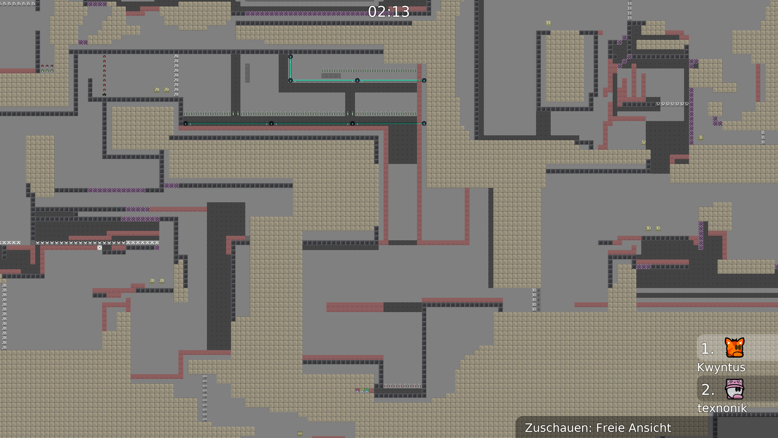
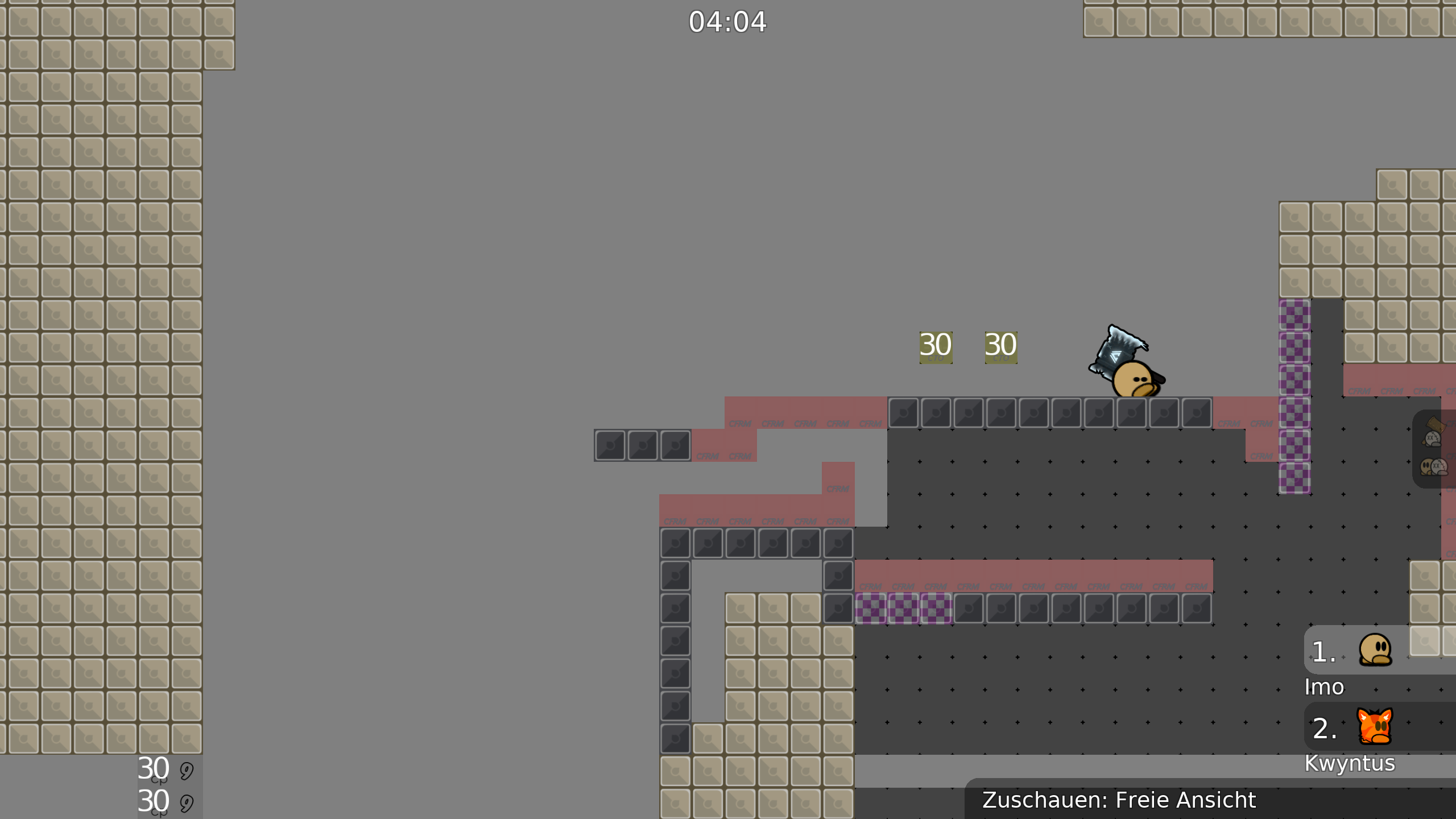
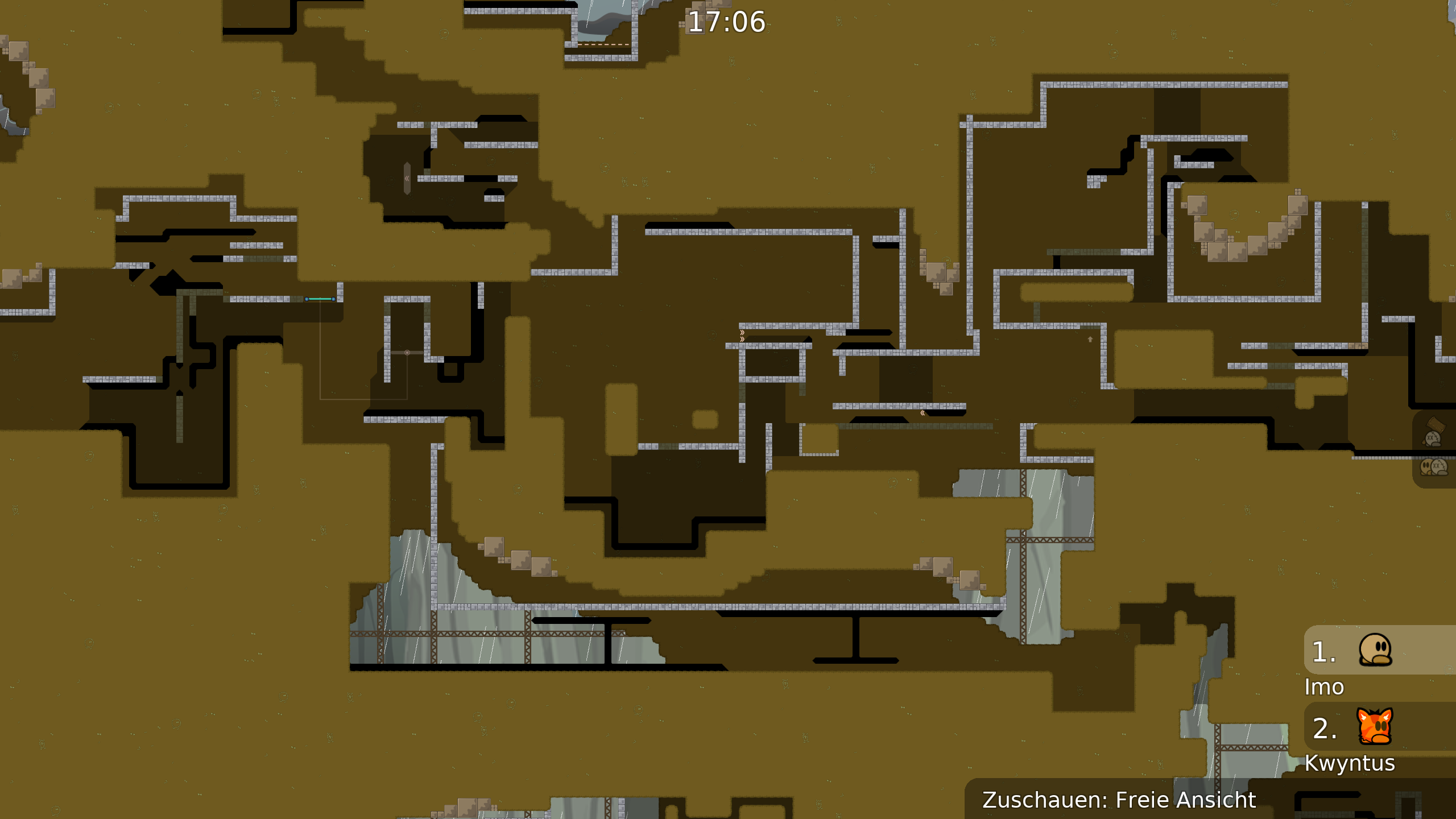
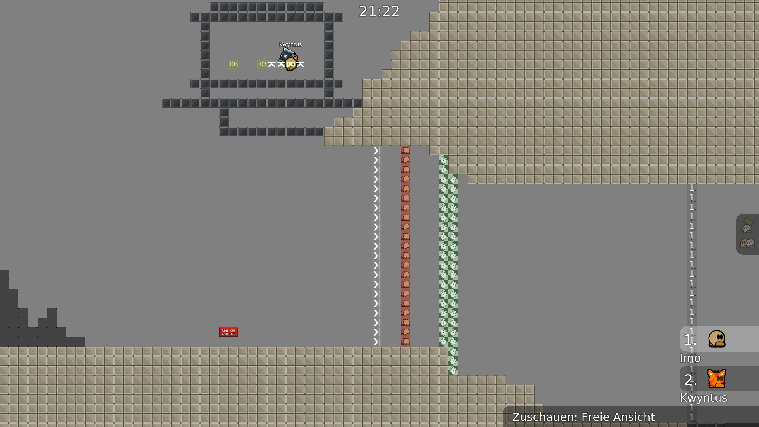
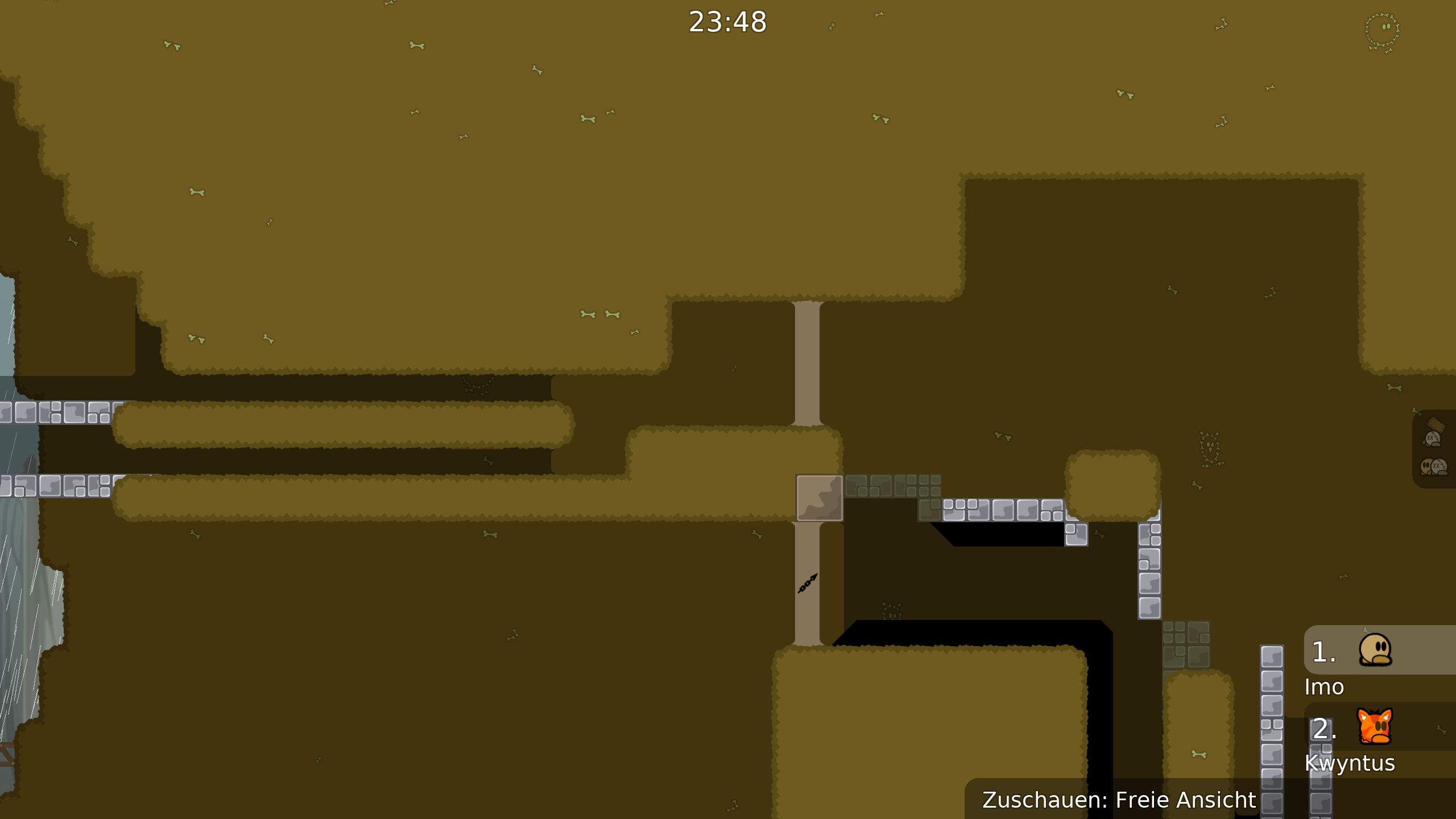
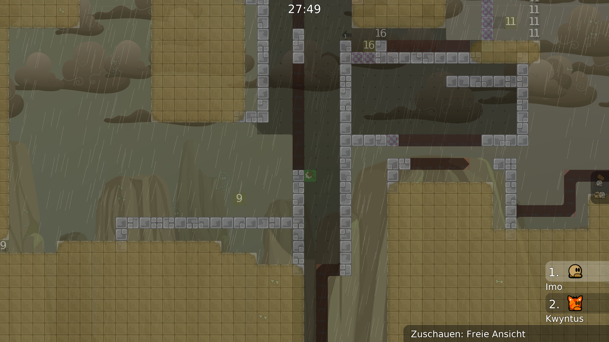
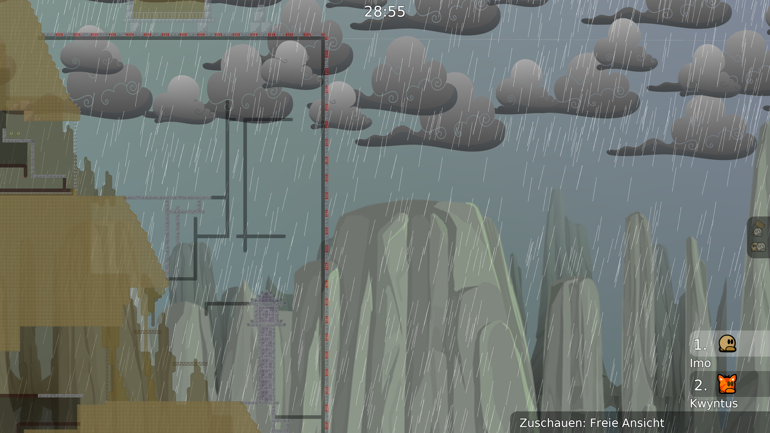
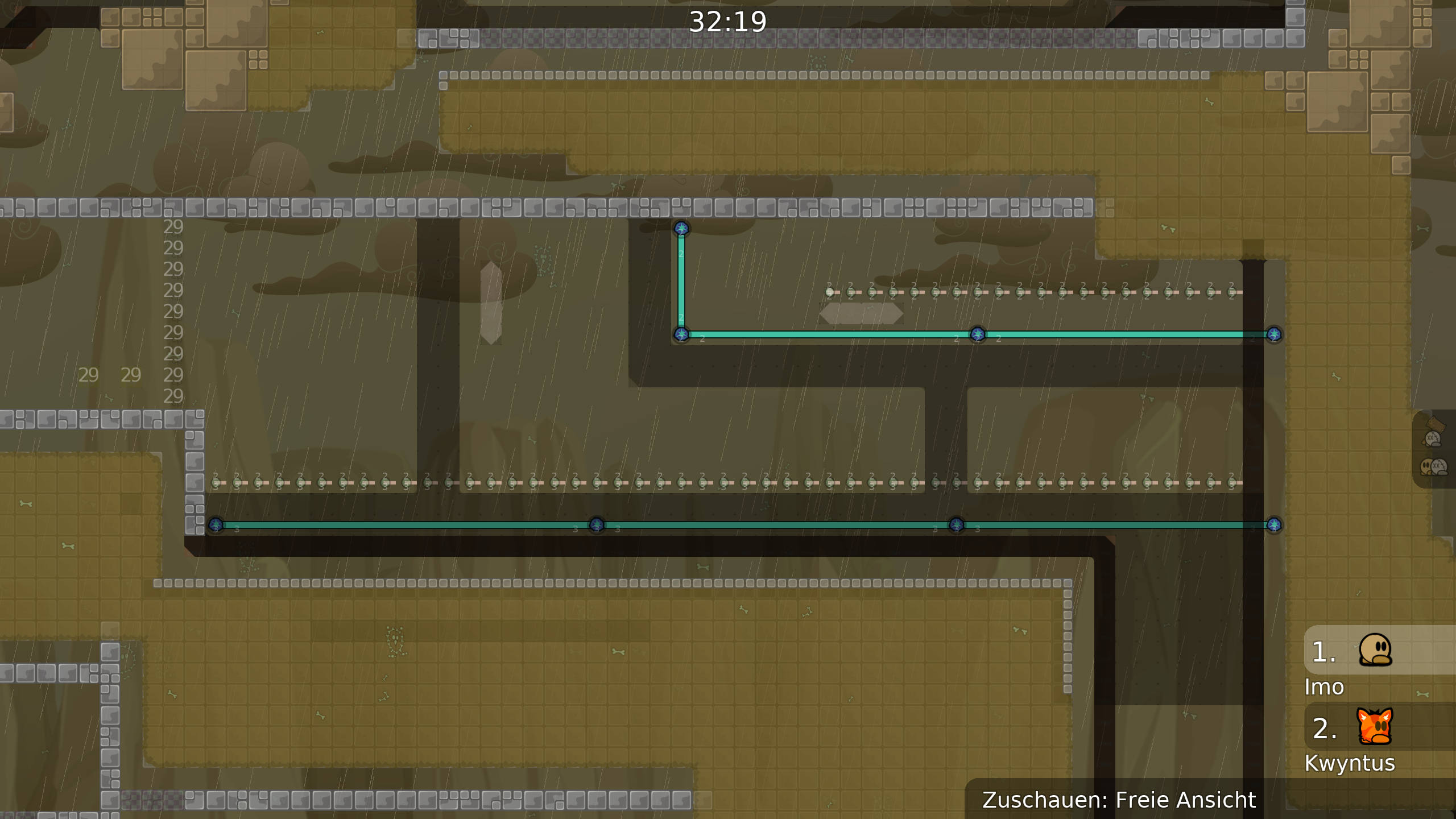
this is your map's testing channel! Post map updates here and remember to follow our mapper rules: https://ddnet.org/rules
fix it everywhere
I didn't take care of a lot of small details,and I hope you can forgive me a lot.
random corners
what do you mean?
i mean random corners
I hope I didn't misunderstand you
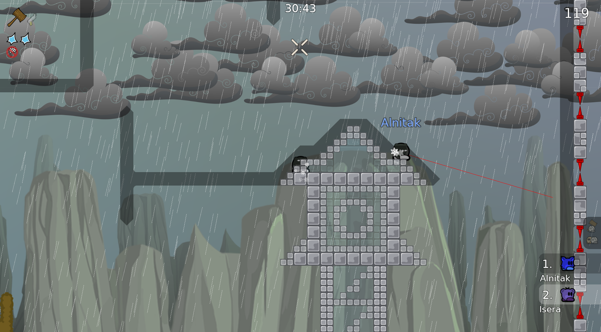
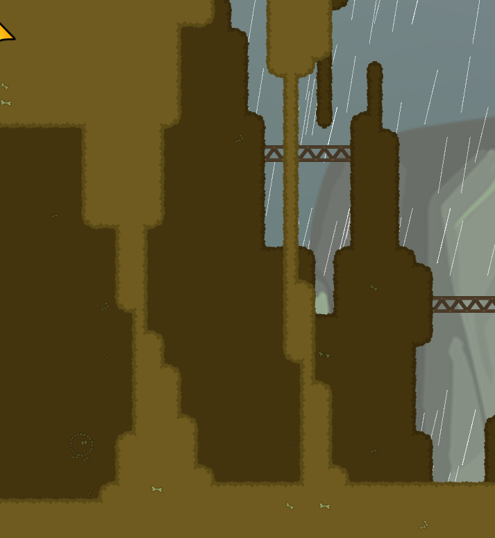
The raining so annoying for my eyes (my opinion)
this map has a lot of cool, interesting and unique parts, but a fair amount of it also seems very cramped and uncomfortable to move around in. there's also some places that it seems excessively and uncomfortably precise for no good reason. maybe this is just because i was stuck testing with dummy and that i'm myself just a mid-moderate player, but some of it feels like brutal 1 to me
I'm not sure if you intended this to be a t0 map or a forced teams map, but I can say for certain that right now it can't be released as a t0 map because there's too many places that are problematic in t0. So I'm going to go over this stuff assuming that joining a team will be required.
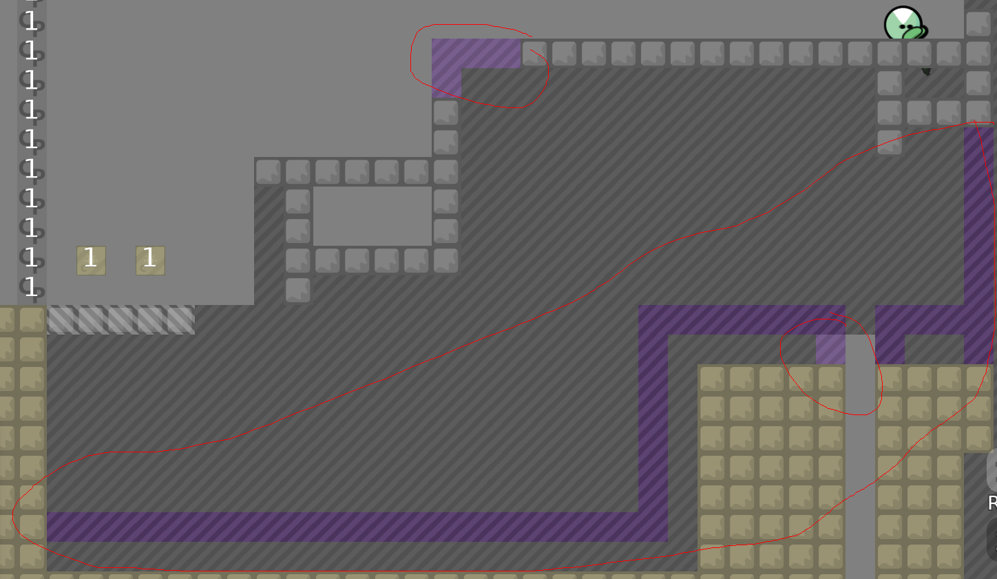
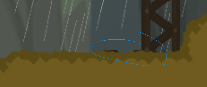
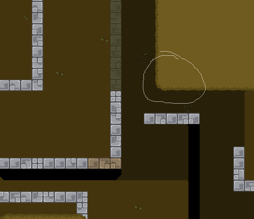
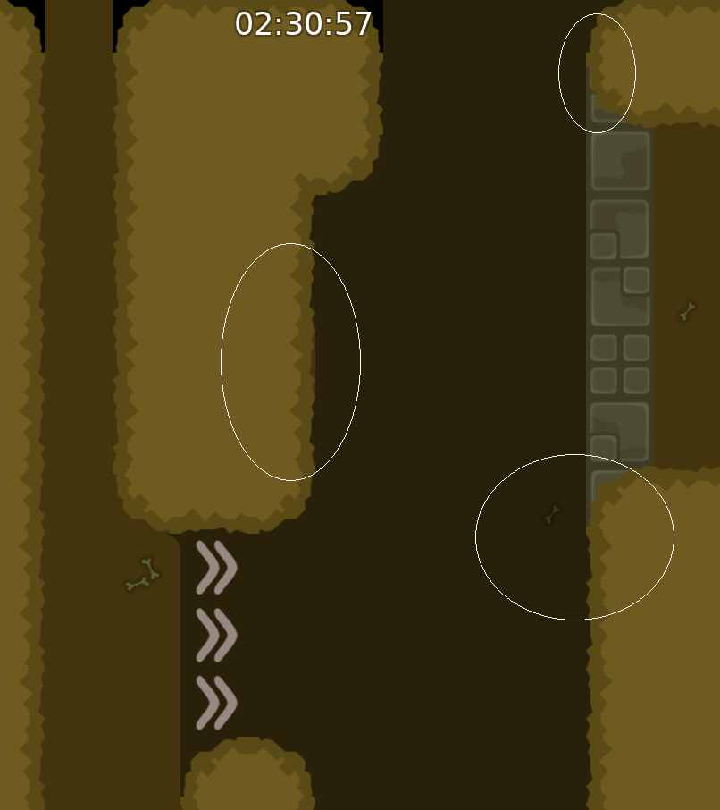
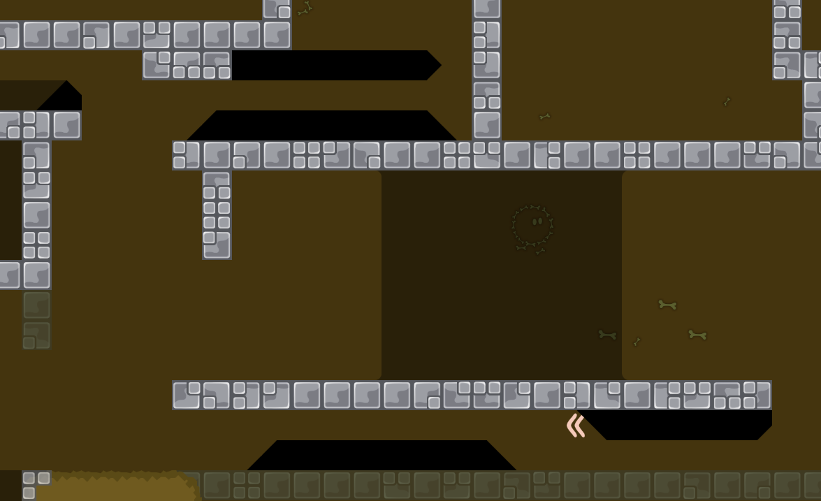
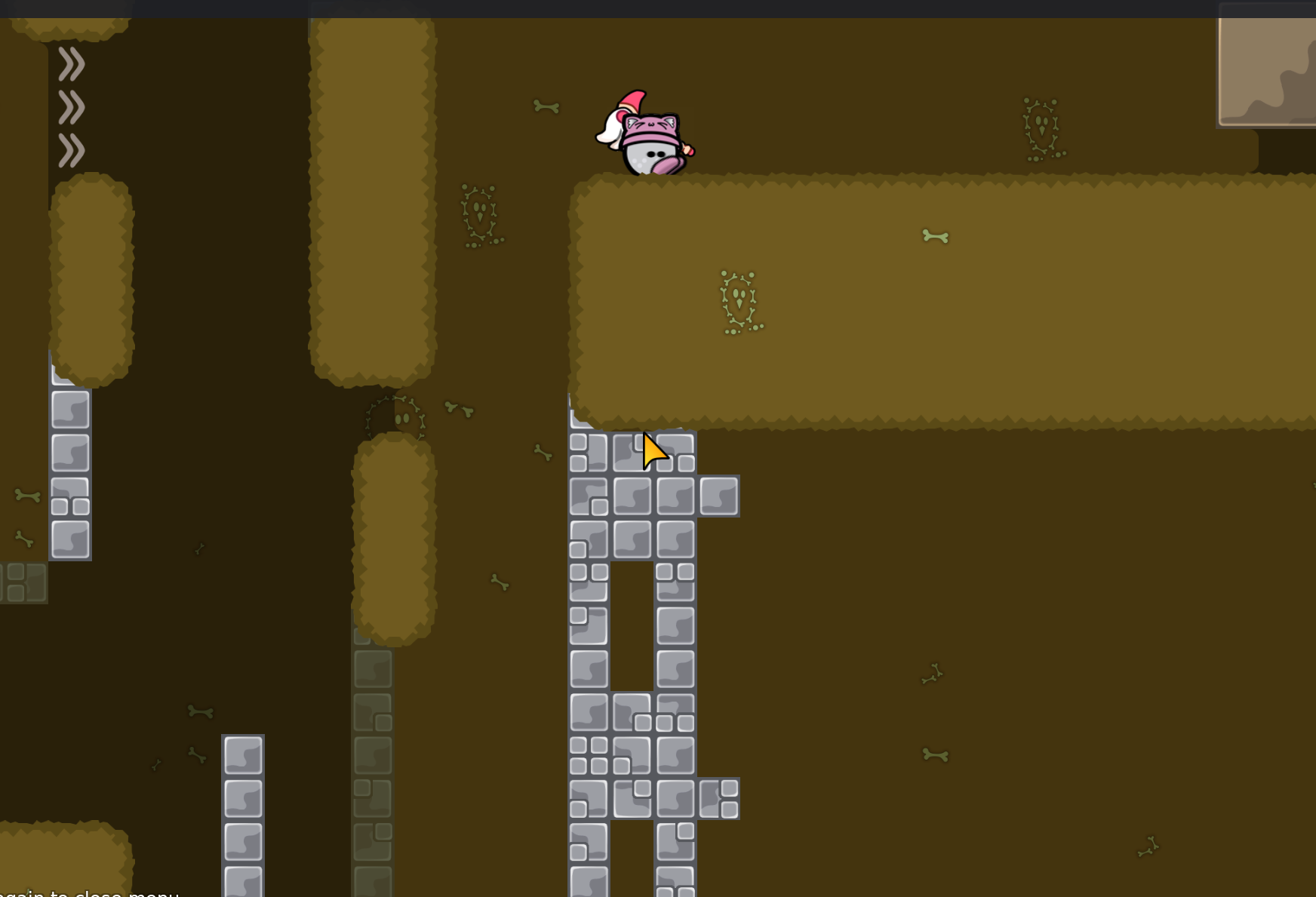
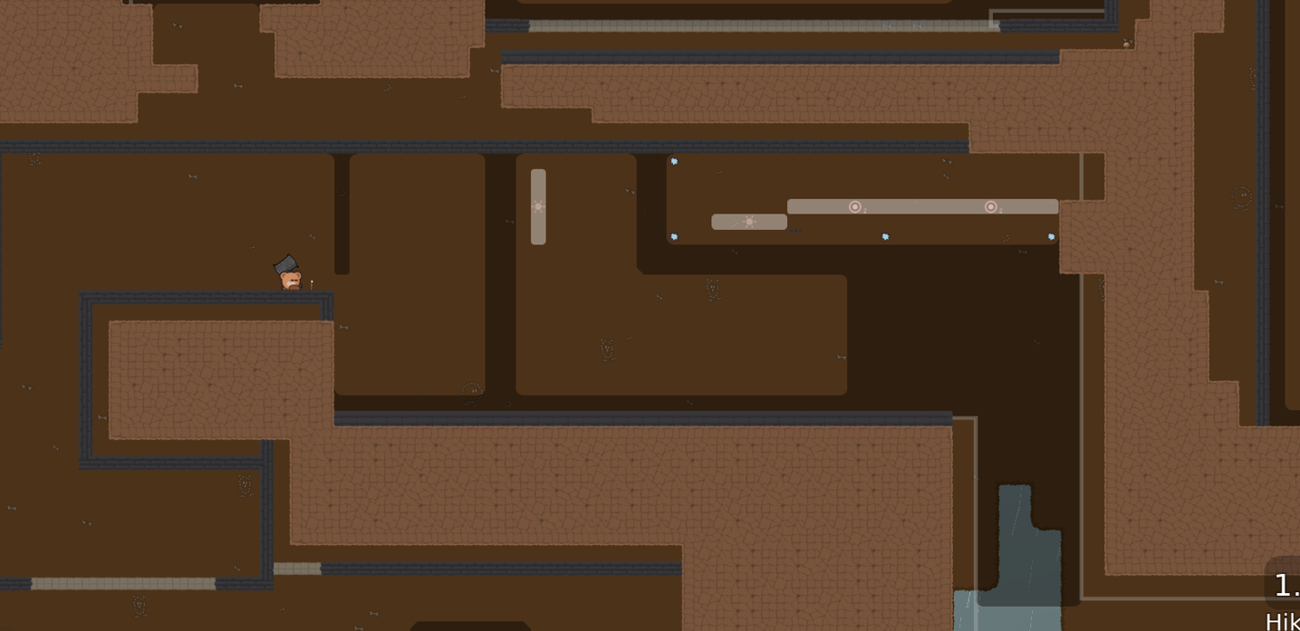
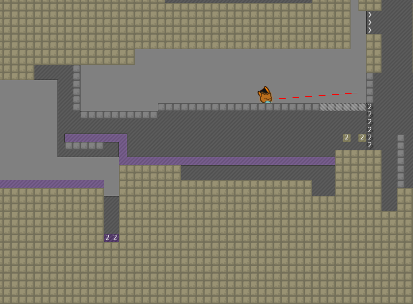
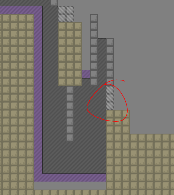
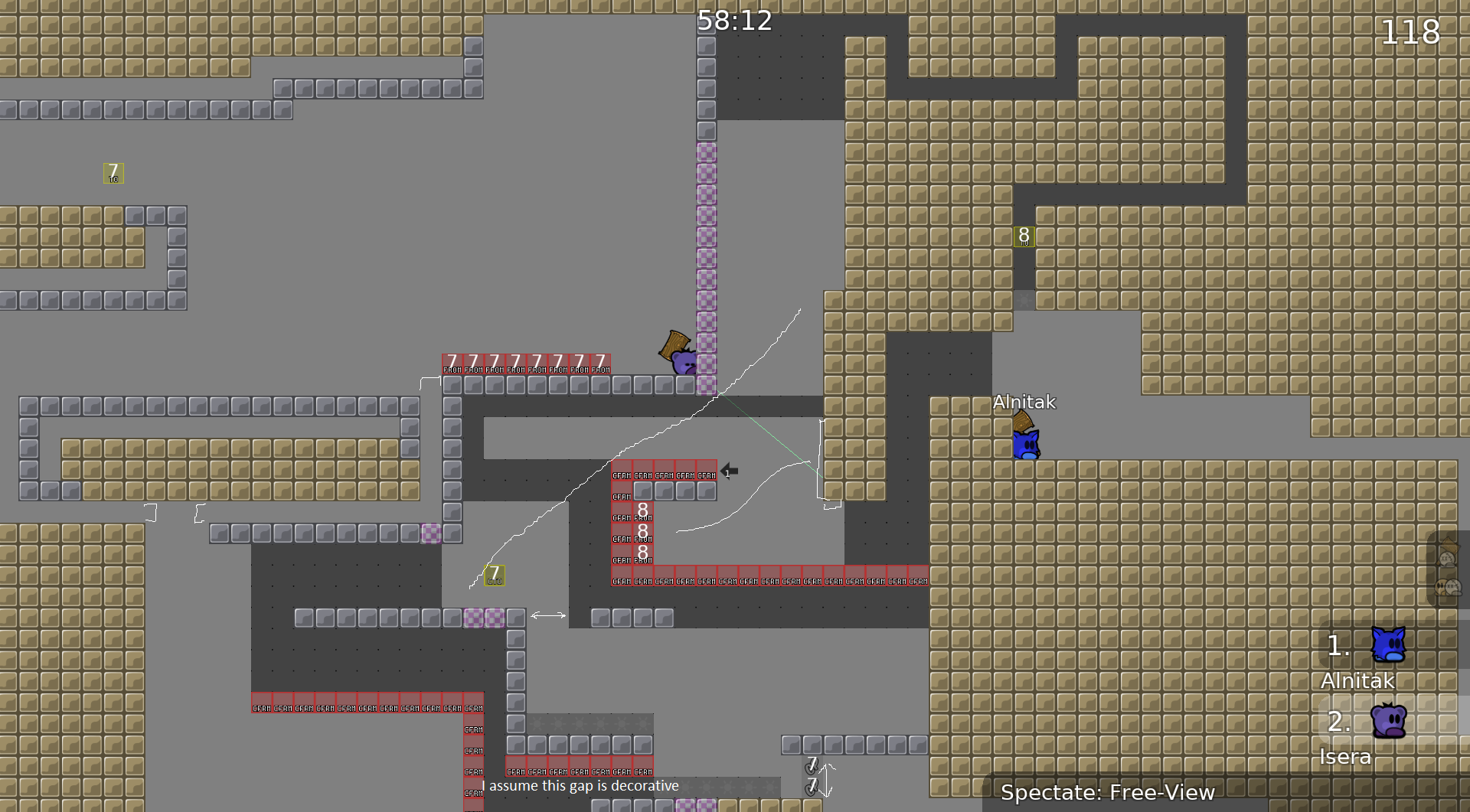
Here we have fake collision outside of entities which looks the same as real collision and obscures what's actually going on here. I don't think you should have this in a map. Foreground sections that are in front of the playfield are okay, but shouldn't make it harder to read the parts players actually need to know about. Unfortunately, that is what is happening here (and in other parts of the map where this is done). There are stoppers, unsolo, and startline all obscured by these pillars. I think these should be visible to the player, especially the start line since it kills you if you aren't in a team yet when teams are required.

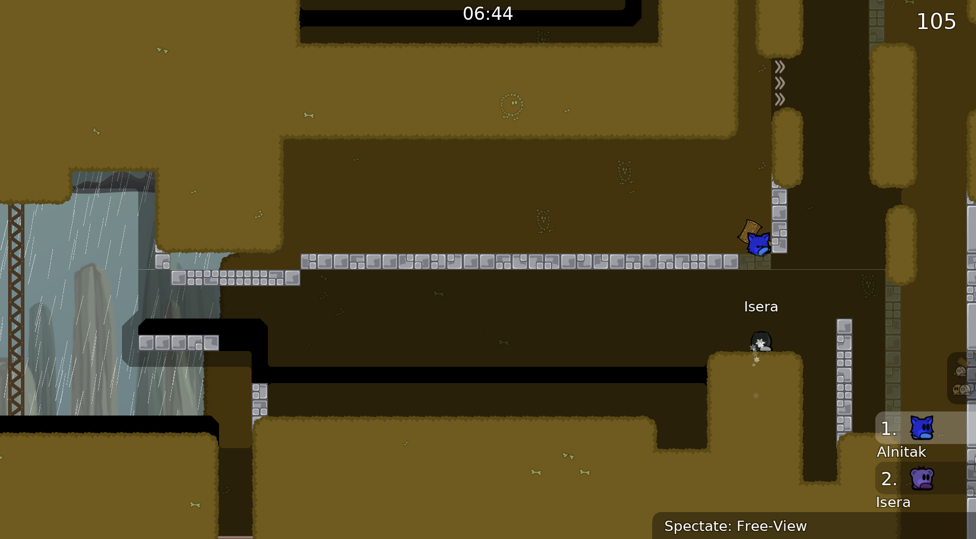
Another reason to force teams here: as the map currently is, a group of several players can work together to throw a pair of tees back through the stoppers so they can skip the entire map and get a 1 minute time.
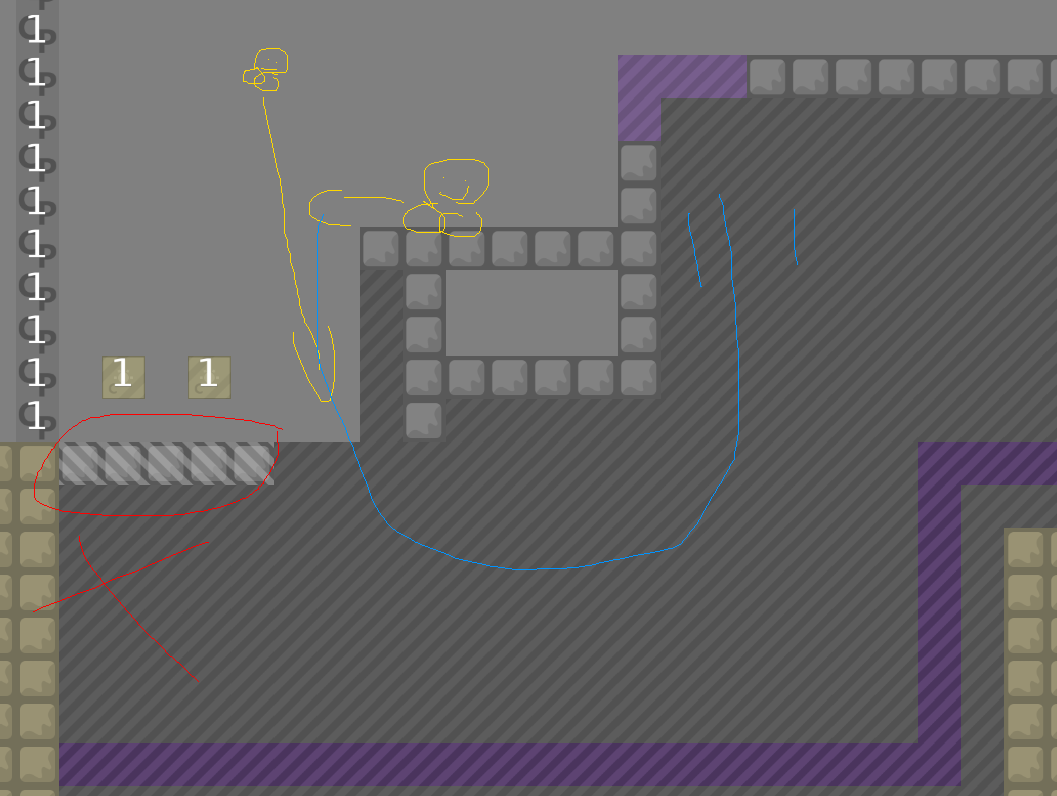
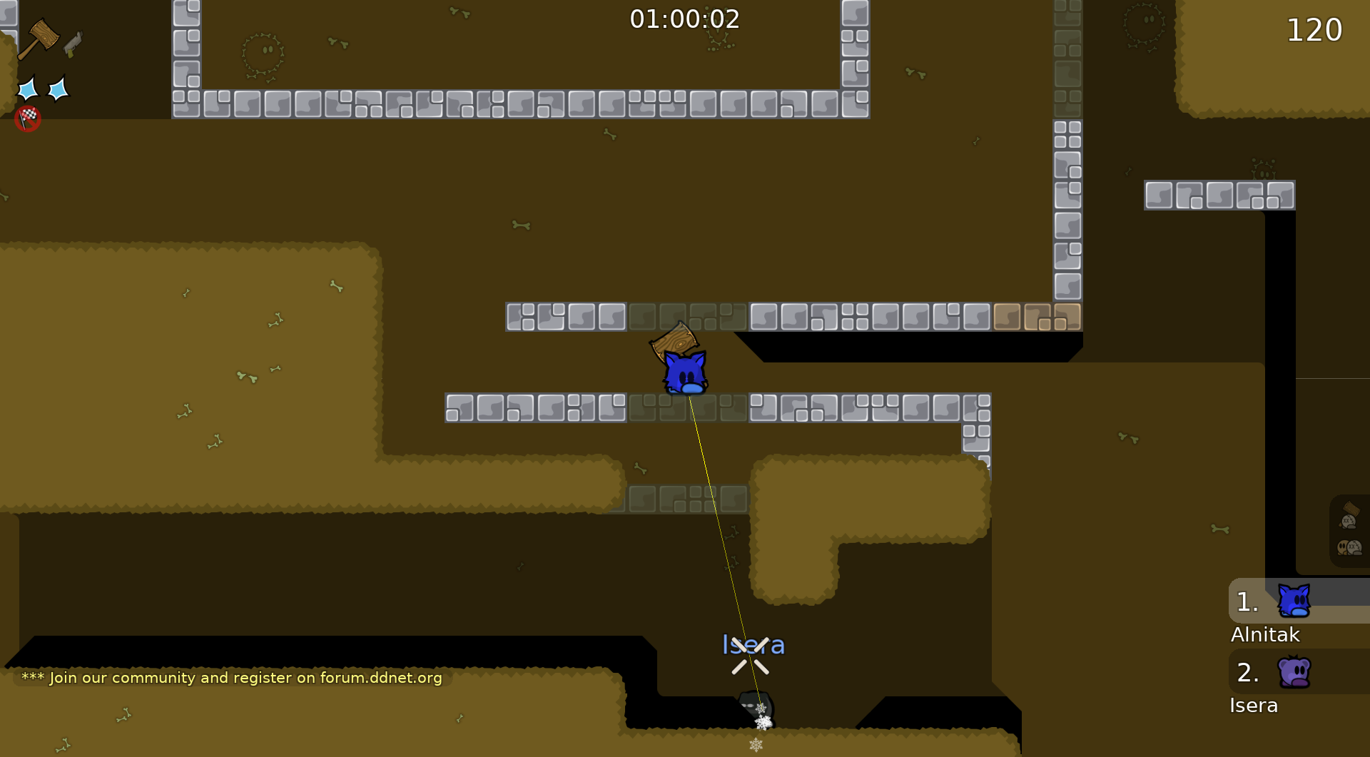
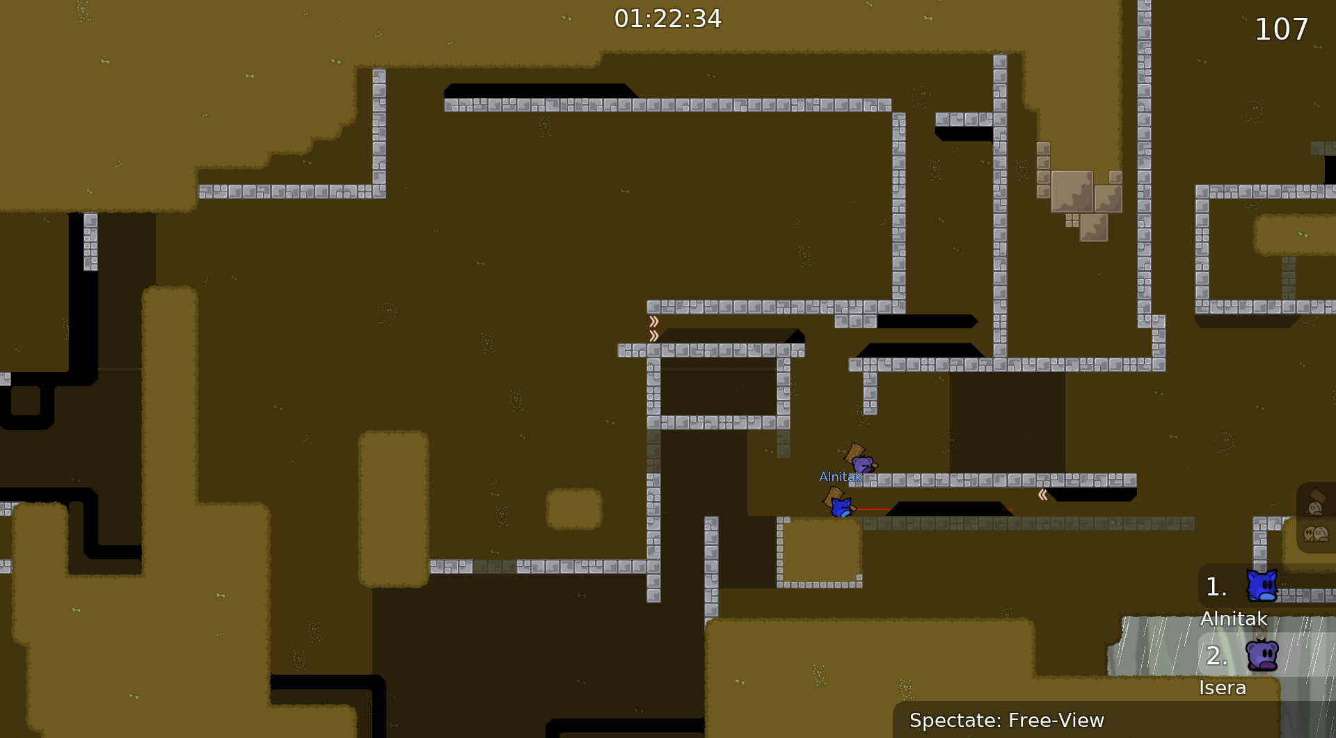
Maybe I'm biased because I was using dummy, but grabbing tee with endless hook here and sending them back up left side is annoying here. I'd personally put some hookthrough somewhere here, but idk if others would agree.
This is also a really awkward place to put endless/unendless transition and it will lead to chat getting spammed. If you don't change it though, the right side has unmarked un-endless, it should be marked (and also should probably let you get endless back if you come back up, like the left side)

Cool section, but this area is just very cramped and I really don't like the way the teleport to next area is situated, having to redo literally the entire thing if one tee messes up slightly is kinda annoying. Having the default failure mode for every component be the one that sends you all the way back, even after mostly completing the part, is not great IMO but that may just be my preference again, I tend to get strong opinions about mapping stuff
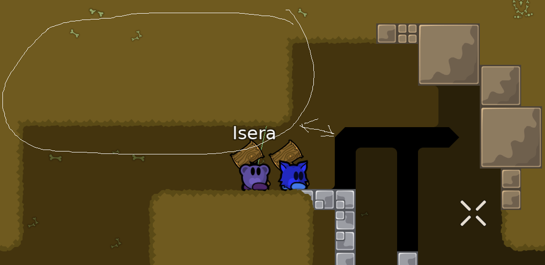
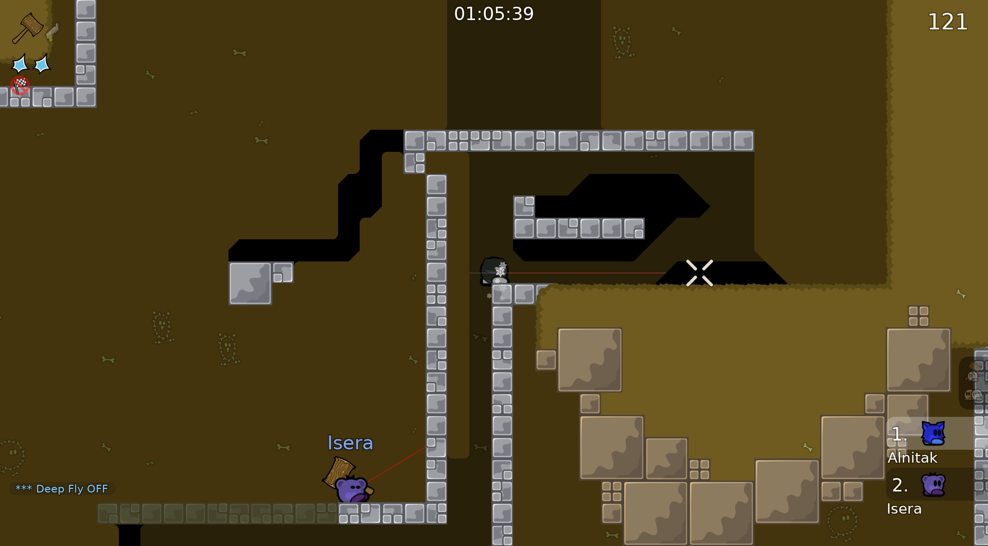
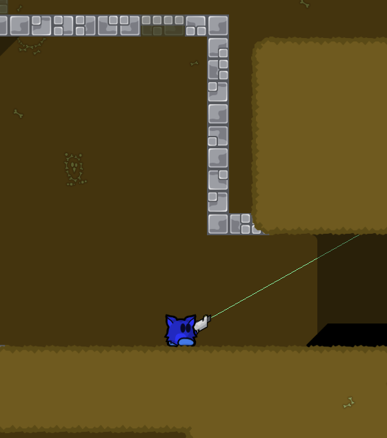
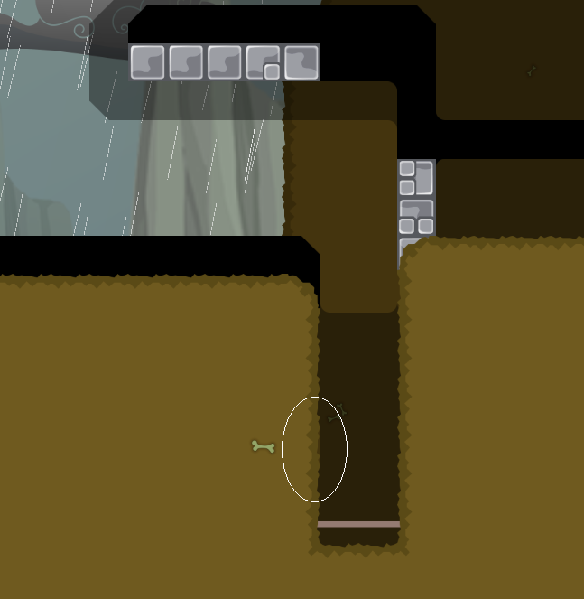
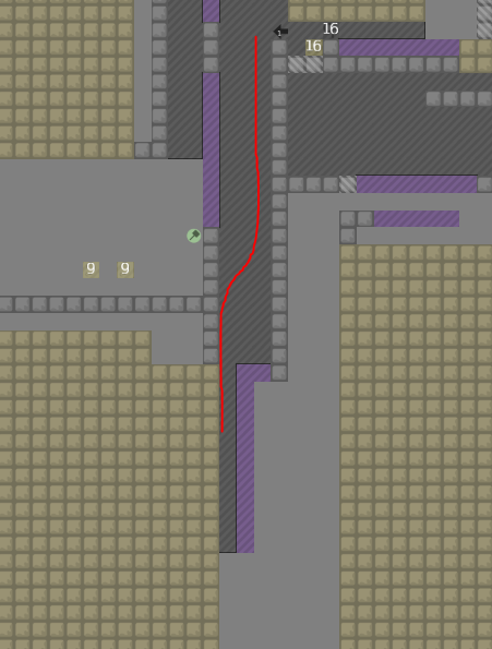
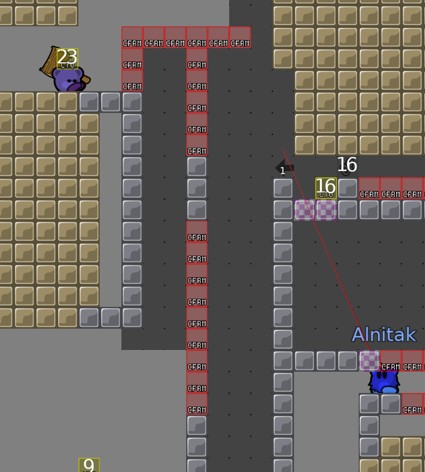
This hook angle is annoyingly precise IMO. Also, many players won't be able to land this hook effectively with standard zoom, because the player falling appears on screen only one tile above where they need to be grabbed on common aspect ratios. Maybe add a little room accessible going up the left to get a better vantage point to hook the player over.
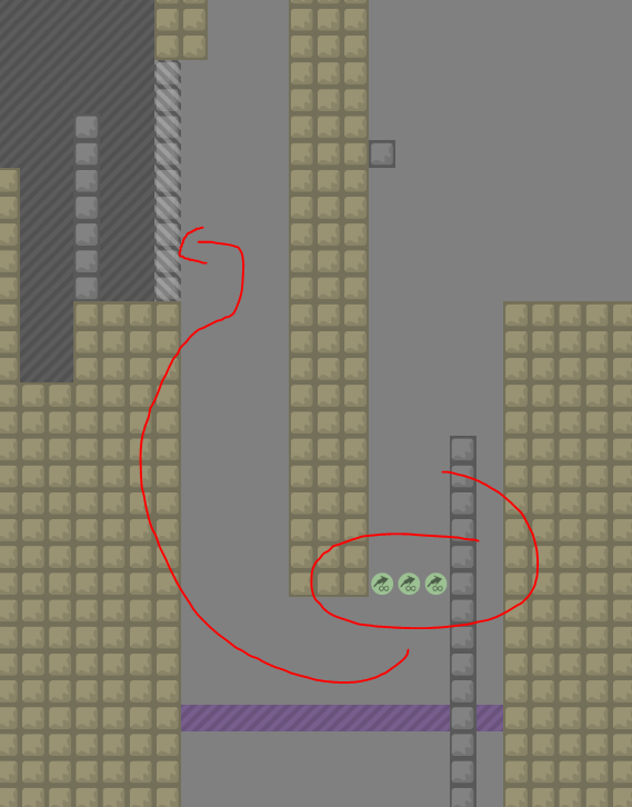
Also, the speeder seems unnecessary (and is not properly marked given its impact on gameplay). All it seems to do is prevent progress when the bottom player has weak, as it becomes literally impossible to drag the top tee over. This is also not great IMO and can be fixed by just removing the speeder.
next hammerfly part kinda tight and faily for moderate IMO but idk maybe I just haven't played enough mod 5* maps
Also you can nudge the frozen tee over to the left and then grab from the next level up. This whole thing is cramped IMO but I can see the argument in favor of keeping it the way it is. Maybe use the newer 0.7 dirt to make the dirt there 1 tile thick (like the hookthrough) so that it's less awkward. Nudging the tee left can be fixed by adding more teleport tiles so you can't put the tee in a spot you can reach from the second level anymore.
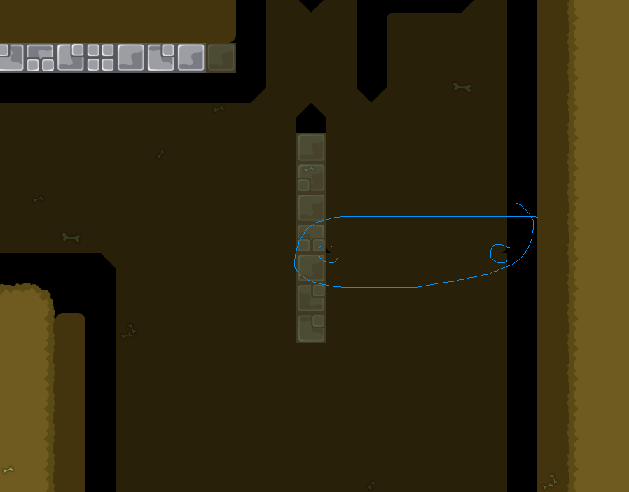
the solution Idea I came up with here puts a tee back in to get the switch who has grabbed the top checkpoint. doing this with wrong checkpoint would kill the run. maybe add checkpoint for the person who was initially dragged through as they come out, and for the person who is tossed back in.
also maybe add unfreeze above the door so that the door remaining open for too long doesn't cause you to have to retry (assuming I understand the part correctly)
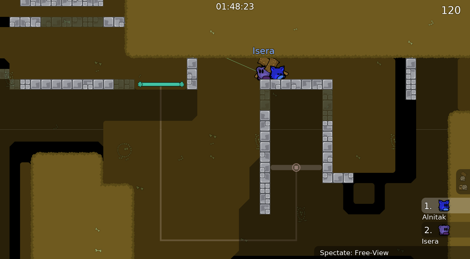
that's all as far as my commentary on part design goes, there's a bunch remaining that I didn't look at and there's some stuff that I did look at and decided I wasn't qualified to comment on.
Overall, this map has a lot of cool stuff in it and I think it's got good potential. Very unique parts, and some stuff that requires actually thinking a bit about what you're doing.
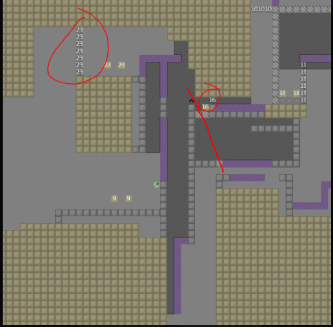
This part,you need to go down and hammer the other person to the speeder,and then it crashes down
My English is not very good,so I not express myself clearly……
oooh i see
alright that's interesting fixing the strong/weak issue would still be good to try and figure out if you can though IMO
though it's not as big of a deal if /spec will be enabled on the map
I've been so busy taking exams lately that I haven't been looking at discord much
yes,I turned this on before
And thank you for your advice!
$waiting
I have revised some questions, and thank you for your advice.
I added a little house
Maybe point out what u fixed/changed
It just add some decorative architecture, and add a level after finishing.
good map but definitely not moderate
I added a little house

i would change some parts , but i didn't played all parts (some little changes like more space and some more like changing difficulty little for parts , maybe even totaly changing part ) map have very cool parts definetly releasable . and after changing design color and other minor changes design changes .
and make all extra design in HD
otherwise nice parts (you even need brain sometimes) but i would change difficulty to brutal 2 or 3
you do not even need a switch there imo (I would remove it)
Thanks for your suggestions, I will make a lot of changes to the map, it may take a few days to get the results

$waiting
1.Modified all the textures in the scene.
2.Modified almost every level.
3.Modified the map logo and its animation.
4.Cancelled team play.


Gaochan

tiles?
pretty map
1.Expanded two passageways. 2.Fixed a texture issue.
Amazing design and cool animation !
fixed a texture issue
would be cool if the map had a bit more space, everything feels so tight
claustrophobia in ddnet
If you ask me to add pathways between the levels, I might just mess it up completely, and I don't have much time to modify the map right now
i really hate the design of this map
this part is not so good
you can just get endless and go back idk
maybe im doing it wrong
but it sucks
was this map even tested
all of the parts feel clunky and annoying
this hook sucks
idk if its intended but u can
i think its supposed to be a drag part
its way too tight and is not clear where to start from
played most of it and just got annoyed this map is really not it imo
crazy its been open for so long
shit is really missleading theres so much here for just 1 hook part
just fly so why deep
weird choice
i guess to prevent aled?
just put tp
i stopped playing the map here
tester come play this with me at some point in a server im so confused
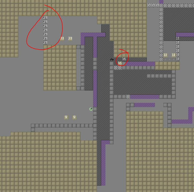
i should clarify that its random because of the number of it not the placement
nah but if you dont know how to do a part, you shouldnt say its bad or it sucks, you're doing every part wrong and calling it bad and annoying?? just because you cant sightread a part and it takes more than 5seconds to think about doesnt make it bad
you fall down and hook while hes still inside then get endless and go over
theres not even a hook there
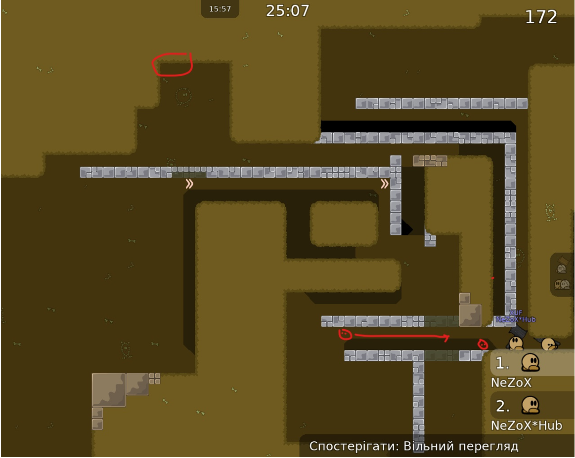
you hammer your mate up to the stopper then go inside and you fall down to the unfreeze whats misleading
the design is good????
way better than generic block version 53 map
only useful thing said here
yea i did that
stopper where
theres an unfreeze and the bottom tee goes to the right
simply do 1 hook
then how is this not made very well
stopper pusher arrow whatever
not hard to think what im talking about in that picture
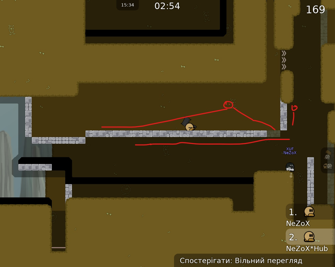
too tight for what the part is as u hook him out u have to go too far so it results in you going <-
speeder
u dont do that in the part
?
or i did it a different way
the mapper even put a hammer sign for u there to show that u should hammer
yes thats why i said it was missleading
because i didnt do a hammer
xd
?
?
Just tested the map with VéNa
I'll write a full review
But it's a decline
nah
XD
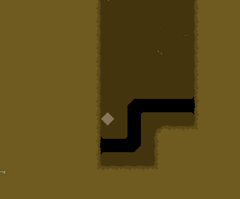
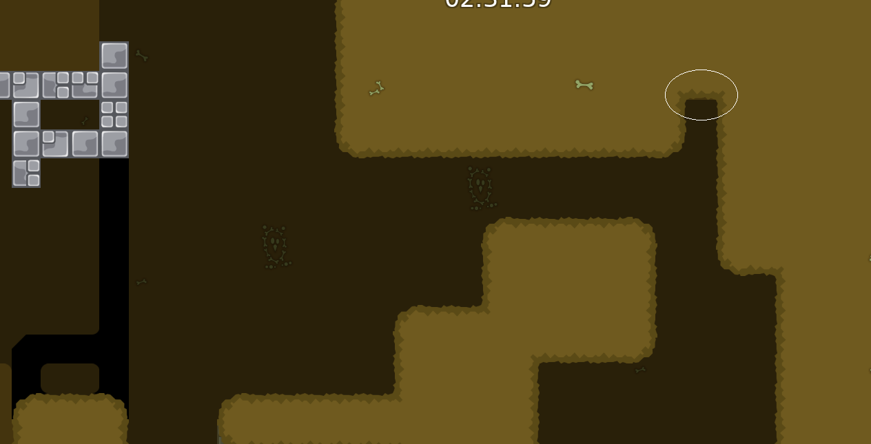
The map has a lot of problems, some parts don't work well, are confusing/missleading or are just not well made and because of that it sometimes felt like a brutal instead of moderate For exemple just that part, it doesn't work if you have weak (how could you know, even if you can spec) + when you hook it looks like you have to hold but you have to rls

It goes for 90% of the parts
Due to our new rules in testing I won't be declining this map now because we are now voting
There is also a lot of problems design wise but I am not an expert in this category
And there is also cheats
$decline
voted out
🙏


