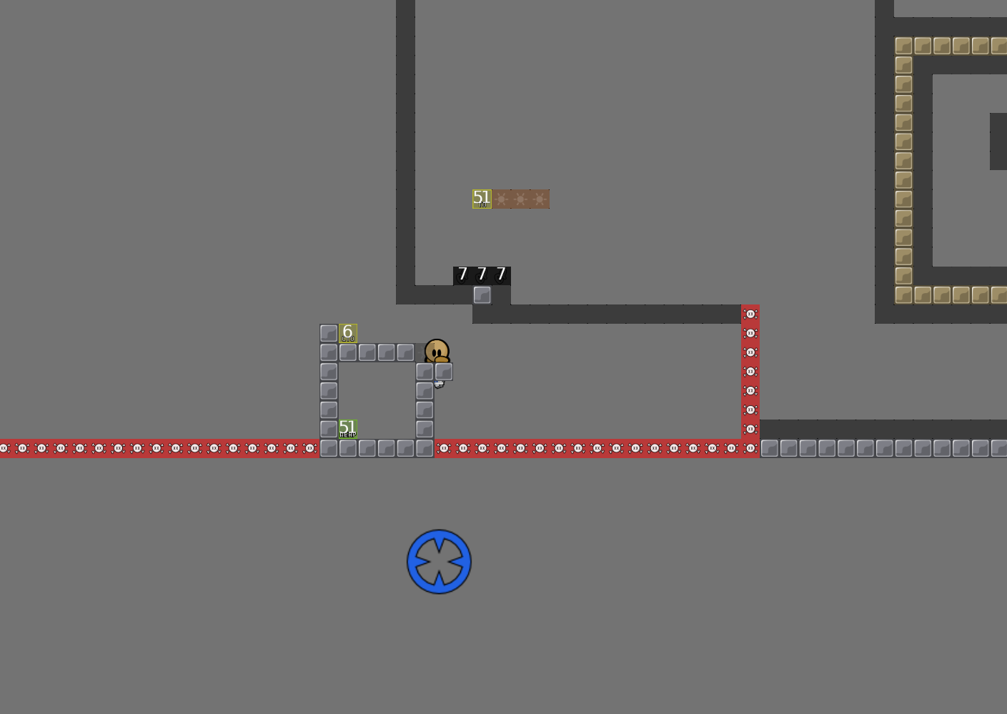
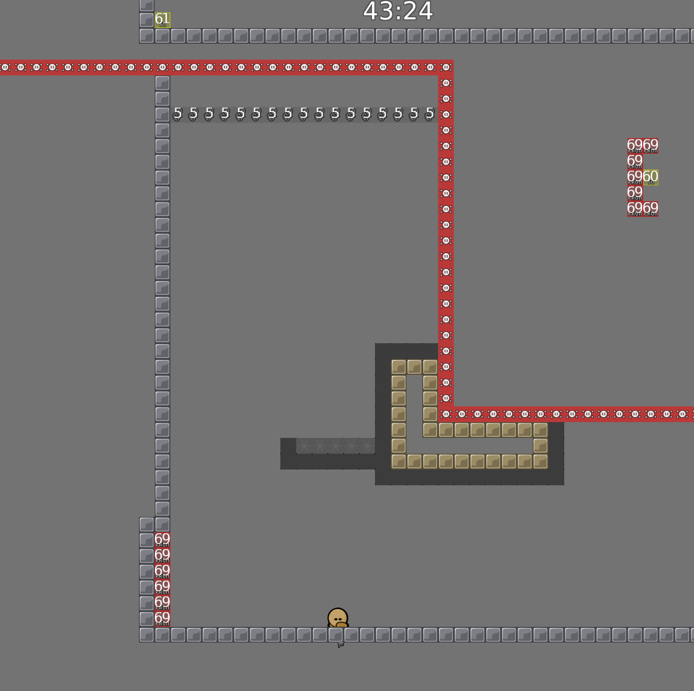
this is your map's testing channel! Post map updates here and remember to follow our mapper rules: https://ddnet.tw/rules
thx I.K.U
just a little idea to make that finish where you started thing more fancy. Use something else than cp1 for first part and in order to finish u must get cp1 instead of cp9. Do NOT place a cto with number 1, then getting into a cfrom tele with checkpoint number 1 will teleport you to spawn :P
good idea, i will think of a way, thanks!
some of the individual parts are cool, but from the playthrough, i don't like the "abuse" of teleporters
i'd rather release a map that has good parts and nice flow rather than a map with good parts but a weird pathing that just confuses people trying to play
i wouldn't sacrifice the flow of the map for the "return to the center" concept
i recommend connecting the parts normally
Boring
i was going for a rather new approach instead of a straight line from start to finish, and i think if you know the route the map does have a nice flow, but correct me if i’m wrong. If it’s only releasable by connecting the parts normally i’d want it declined, thanks for the feedback tho!
i mean it can still be releasable with the center idea, but there would need to be some changes
for example you could have a big circle of gravity 0 tunes in the center, and to go from one part to the next you have to fall thru the circle at a certain angle and travel to another side where a part opens up
Nah. Its really cool like that. Its a nice use of cps. And not that boring switches everywhere that will open a door. Also less cheatable. Open maps like this are actually perfect for speedrunners flow
I like a lot the idea and i feel is very intuitive, maybe for non entity players would be nice to add a number in each cp (u added numbers only in cto) so u know the order, but knowing the order of cps u just need few secs to guess the path and transitions between cps are smooth.
how is it intuitive whatsoever
likely that 90% of testers will agree with me
actually no, openness and cps are more prone to cheats (you should know this)
Switches and doors are the most cheatable things

I thought the map was really cool and I really like the concept of returning to the center but from different places and with different weapons/powerups. I also think that it is intuitive because getting cp2 forces you to go into the center, then cp3 is also simple but teaches you the concept of going back to the center on your own after getting a cp. I think that making the design a bit more clear on what to do by making the cp's numbered, and possibly making the numbering on the current cto's a bit more noticeable since its important to the map. Overall though I really like the map, its a cool idea!
yes, i fixed it already, just didn’t upload the right version😅
feel free to do that, some might find it more faily
thanks! i will number the cp’s
-totelecp 6 small laser skip fixed -numbered the cp's -added timecp's
ugly corners
they look fine, please be useful if you are testing
and gameplay matters more in early stages anyways
thank you for your thoughtful and meaningful feedback, i’m hoping to learn from my mistakes, and please you next time
i like this map a lot but HOW CAN YOU TELL UNHOOK FROM FREEZE APART THEY'RE THE SAME COLOR (in your entities)
thanks, i kinda got used to it ig😅
cool map!
can i get a fast sweep through if everything is alright? wouldn’t ask for it normally, but i’m going away for a long time soon
Hello dear mapper. Should say that personally for me i do not like map. Concept bad, balance bad, very confusing ways.
didn't your map just get declined? lol
not really acknowledging this, since it doesn’t educate me in any way. i don’t know if I hurt you or you’re just like this, but waiting for more tests
Cooldown, just my hornet opinion. İ played veeery much solo maps, and would say that, not to offense you
İ did it myself. lol
i’m pretty calm, and never took it offensively, i don’t know where you got that from, please stop spam
then why you answer like offensed kid? lmao Didn't though real opinion can make such butthurt
i didn’t answer like an “offensed kid”? 😹 it’s not a “real opinion” it’s just some words written by you, a “real opinion” would tell me what to fix, what’s unbalanced (xd?) and so on. once again if you don’t have anything detailed to say, then don’t, stop spamming
all of u stfu pls
-fixed corners
Its a cool concept but poorly executed imo. The pathing is very counterintuitive, so you essentially have to memorize the map before you can play it all the way through. This is the type of map (in my opinion) that would work better with tele checkpoints, so that the player is more willing to experiment and find the solutions/proper routes WHILE they are playing the map, rather than try to memorize things.
i agree with the aboive statement, the pathing is not really nice to play unless you spec whole map beforehand
it’s literally 1 possible way from every cp
I think it’s because you don’t really know where relative to the center you are when you get to the next cp. I don’t personally see this as a problem I think it’s pretty cool, one “fix” could be in the design of it you could have a parallax background that lines up when you are in the center of the map, this would always tell the player exactly where they are by giving them a way to know where the center is I guess
Although 99.9% of people don’t use designs anyways so idk if they would like that fix. Again I don’t really see a problem with it I really like the concept and the map
I think parallax background idea is a super complicated solution for a simple problem. Just add tele 4head
also the parts arent really good enough to be put together without good flow
and considering you are teled to each part, the flow isnt really nice
is the main problem for me
I guess thats true
therein lies the problem with the map

well i'll wait for another tester's opinion, but imo i would decline this because of the flow issues
As i said almost two month ago xd
That map is very messy, not only because of the way it's mapped but also because of the colors and the beams
You really can't read the numbers as well
It's too small, written in white over another bright color
It could have been good with a better map structure
You should reorganise the map, its structure, pick matching colors and make sure the beams or other doodads do not have more details than the playground otherwise it's confusing
$waiting


