this is your map's testing channel! Post map updates here and remember to follow our mapper rules: https://ddnet.org/rules
delete noobfilter
plz fix ur deisgn
and this is way too bright
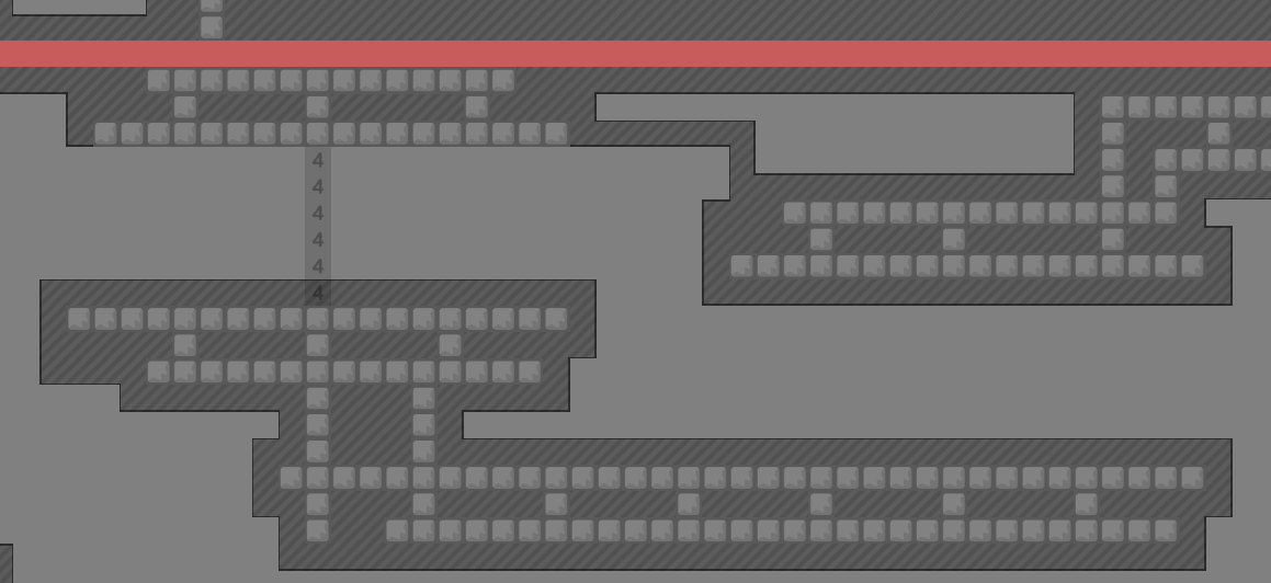
- missleading cuz those blocks arent actually there
if this goes to waiting i think needs a complete redesign
in my eyes i see it as we already have "just pseudo fly"
so why do we need this also
u dont even need pseudo for this map
this sucks
?
pseudo aled moment 💩💩💩
I want your physical layer.

My entities skin?
It's t Client
entity textures are just comfort pack which is an option by default, the outline is t client so you cant do this with normal ddnet
tater client
oh i know
yes
this map should be $decline btw just make a new one
oh~
thank you
np :D
Unlucky
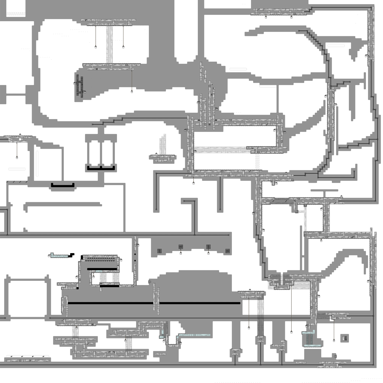
tested with nehr the fly have no flow, and have irregularity sometime it's tight and some time they is huge space, the structure of the map is good for unhook at start and at the hh part but the structure of the kill tile is totally another style the style of the map itself is weird, it's a fly map, but they is a part in the middle of the map for no reason + the part is bad forcing aled 4 or 5 times with no setup is annoying (even more for the 2 aleds up) the part cp 3 is rly weird, they is 2 aled and a speedfly (need to keep dj with pseudofly aled or somehow) they is unhook tile for the speedfly (or throw rehook i dont know what you want us to do) and the part in bottom right is horrible to play, tight with the kill tile, the hookable with weird position and the "part" itself is bad it's clearly a decline from nehr and me
$decline
$archive_imm
