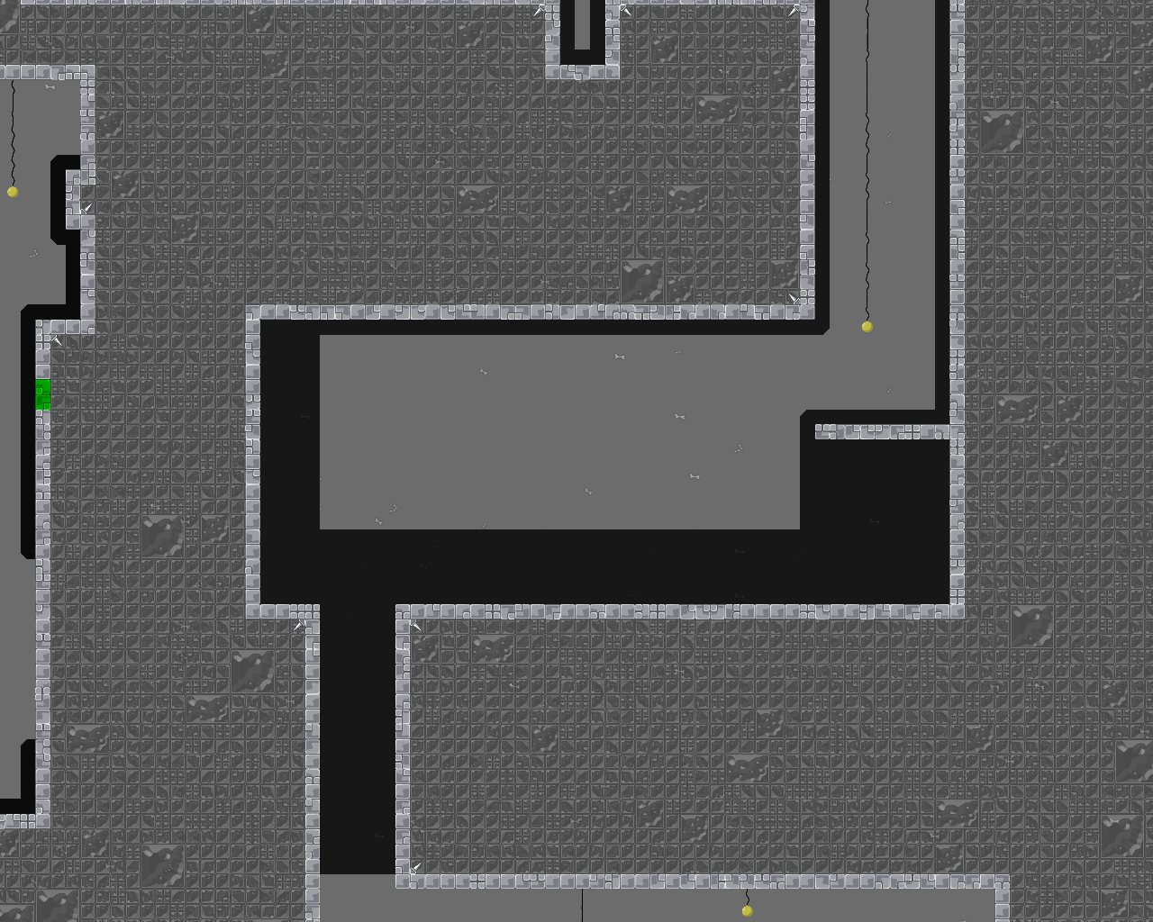
#Grapple_Cave
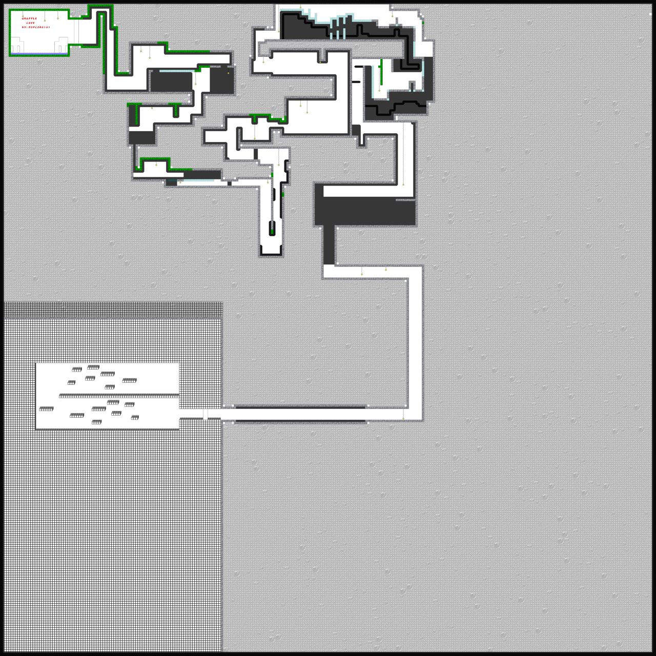
"Grapple_Cave" by PopCorn181 [Insane]
DDNet 11/25/2020 2:46 PM
@PopCorn181

this is your map's testing channel! Post map updates here and remember to follow our mapper rules: https://ddnet.tw/rules

ano 11/25/2020 2:47 PM

😳

wsike >.< 11/25/2020 2:50 PM

great improvement

wsike >.< 11/25/2020 2:50 PM

😳

Ama 11/25/2020 3:00 PM

better design same problem as before way to narrow

Ravie 11/25/2020 3:04 PM

insane

Pepe 11/25/2020 3:12 PM

Rls pls

snail 11/25/2020 3:12 PM

its very un,balanced

snail 11/25/2020 3:12 PM

and extremely short

triki 11/25/2020 3:14 PM

it is insane xD

triki 11/25/2020 3:14 PM

no balance , toxic design. some parts more than insane

snail 11/25/2020 3:15 PM

nah

snail 11/25/2020 3:15 PM

if u pass first 2 parts

snail 11/25/2020 3:15 PM

its low brutal

triki 11/25/2020 3:15 PM

try this

snail 11/25/2020 3:15 PM

y

snail 11/25/2020 3:15 PM

this is rly shit

Ravie 11/25/2020 3:15 PM

Everything is too tight, don't be afraid to map with more space. Also you shouldn't try to make "insane" or any other hard maps with your skill level.

Pepe 11/25/2020 3:15 PM

Insane part

snail 11/25/2020 3:16 PM

but ye

louis 11/25/2020 3:31 PM

ur improving

PopCorn181 11/25/2020 3:58 PM

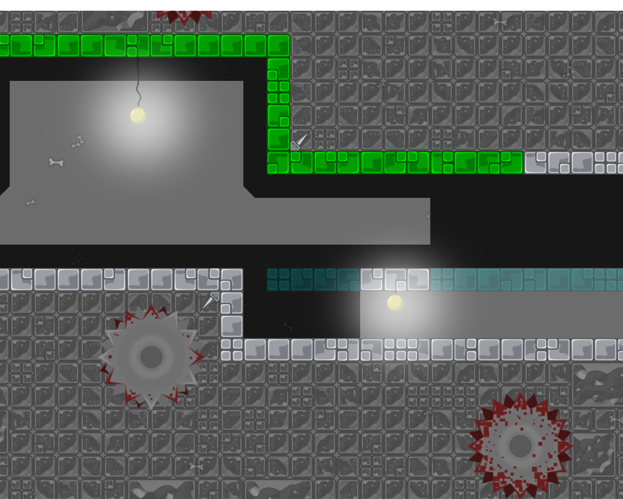
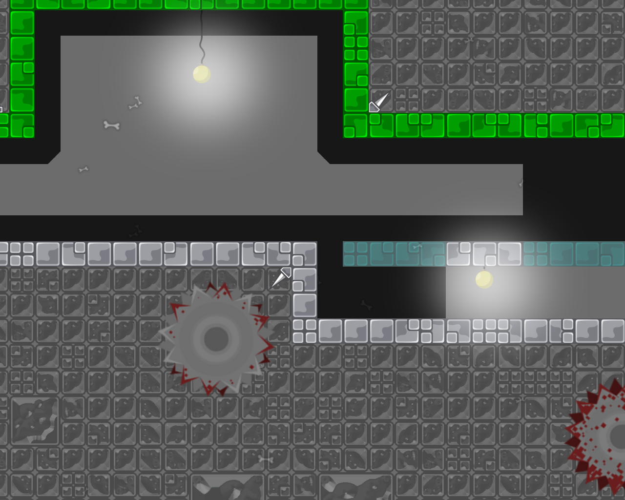
Did Some Nerfing With The 2 Sections Near The End.

PopCorn181 11/25/2020 3:59 PM
PopCorn181 11/25/2020 4:01 PM

It's still hard but much easier.

triki 11/25/2020 4:01 PM

just hh

snail 11/25/2020 4:01 PM

its moderate now

snail 11/25/2020 4:01 PM

xd

triki 11/25/2020 4:01 PM

hf

triki 11/25/2020 4:01 PM

xD

triki 11/25/2020 4:03 PM

if u here will empty it will better but not insane

PopCorn181 11/25/2020 4:15 PM

Buffed 2 Easy Parts.

PopCorn181 11/25/2020 4:15 PM
PopCorn181 11/25/2020 4:20 PM

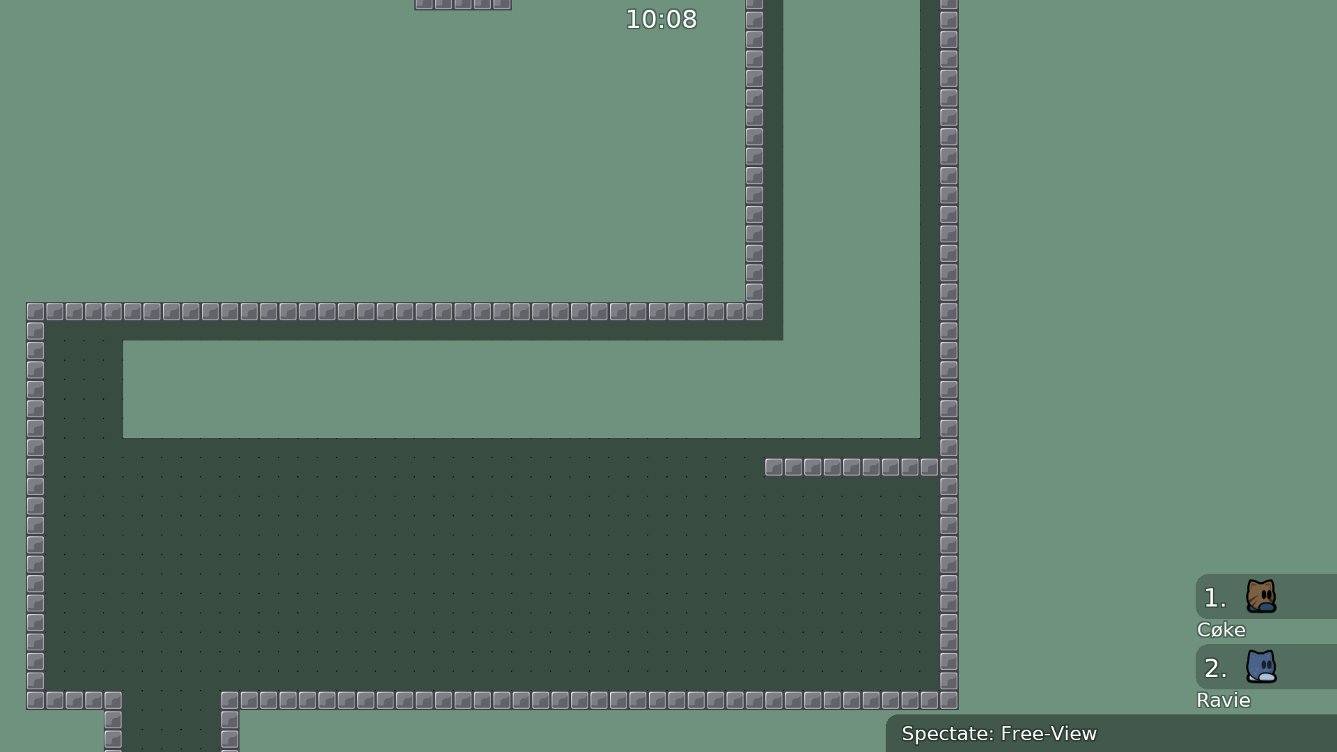
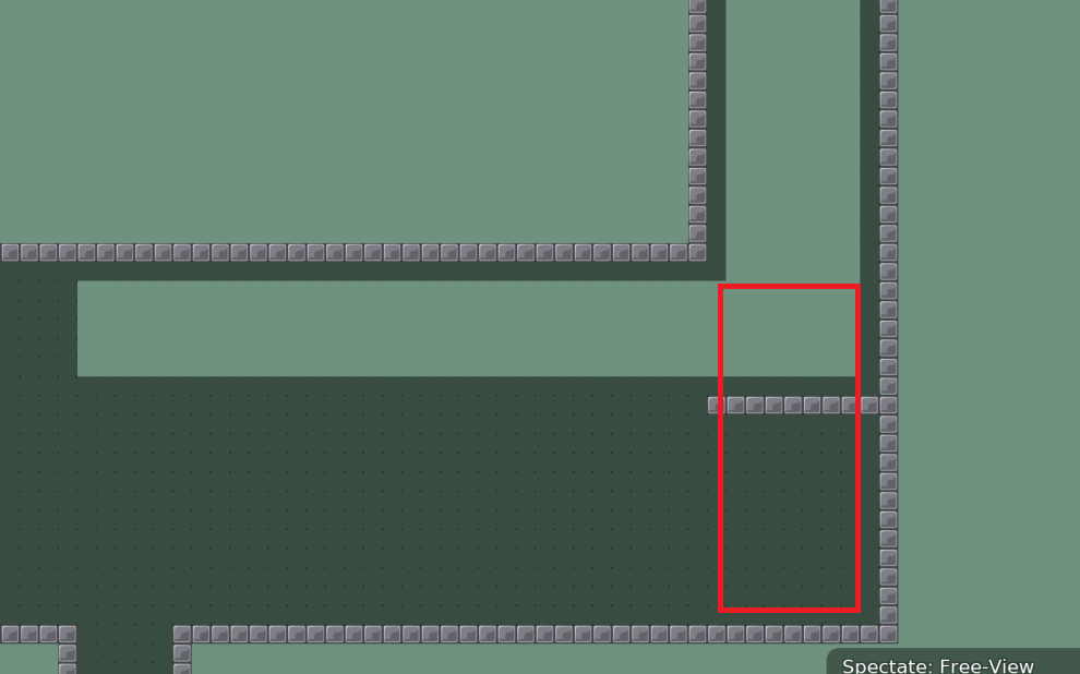
Fixed an area where there was freeze texture inside of a hook-through object.

PopCorn181 11/25/2020 4:21 PM

Old:

PopCorn181 11/25/2020 4:22 PM

Fixed:

den pa 11/25/2020 4:23 PM

Design doesnt look good imo. The colours dont go that well together

PopCorn181 11/25/2020 4:29 PM

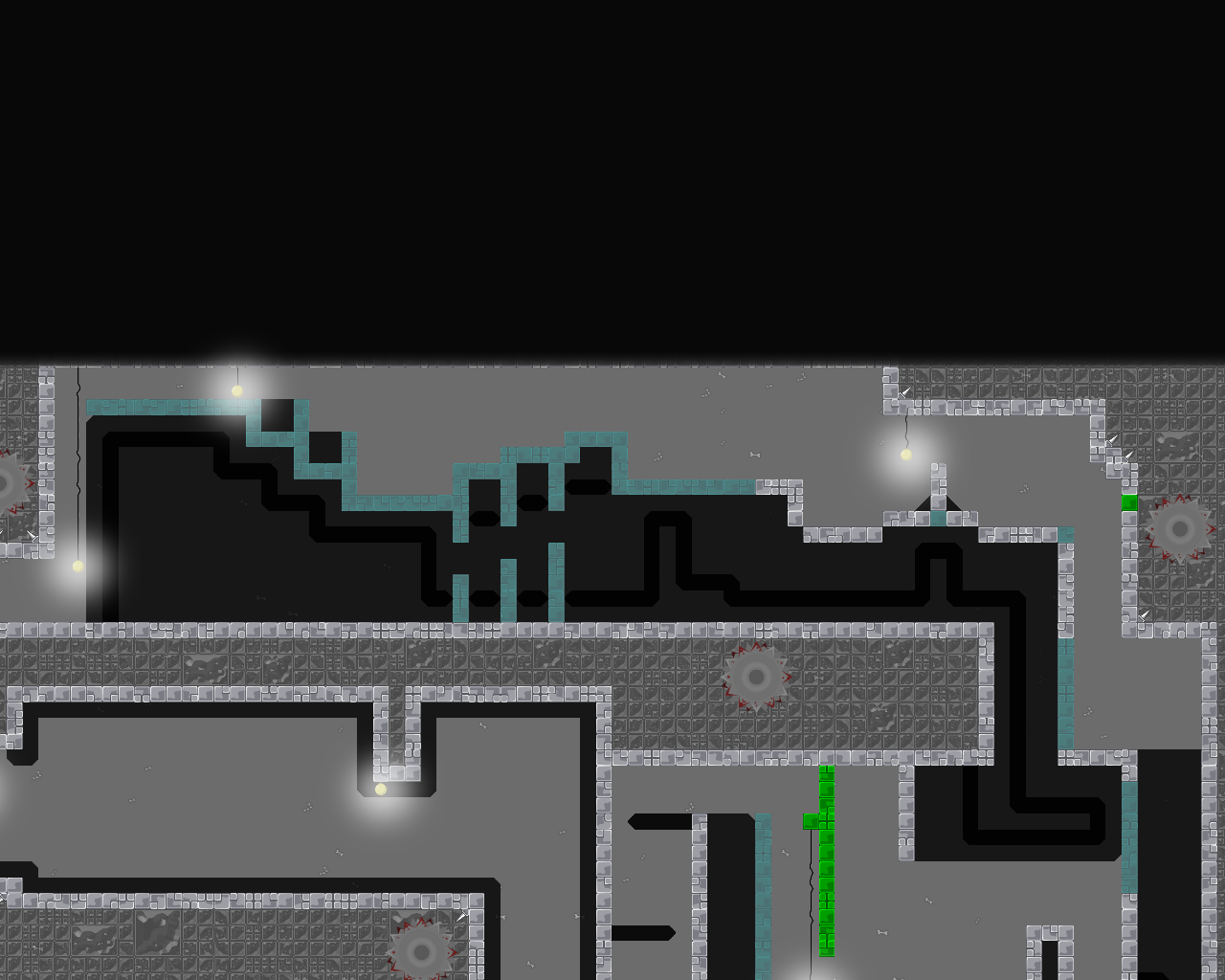
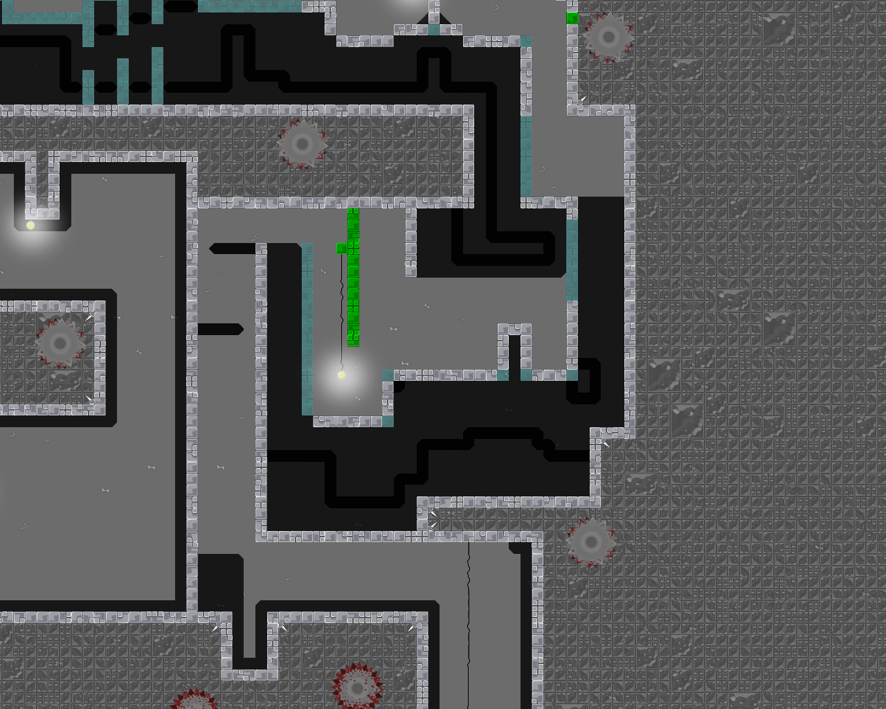
Changed the background behind the blocks

PopCorn181 11/25/2020 4:30 PM

Actually no it looks worse now.

PopCorn181 11/25/2020 4:31 PM

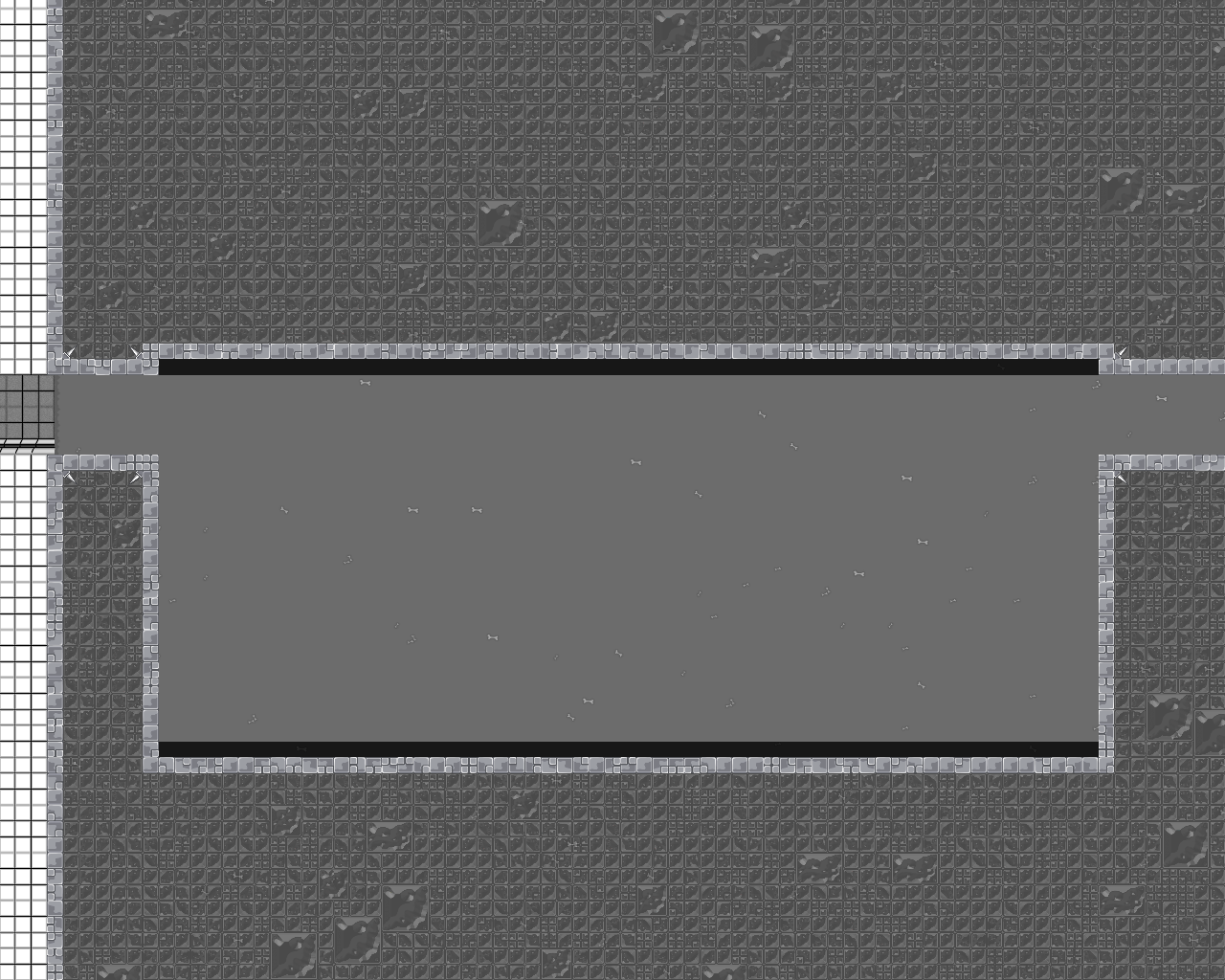
Better object background

I.K.U 11/25/2020 4:34 PM

ok

I.K.U 11/25/2020 4:34 PM

problems with map

I.K.U 11/25/2020 4:34 PM

no sapce

I.K.U 11/25/2020 4:34 PM

bad difficult rating

I.K.U 11/25/2020 4:35 PM

design pretty bad aswell some too bright

I.K.U 11/25/2020 4:35 PM

colors dont fit

I.K.U 11/25/2020 4:35 PM

boring gameplay

I.K.U 11/25/2020 4:35 PM

not fun at all

I.K.U 11/25/2020 4:36 PM

and also extremly unbalanced

I.K.U 11/25/2020 4:37 PM

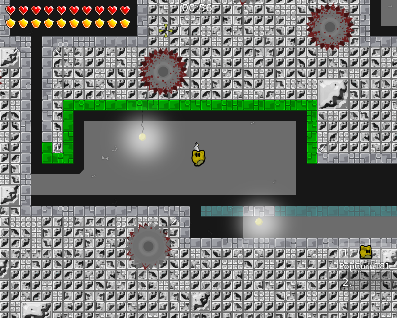
the glow around the map is pretty cool

I.K.U 11/25/2020 4:37 PM

winning room is hurting my eyes

allocaツ 11/25/2020 4:37 PM

like the part you edited, make parts like these way bigger with more space. if your map has overall this much more space it would be much better.

I.K.U 11/25/2020 4:39 PM

also dont do invisible kill tiles (like at spawn, you probably got the idea from cobra1-4 but there is a reason only that map has thoose)

PopCorn181 11/25/2020 4:40 PM

Audio Bug Fixed.

I.K.U 11/25/2020 4:40 PM

that wont save map from decline :x

PopCorn181 11/25/2020 4:49 PM
PopCorn181 11/25/2020 4:52 PM
PopCorn181 11/25/2020 5:03 PM

is there a way the difficulty could be switched to brutal?

PopCorn181 11/25/2020 5:03 PM

not insane

PopCorn181 11/25/2020 5:08 PM
PopCorn181 11/25/2020 5:10 PM
@I.K.U

the glow around the map was made to hide the glitch where objects would copy themselves if they were on the map border.

Ravie 11/25/2020 5:18 PM

No need to, this can't be released Way too tight and many things don't really work, as I imagine you can't properly play and test them. Make an easier map with more space and test it properly and make sure everything works smoothly. Also try to avoid clashing styles in design.

Ravie 11/25/2020 5:18 PM

$decline

texnonik 11/25/2020 6:40 PM

granpa_cave xD

den pa 11/25/2020 7:13 PM

Maybe look for a color palette and use these colors to make a map design also stay away from bright colors

maggi323 11/25/2020 8:17 PM

in comparison to your older maps this one definitely had better gameplay and graphics. it's still not at the point where we could consider a release, but you are always improving.