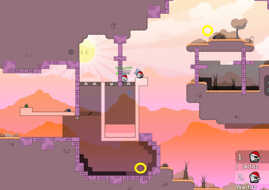
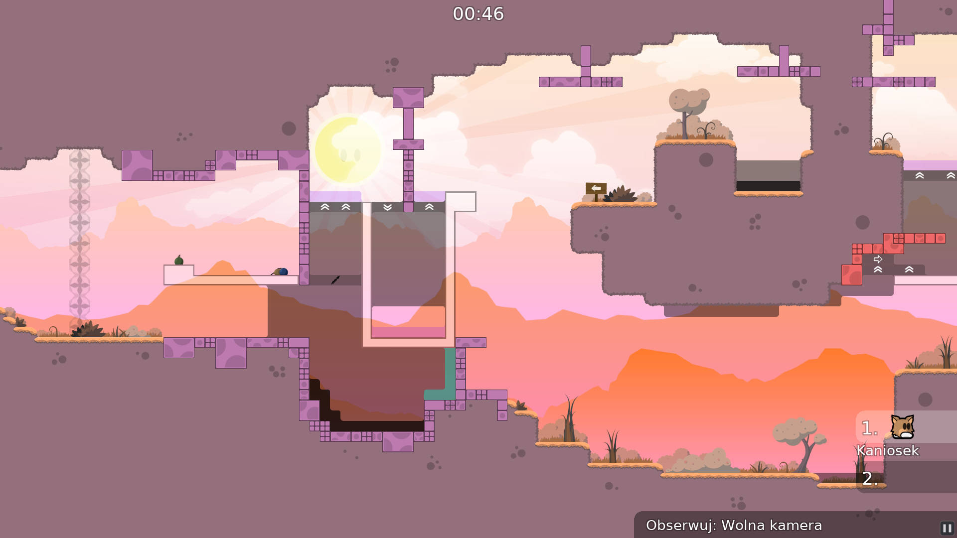
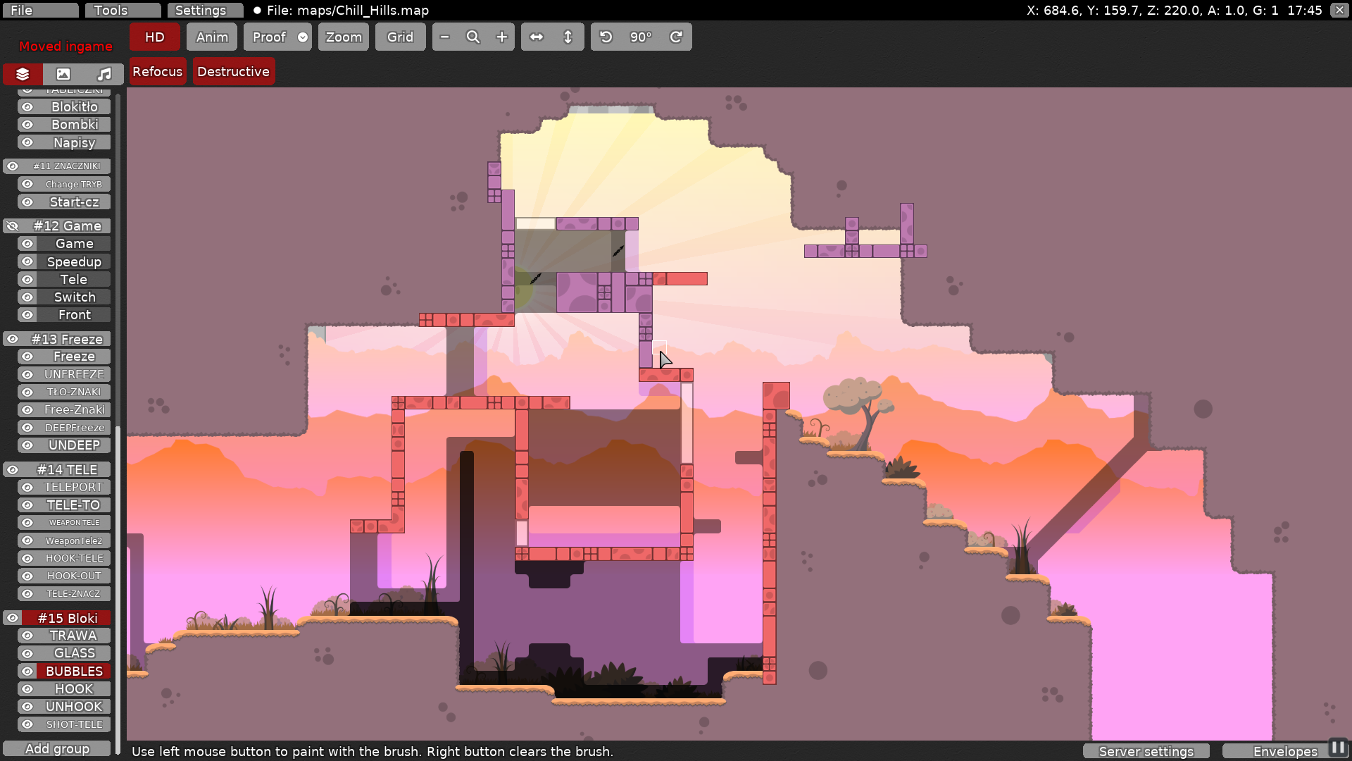
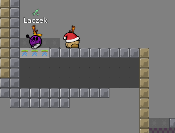
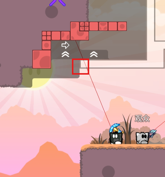
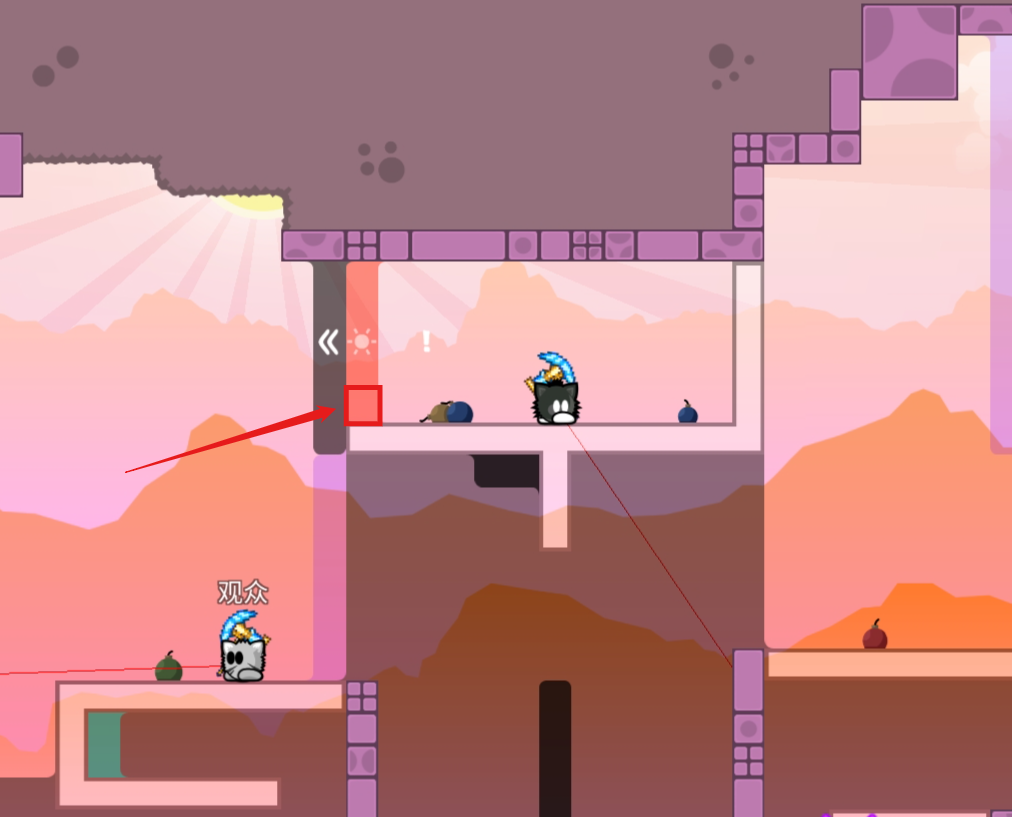
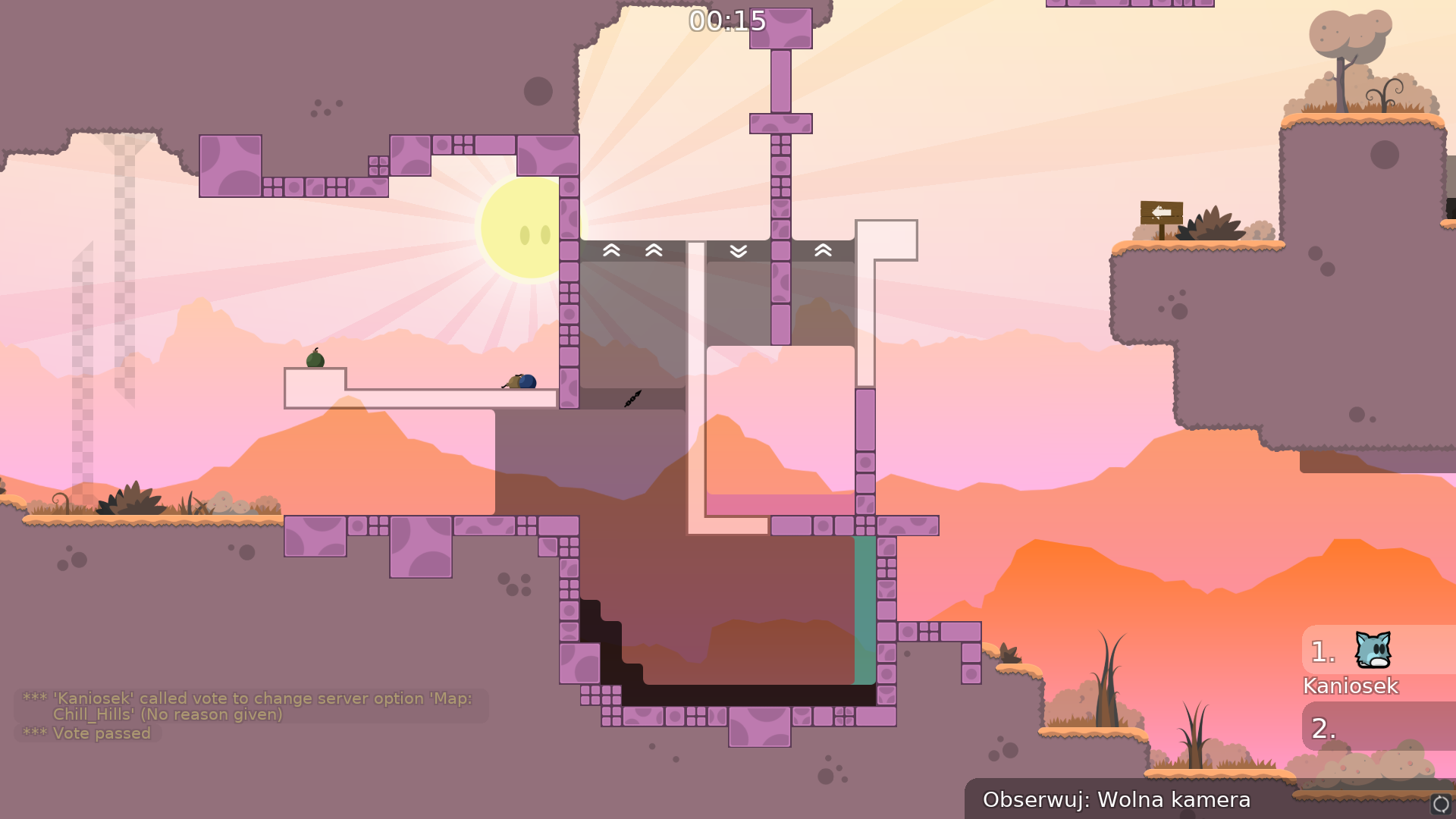
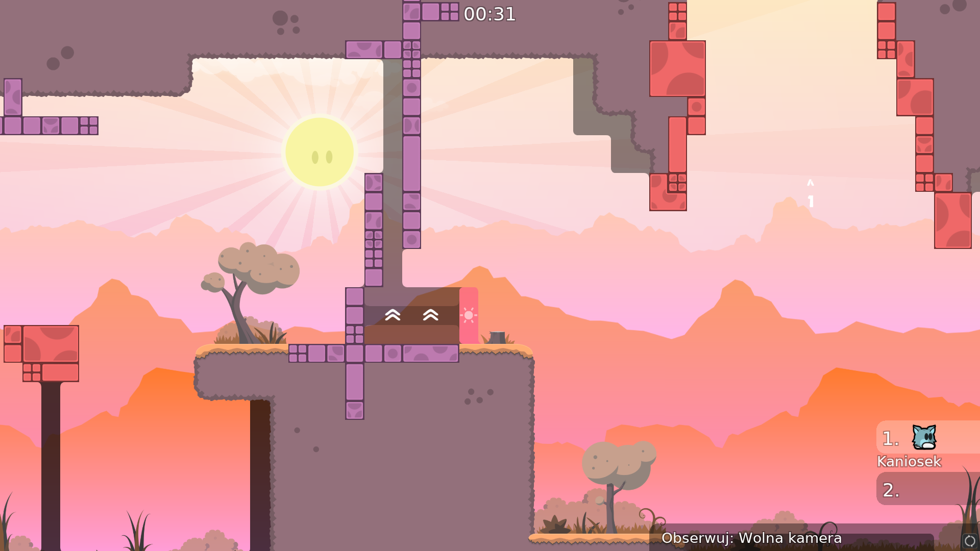
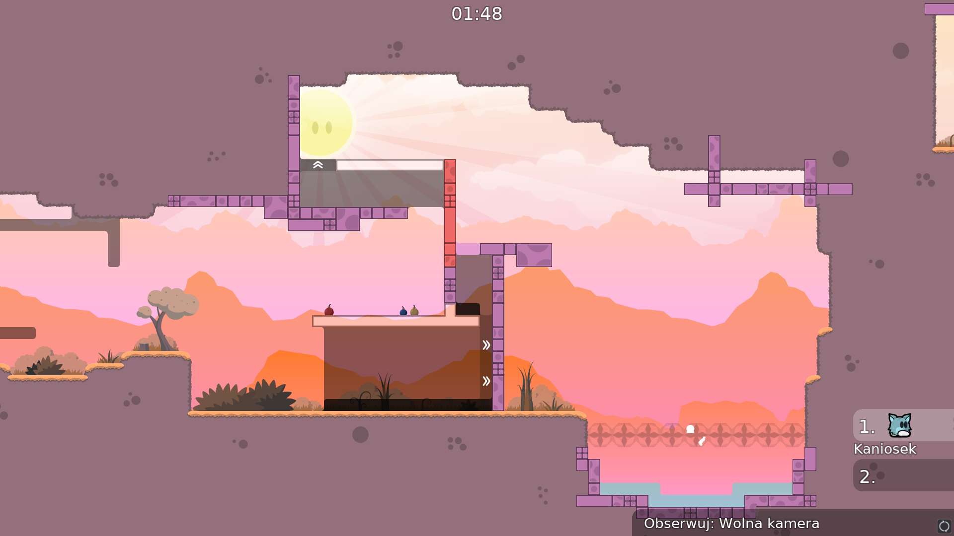
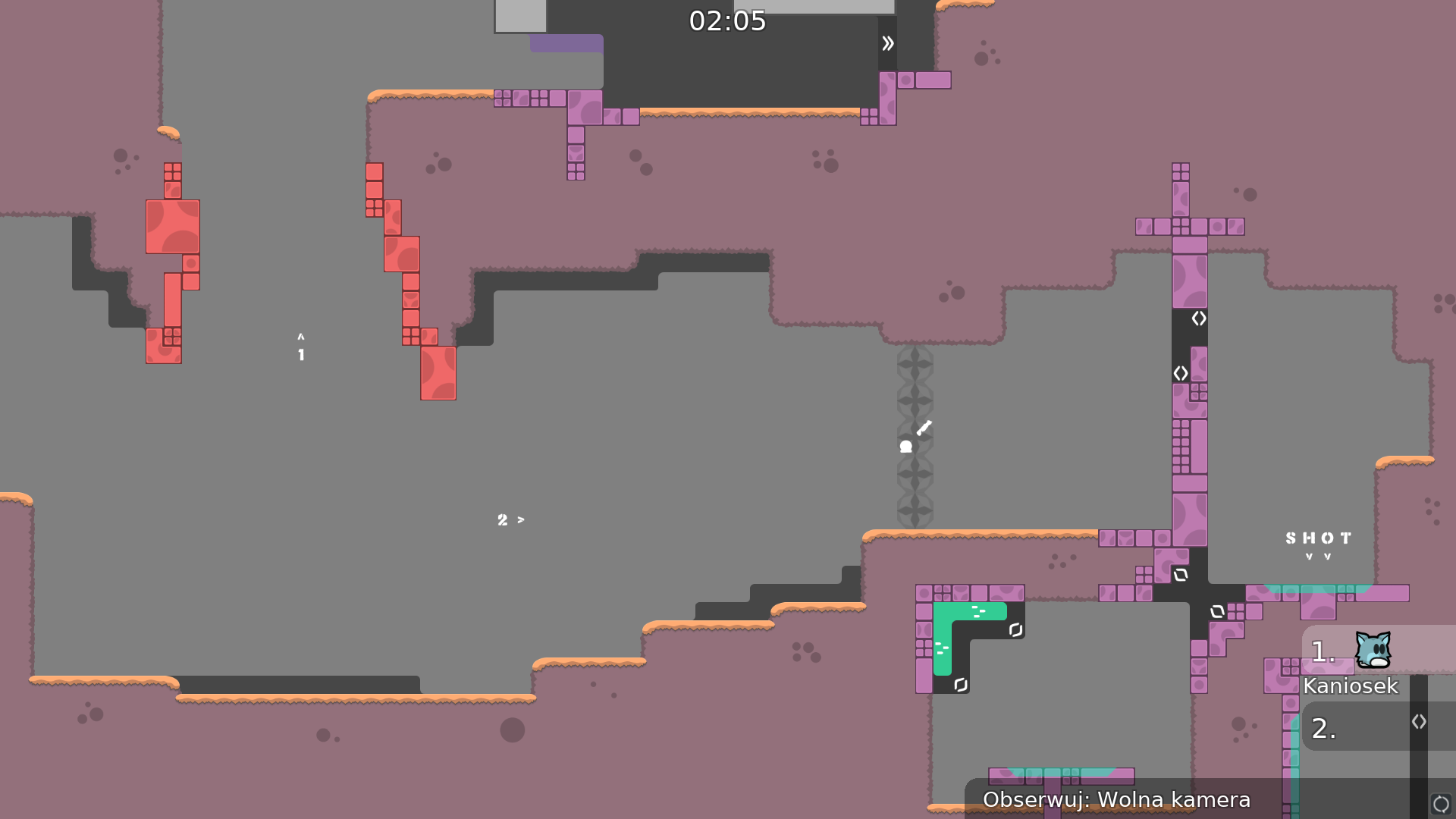
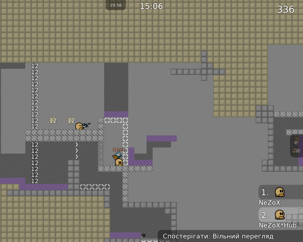
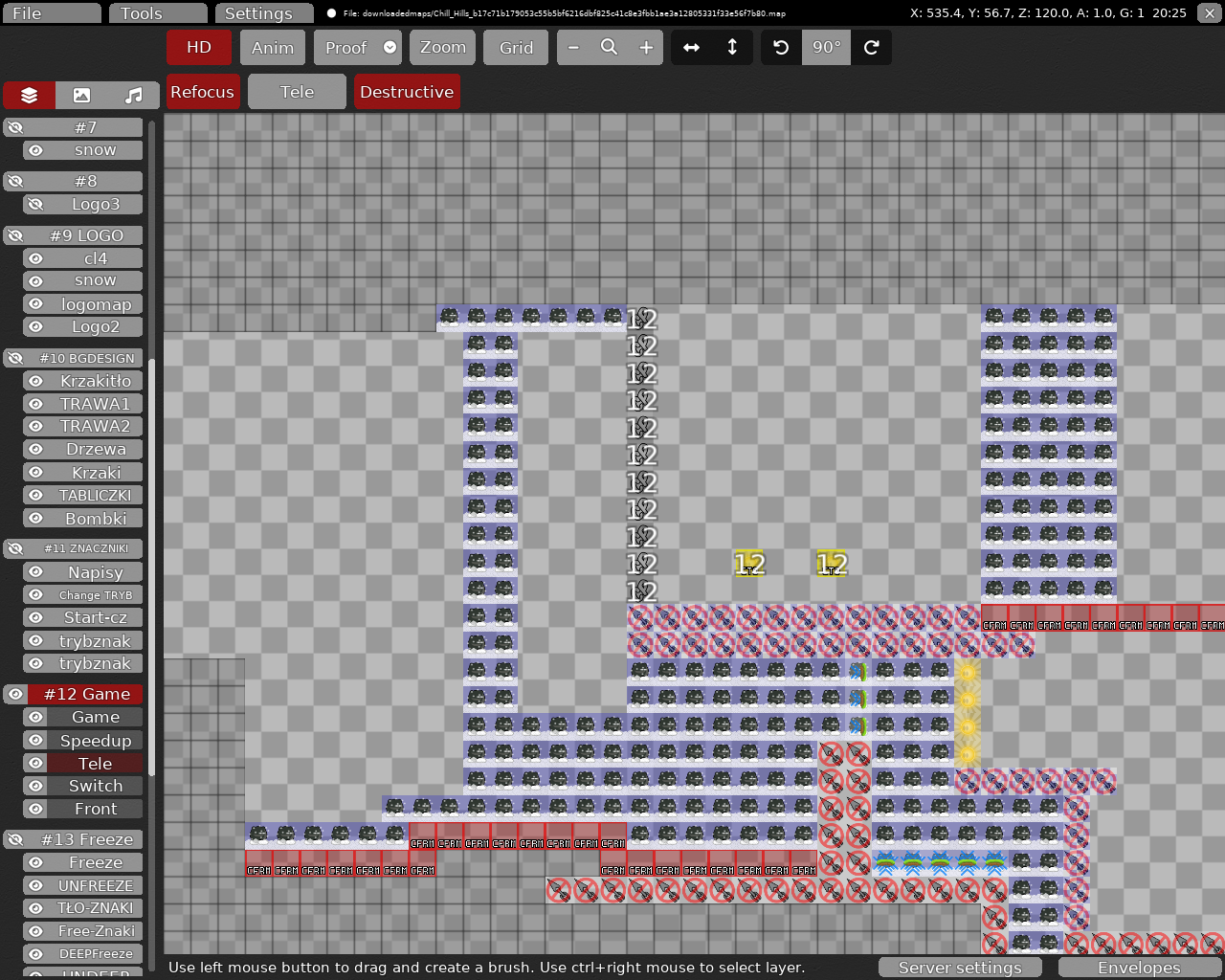
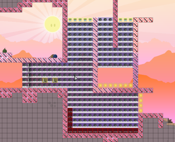
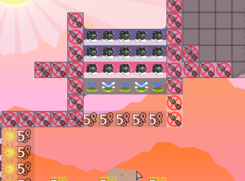
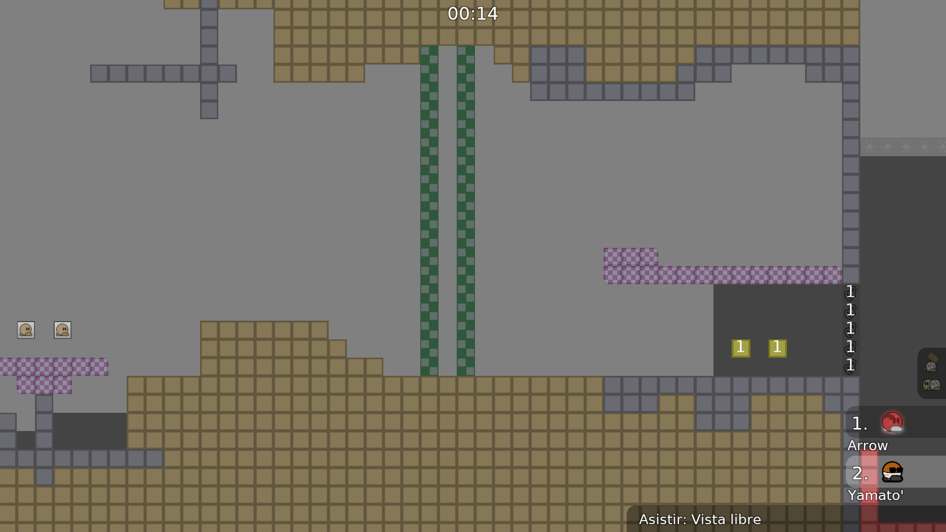
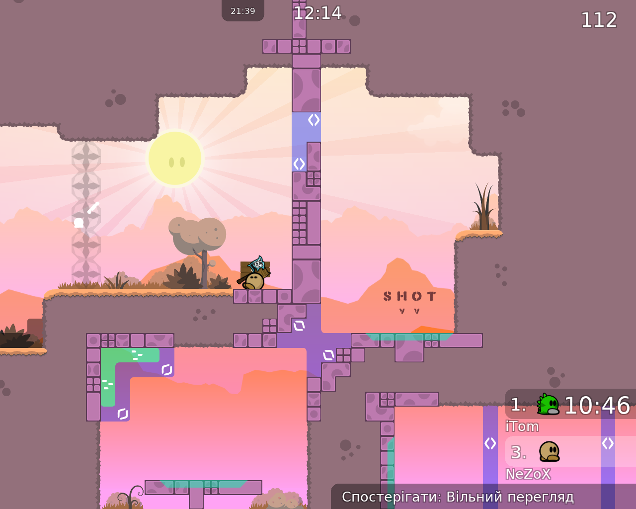
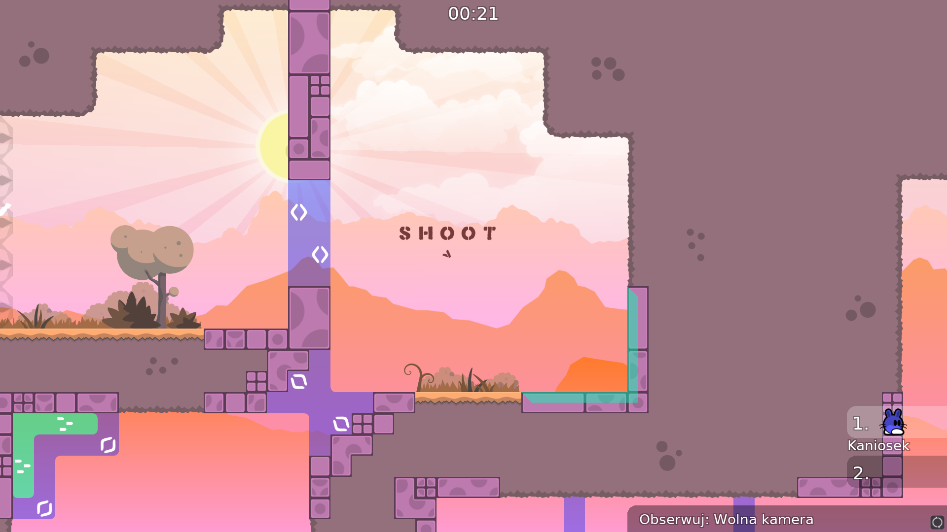
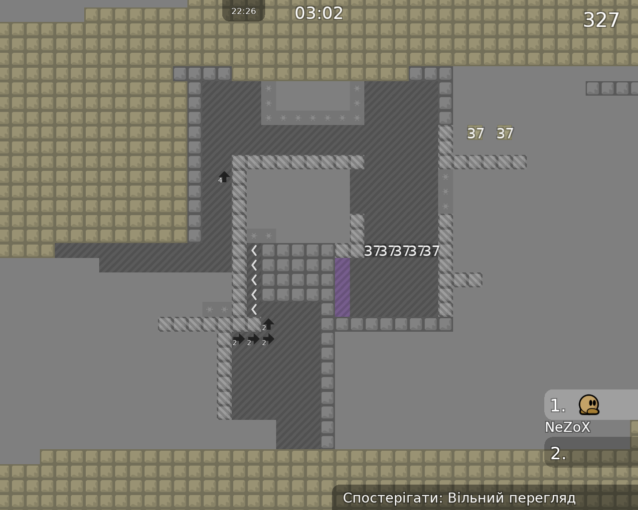
this is your map's testing channel! Post map updates here and remember to follow our mapper rules: https://ddnet.org/rules
Make the changes right away and send them ?
Nah, when you have time, fix it and post it on this channel.
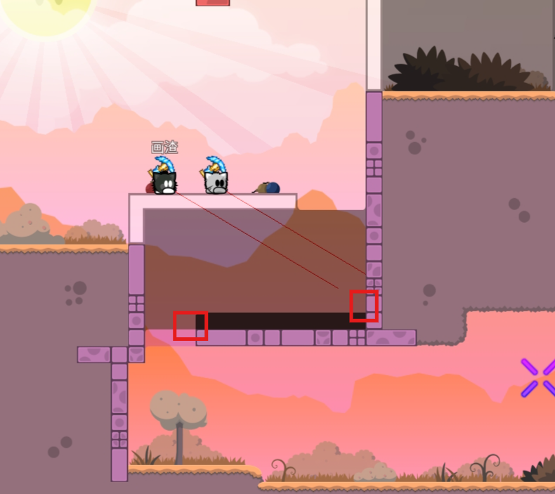
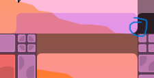
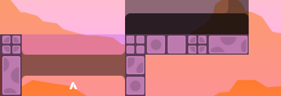
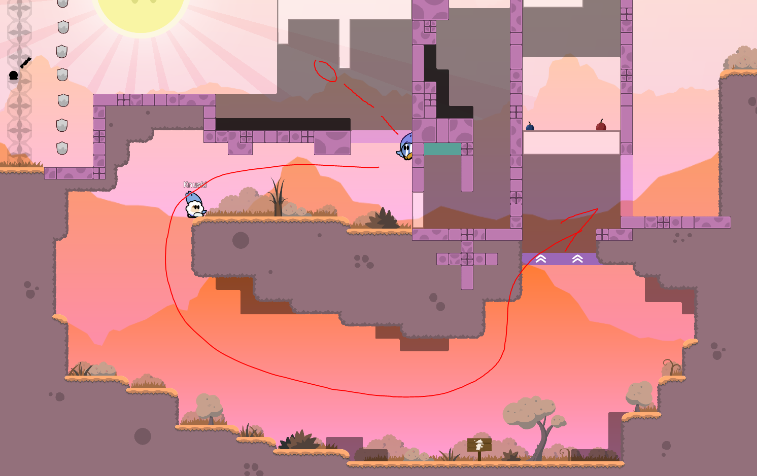
something like this ?
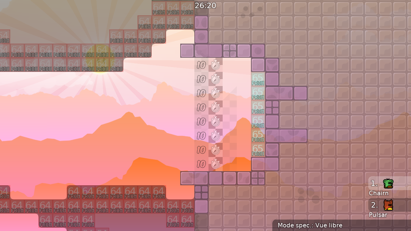
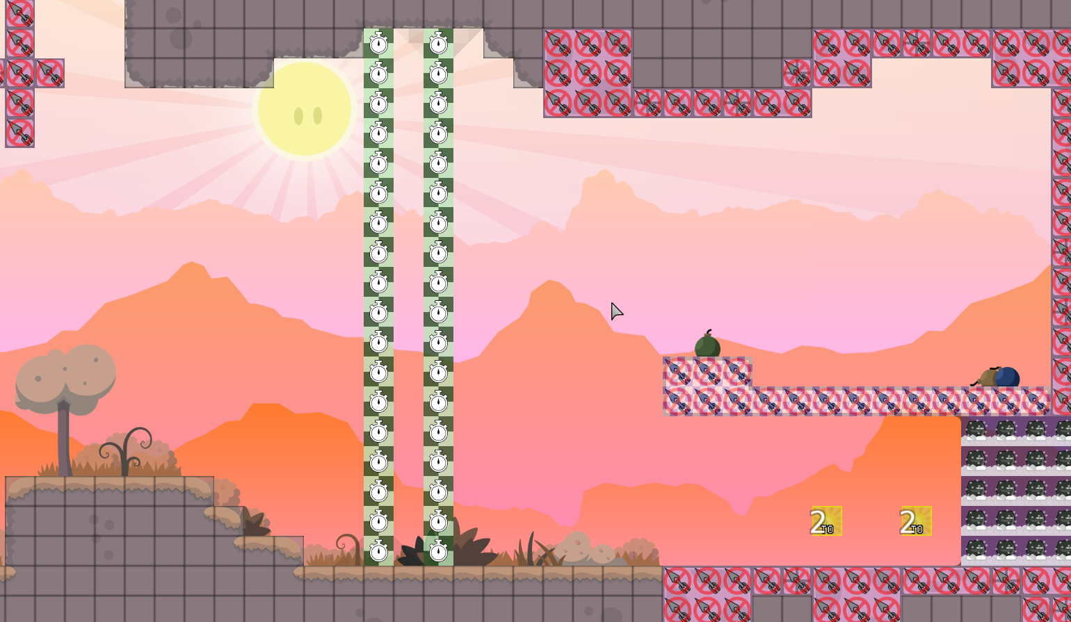
I can lower the teleport TO even further
Map filename must match channel name.
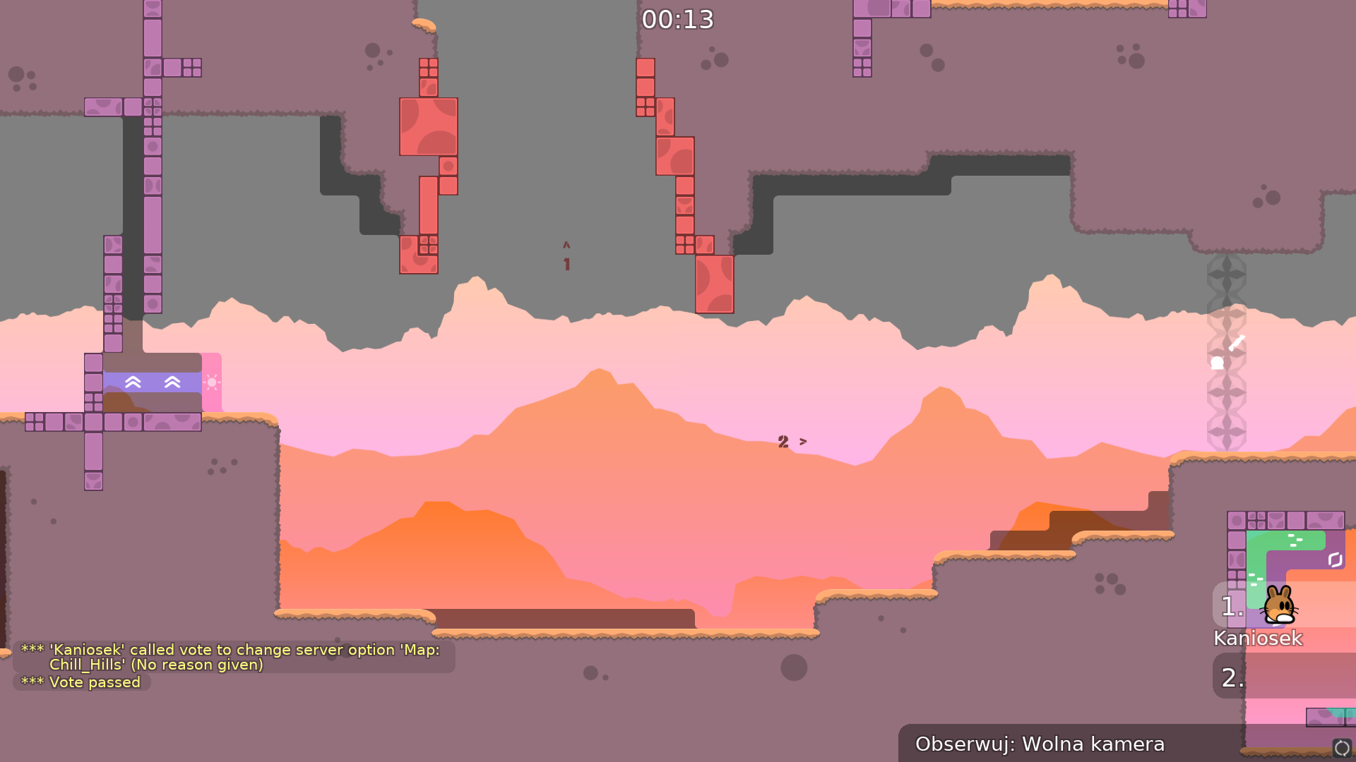
Chill_Hills.map
sure
feel good
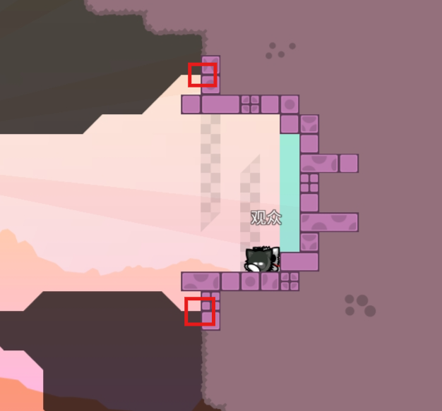
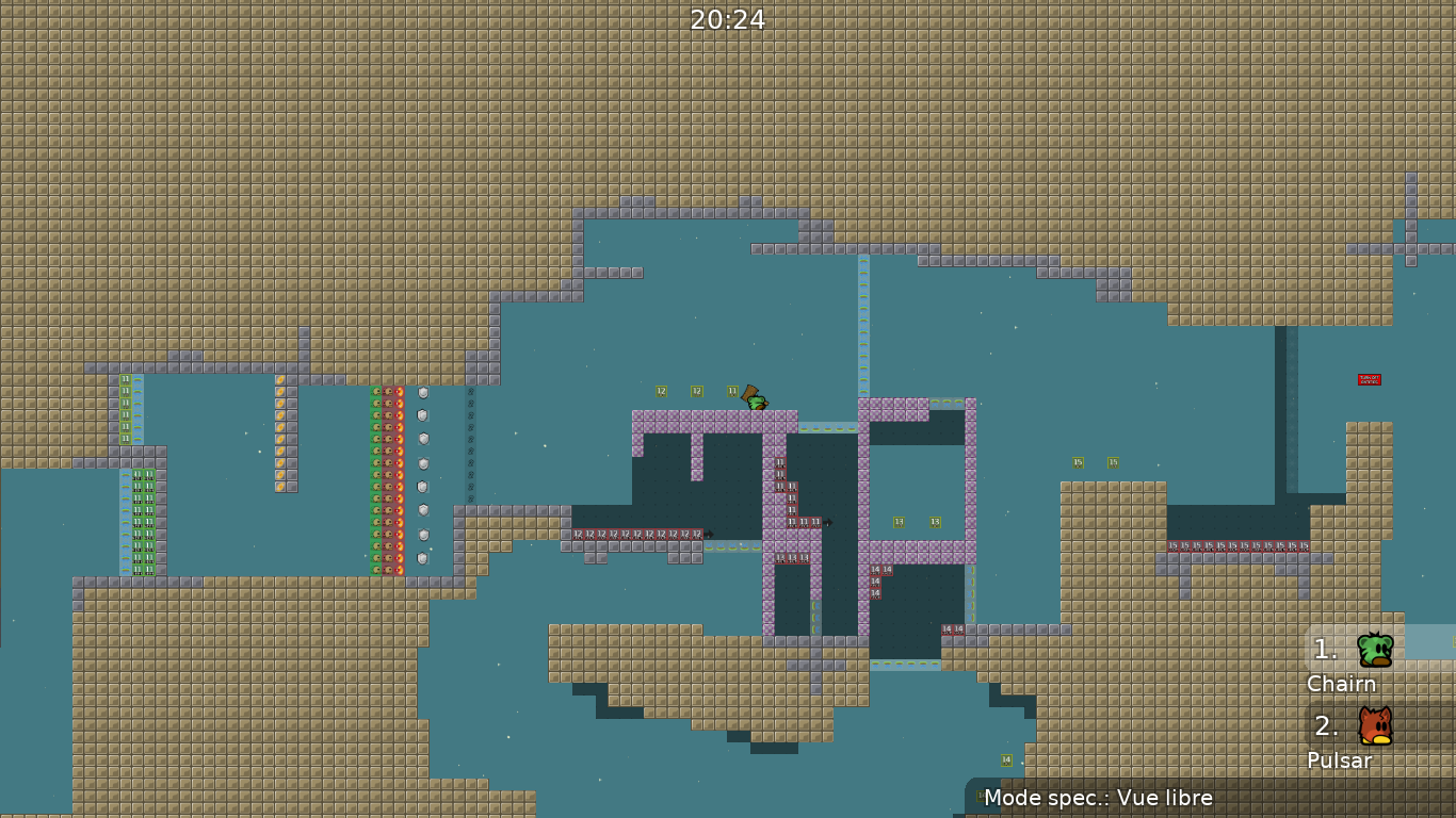
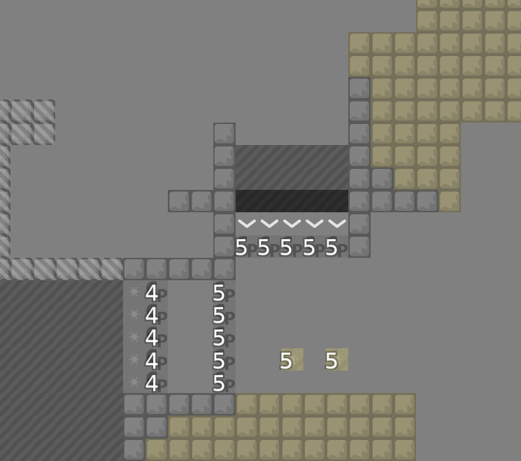
tele 12 , 20 , 22 , 23 should be different color
totele 2 , 3 should have unfreeze
i think weap 19 not needet
some stoppers have freeze inside some not
after you will do all changes
@prezes3333upload map here with name Chill_Hills.map
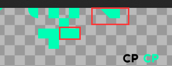
there is no time cp's
bruh
then u can skip whole part
i could do something like this
i replace whole part
I've fixed 5 skips and two Game Tiles issues in 2 parts
I can point out on the screenshots where
After removing the last skip. I don't think there should be any more
Sorry for the confusion, I had a lot of time today 😅
Looks like no enough space on floor (4blocks) where you have to get up so other guy hooks you
No , top
There I have to make a small correction because you can fall down. The idea was that you would jump in there with a doublejump
So ye u are right
That's much better
↑
Harmonize CORNER handling throughout the map
I don't quite understand, can you make it clearer?
I've made all the changes, but I don't quite understand what's going on with solo part ;p
I found 2 more bugs, one with corner, the other with the return teleporter (it was the wrong color)
it was antiskip
but I guess he didn't give that much
At the beginning of the building I did it, then I changed my mind to do it as it is on the map. I can change it if necessary.
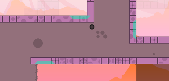
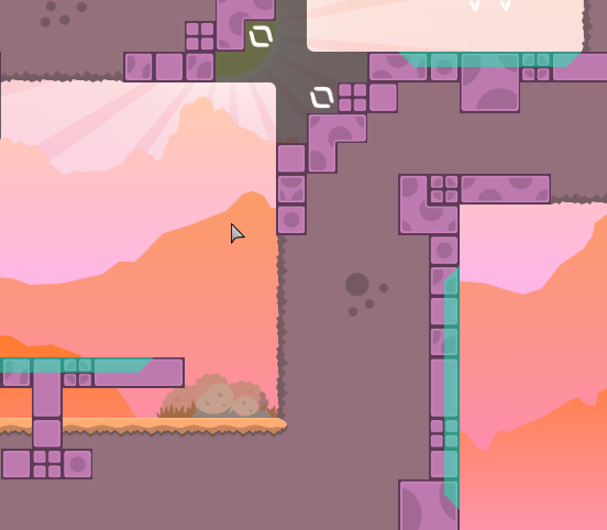
Here are three different ways Corner handles it Choice 1
The idea is good, but the disadvantage is that it takes up more space, you can use my program to make the map look a little neat, I think it is necessary!
So I've understood it well
oke
wait, let me know something
cuz im a little confused
sure
in these two cases
i mean this
u are talking about this ?
you want unfreeze to be the same way
?
ah this treatment is also reflected in Mellifluous, connecting grass state maps do not need to do corners because it's a pain in the ass, connecting bricks (hk, ht, unhk) need to do corners because of it's regular shape
The unfz in the first picture is connected to the grass and doesn't need to be corners because the shape of the grass is very irregular, the second picture has to be corners because it has a regular shape.
yep
so ?
I don't quite understand what's going on with this
These two correspond.
ye i see
oke
It's a little more aesthetically pleasing.
so lets back
u want to replace grass witch regular blocks ?
cuz this is clear
nah
You can do what I told you to do. I told you how to do it. Or you don't have to, because I said in my first message that they were suggestions.
↑
It's clear, but it's not pretty.
I'm running out of ideas on how I can connect 3 corners
can you give me an idea
sure
i could delete freeze and ufreeze
and replace it with stoppers
with unfreeze inside
it would make it easier a bit to connect
ye it looks better
You can do this all over the map.
what about this
?
So do what you do in the second solo part ?
what i did *
oke nvm
where
It doesn't matter, it's just talking about what you've sent
yes about this
I'll make changes in a moment
good luck
ty
are u still here ?
👍
it is also possible to keep grenade by shooting your teammate, no telegun should be before unsolo
same for start line
Done 😄
thx 😉
bruhg
these corners will get me sick someday
fixed corners
I changed the finish lines to resemble the starting line
Also fixed this
- I've changed the freeze here to be symmetrical to the stoppers
- unnecessary speedups detailing has been removed
- Speedups in unnecessary places have been removed
One problem with the structures has been fixed
- Fix 3 visual bugs
welcome new comer 😄
fixed 7 grass block corners issues
I hope there are no more bugs 😄
never hope i am veterant in it xD
In fact, I've said this to myself a few times... so yea xD
- fixed 4 COOORNERS problems
😂
it's not the last one
Last visual changes
good flow and interesting parts 👍
- Replacing all teleprts with CP ones
- Unnecessary teleporters have been removed
- small reconstruction of several parts
- Improved appearance of second solo part entities
- change the color of the subtitles to a more visible one
- Bullets have been removed
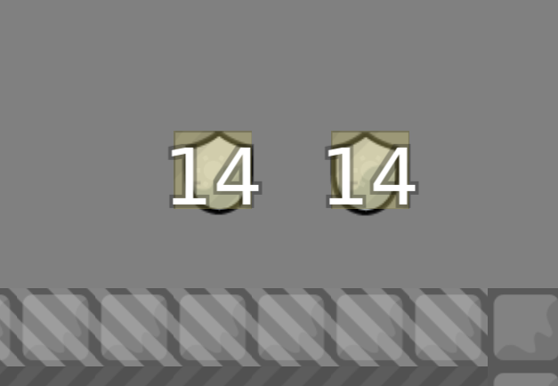
- Added gaps between ninja shields
- removed unnecessary blocks in the background as design
unfreeze
Very interesting map, you can do better

small change in one part
for better flow
👍
For now, try to remove half of the unnecessary stoppers, and speedup, making the map more interesting at times
gl ya
i think thats all
In the afternoon I'll add a fix to the stoppers with unfreeze

$change server moderate
$waiting talk to the mapper in game

It was room, not run

can i ask what is ur ingame name?
this map is fine for release idk what this whole chat even is
if u consider latest coke release
this map surpasses that by 5x
$request different tester
save me
- bigger spawn
- stoppers bg change
Huuuh what’s the matter with you
Good gameplay, but feels like ~4star novice for me
why you put all in hd, just put in hd sun, clouds, grass, trees
Why you put bg into hd xDDD
Is it important to anyone at the moment?
like wtf
xD
hmmm
btw its fixed
on the next file will be fine
I even forgot that HD quality option exists
All non gameplay related has to be HD, except the logo, shoutouts, the one who made the map, and those mappers that helps the player to do a part
And you must put it in HD because believe it or not there are ppl that teeworlds runs like shit on their PCs
i got it. I'm just talking about prioritization.
nnothing bad i think
The usual, but if you were a novice player you can’t know what tele hook is (ye is added on kobra, but is quite old tho)
i will delete fonts, and create own in gimp tomorrow for an explanation of how to make these parts
same - signs where to shoot and where to go first
2 skips removed
isnt that kind of a bad thing? gatekeeping map tiles and mechanics behind ratings? (apart from obviously difficult stuff, that by common sense is only seen in brutals/insanes).. as a new player i would want to see what the game has to offer, and since you can introduce "almost" any mechanic in a way for people to understand, (give them chances to redo, add subtle hints, map the part so its easy to read out of what someone has to do), i'd personally like to see more approaches where these things are introduced.
yeah, was either that (explain every "new" things, like telehook or using ninja through stoppers) or just put this as a moderate 1 star and therefore you dont need to explain it
your call
- added explanations to parts
- added little change to last solo part
fixed
Fixed
I will try to reduce map size under 900 kb
$waiting
you have not change anything what we talked in game
you just changed the color of the stoppers
What are u saying right now?
For now ive add parts explanations and stoppers color
I think adding unfreeze in other position in second solo part is pointless
structurally speaking
U mean all parts size?
everyone thinks it's nonsense
Including me
ye, and stuff like this
who is everyone
if is a tester that dont thinks like me, could be different
Dude other maps who has been released are tighter than mine
Im not talking about old maps
and that shouldnt be done, that some of the thesters ignore that is different
For example: i asked for
@texnonikto change that issue on his dummy map and he didnt, Quix told him the same at that time, now the one who released that map should have told him that situation.
but im not responsable for every release and testing
where ?
in essentials 2
Dude, if you want to discourage me from making any maps, you've succeeded. but what you say has nothing to do with what I see on the maps that has ben releasd
Wtf
you literally expect it to change the entire map
you understand, you want to follow the rules without at the same time not following them
XD
map is not tight
and it's definitely novice
this is how it's supposed to be, I'll change it at the end
as long as this end comes
xD
but I agree that the first part is too close to the spawn
I will try to change it
I think you don't understand; it's not that I'm following rules and then not following them afterward; that doesn't make sense. I'm simply sharing common-sense observations about creating maps, specifically for team 0. From the beginning, when you joined the server where I was testing maps, my only suggestion was to adjust the structures in certain areas because they were a bit tight. I also suggested that you always imagine yourself on Chinese servers, as that's where the majority of players are concentrated after Germany. In light of that, I recommended creating more space in certain areas I mentioned (not all, as you should understand which ones).
On another note, what I suggested on some point was you could remake the map with the steps that i said, may sound drastic, yes. However, it was an example of what you could do to enhance the map's structural integrity. Typically, when you make adjustments over existing parts, they don't turn out quite right. Therefore, I wanted you to consider the appropriate action to take. And as i can see you didnt do anything of what i mentioned to you (structurally speaking)
I can do this by giving more space wherever possible. but I won't change the entire map because that's what you "suggest"
Or "i could do"
I could have made it so you would have too much space, but I didn't
- added some room at the start + solo part to the beginning of the map
- added cps in timecps
fixed
fixed
Fixed
Again……Just change the parts that need space
I'm going to change it today, where possible.\
almost every part
Today I'm going to make one more update to reduce the size of the map (KB) and change chronology of teleports
- Texture repair
- Reduced map size
- tps chronology
- removed unnecessary shields
- Texture enhancement
Pls ready this now
yep, should be ready
- A few graphics changes
- Increase space in one part
to
i think its done

pls ready it
- Texture Repair
when rls
- more space in winners room
- improvement of one part
- Added one sign in solo part
Done
👍
When rls
It's his first map, he fixed a lot in a month, the gameplay is good, there are no major problems, we shouldn't be too nitpicky so that new mappers stay motivated
can ready this map👍
-why put a noob filter for this map + the filter is not failly, it's just a lost of time -gameplay is not good everywhere, specially in some solo -gameplay is not balanced sometime it's novice 3* and some time moderate -bad use of cp and spawns -bad use of blockers -bad use of weapons (laser, ninja, shield...) -bad use of all other entities in general (tele gun, 1 jump, tele hook...) -bad use of speedup +some other little things
if the gameplay was rly good, I would maybe let you fix, but there is too much problems, if you do a big rework, you can repost the map, but take time for mapping, and try to think "how can I make it cleaner"
$decline
missing a good novice map
missing a good novice map
To be honest, this is a mess. Arrow has given feedback and he has tried to fix a lot, done his best. Several players have tested it and found the map to be good. Your feedback is super petty, I disagree with most of the points.
Objectively, the map is not bad, people who tested it pointed out that it was enjoyable. Bad use of entities is not true imo, you can't make complicated stuff on given difficulty + it has signs to help new players understand parts. Bad use of speeders and blockers is partially true, but it is minor and can be fixed in few hours at maximum. Noobfilter is also a minor problem, it can be easily deleted or changed. As i played i didn't find really unbalanced places, even if there are, they can be fixed in minutes (would be cool to point out them to mapper too). Declining this map is unnecessarity, considering things can be fixed quickly and the map is not bad. That's a huge demotivation to a new mapper.
Not moderate map imo
It was submitted as novice
it's not rn :c
as I mention : he can rework and repost it, if he want, I can give him a feedback with more detail.
the map doesn't stand out from other maps for entities, it's panful to watch and the part are not complicated. all the bad use and noobfillter is not minor, the map have to be clean and the most enjoyable possible for the demotivation, 95% of the mapper start with a decline map, and you can't use argument like "it's new mapper so u have to rls"
dont worry lil man for ur next map either try to make a novice map with full hookthrough parts and some unfreeze or you can maybe try some boring ass hh map with reshuffled parts and rename urself to one of the testers friends if none of that works maybe try be more creative, but also not too creative because then the parts wont feel enjoyable to play best of luck!
- It definitly stands out to other new novice maps as it is not only ht
- how can you say its "painful" to watch, maybe there are minor problems but its definitly not "painful"
- if it has to be super clean, your limited in your creativity
- 95% of new mappers get their map directly declined
He got feedback, fixed and invested a lot of time. I wrote with him ingame and hes kinda frustrated, already left the dc server once and deleted this map from his pc xD
The issues with this map can be fixed in 1 hour if you give him examples why everything is "bad use". Maybe write with him ingame and show him directly, the way you have written it only frustrates.
To be honest I kind of agree with VéNa.
The map is not bad but it just looks like the mapper wanted to use all DDNet's features on the map even if it meant to use them weirdly or for no purpose
For example, the ninja is completely useless on the map. Removing the dj from novice players just to make the shotgun part unglitchable is kind of akward. Presenting the nade to the new players as a way of teleporting yourself is completely wrong in my opinion.
Also the map has indeed some interesting parts and is different from most of the latest released maps in novice, but some parts are also taken/inspired from other maps and have nothing new to offer to players.
We also have this problem of unbalanced parts, the map is impossible to fail even for novice as there are tp's in every single part so it cannot be rated above Novice 3 stars imo, but we also find some parts laid out like moderate parts and some other that just require a single hook to be done.
So indeed most of the map is good but considering we would have to rework almost every solo parts + change some parts + adjust the others to make them at a same level of difficulty as well as deleting the noobfilter and reworking a bit the spawn, I find it fair enough that this map is being declined for now as the modifications would include 60 to 70% of the map.
Played through. Gameplay seems like a year 18~19 novice map. Some parts for the beginning, and then a solo part, and public part, and solo part... till the ending. Overall, the map style itself is hard to change, or the mapper have to rework all the parts to make the style modern. So i think it shouldn't be released, should work hard on next map. But the tester shouldn't use this kind of reasons to decline it, the reasons may be right, but they made others feel ...unreasonable.
which is funny to say because the maps released in 2018-2019 are overall better than "modern style" maps released today
The decline is Something we have to Accept since thats what testers are for and we can be Happy they Take their time to play, analyze and review - IMO the reasons for the decline are formulated quite harsh and Sound really demotivating for someone who Just started. Declining is fine But WE should keep friendly Sportsmanship when doing so - it Just makes them Not wanting to publish another.
map is way better than one of the more recent novice maps released imo, and im sure it will be better if he fixes the issues
I just tested the map to understand better what was this about, and honestly the map as it is is already better than most novices released last year. It goes a bit over the concept of "you hook me. you wait. I hook you. I wait. we repeat". I wont go into much detail as it's already been declined, but a few things really did seem strange. I enjoy the idea of using a lot of techs, but a novice map may not be the best idea to introduce so many new concepts + some of them felt weird like the tp gun on a sg part, or the hook tp which comes a bit out of nowhere, could be confusing, and is only used by 1 game. I'll stop here but yeah, overall seemed a nice, chaotic, fun map
So, if you think this map is better done and executed than semang for example, you don’t know what you are talking about
Thanks bro
im still trying to figure out where he mentioned semang
which is also funny to mention because if you put semang next to other released maps and turn on entities, 70% of players wont be able to say which map it is xddd
Not related to this channel but that leads to the question if maps with the same gameplay should be released over and over again. That was 2 years ago:
The ONLY 2 maps that didn't have ANY generic part are open lane and chobo. and by the screenshots you can clearly recognise them. (and kinda circular, but the whole idea of circular is... well, the same as every other but on little corridors)
Ofc every map had its own tries at being original, but for most of them it consists of like.. 10% of the map? While staying the same for the other 90%? (I have screenshots about parts I do consider kind of "new", but I don't really want to spam more ss for now)
THe issue about chill_hills. it's mostly that it's wayy harder to map than all those others, because it tries to introduce very simple concepts of a LOT of new techs while still trying to stay clean with good parts overall. So it's just adding a level of difficulty on top of what most of the other maps did
I had more fun testing this than playing some of the released novices. This map could have gotten fixed withouth that much trouble. Fixing some unnecesarie fails, reworking some parts, removing some techs, even maybe changing a few colors from the design (even though it's already prettier than a lot of maps xd).
And btw this whole rating system is a big mess. it makes no sense. How is this moderate when the only moderate thing it has is a solo. For the past few years new easy maps have been rated WAYY harder than they should, making past moderates look brutal in comparison.
and even on new ratings it makes NO sense. Open lane is as hard or barely harder than teeasy, and one is 1 star while the other is 5??
it was novice first
I know, and testers changed it to moderate.
Thanks bro
please compare the two maps again and see where the differences are
what do you need to know to finish the map without any help
Isn't the issue here that a good map != An interesting map?
Chill hills is fine for us since we understand the mechanics of the game well so the part seem fine to us, but for newer players they may not understand what is happening
Thus is a reason why a lot of novices seem boring and repetitive to us, there's a lot less room for creativity in them imo
Exploring a large variety of mechanics is bound to be confusing to newer players, so it requires a lot more hand holding which this map doesn't seem to give compared to others
We just aren't the right demographic for this category of maps, since most of us play brutal or harder maps from what I know
To be honest, it's a really good first map! There's some good gameplay, different mechanics and there's also something in terms of design. But all of this still needs to be improved somewhere, and not just a little. Basically, the map is pretty unbalanced. Some parts need to be simplified, some made more difficult. Some stoppers and speeders could be removed and entities in general could be better placed.
The structure could also be adjusted a little. At the beginning you have a lot of space in the middle of the map and then it gets pretty tight - you can see that especially when you zoom out a bit.
The different use of Tele and CP Tele is not necessary, one of them is enough - no matter which one. Everything can be mapped in such a way that it is somehow coherent.
In any case, I would advise you to rework the map. It definitely has potential. As a start, I would personally go through the map again and ask myself about each part:
- do I really need all this (stopper, speeder, ground freeze, unfreeze, etc.)?
- is there enough space even if 10 tees are here at the same time?
- is the difficulty of the part similar to previous parts?
- does every player understand the mechanics without having to be given any information? And if not, where is the info? Is it clearly visible?
But from the assessment so far, I would also classify it as mod 1-2* - without any changes. 🙂
So basically, yeah we should rise the expectations on novices. Beside with the time player skills are going to get better and better, but the maps are not getting harder at the same time 🤷🏻♂️
The thing is too much work, there are like 2000+ maps
should we discourage new mappers from mapping novice though ?

