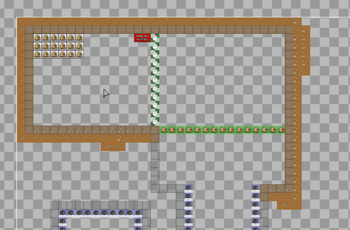
this is your map's testing channel! Post map updates here and remember to follow our mapper rules: https://ddnet.tw/rules
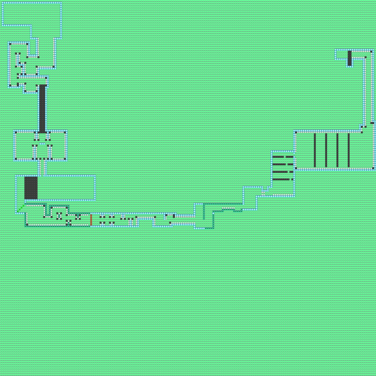
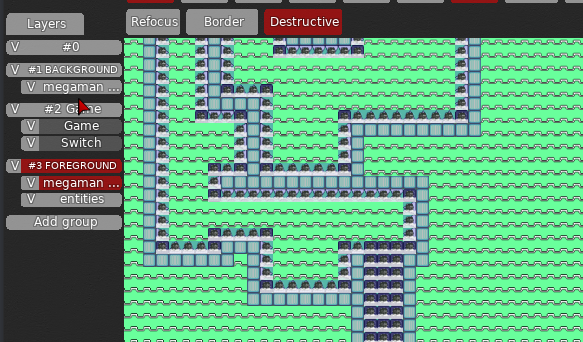
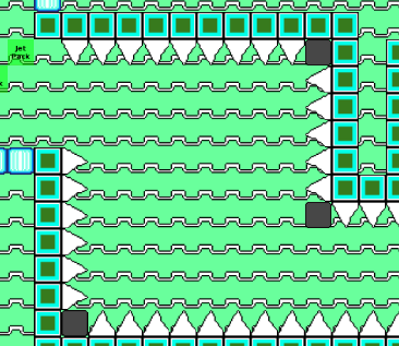
this map is an attempt at trying to do good decoration, its still notr good decorations though.
its definitely better than ur last designs
try to have some contrast between the background and the foreground
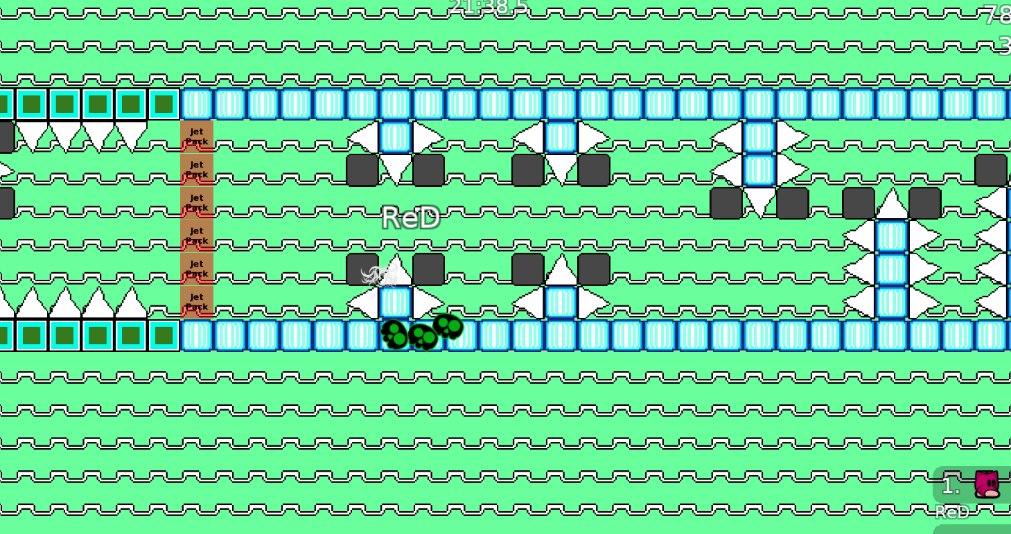
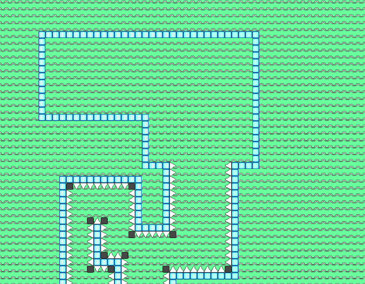
in this map, the background is bright green and the blocks are bright blue, so it might be an eyesore for some
$decline For the same reason as your old map Take your time and don't rush mapping !
w8 i send tips in abit
thanks for tips
coach him b4 submitting a new map 😂
ok
yes he has a good point
i will write essay now
DDNet maps have two aspects when you're creating them - Gameplay and Design. While both of these matter, the one that matters the most is Gameplay, so I'll be testing the gameplay first.
Gameplay is the tile makeup for your map, so whatever you see when you use entities. Gameplay tiles are placed in the Game, Front, Switch, etc. Layers and don't require images to be used.
Let's start with the spawn
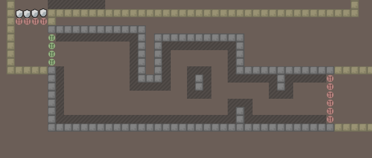
For a solo map, you don't need so many spawns. Solo maps are meant to be solo, so you only need one spawn.
Solo servers automatically make everyone in solo mode so you don't have to worry about tees colliding. Also, place your spawn on the ground so it's easier for people to start the map
- u dont need solo tiles since server is already in solo mode
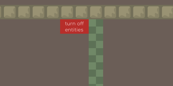
you only need turn off entities if something in design is an important instruction or if there is a logo
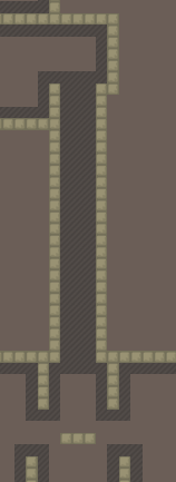
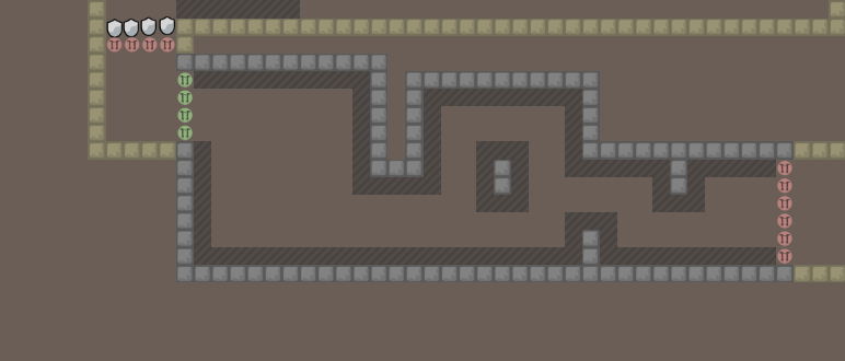
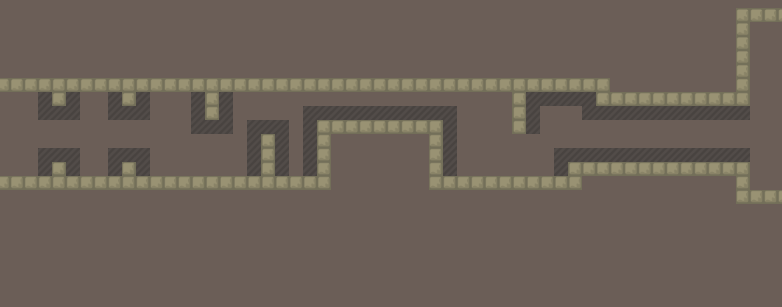
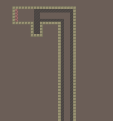
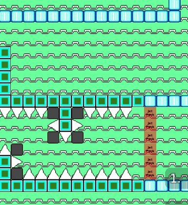
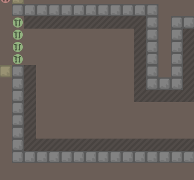
this tunnel does nothing, and there is no unfreeze at the bottom
so it's just there to waste player's time, which isn't really fun
you should put unfreeze at the bottom so people don't have to wait
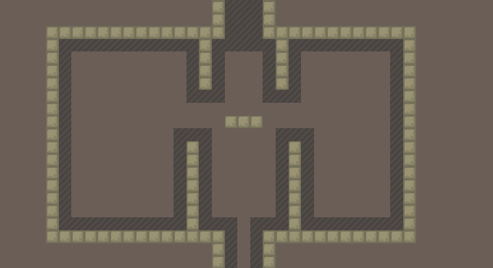
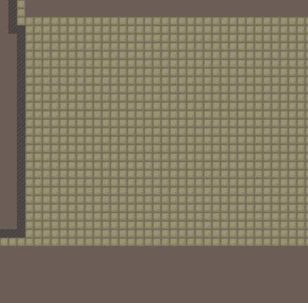
you have empty space to the left and right
it's totally fine to have empty/unused spaces for decoration, but here it's not even symmetrical so it's not very decorative
The part right above nade is kind of annoying because you have two hookable blocks with freeze on the sides which is really crammed
Also, it's pretty nice to see the full nade if you have the space for it. I only advise putting weapons inside blocks if the part requires it. You could just put the grenade below those two blocks or to the right where people can see it
also you don't even need grenade for the part, you can just use hook. make sure to test your maps so no parts can be cheated
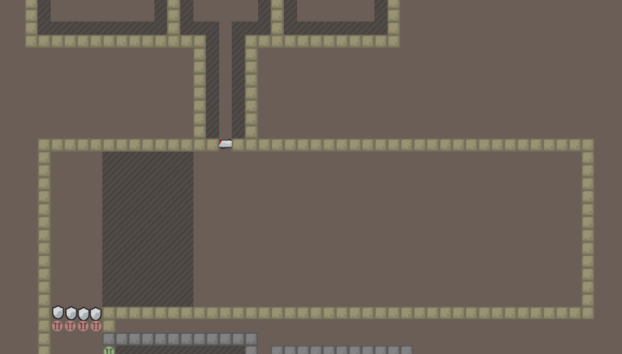
you don't need the jetpack off aat the left side because you can't cheat with it and there's no point in going back in a solo map (however, you would need it for a teams map)
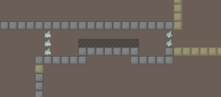
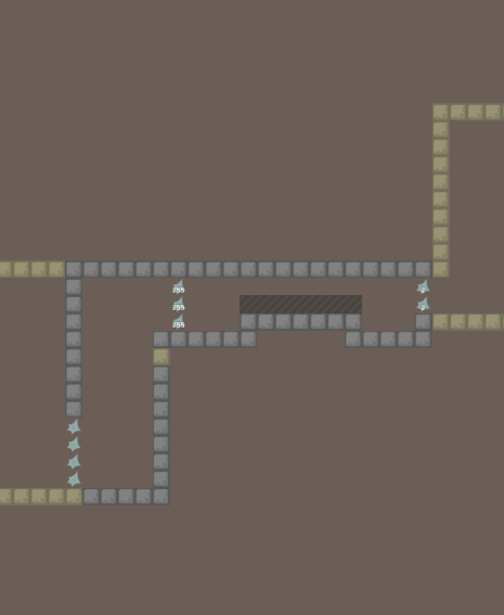
these don't work, you put the number in the wrong category
ok
those are all the Technical errors I found (these are bugs and skips that weren't intended by the mapper and should be fixed)
Now I'll list some general gameplay errors, which will be how fun the map is and how the flow could be improved.
This part of the map is pretty boring.
It's basically a bit of gores, which is a style of map where the only objective is to go through tunnels of freeze
It's not really good to have too much gores on a DDNet map.
If you want to map a full gores map, you can go to the KoG discord https://discord.gg/ed2hv2K and submit your map here
but not on ddnet
This part is also very bland
it's just a single grenade (which you don't need)
assuming we don't cheat, all we do is fire once and go to the left which isn't too fun
maybe try adding diffeernt nades or forcing the player to use different angles.
It's sort of a let-down when you give the player a rocket only to take it away after one grenade
You also don't need to only shoot the rocket at the ground, you can also shoot rockets upwards and do a double rocket or use different techniques
get creative with the parts
this jetpack is also very boring
you just go from left to right
it's also really tight and faily, which isn't bad, but if it's boring AND tight and faily it's not fun
you could go in different directions and force the player to change what angle they're shooting at
or maybe take away jetpack for a moment then force the player to double-jump and then get it back
little changes to these parts could make them more fun
again, too tight
nobody likes doing small movements in tiny corridors (maybe some do actually), but that's not really what DDRace is about
try to use the full moveset of the tee instead of just requiring very tight and small jumps in a little corridor
this part isnt bad but the switches don't work
too hard
also way too faily for how hard it is
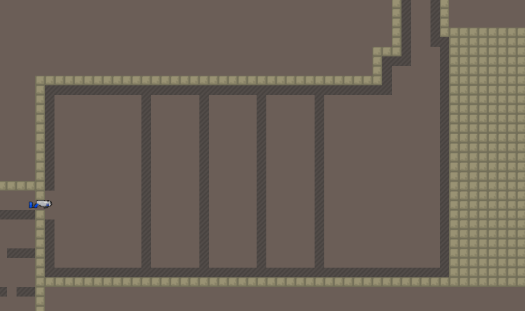
repeating the same laser move 4 times is boring especially when you have little space in between them
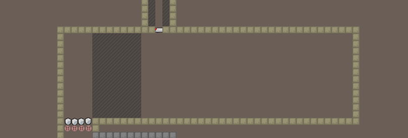
this is a technical bug i forgot to mention, please dont put tiles on the border unless you want them to go to infinity
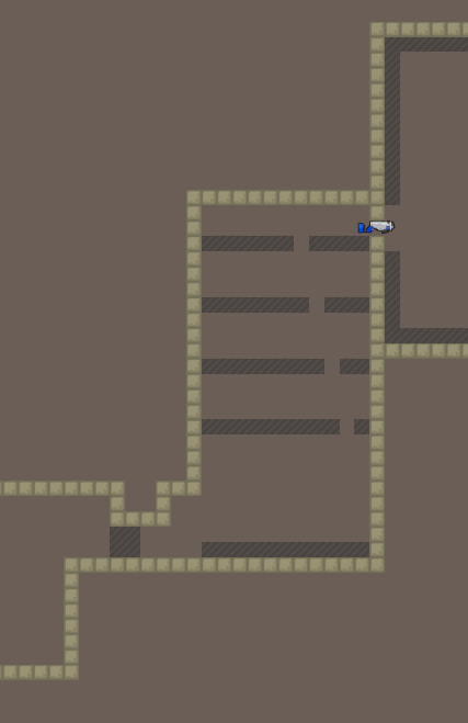
this huge corridor is kinda too long
it's just a timewaste, they already got the idea after a few hooks
- its gores again
try to just make different parts
ok that's all i had to say for the gameplay
now for the design
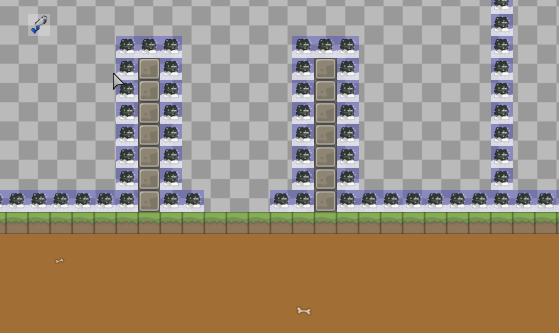
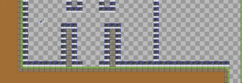
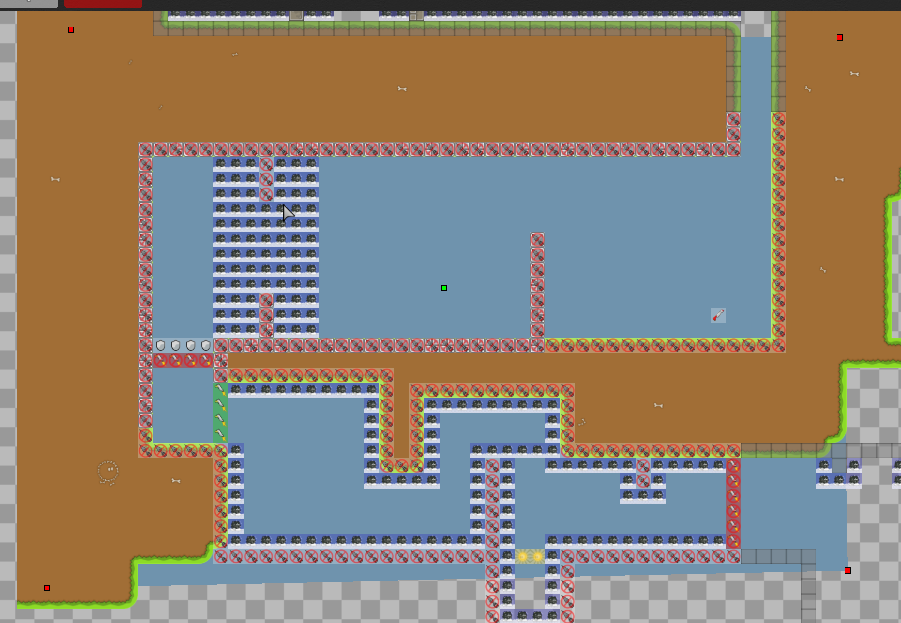
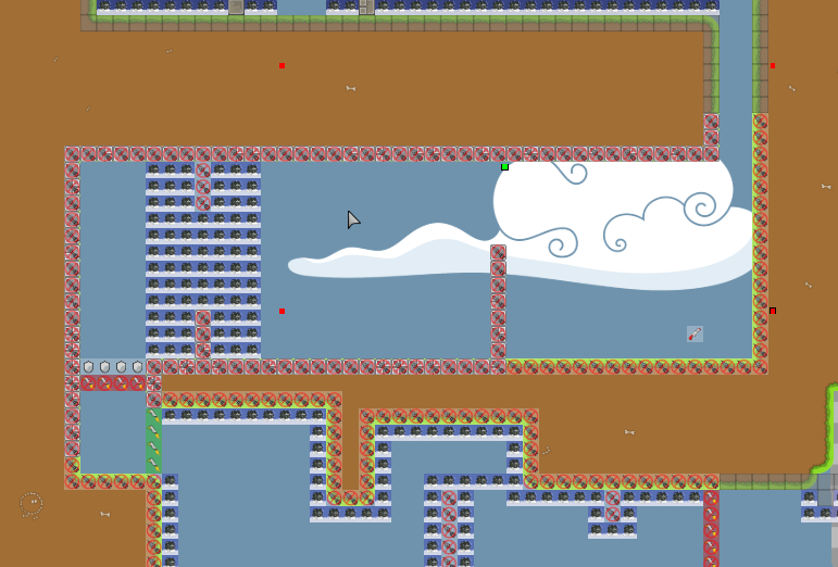
the background is way too filled
its very pattern-oriented which is okay
but its green, black, and white at full transparency
this can be a hurt to the eyes
also, its ahead of the game layer which means u wont be able to see ur tee
put the background tiles BEFORE the game layer and the foreground (the tiles u stand on and whatnot) AFTER the game layer
this will help u stay more organized
you only used 2 tilesets
which is very limited
use more tilesets so you can design better
and your tilesets should try to fit to a single style
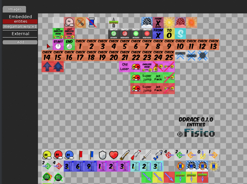
you have pixel style (which isn't tooo bad for teeworlds) but you also have this janky "Jet Pack" entities tile which does not fit
Also, you have multiple tiles for freeze
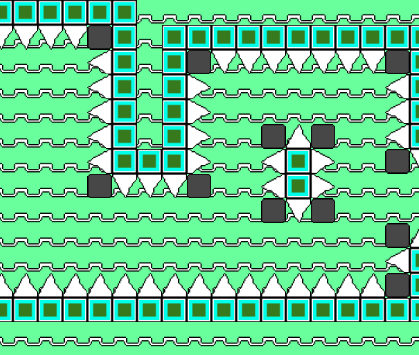
idk why a spike is a freeze
a spike would kill you in most games, not freeze you
also, the black block has borders which is pretty ugly
as u can see, u have both a spike and a black block for freeze
u shouldnt have 2 different designs for the same block
or else its confusing
here
i'll show a really quick and easy way to get a decent tee-ish looking design
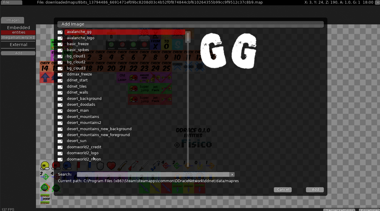
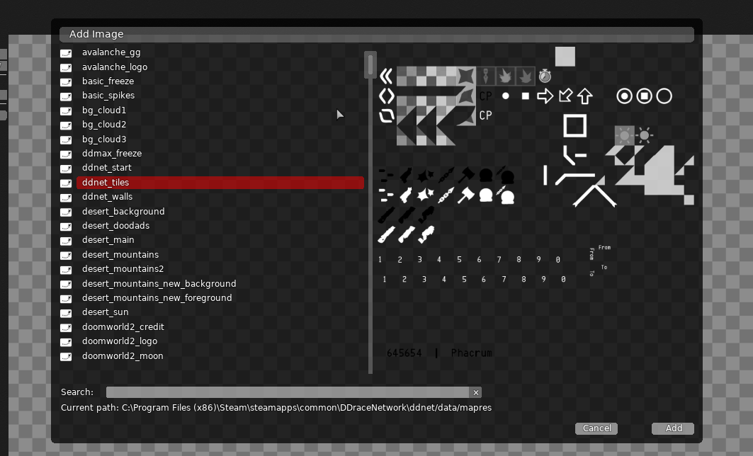
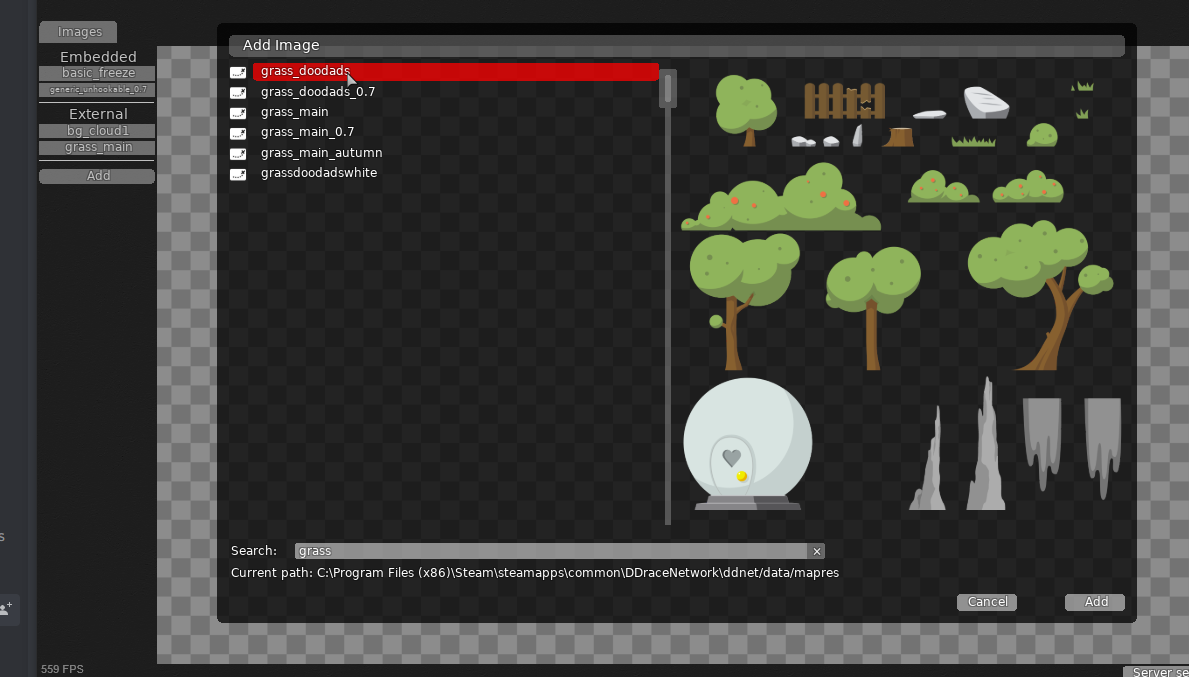
step 1: add the correct images
u have a full folder of images, but its important to use the correct ones
let's start by marking the gametiles, then we can do the background and decoration.
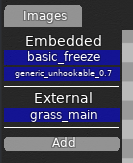
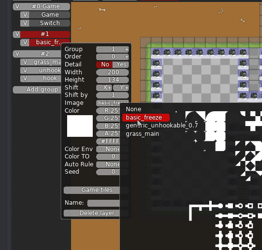
for gametiles, i'll use 3 basic images
basic_freeze (which i'll use to mark freeze)
generic_unhookable_0.7 (which i'll use to mark unhookables)
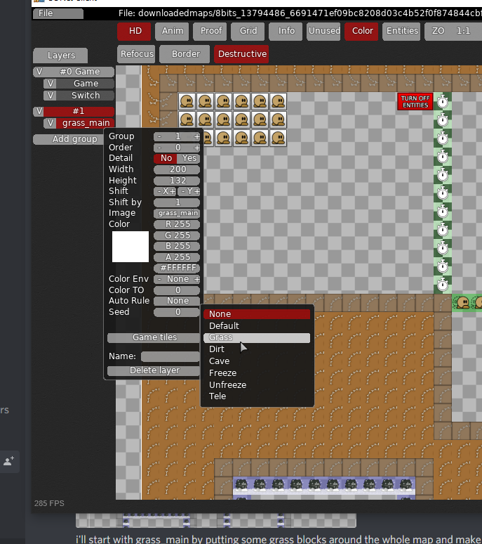
and grass_main (which ill use to mark hookables)
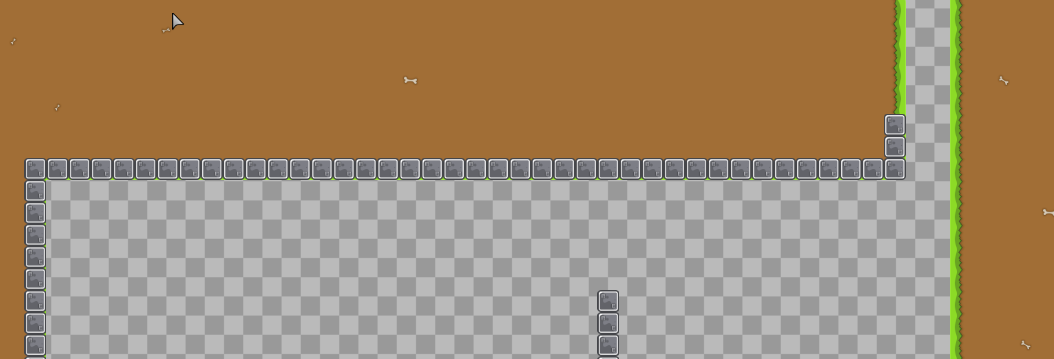
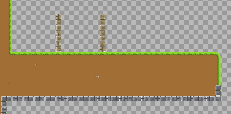
i'll start with grass_main by putting some grass blocks around the whole map and make sure not to put any inside the parts
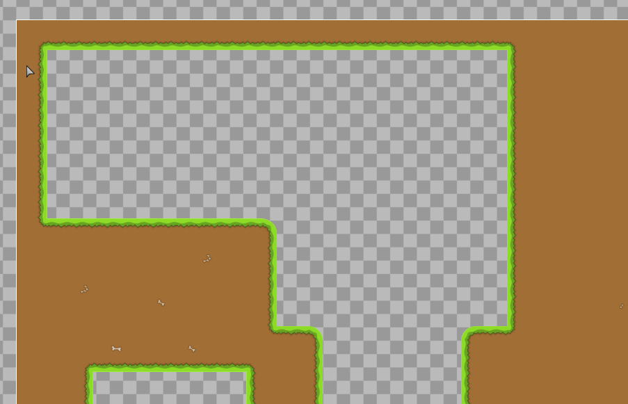
then, after i filled in the whole map, i'll automap the grass layer
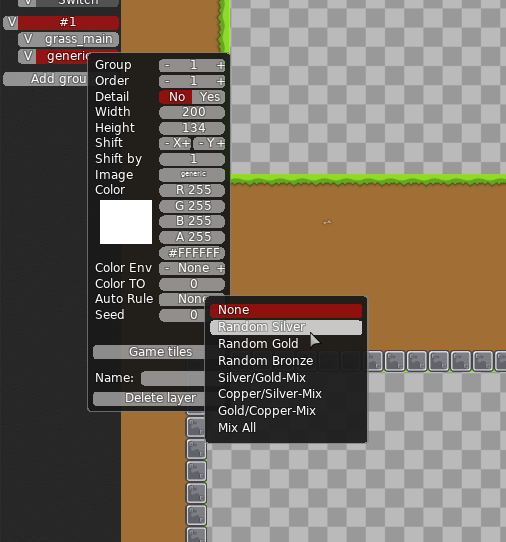
You can do this by selecting an auto rule and clicking automap afterwards
Then, it'll look neat like so
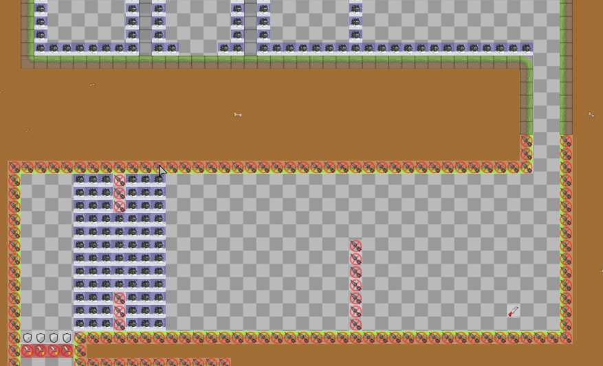
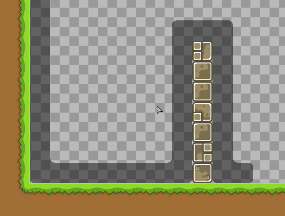
now it's time for the generic unhookables
wherever i see unhookables or 1-tile hookables i'll use these blocks to mark them
Let's start with the unhookables
I've placed them where I want
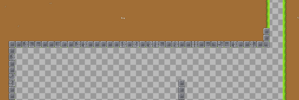
Now I can use the auto rule and automap function to make them random silver blocks
Now it looks better since they aren't all the same block.
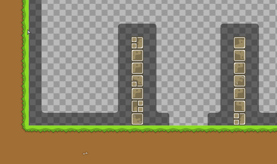
Now, time for some hookables
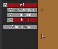
make sure to create another layer
or else you wont be able to automap them (because it will override and change the previous blocks
I'll put them wherever I have 1-tile hookables (but not the outer layer - we already have grass there) because grass_main doesn't have any tiles for these
Then, use random gold automapper and automap
boom, we did most of the work for tiles just like that
Now, it's time for freeze
add another group and make sure it's below your grass_main and generic_unhookable layers.
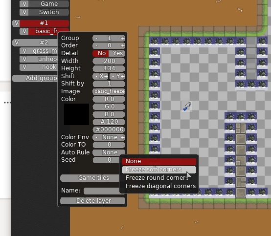
add a tile with basic_freeze as the image.
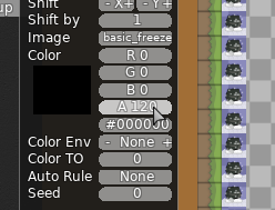
freeze is generally black with half transparency.
you can edit the color values as so
now we can draw a freeze tile over all our freeze
Again, automap it. I'll grow with freeze soft corners.
However, the automapper is not perfect, as you can see, there are some gaps. so, change the tiles to fill in the gaps.
now it's fixed
you can also use the ddnet tiles to mark things like jetpack and infinite jumps.
Finally, it's time for a background.
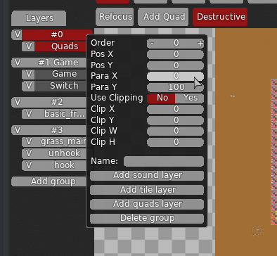
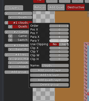
Add a quad layer below the game layer and make sure the para X and para Y for the layer are both 0.
if the para X and para Y aren't 0, it won't work.
add a quad and make sure it fits the whole screen without any gaps. change it to a nice sky color
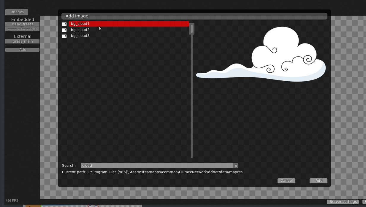
you can add clouds with these images
add a new group between the game and above the background quad
you can make the para X and Y around 0 but a bit above it
so the clouds move a bit when you move around in the map
add a cloud and there you have a nice cloud in the background.
you can finally add decoration with grass_doodads. i'll leave that to you to figure out how to do.
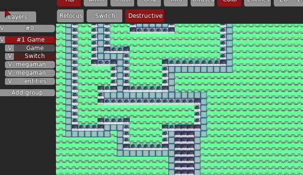
and if you still want some more help, i made a little rework of this map
it still has a lot of bugs and is far from a releasable state, but maybe it can show you what i mean about the stuff i said
i made some of the parts less tight and made some more complex
and you can also see how the design is organized in the editor.
but
even with all this help, the most important thing is to test your maps before you submit them to DDNet.
testing your maps makes you a better mapper (because you can learn from your mistakes and improve the parts) and also makes this whole testing process a lot easier
maps that are already tested get released more than maps that were barely tested on submission.
additionally, if you're struggling to get creative parts, try to play the game more.
increasing your skill in ddrace as a game will make you a better mapper
playing other's maps can introduce you to different parts and techniques that you may have never thought of, and you can then use that as creativity fuel in a map
good luck, and please follow my advice before you submit more maps :)
wow, amazing job
Hq tester
i nominate louis for mod of the year
agree

take my place
@louissuputa madre va a leer todo eso
ni yo se por qué lo lei todo
Probablement perquè ets un gran nobo
i am gonna agree,
yes
