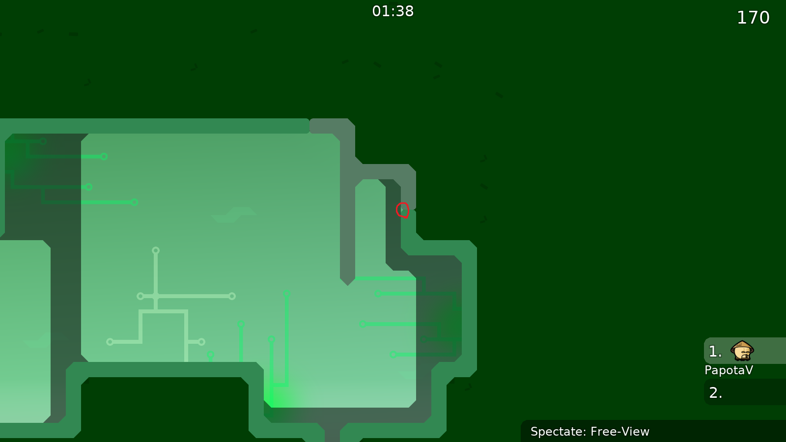
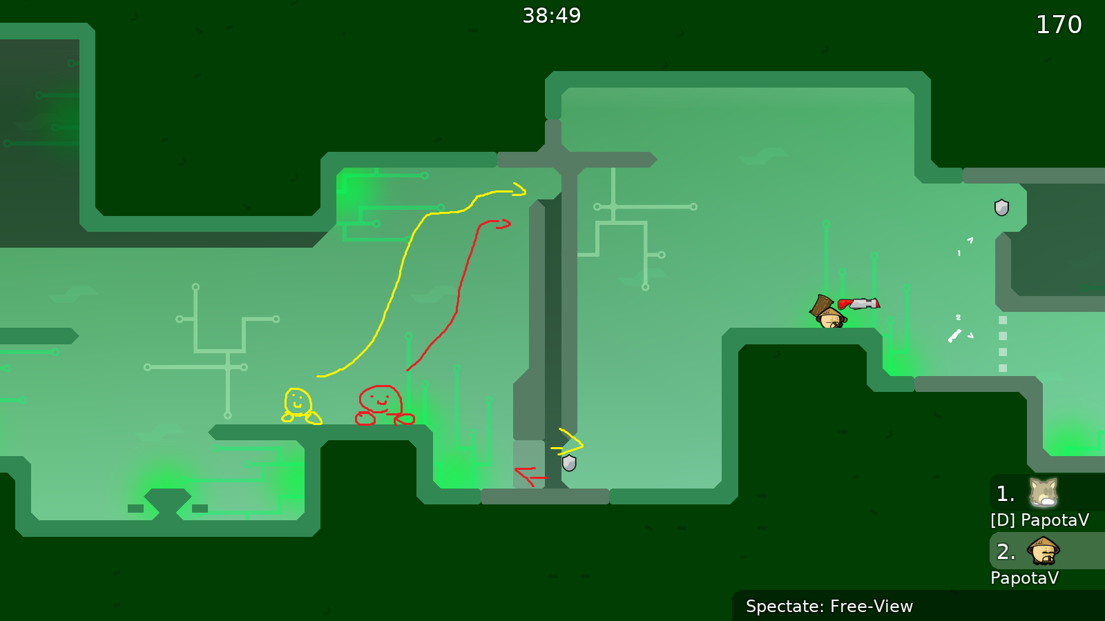
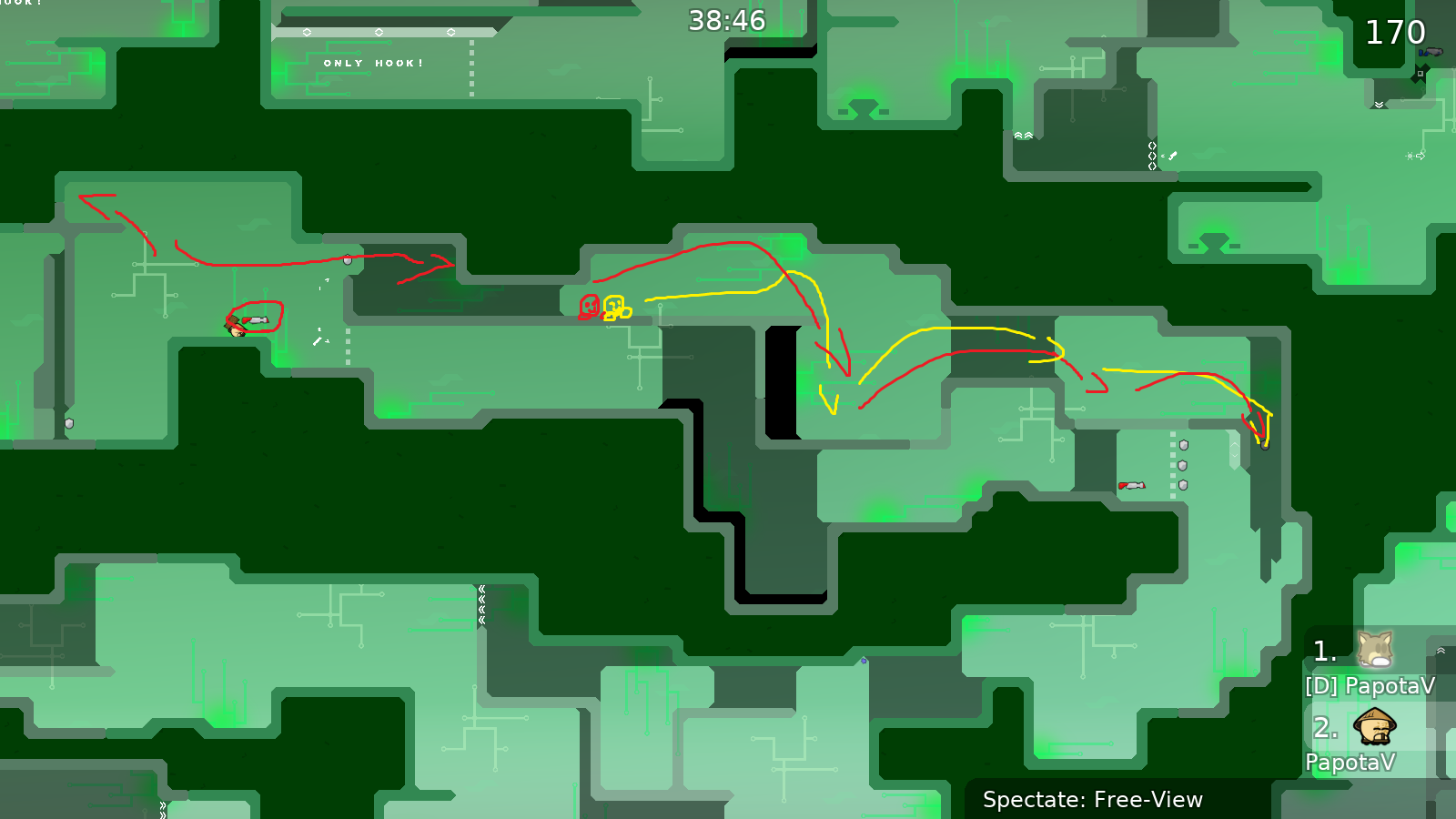
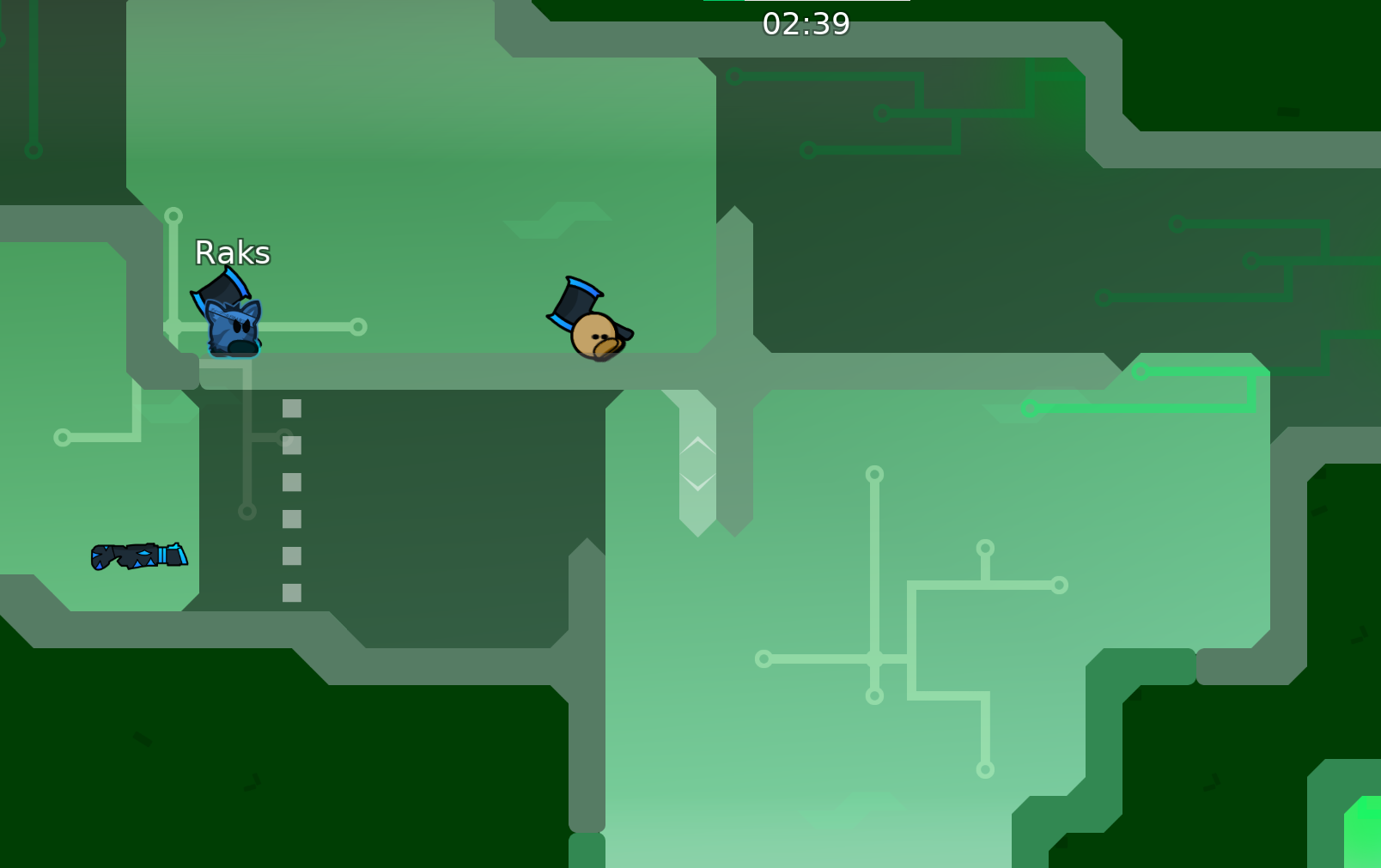
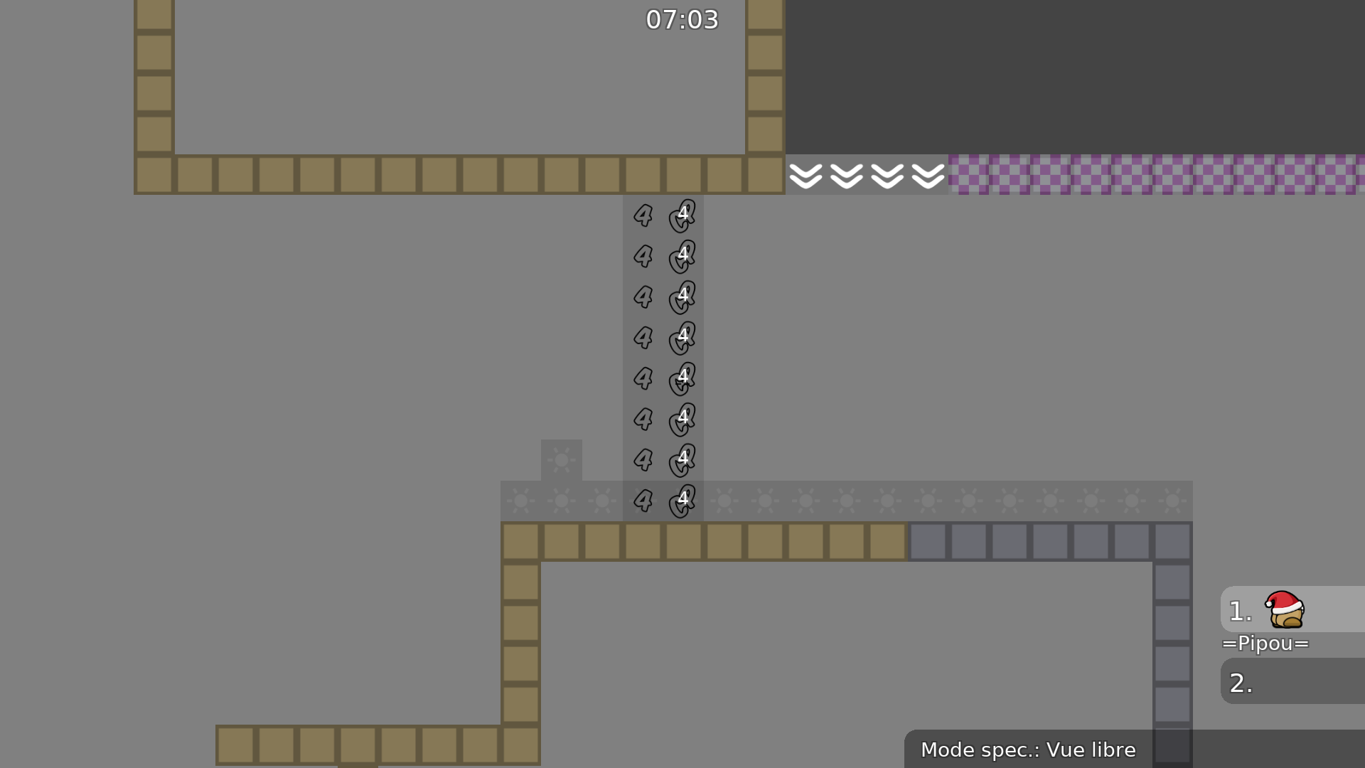
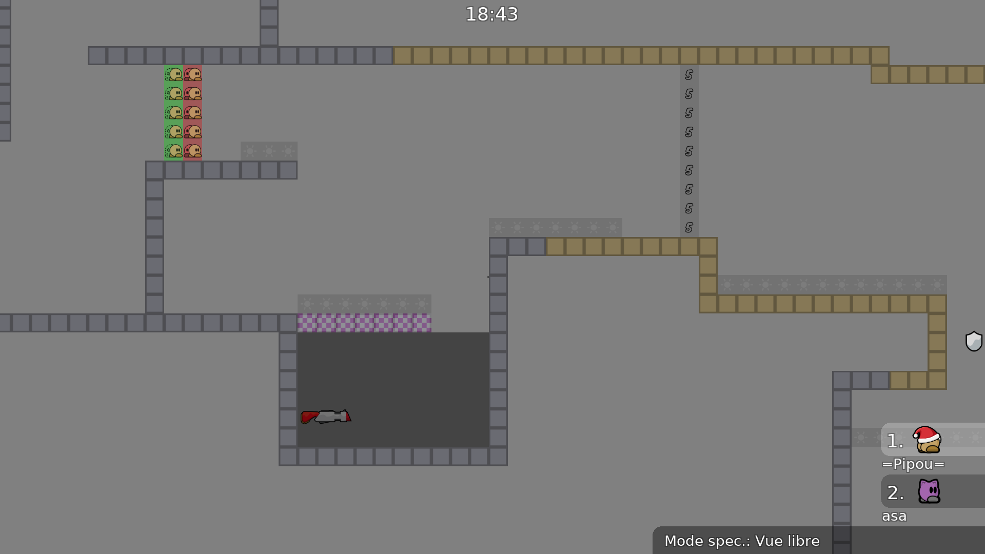
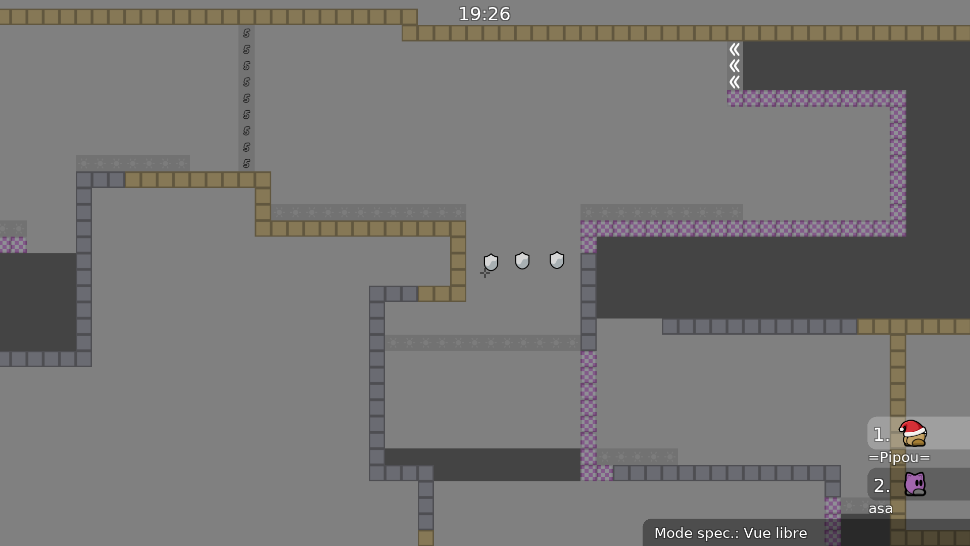
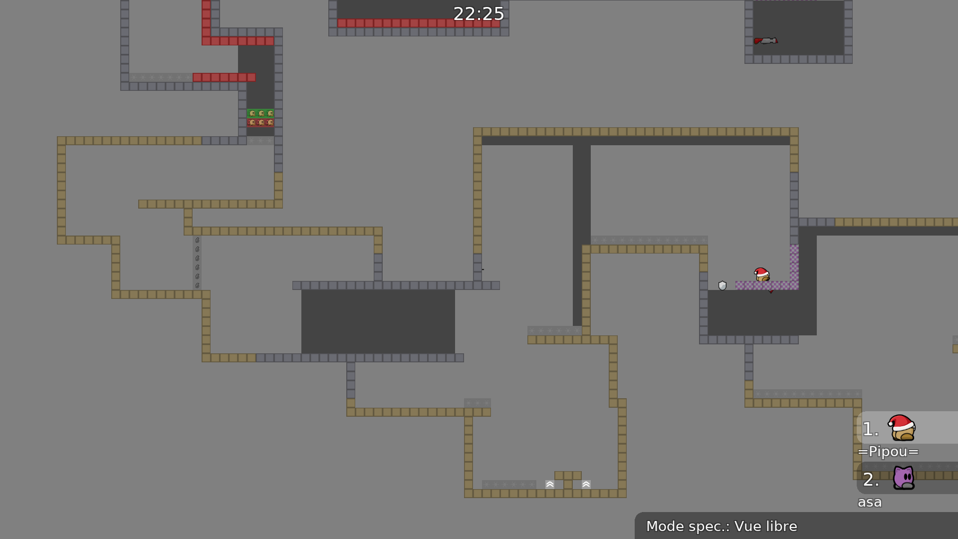
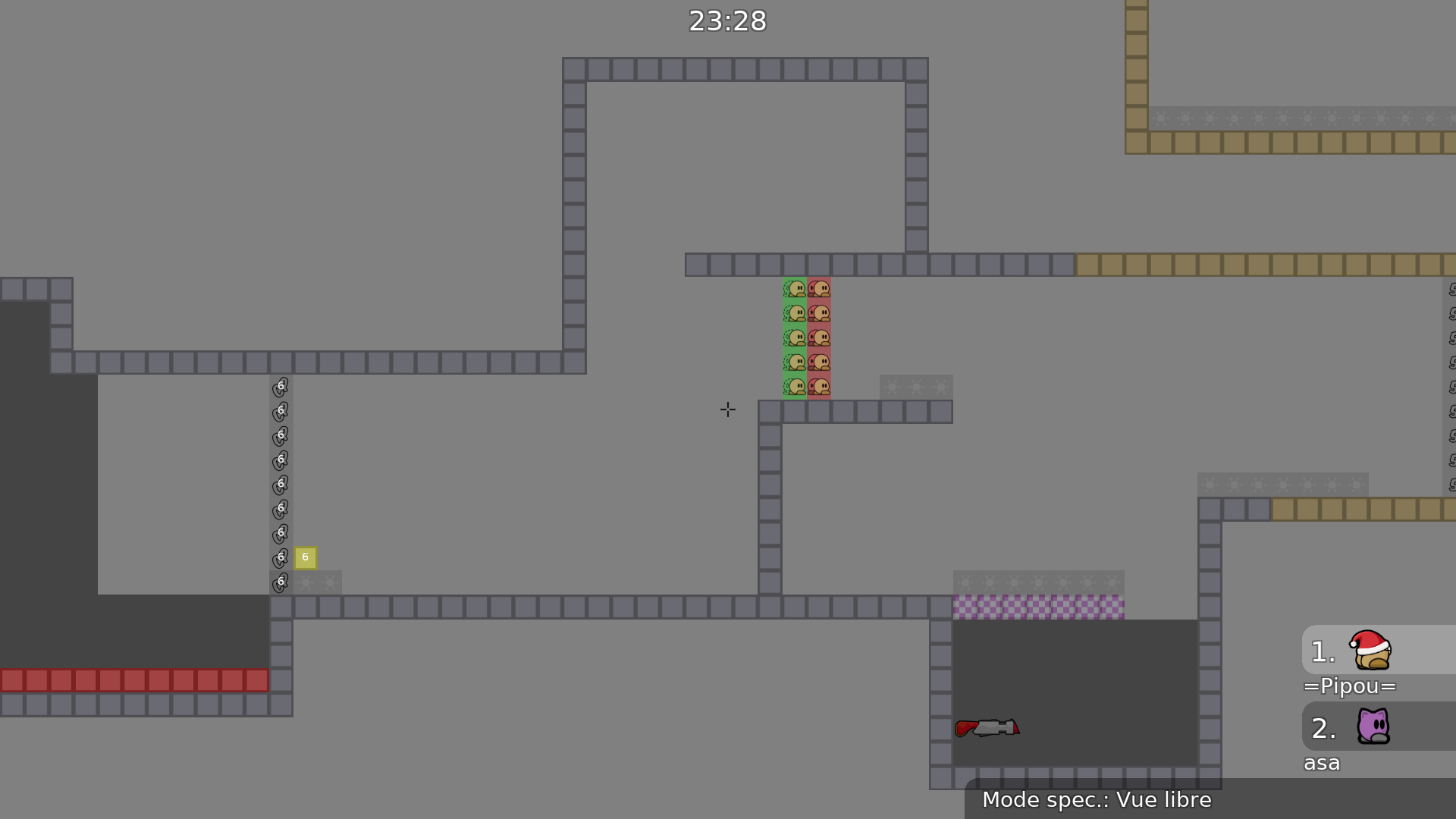
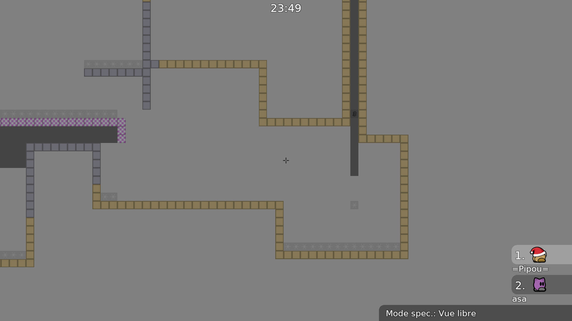
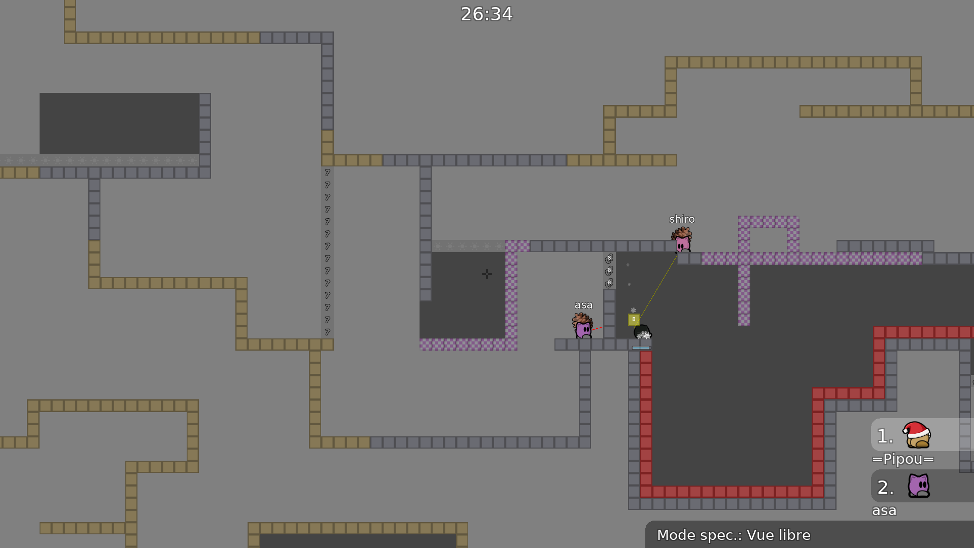
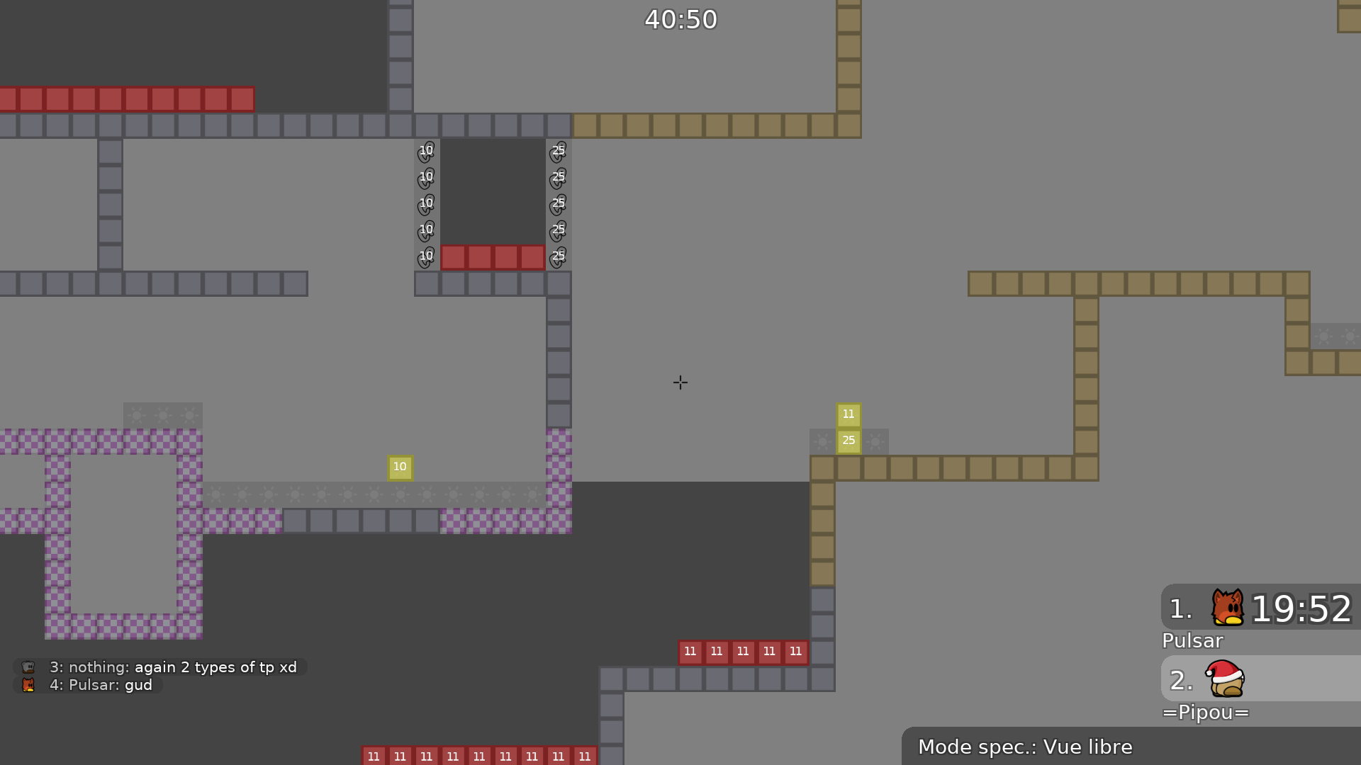
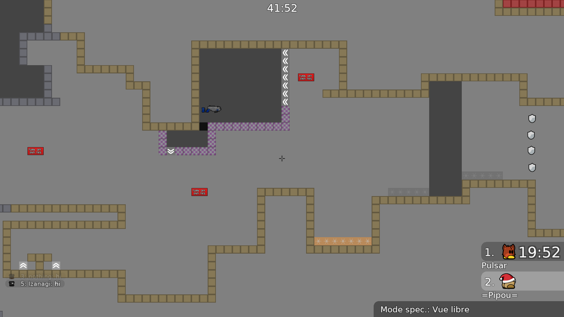
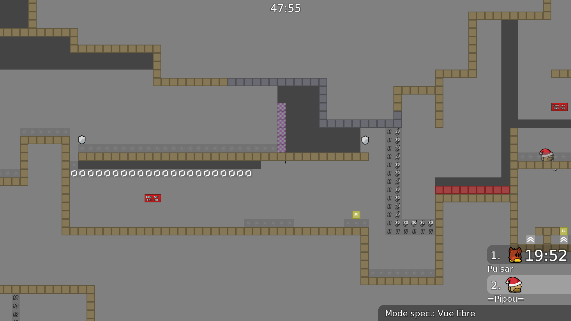
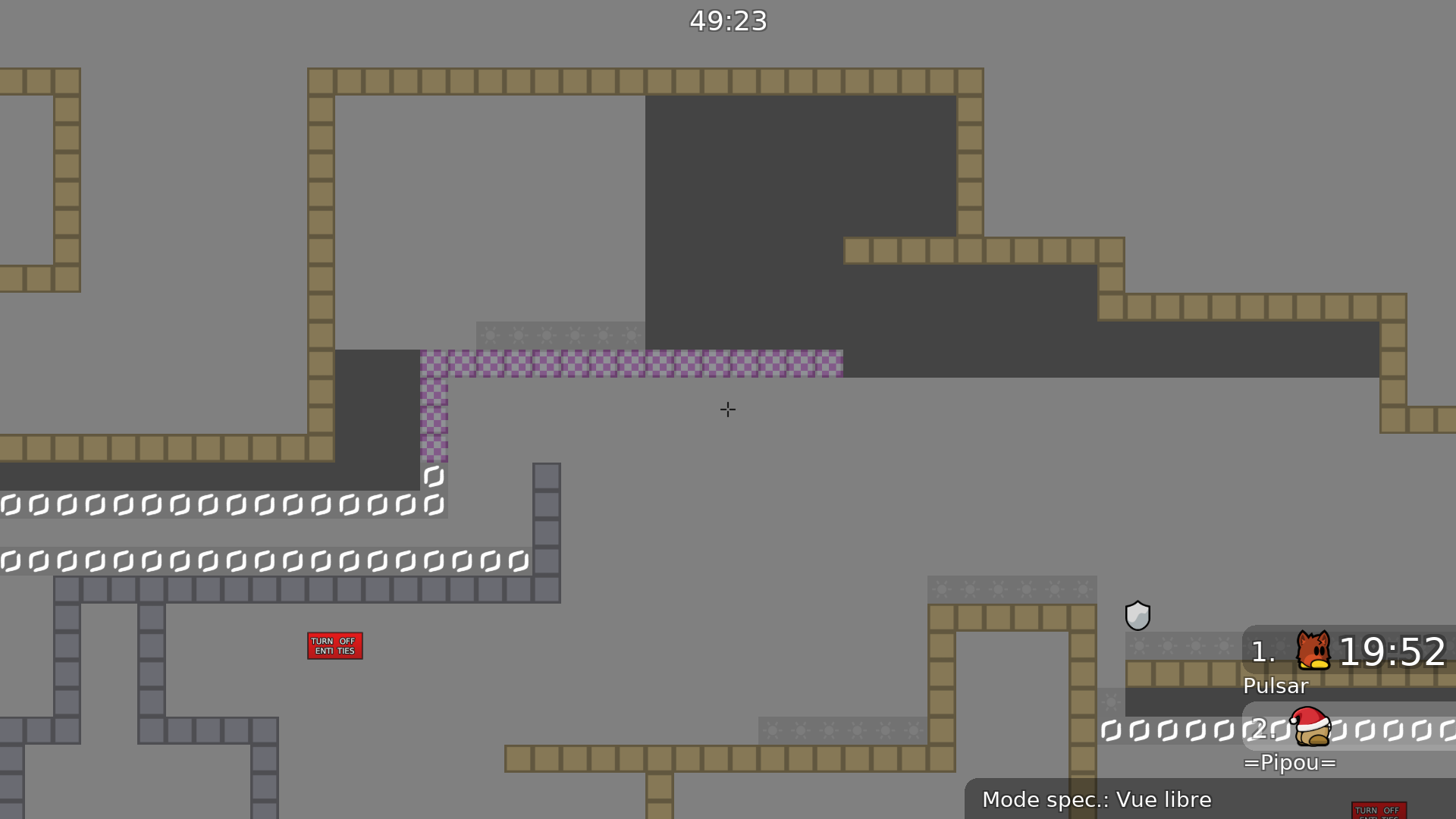
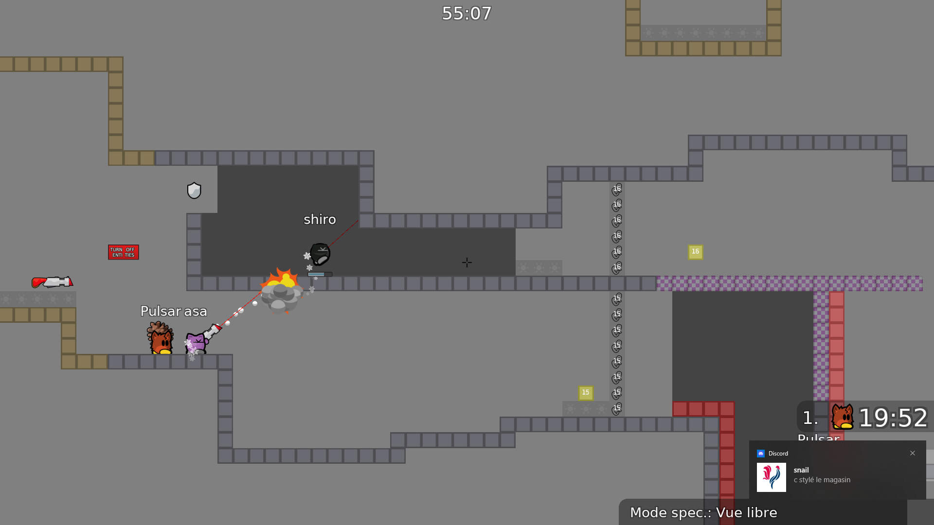
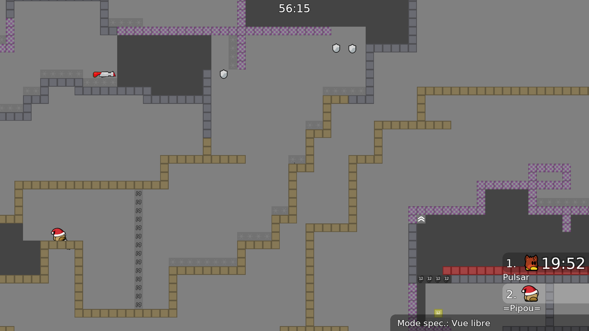
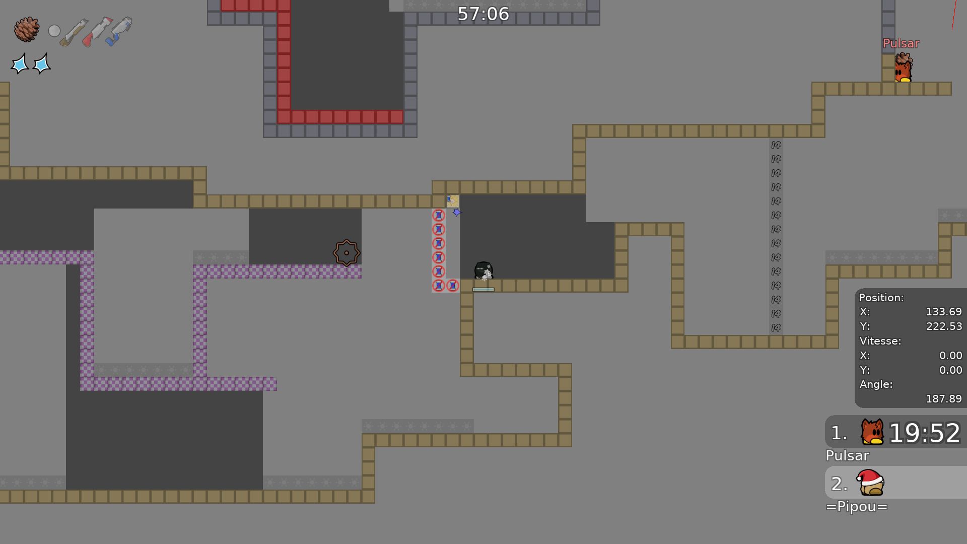
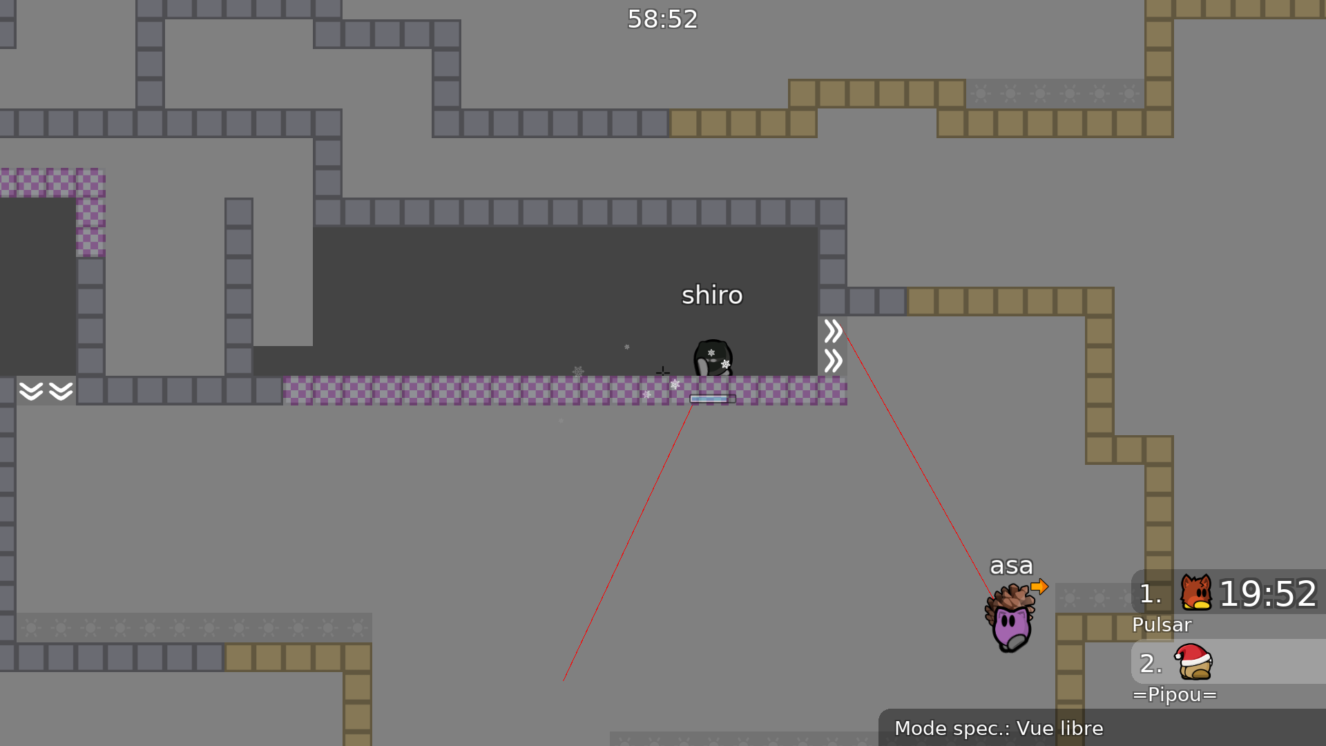
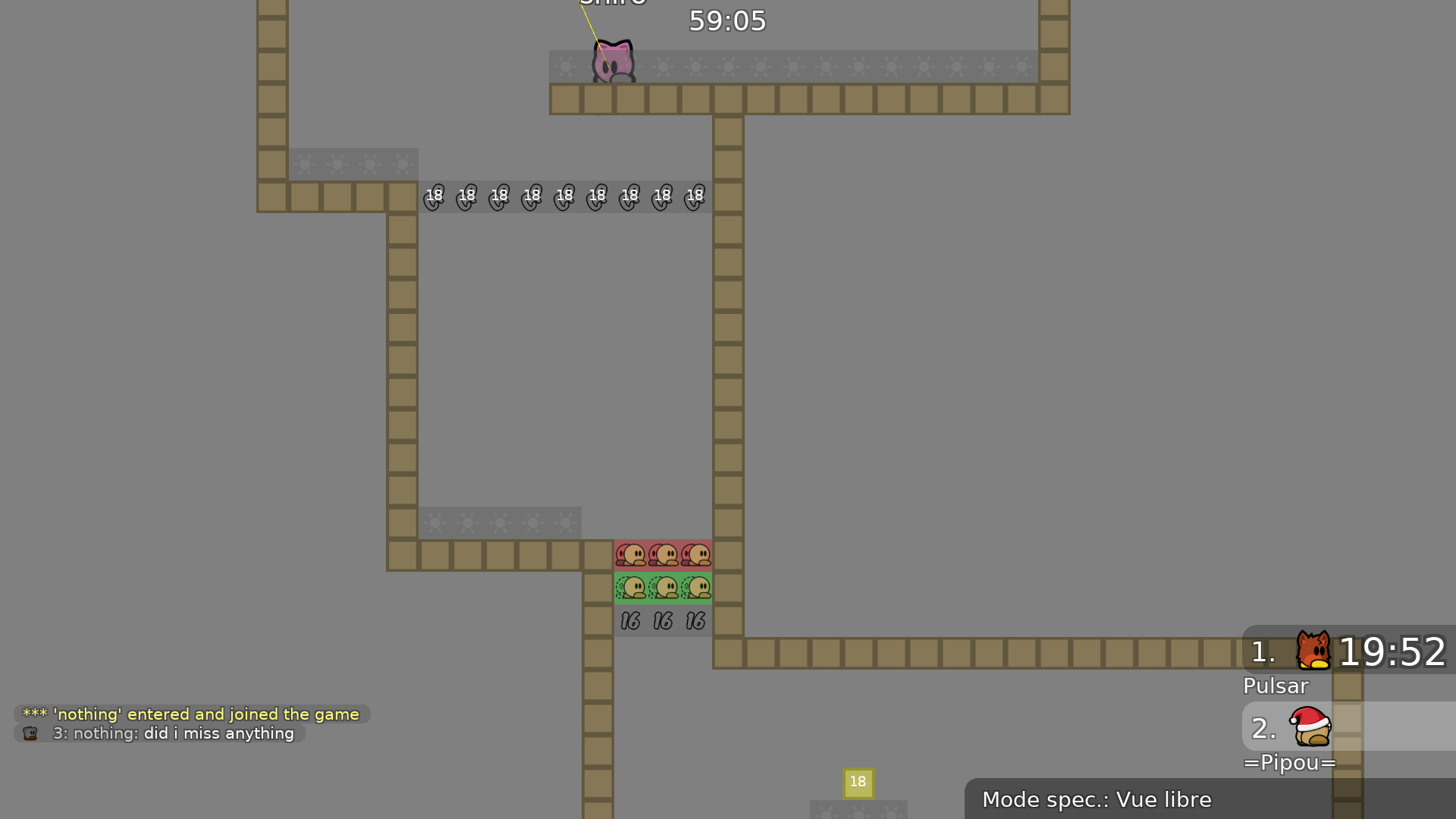
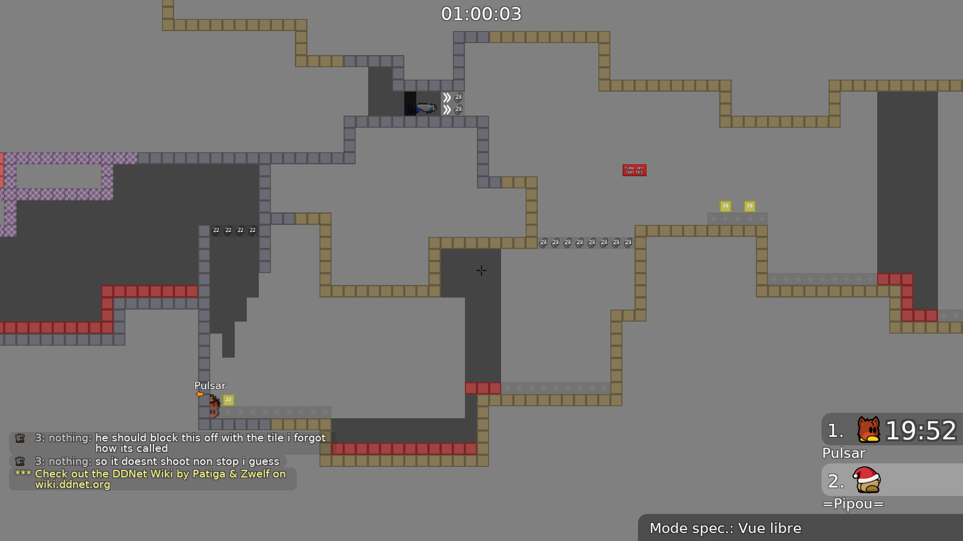
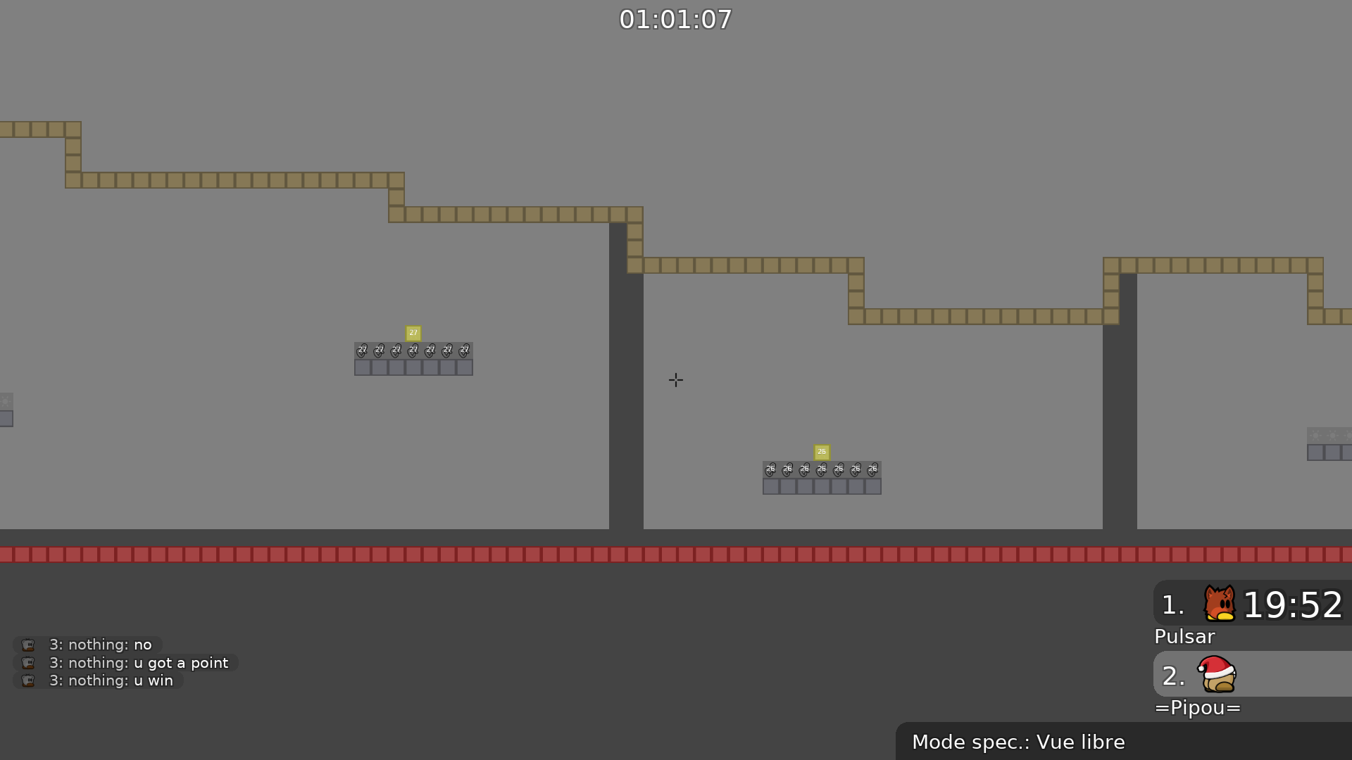
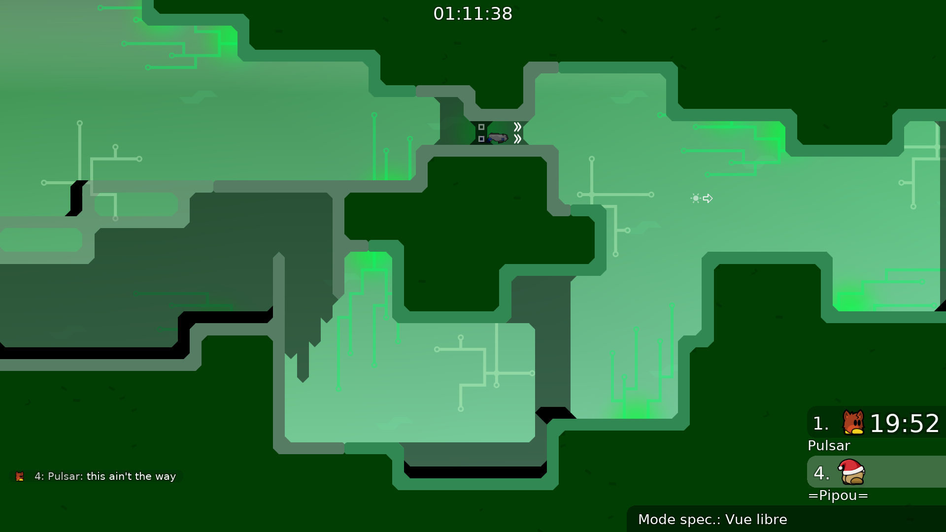
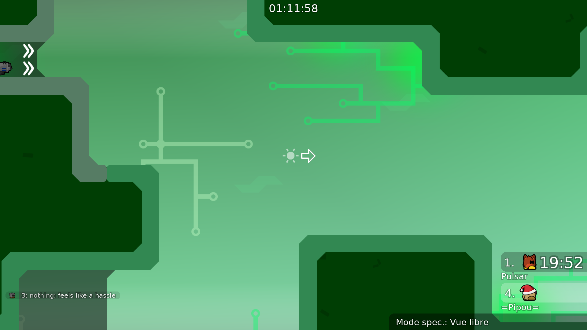
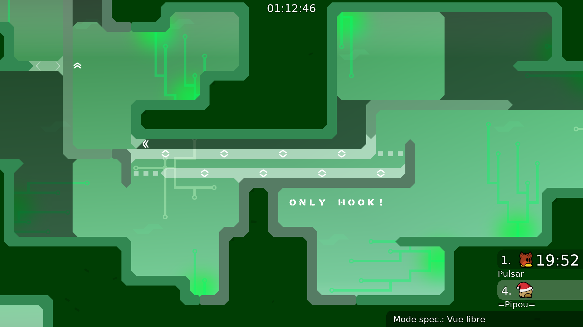
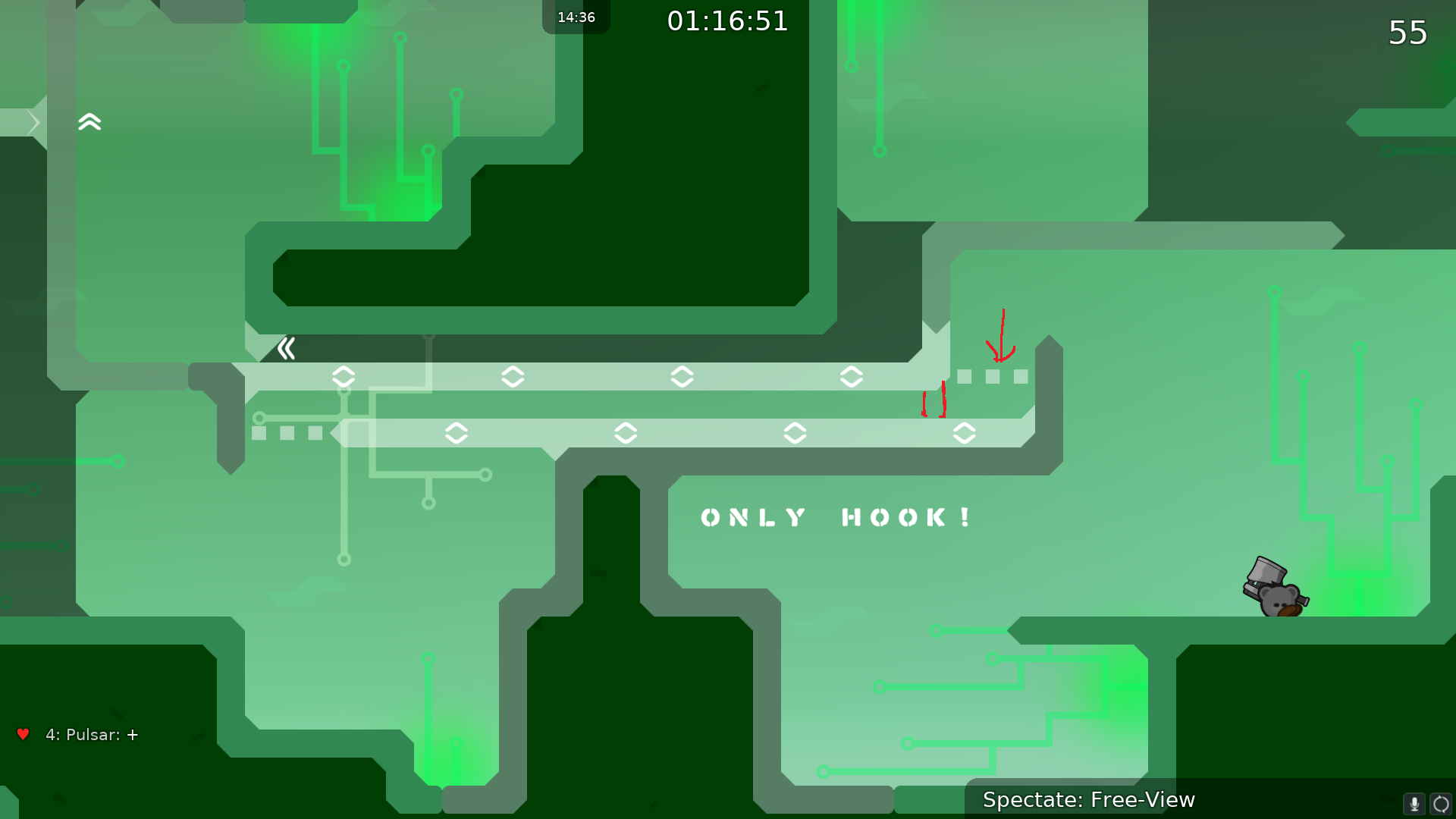
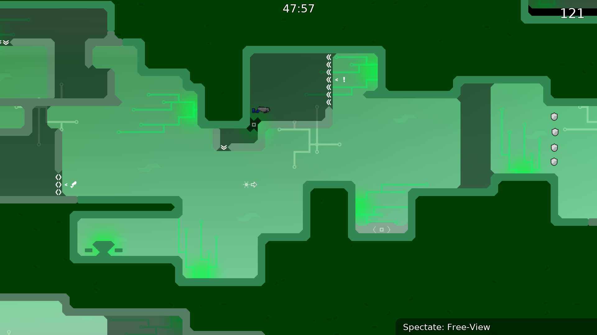
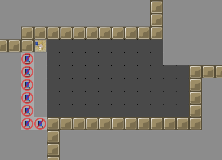
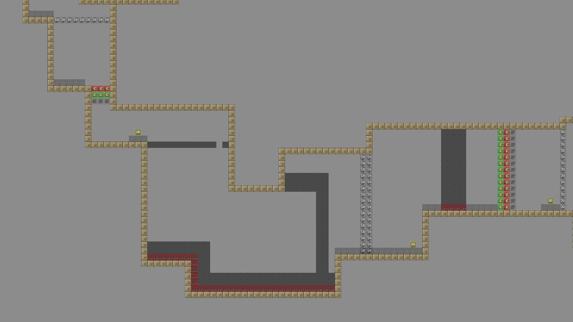
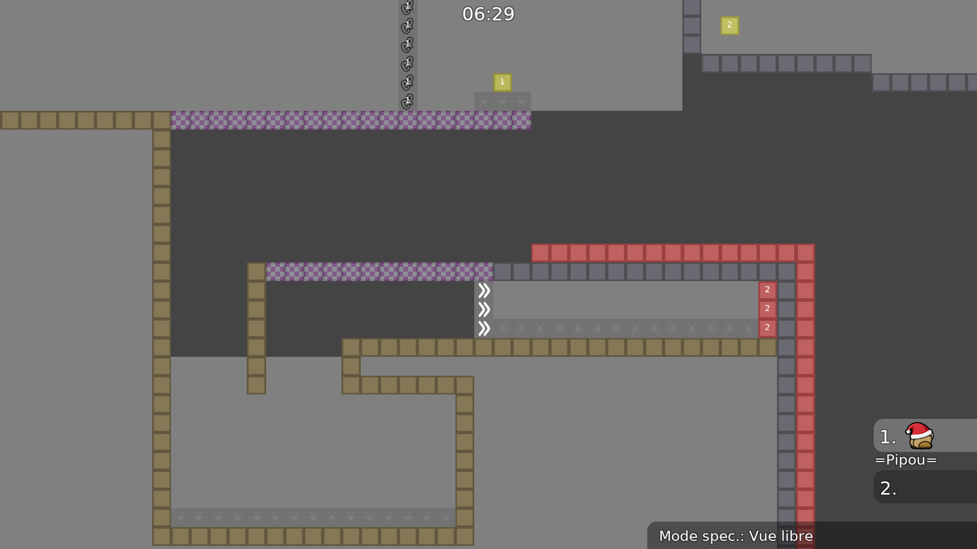
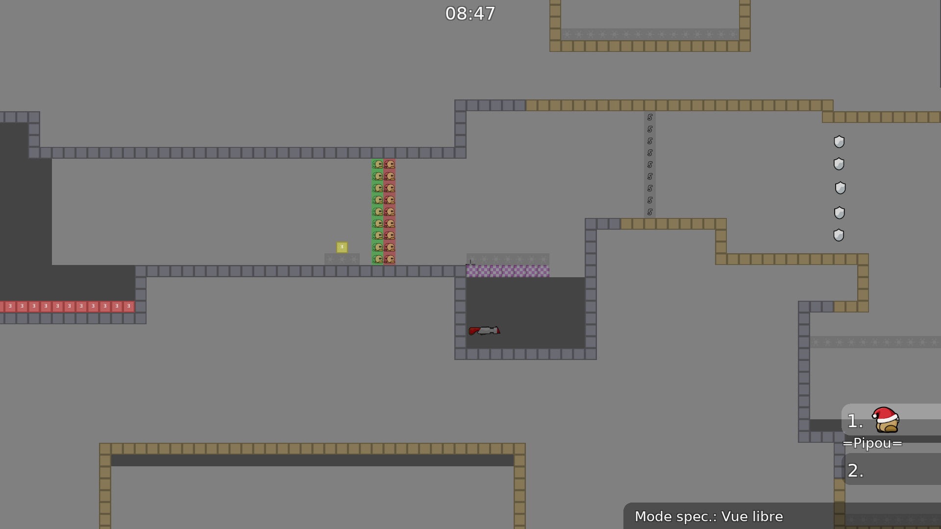
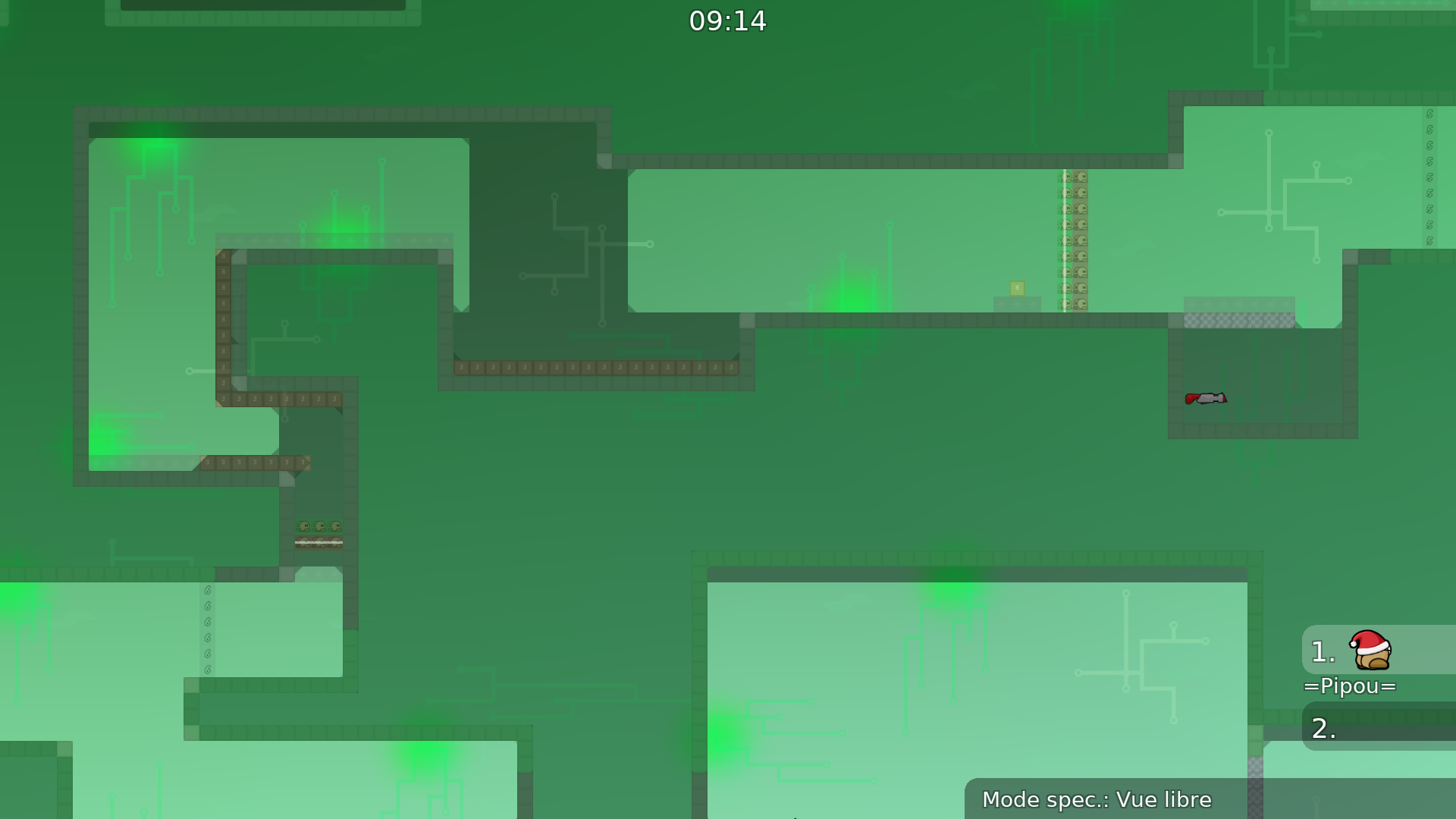
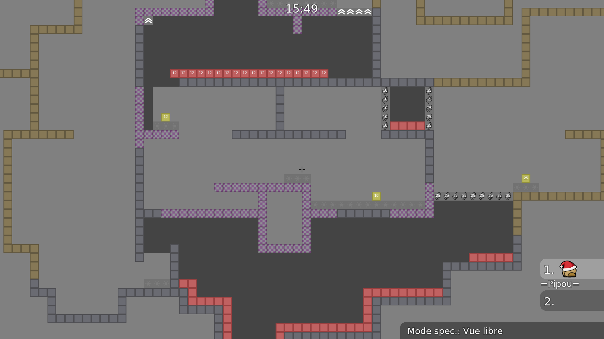
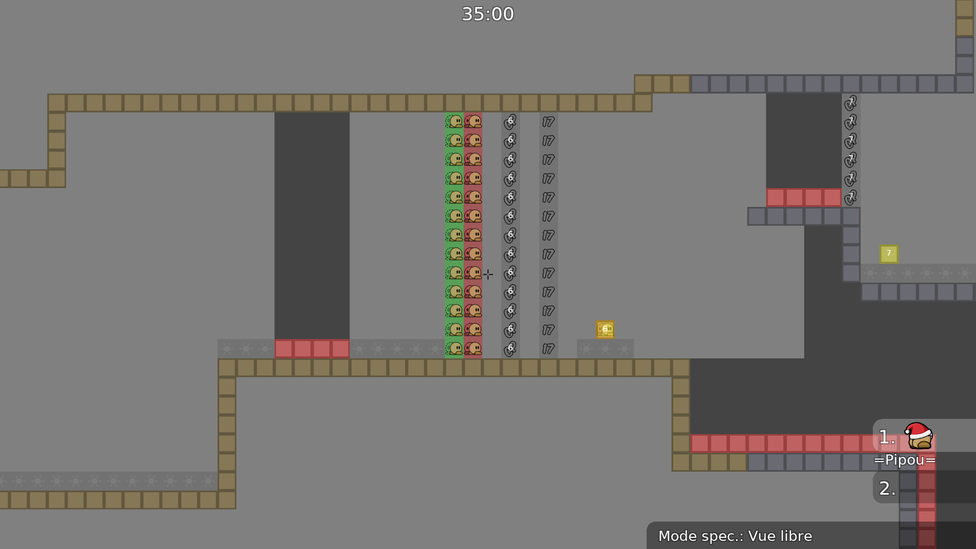
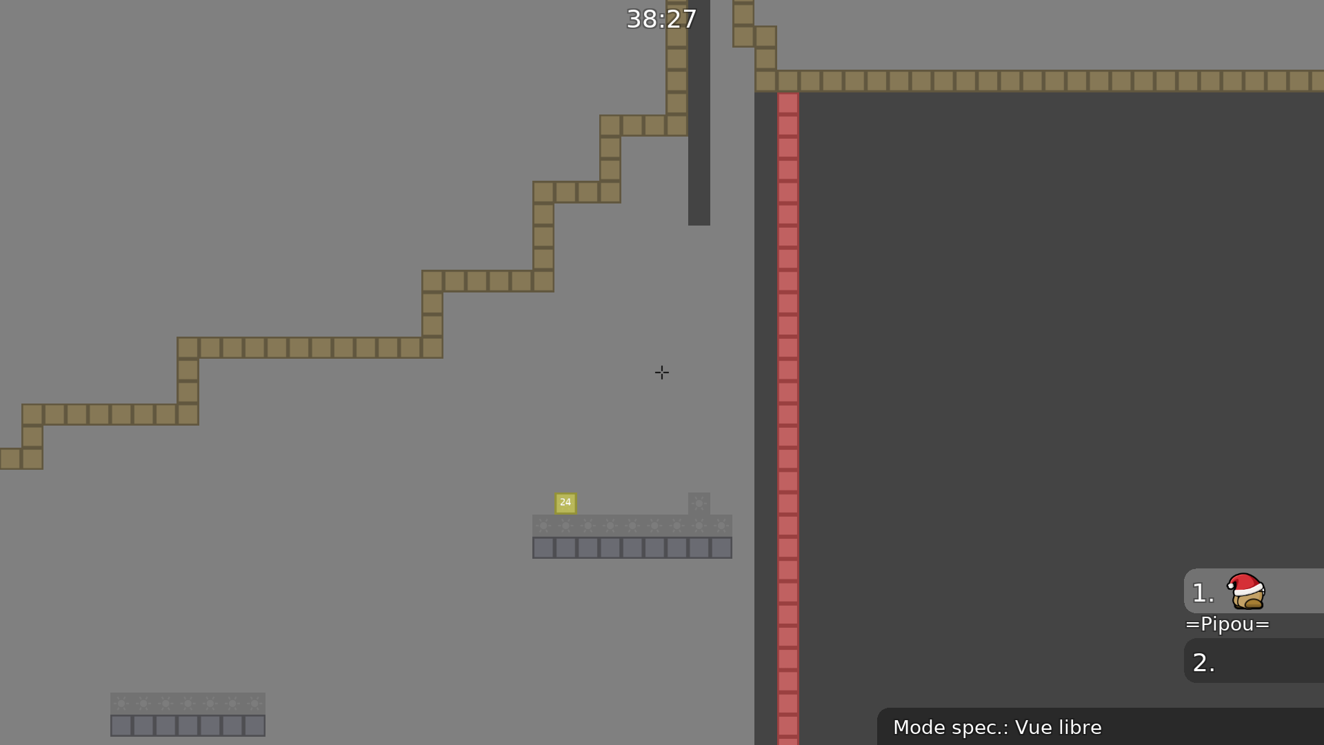
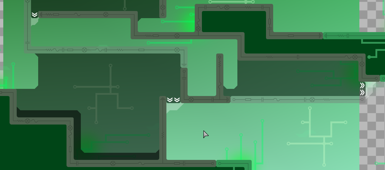
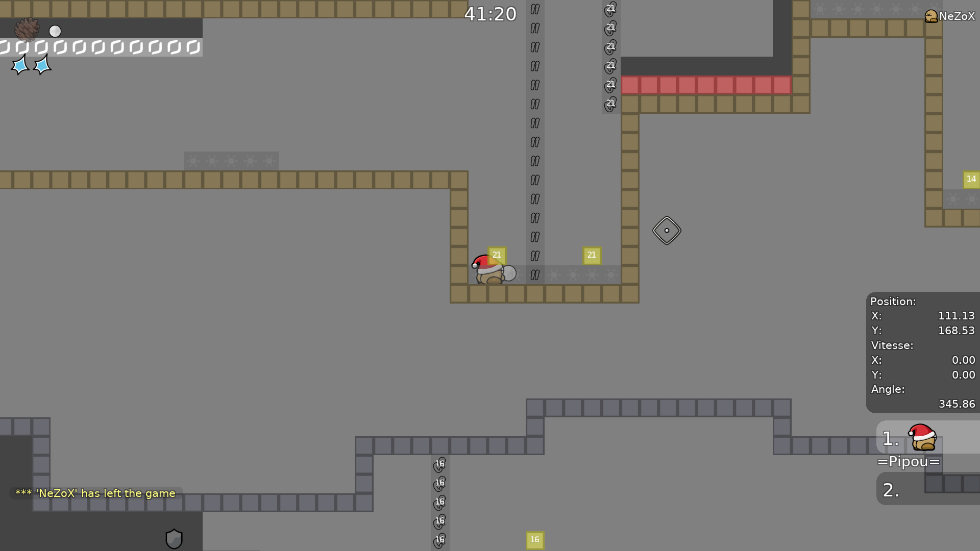
this is your map's testing channel! Post map updates here and remember to follow our mapper rules: https://ddnet.org/rules
Time Checkpoints has been planted!
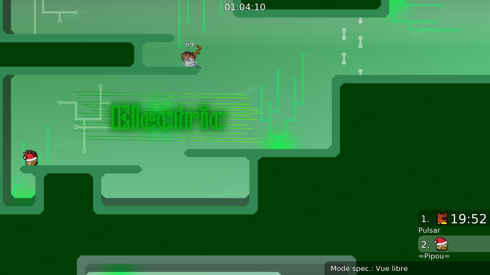
very cool design
Thank you!
Thanks i fixed it
upload the map then
Alright, I finished playing through the map. I really like it! the theming is cool, and even though at first the cut corner block design tripped me up, it didn't take too long to get used to. With that said, I have a few thoughts on the map.
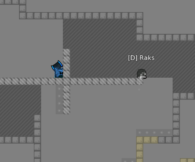
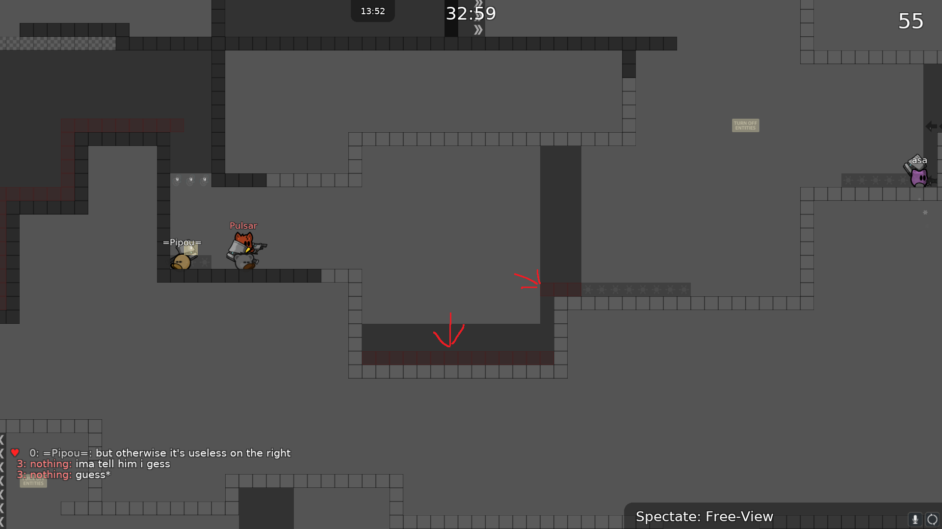
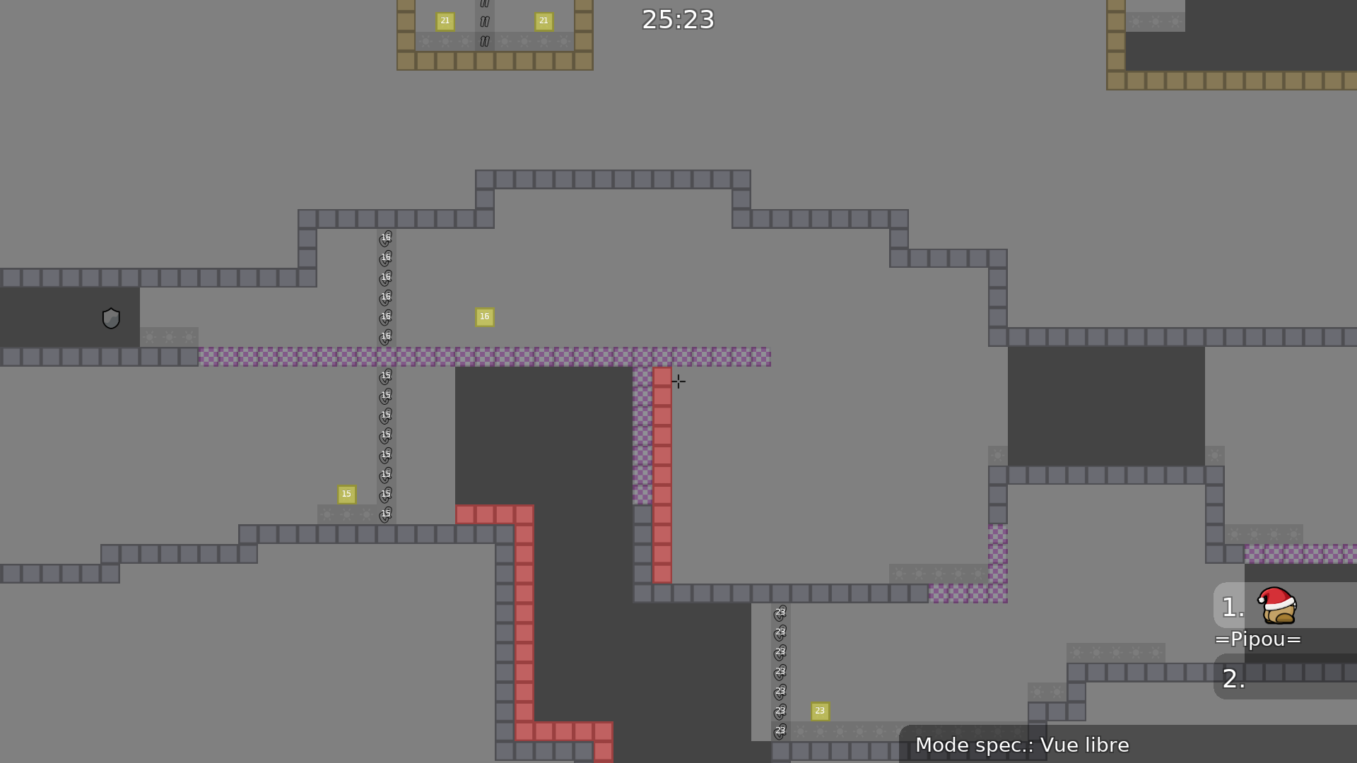
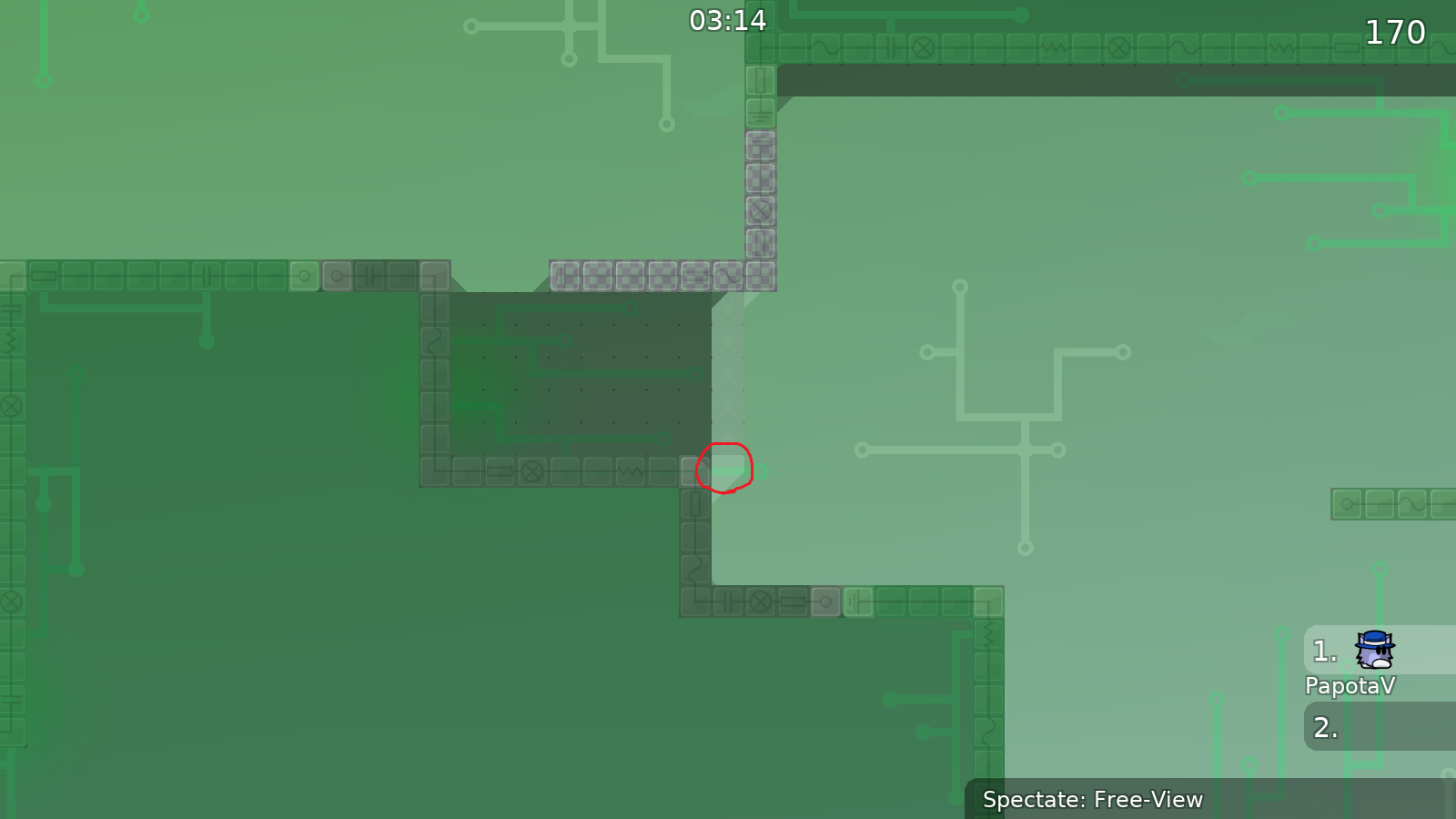
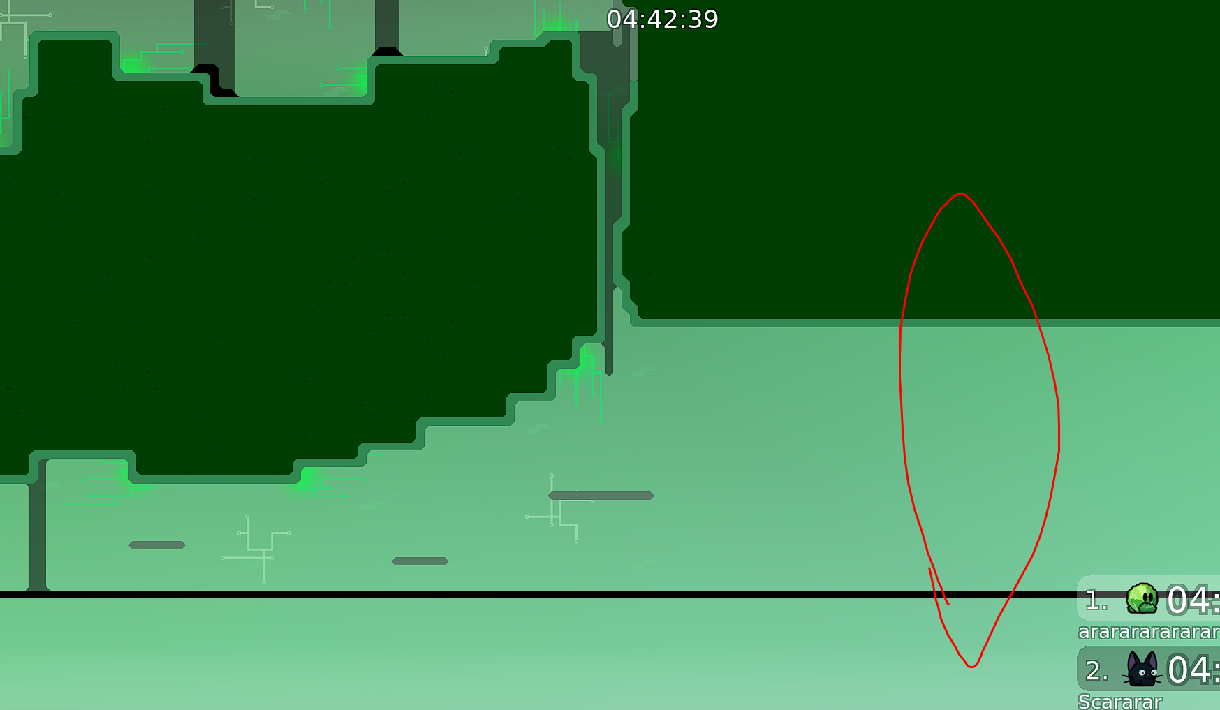
Secondly, and this might just be more nit-picky than anything, but there should probably be a wall or something here to stop players from swinging all the way to death thinking something might be over there. Experienced players would understand that this is death but a newer player might not know about map boundaries yet and having them learn the hard way at the very end of a map would be unfortunate.
Overall, really like the map. I think you did good with creating parts that were interesting and fit within novice difficulty. Hope to see this map on the servers soon!
About the last (Sunny side up) i dont even realized that
Should i change that to something else?
Anyways i fixed the things u said here is the newest version:
I hope too! I'll do everything to reach that.
I like the changes! I think if you didn't intentionally take it it is fine tbh, but i'm not the person to ask about that
Like i said i'll do everything to make it released.
Anyway's thank's to tell me your opinions
And test out my map
imo the maps name dont fit with the design
also all of the blocks look like freeze tiles wtf
About the "Freeze tiles" i was about to make something new style. But if it's not releasable i'm sorry about it. I will try maybe later with a new map...
i do not decide what gets released and what doesnt
yea just ignore this nobo
Nice map, I had fun playing it. A few things need to get improved:
I also think the design needs some improvements but we can talk about that later when gameplay is all fixed
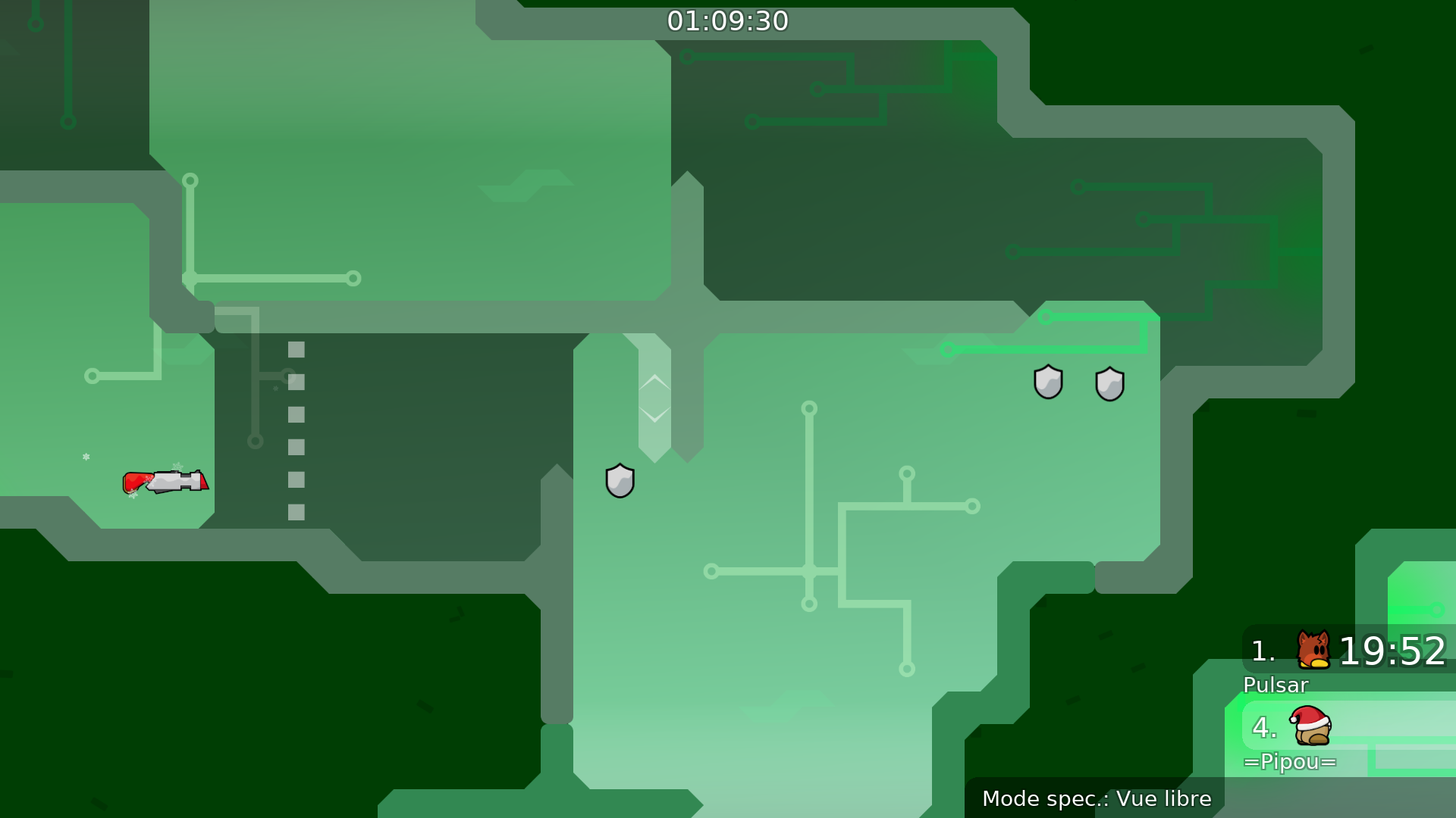
Also use normal shields everywhere, not the new weapon specific ones
very good map
I fixed the rocket part, changed the shield's and i also make that difficult part a bit easyer.
and i removed few arrows
I found some new bug's i fixed them:
Newest version:
Can i get access to the test server?
Cool map, also very beautiful design. I liked how u introduced a mechanic like livefreeze in a novice map, very original :D
Alright thanks
Last file:
Thank you so much!
thanks for look around the map and found those things. I will working on it to fix them
btw great job whit the design
i love it
Thanks!
If you have time we can test together
i gotta sleep :(
but sure
lets do it fast
I have to fix the things u said first
then im going to sleep :)
But we can test one time to make sure nothing else we missing
alr gn
Alright then goodnight
I think i fixed those things, i'm sure i fixed the corner tiles and about the cheatable gameplay... I made something i hope it fix it
and i forgot to add shield...
sec
With Shield
Some fix
Fixed the faily reworked part
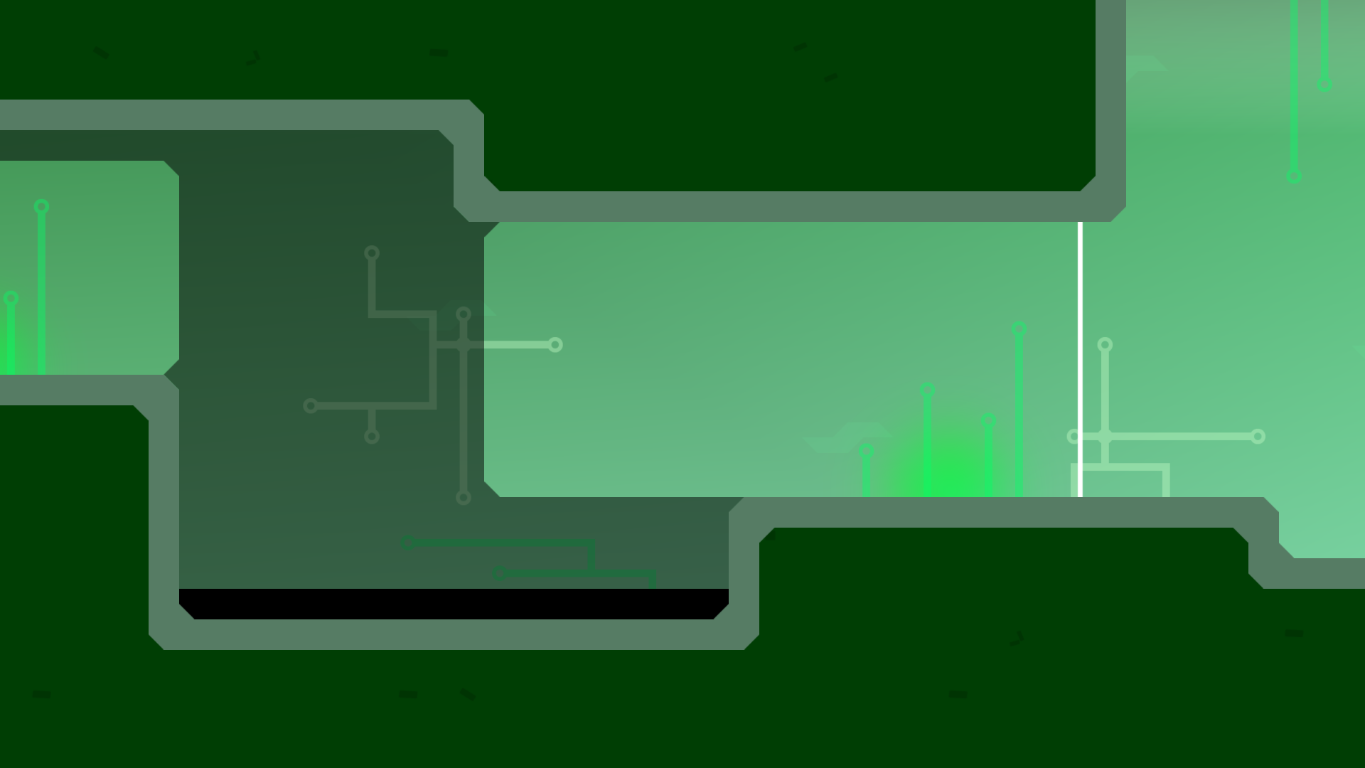
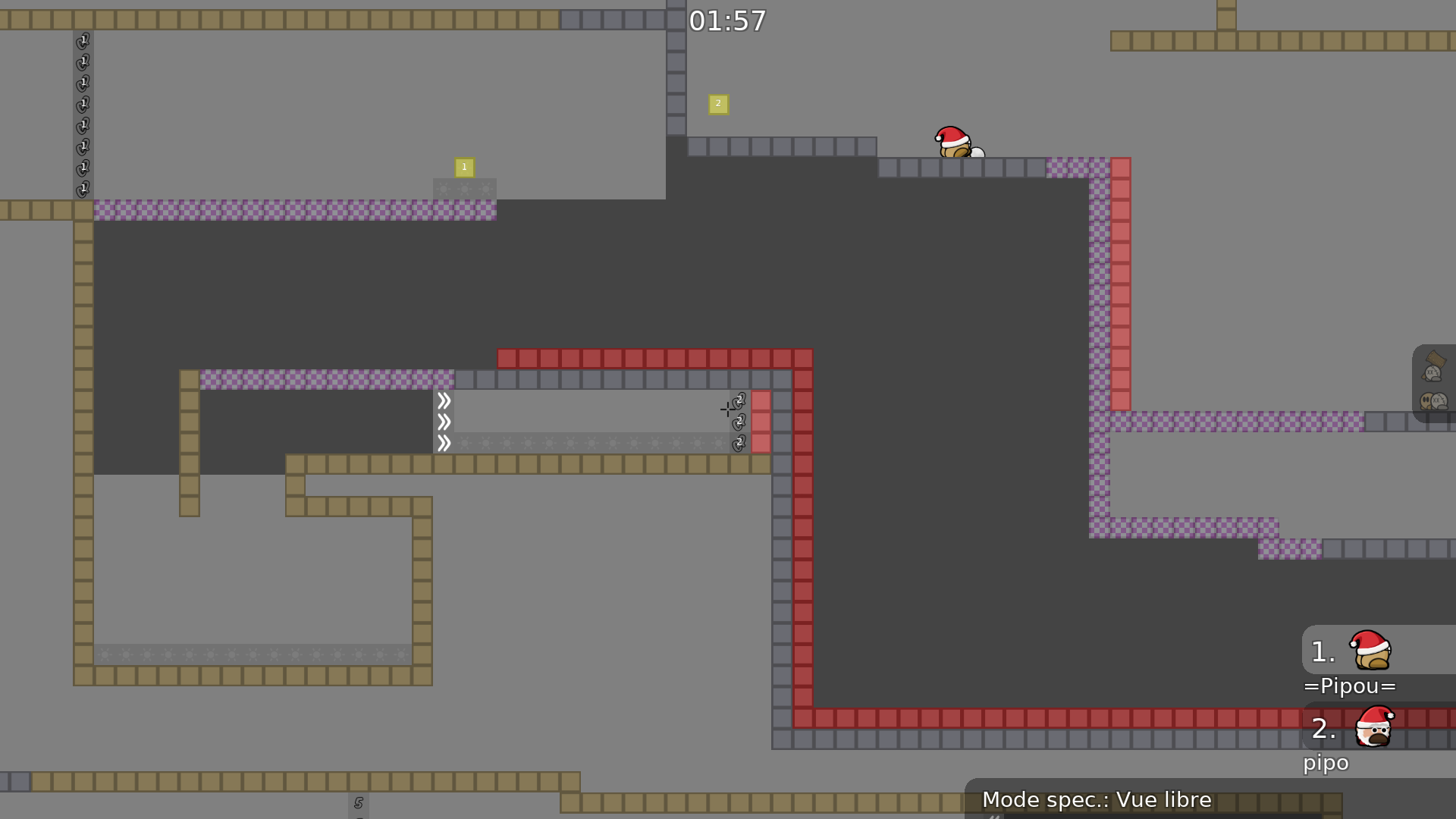
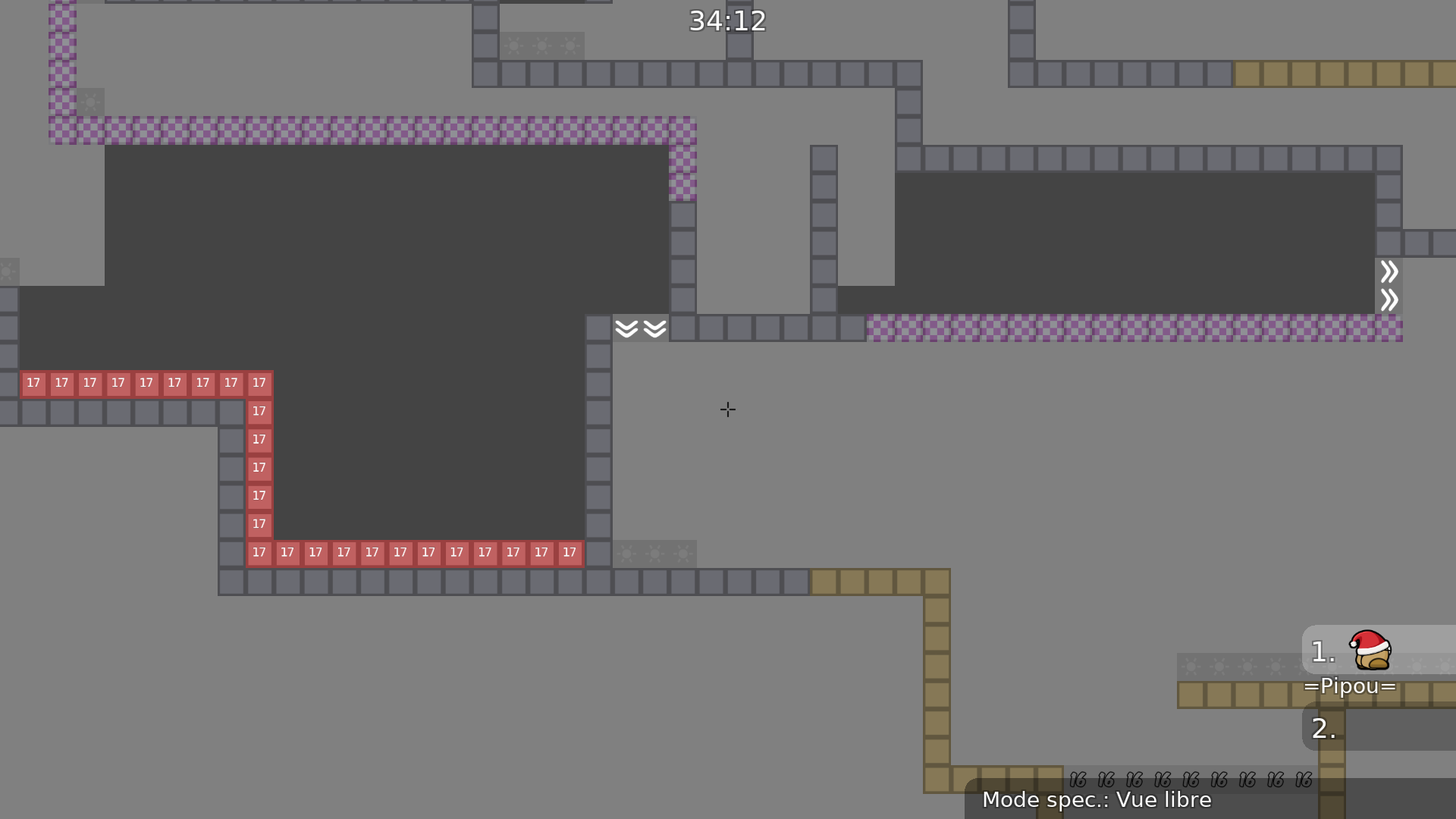
That hook passage at the top seems kind of long, would be really bad with weak, maybe consider shortening it a few blocks
use strong then
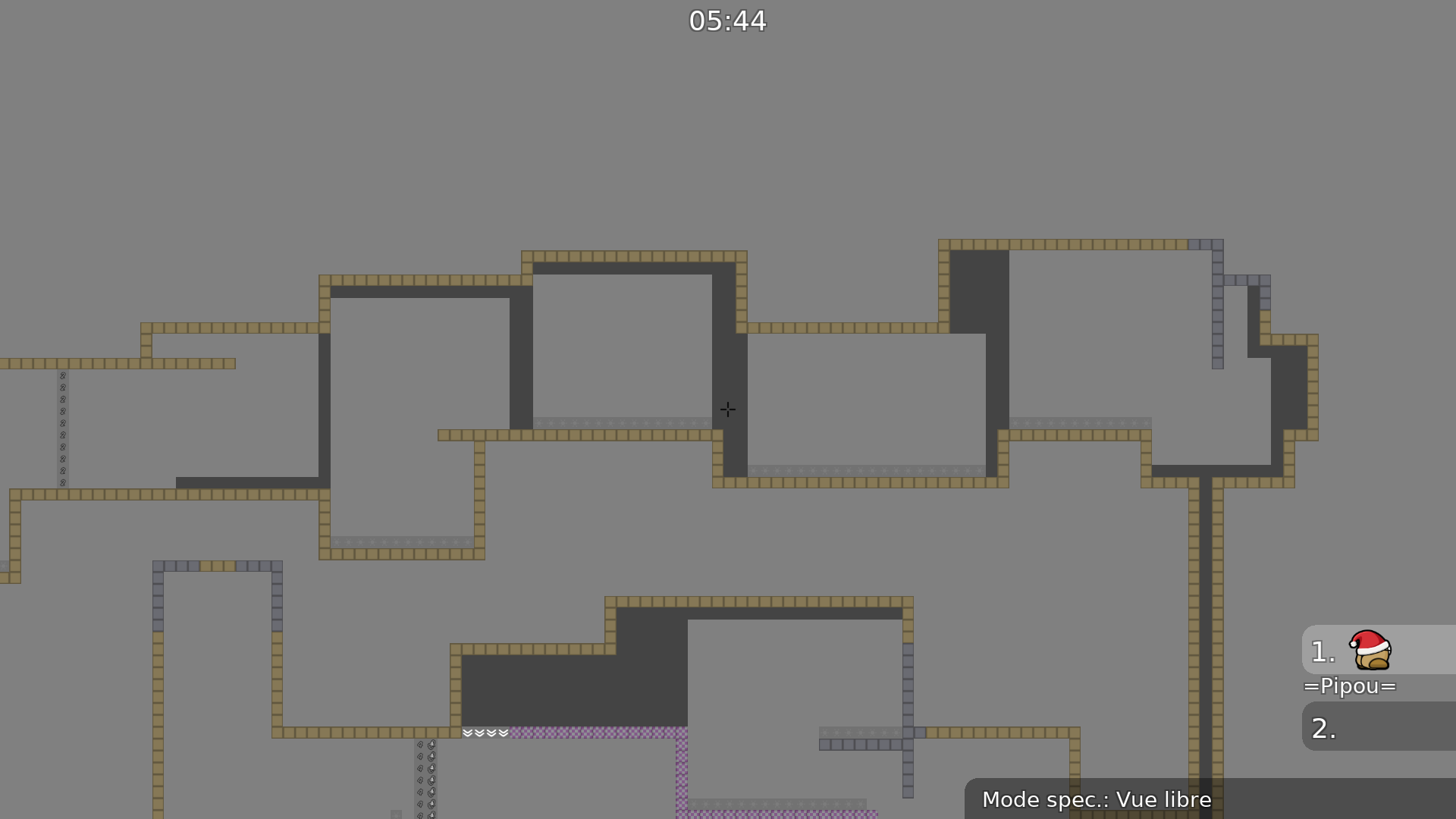
I'm conflicted between novice 1 and 5. Some parts are "quite difficult" for beginners, but then you get very short and meaningless gores
Don't use telecp when not necessary and don't forgot to give a cp to both (especially at the end of the part) to prevent cheats and fails
Don't give weapons for one part, it's meaningless
If you give a weapon, at least leave it for a few parts or for the whole map
So you must rework your laser and grenade parts
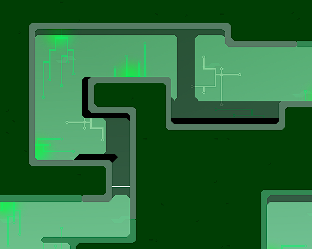
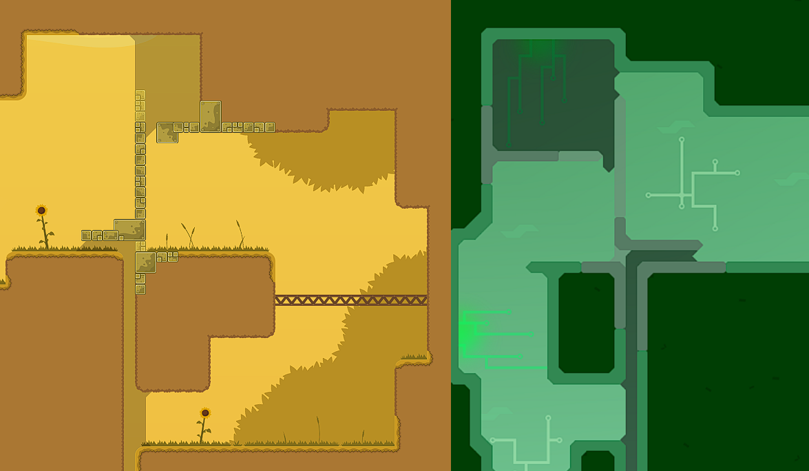
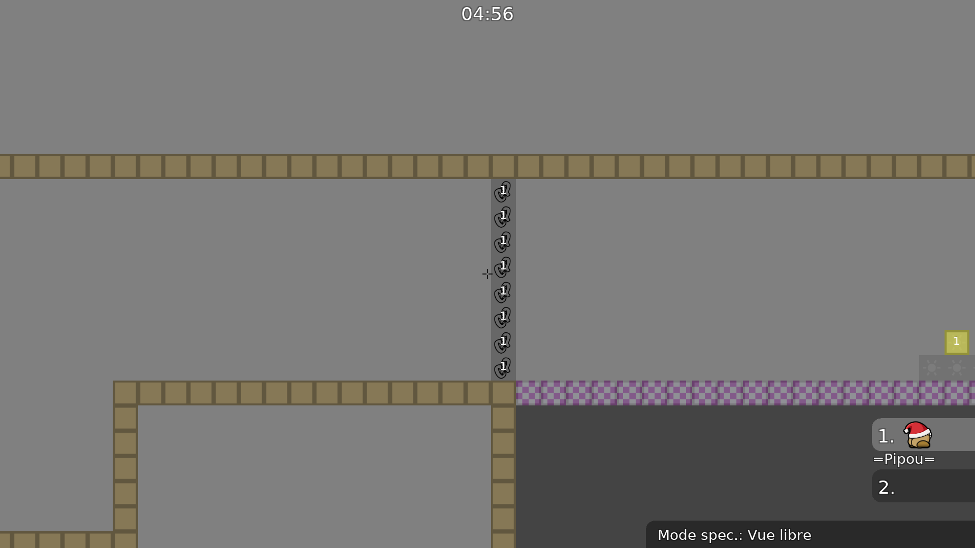
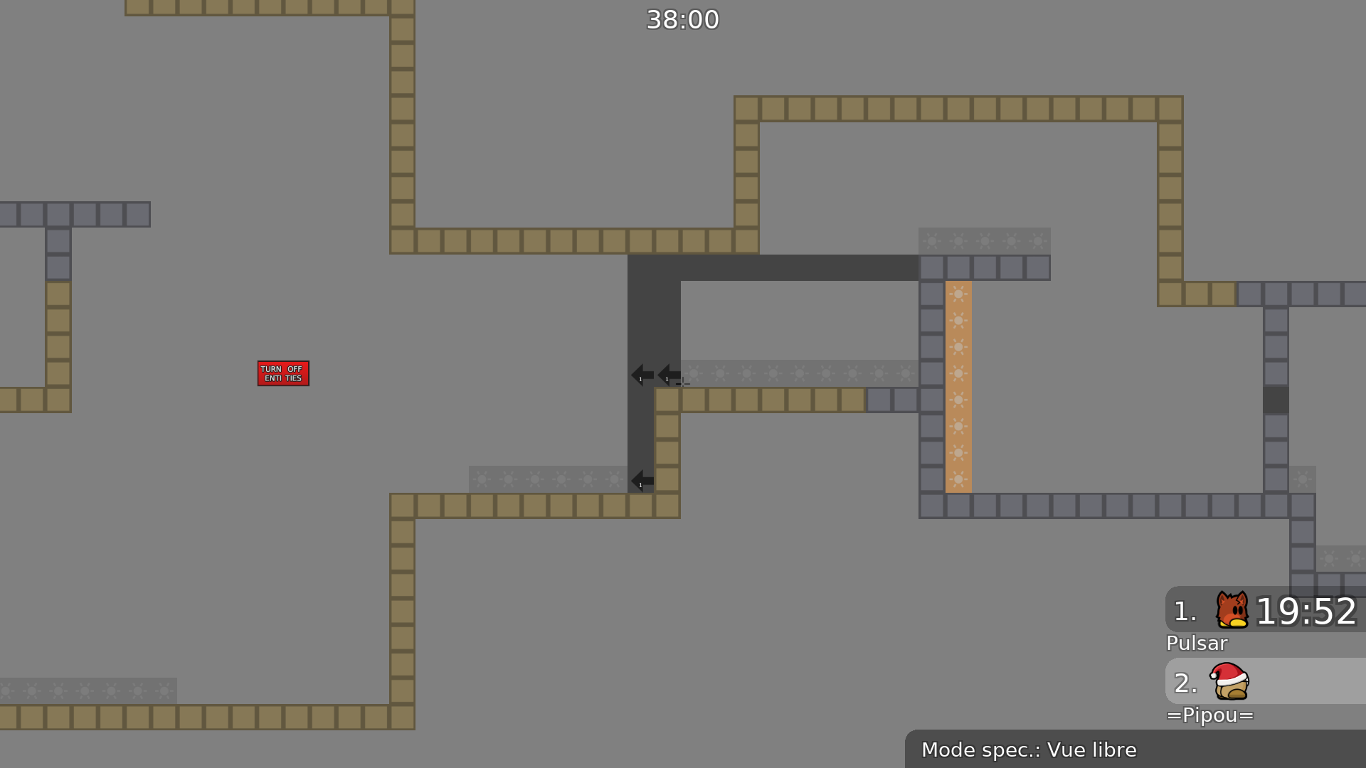
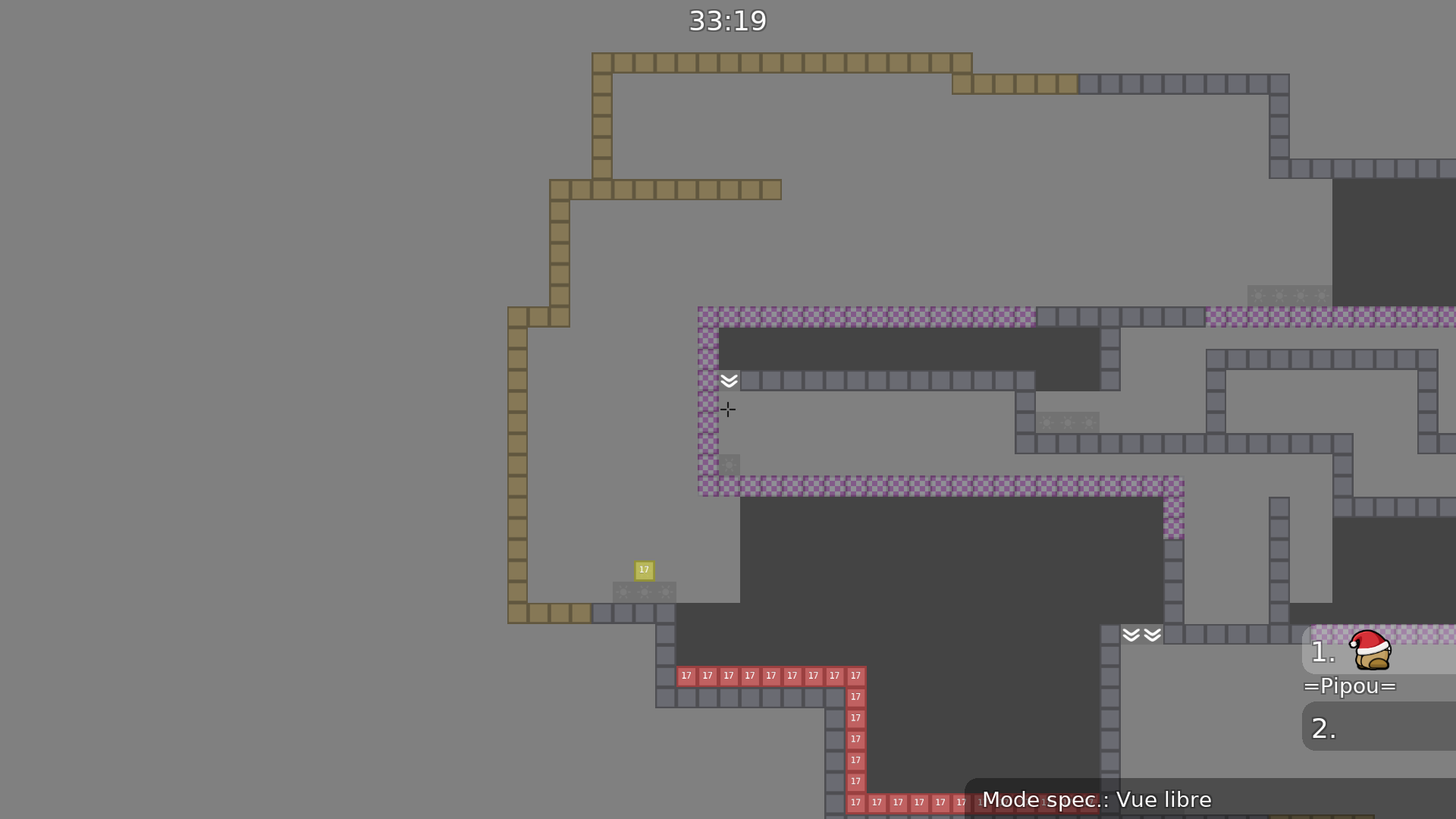
It's very confusing to play with the design as we are used to have freeze and ground designed that way
I like the the background but the colors must be adjusted
You could add well increase the para values so it's more noticeable
hookthrough unhook blends in together make it more diffirent
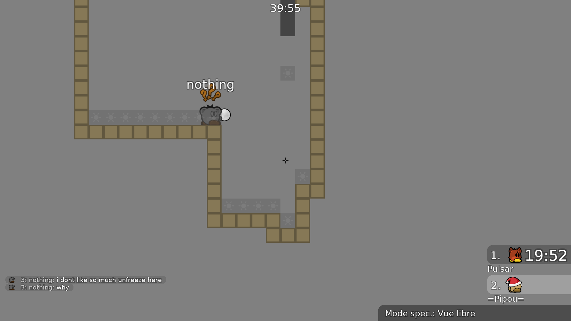
Finally, I'm quite hesitant about the use of livefreeze
Those tiles shouldn't be considered when starting mapping
^ t0 can block pretty easily on that part
since its pretty tight
^
$waiting
I disagree with some of the things you pointed out. I think the fillers are fine in a novice. The map's flow felt good for a casual playthrough so more isn't required. Also imo cp tele should basically always be used, with only exceptions being tele to the next part and such.
These kinds of fillers were fine in 2015. You mentioned "the flow felt good for a casual playthrough", should we let aside higher skilled players ? Novice maps are aimed toward a novice category of players, but any map should be made in a way so speed running is comfortable (so more players can enjoy it, for different reasons). Furthermore, it's a good thing to get good mapping habit as a beginner, so it's a great training. I particularly disagree about the use of cptele. They are usually a mess, generating issues/cheats (happened twice in that map) and entity spam. Cptele should be used when multiple parts meet or when multiple players share a same teleport through two connected parts or to prevent a fail (falling back in teleport)
Yes I think novice maps don't need to care about higher skilled players, they're for beginners and I've also seen novice maps that tried too hard to be speedrun maps and it hurt the gameplay for novice players
and if you make cp's carefully they work way better than old tele, no issues like losing progress because you went into a previous part (especially important in easy maps), it's worth the extra few tiles in entities that will be invisible anyway
and I don't think some 2015 fillers are a bad thing if they're made in moderation and complement the gameplay
at cp8 top tee doesn't get a checkpoint, meaning if he touches tele you fail
^
and put unsolo on cto20
^
^
You are repeating what I pointed out already
yeah I only glanced over the screenshots
When i have enought time ill make it releasable
I made some rework and almost recreated/fixed everything
.
Smth is wrong with the name file
You didn't fix everything for sure
Still too many bugs and the design is still too confusing
Im sorry i forgot those
Ill fix it tomorrow
I changed few things but not all cuz i didnt had enought time. And the reason i sent the lastest saved file to get checked out is the new parts are good enought like this or still have to be changed. I made the unhookable tile more different with color. I dont know is it good or not
I also know i have to rework the teleport gametiles
I will do it
👍
Sorry but i dont understand this one
Fixed the similar part:
Fixed teleport checkpoints
Fix Details for low quality setting
Fixed solo teleport
Lastest version
Waiting for the new fixes ❤️
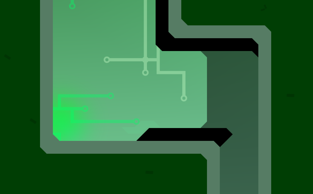
Found missing corner
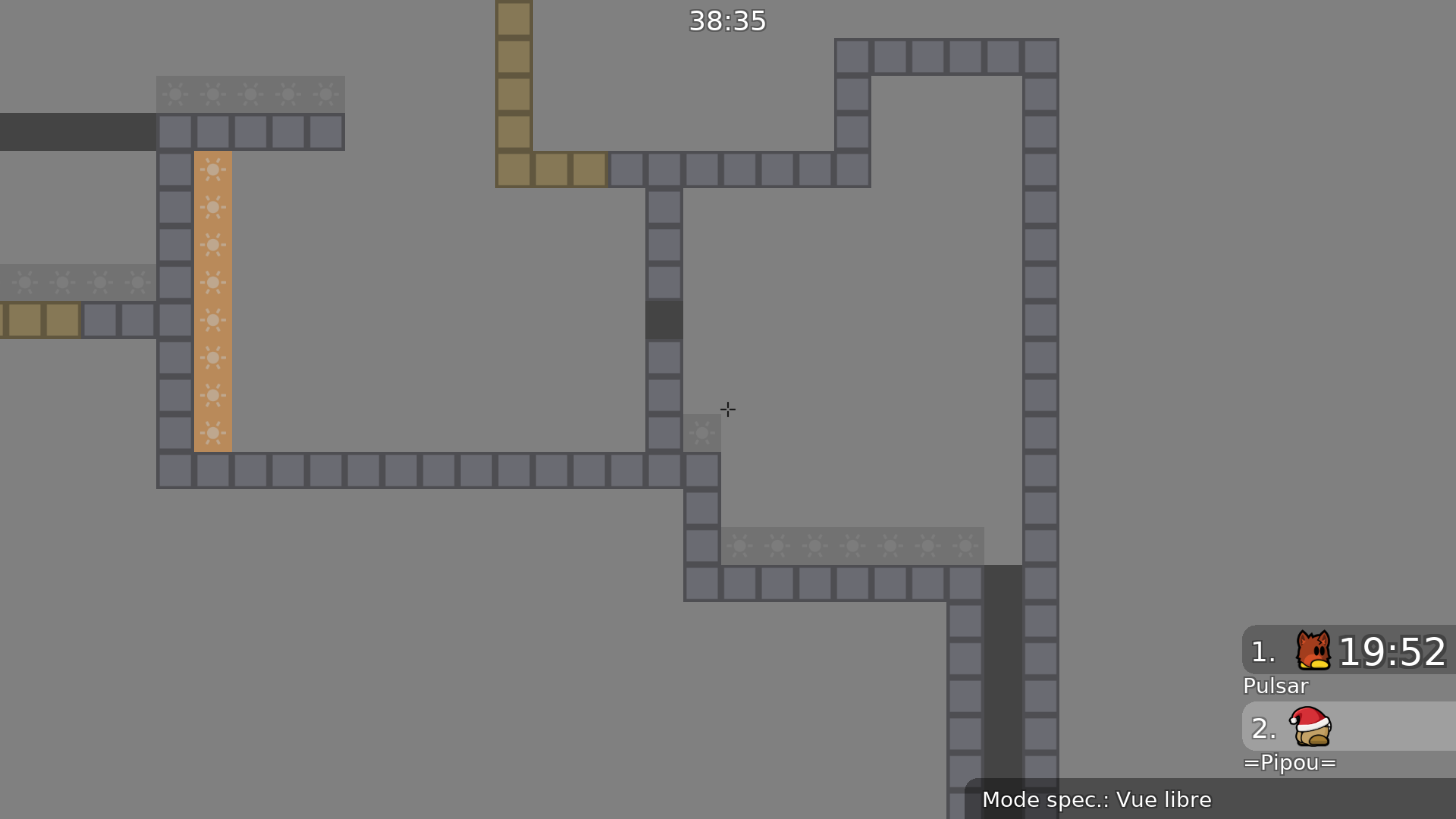
It's much better now, but the design is still a problem. Maybe you could add hatches or a texture to your tiles so they don't all look like freeze
$waiting
I think the flat design is ok
it looks too bland for me
imo adding some texture would make it look better also the whole map feels like its missing smth with such bland design imo
So it should have more detail?
I didnt wanted to make too many design for the nobos cant be confused
Maybe put borders to the floor
That's actually the opposite, I've shown it to multiple people and their reaction is always the same : they are lost, they see freeze, they can't tell the difference between the tiles
Why...
To fix the thing that pipou mentioned
Fixed tiles + new decor
It's much better now
But you did that at many other places like here :
The shapes of the map are really great now, did you do it by yourself ?
It seems to fit and you can't miss it
So its godo right?
yes
Yes
Well you did a great job
i actually finished the design
Oops 😄
Oh no, it was great as it was, it doesn't have to contain more information. It would maybe be better if it was between the solo and the unsolo tiles (can be done with another group with an offset)
in the new version already fixed
i just didnt uploaded it yet
Someone told me to not spam the uploads
Yes, exactly
That extra unfreeze for the stacking tees
like when so many player falls down in the same time
but i just remove it then
I understand, but the problem can still occur with more people
would also be better if it was right at the end of the unfreeze
i dont really get this one
oooh
i see
okay
That's all for now 😄
like this?
and one more question
wdym by this
That solves the problem
oh okay i got it
the unsolo should be different
nvm it
yes or just use the line to mark the solo, not the unsolo
or place it in-between with an offset
i do this
Done!
dammit...
i forgot the solo more info to remove that
cool decoration bro
Thanks!
Is it ready?
wait for testers
Yep thats what i do

waiting for the new logo
$waiting
There we go
$ready 5
ow
$ready 5
$optimize
- Added the missing unfreeze tile
$ready 5
$released
$released
stop spamming $released
u keep writing it under any of the maps that get released there is no need to type it if you are not tester
... $released

