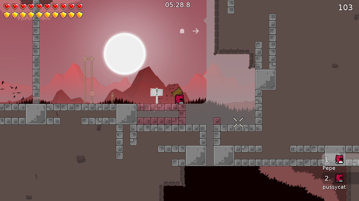
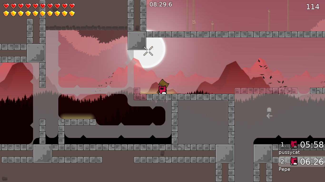
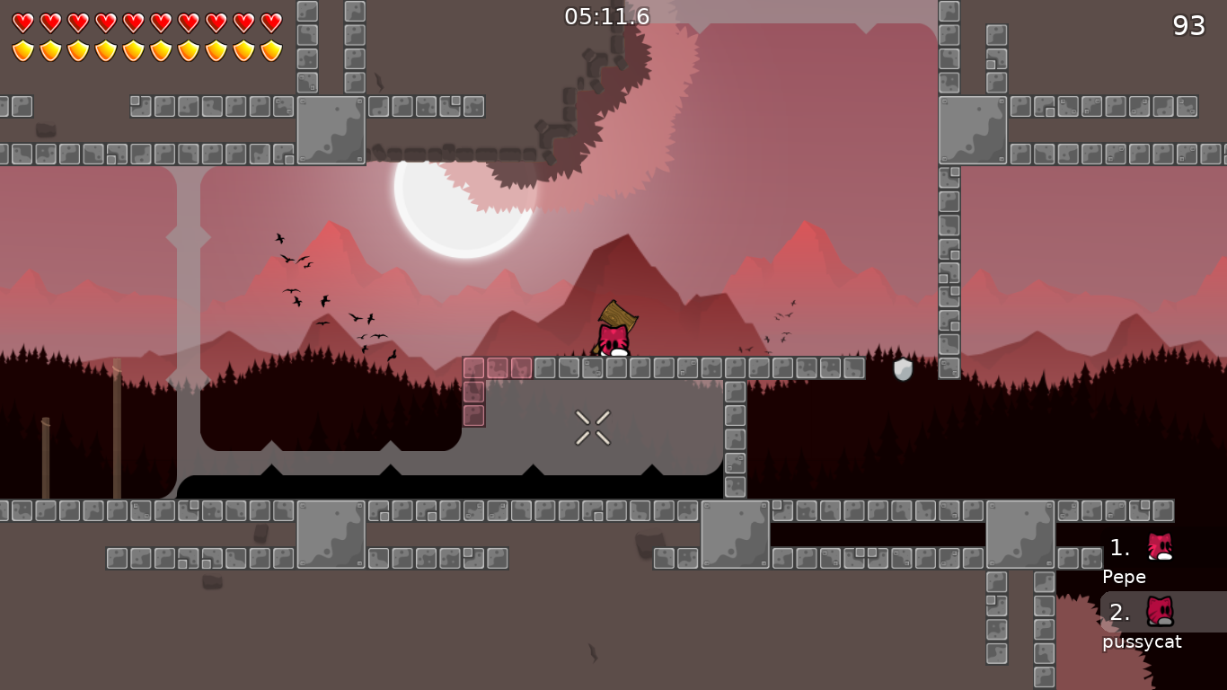
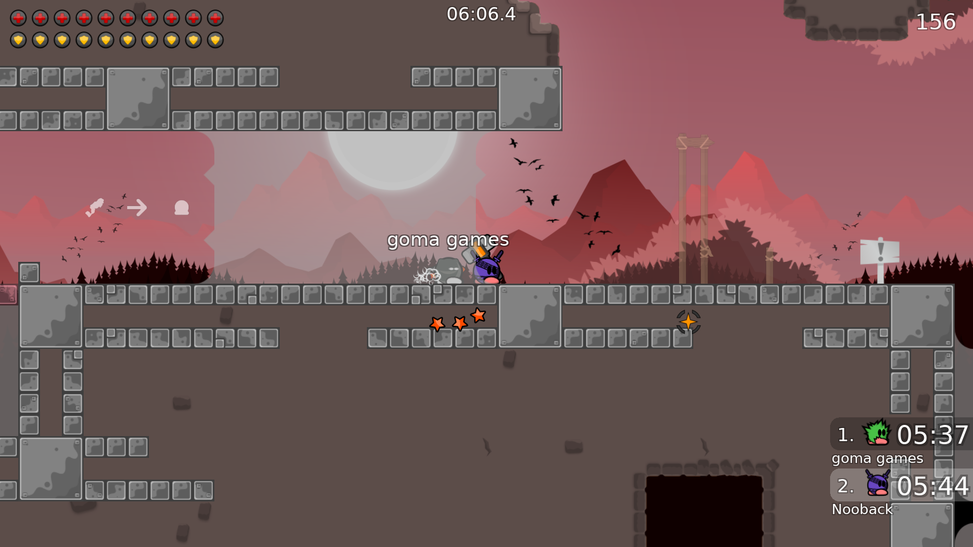
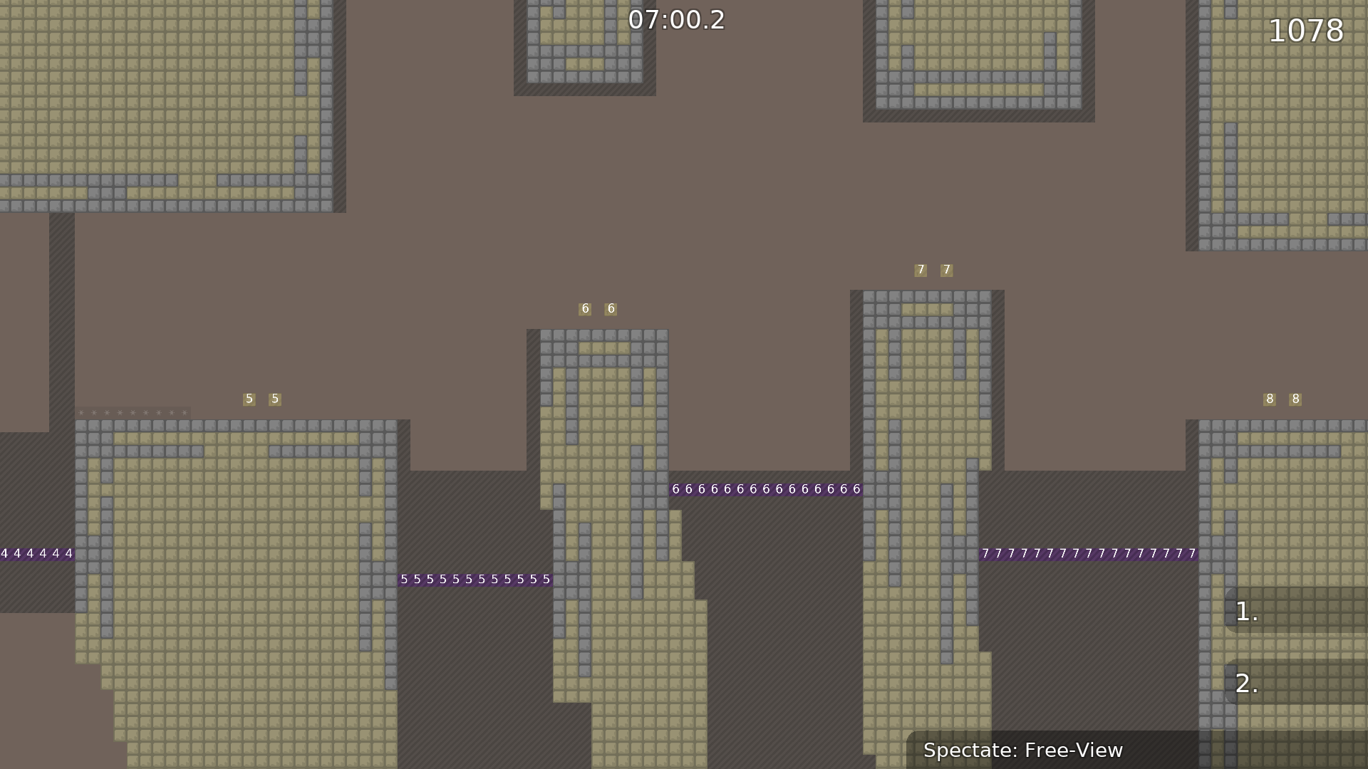
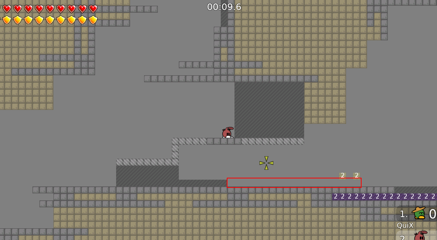
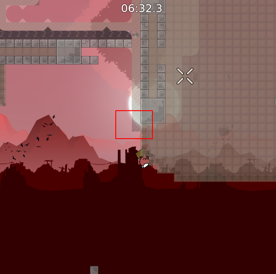
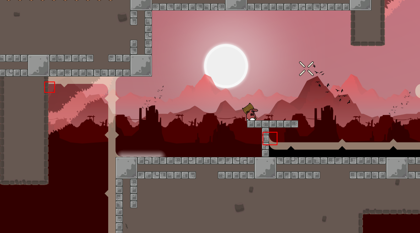
this is your map's testing channel! Post map updates here and remember to follow our mapper rules: https://ddnet.tw/rules
Map is unnecesarily big, maybe thats why its 1.18MB
You should fix that
beautiful design
I have to agree on that, design is amazing, and i love what you did with the unfreeze
for me it has some potential, specially with this design, i'd sugest to nerf some parts (like the laser part) because its a bit too hard for novice players compared to the rest
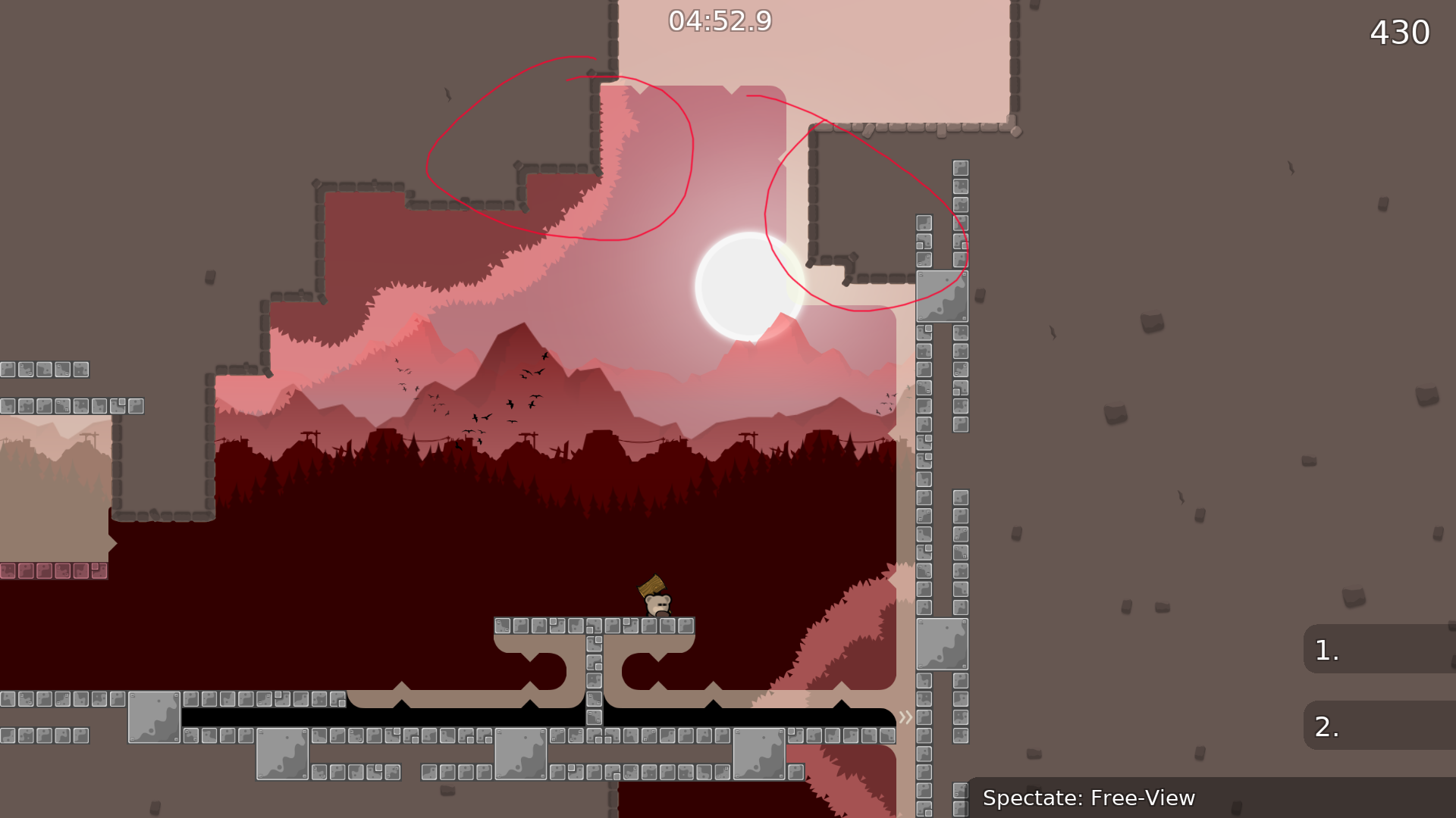
the two forests are way too dark imo
its all great except for the color of the forests
have not looked at gameplay yet tho
it depends on the resolution of your screen too, mine is not that good and it looked nice
i'd also suggest to change the start/ending design
doesnt fit with the map at all
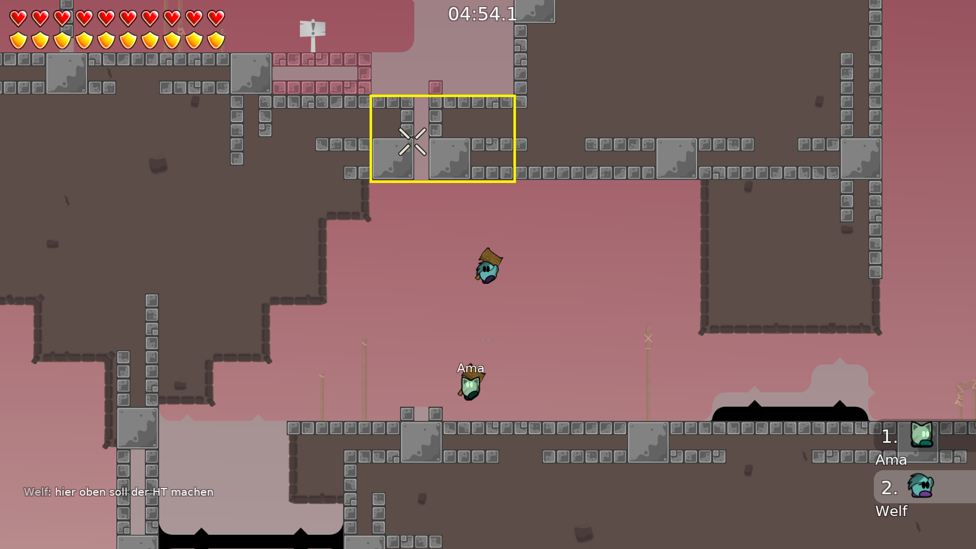
Hello there Pepe, thanks for the test ! :). The exclamation sign marks (imo) it looks good and i placed them in places where its a long jump where they cant see ahead (even tho isnt faily) or faily parts like in the first picture you send.
All of the hookthroughs i made them to simplify parts. For example in the first picture you send, its easier for them not to preciesly be on edge to hook out as they can slip of (ping/newbies), in the second image maybe u right i can make that normal unhook but still idk maybe some people cant jump that so thats why others can help (but yeah i can change that) and in the last pict same thing, instead of them being on edge to try hook/jump/move right, that ht helps to just easy catch. And for the laser part, newbies pass them easily, specially the second part, because when they got the laser at the first laser part, they know that they have to shot the tee, So the second part (as they also tend to hold a/d in their movements) they will just understand it, " this is all from what i saw idk what ppl think 🙂 "
Hm, not gonna lie, meanwhile i was mapping this map in trash server, some newbies joined, and they passed all the parts nice not big of a problem and also under 10 min team of 3 if i remember correct.
edit: really sorry for the size, idk there is nothing i can do to decrease it xD if i remove some mapres either it wont decrease it as much and it will make map more emptier :'c
Hey Nooback, thx for looking at my map. Tbh if i make the freeze to the end it will prob be a bit long/boring, but, a newbie i dont thing can make a hammerthrow. I can make it 2 tiles more to the right maybe ^-^
The design only looks good on discord its not fun to play on it
tele has the same color as background
but it makes a contrast with the white freeze + white freeze is visible hm...
I like design, just once I didnt know at first what to do when you have to go wall
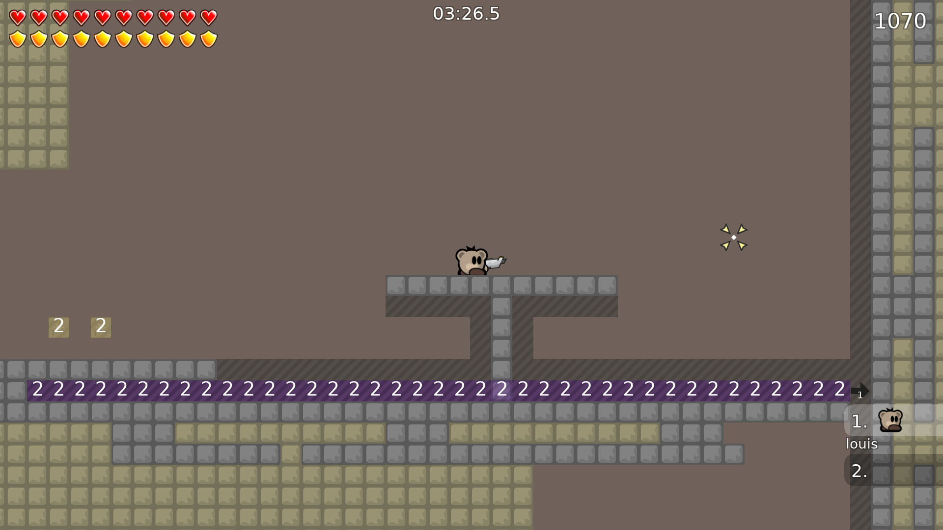
The thing is there is a part in The map where You think you can stand on but its teleporter
where?
might try out making the trees a bit lighter
im working on it ^-^
just make the two forests a little less dark and it will be very nice design
tele in block
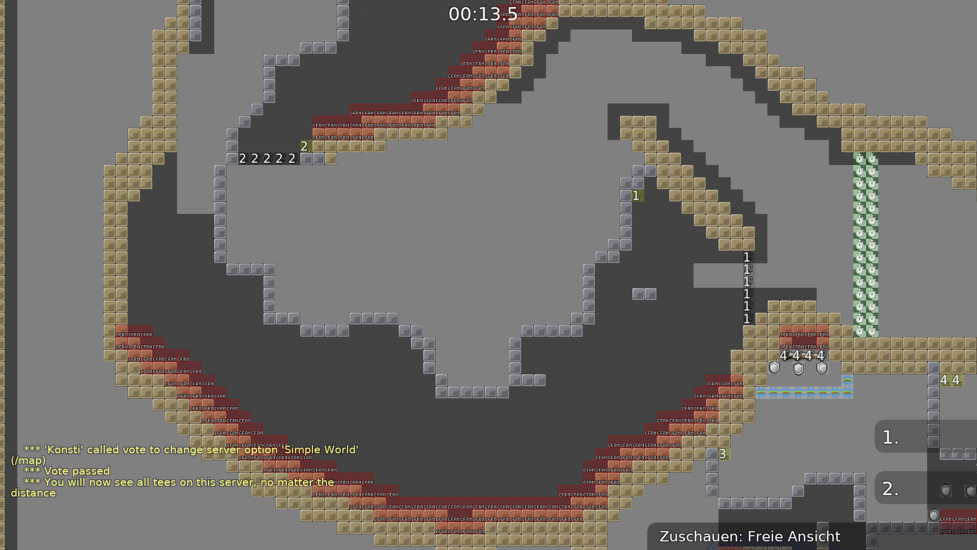
dont go on the map simpleworld in entities
wtf
- Changed the ending bit according with the beginning (island).
- Change hookthrough at Welf's suggestion part.
- Changed a bit the second image of Pepe (removed that ht and make the place a bit bigger and nice to jump on.
- Extended 3 tiles of the first laser part.
- Fixed that tele (Louis).
- I made the forest bit brighter so you can see freeze/tele colors better.
- Retweaked a bit the freeze make it a bit more "enjoyable" (i hope xD).
- And i tried to make it under 1mb 😄
id put some unhook here cause its not obvious you have to go right (or alternatively you could put an arrow going right or smth) so nobos might try to go up and unhook won't allow them to
oh i had the arrow pointing downwards on wall, i deleted i thought it was too easy xD
i will reupload the change if more fixing need done :3
also are u sure you want a tele on each jump?
seems a little too easy for me but it's up to you
better to have more hookthr than too little, players will just not use it if they don't need to
Here is a demo we record when i was mapping it, of the old changes 😄 https://www.youtube.com/watch?v=j-TQxqAuEyM
- Added some freeze at "cp12" just to not be that repetitive.
- retweaked ending a bit, made a cool ending with some jump movememnts (not hard tho).
- added some unhooks on some ceilings to focus the direction of the gameplay.
- added some marks as well (maybe some tees get lost :z)
why are there images from Crimson Woods?
dizzy x crimson woods
oh right, there's Dizzy bg too
from crimson woods i took the forest yh, couldnt find other nice forest, but Dizzy? nah i got from normal ddnet mappres lmao xD
well I'm not okay with people reusing stuff from my maps, should ask
@Oblikumquatabout dizzy stuff
u can use the mountains from dizzy for this map
so im not allowed to use mappres if i also find them on the internet?
u should check and make sure who made them and ask them for permission
sometimes mapres get reposted on the internet but you still need to ask the original creator
oukey
it's okay with original creator's permission, but as I designed Crimson Woods I already know I wasn't asked

yeh i understand, sorry
@Raviefor not asking u
gonna try make my own graphics from now on :3
Fixed some small things with Lenah
No more design bugs found, map seems rdy imo o:
didnt found anything, map looks fine
I really liked this map good for novice players yeah ! :D
Had to change a mappre because of new update, the info was grey squares idk xd
finally! fixed now jeez :/
Made some design changes to freeze and dilated text
made bg higher
Made logos smaller size, could you check if there is something else to change? 🙂
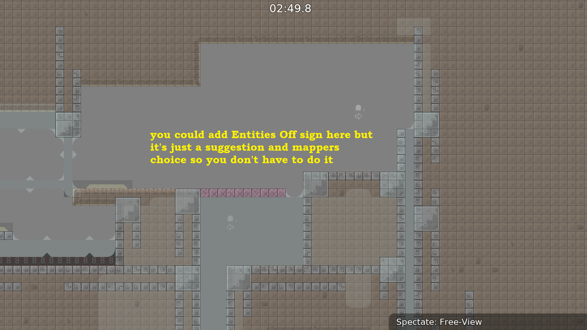
$ready 2
are you serious?
Most beginners do not play with entities
ok then......
to be consistent
This is not to say that you can't do it, I think the mapper can decide where to put entities off
( novice maps)
i will change it np, but what you mean blue arrows?
the blue arrows in entities
u cant assume all nobos dont play with entities, better to have it just in case
if someone shows a friend tw he will tell him about entities
i think that many new players know the entities, for example, I have helped a lot of new players in multimap and i told everyone to use the entities in the last part (the maze) and I think that I'm not the only one who has done this, multimap servers have many people and there is almost always someone who teaches them. also I can't ensure that they use the entities all the time
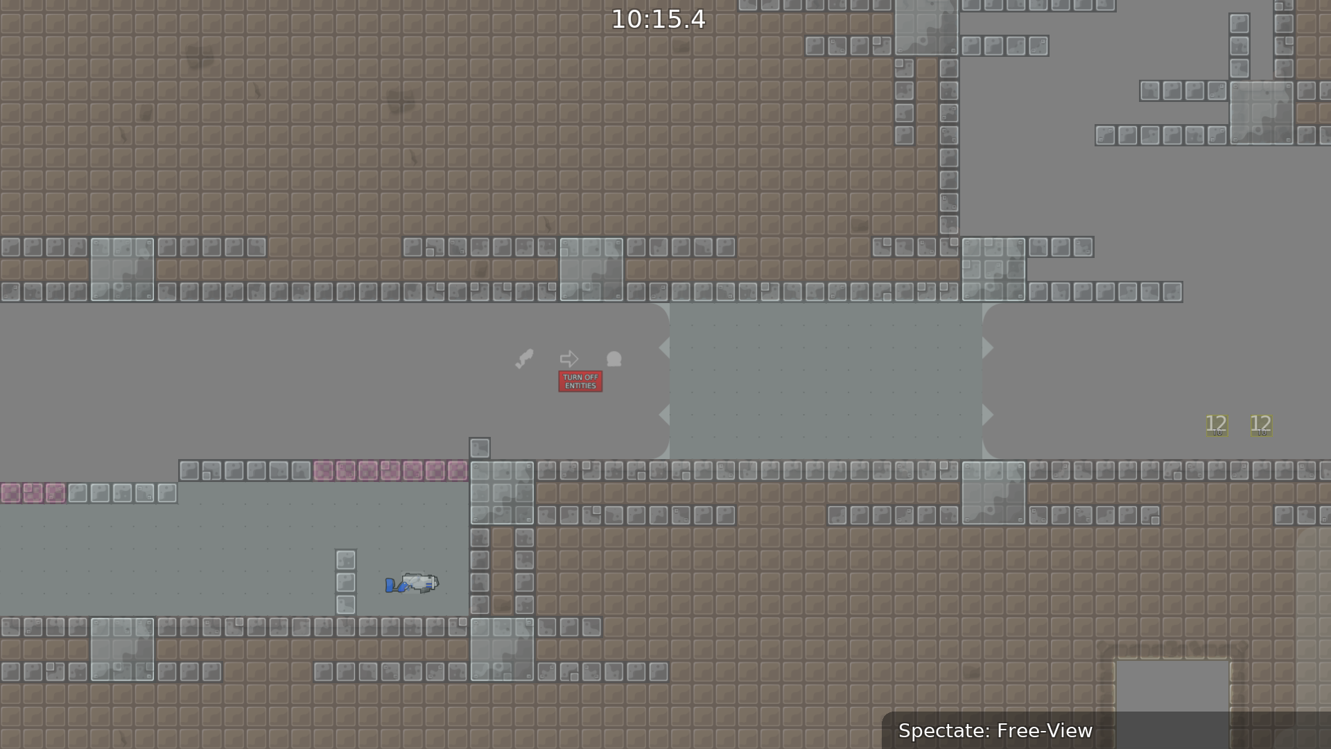
so should i add entities off in all parts that i place a guide then?
ofc
okey 👍
Added entities off

