this is your map's testing channel! Post map updates here and remember to follow our mapper rules: https://ddnet.org/rules

Why.

Recent moderate maps*
Glass box but moderate and without glass

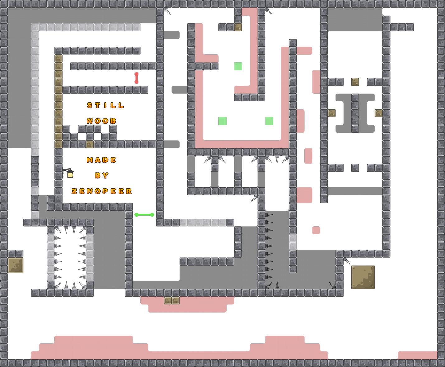
"still noob" written at the end of a map submitted in 2023? (and in moderate category? lol) everything about this map looks and feels extremely dated designwise other than the presence of red teleport and new hookthrough
you have stuff that's clearly designed to be played a specific way that nobody will ever play that way because it's designed poorly and is more easily done in ways that weren't intended
and the whole thing is painfully cramped and everything is either novice skill level or uncomfortable grinding your face into the wall until it works, 1 tile holes and stuff.
plus random kill tile spam everywhere
This part is 90% irrelevant, all you need is one hook and ignore everything else. The alternate 'easy' path below with kill spike spam is pointless, because it's harder and riskier and it still just dumps you in freeze anyway.
Bottom part is also just one hook
i can confidently say this map is going to get declined because it isn't fun, isn't mapped well, and isn't a good challenge for anyone in moderate category IMO because it is simultaneously too unforgiving and too easy.
you should try to take inspiration from newer maps, maps like this stopped being popular years ago
I think this a just first exp. in mapping xd
yeah, probably mapping is hard, to be clear. I would encourage people to give it a try and make stuff. my first attempts were kinda like this (though they weren't ddrace maps at the time) but this kind of map isn't gonna get accepted to ddnet, because players want maps where the gameplay lets players have fun with the mechanics of the game, not just struggle against them
you can try hitting up other smaller DDRace servers though if you still want this map hosted somewhere anyway, I know they can have different standards for what they allow
yep ı didnt think somebody will play sorry for bad english
but ı will fix that parts
$decline
Hey! well, this map cant be released because the gameplay has a lot of flaws that even with fixes cant be fixed, the parts are not interesting at all are more annoying than other thing, structural speaking is more of the same is too small sometimes to do things comfortably, pls take a look on recent novice map or recent maps in general to get an understanding on today standards. If you have any question dont hesitate in doing in his respective channels
#mapping#questionsand pls read
#📌infowhich contains rules of mapping
When you go to see recent map take a conclusión of it like… aah this map got released because has a decent gameplay, I well structured, has enough space, the design is clean fue I can understand easily most of what are trying to inform
yep its bad but my second map will be good
that's the spirit
to give some tips, try making the map more open space, people should in most cases be able to jump and not hit the ceiling, and make platforms a bit longer so a large number of tees can lay there and there still be enough space to do the part comfortably
that said I'm a big fan of flow-type gameplay (things like volt) so anything else I might say will be biased
that said I do think there are some cool ideas in the map
however the cool parts are typiclaly foreshadowed by the fact that a small mistake on them could result in death, which while on a harder map I'd be fine with, but as a short moderate I disagree with
keep in mind the difficulty of the map when considering how faily you want the parts, as well as length of them and more
I like the setup for this part, and I feel it'd be fine if both tees had to do it, but the lack of unfreeze makes it feel slow and repetitive, and the montony of the part is a huge contrast when compared to what the other tee is doing, which includes more thinking and fine movements in comparison to just "hold d and jump"

this fall could be a bit more creative, which you could do by adding jumping into the mix inside of it and giving dj back at certain spots, or including edges and or hooks to make it flow better, that said I do like how if you hold d too much you go into the kill tiles, punishing you for not thinking of what you were doing, or looking ahead, on the other side of things, I think that it's still too punishing. The "saving grace" teleport is a one block teleport, and the lack of space makes it harder even to hit it if you're off rhythm

this part I don't like, having to hit an upwards aled here is a huge spike in difficulty, and jumping into a one block gap (even with the hook there) is annoying, especially because if you fail it you have to aled again. furtheremore the idea that if you accidentally end wall against the pillar in the center you have to do it again is also frustrating and annoying, not to mention the part itself of having to stick close to the hook is both overused and just not fun to play, making it veen more annoying, and finally even the hook at the top follows the same principle, making all of this annoying central. That said, the throw at the top is fine, I'd give it a lot more space though, and make at least a 2 block gap where you have to throw the other tee too

the rest of the map is pretty innofensive, overall just needs a lot more space to be in, especially for any non-solo type map, good effort, excited to see the next one :)!
xd dont do that, the beginning always has to be fast and like..wide ig and then a part that block players to go on on the map
read the feedback pls
i made all the mistakes
but what is wrong in second map
ı did play and enjoy in second map
from the screenshot it looks like you've overcompensated and made it way too big
those are some long corridors with nothing in them
ı will make three ways. easy one for noobs can finish map but longest way ,medium one shorter than easy way but much harder and the hard one shortest and hardest way for pros can make speedrun and some afk rooms , pvp area and king part
if this is to be a race / solo map then you wouldn't be able to put PvP areas because players wouldn't be able to interact in them, and either way thats not really that's usually looked for in ddrace maps
but anyway, as far as critiques of the new map go, it's still clearly inspired by very old maps in ways that don't really fit with modern submission standards. the first part isn't unpleasant to play, but the long fall is still awkward. the ending 'hard' part is not the type of difficulty people these days usually go for in a similar way to your first map attempt.
also, you don't need to put two rows of grenade launchers at the top. you can just like, put one on each of the pillars to either side. (I'm assuming here that players spawn on both sides of the vertical shaft)
what ı should do
look at what moderates do nowdays if you wanna explore rocket for example, look at how modern maps give and take the weapon, how wide or tight the parts are, etc
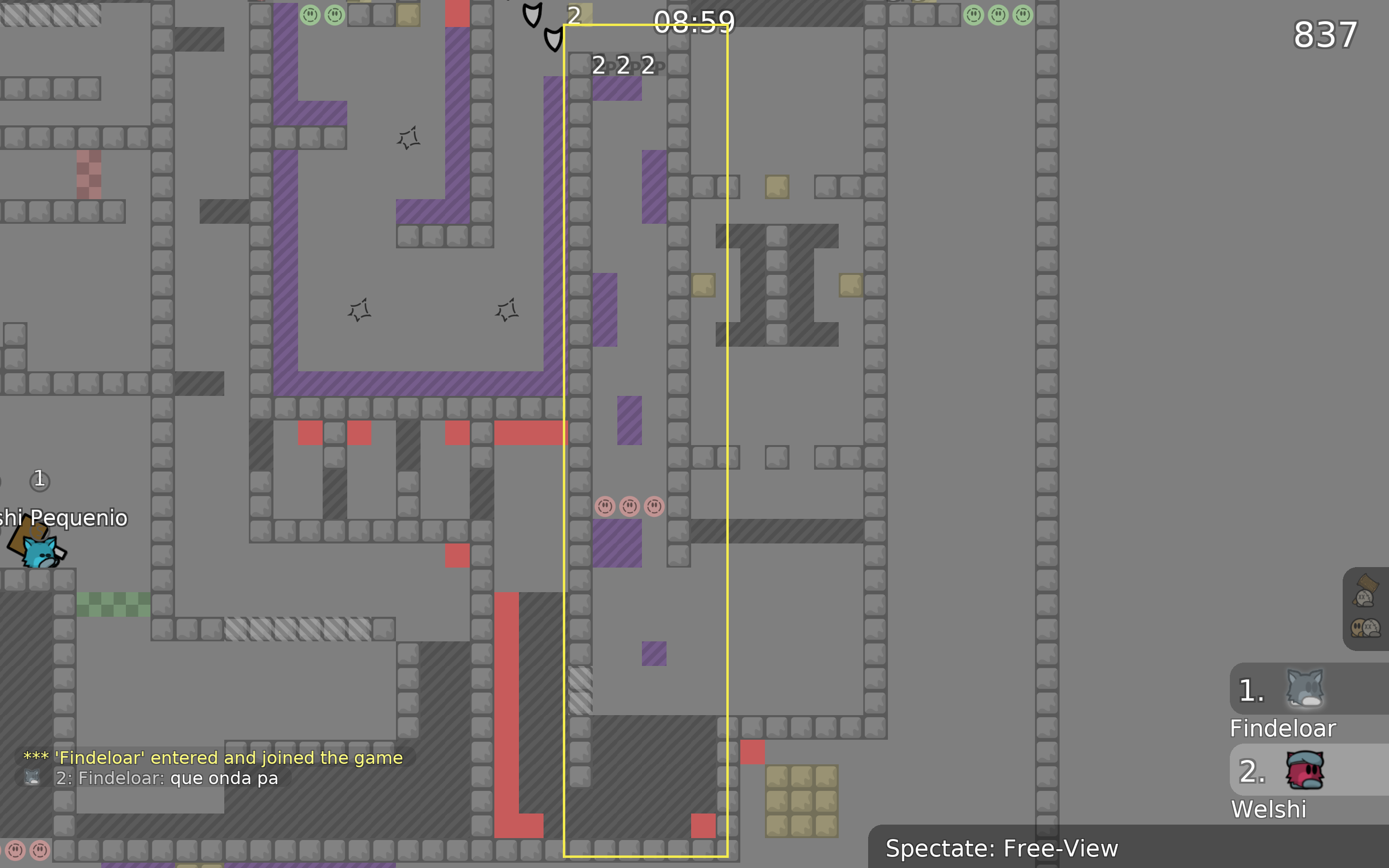
this recording is so scuffed
ı hate movavi
why not use the default ddnet renderer?
you barely have to do anything
ddnet renderer ?
what is that
It’s a form of recording ddnet does directly from demos
I’m not 100% on how it works, but you could also use a free application like obs
or uh like literally any other recording software in existance


