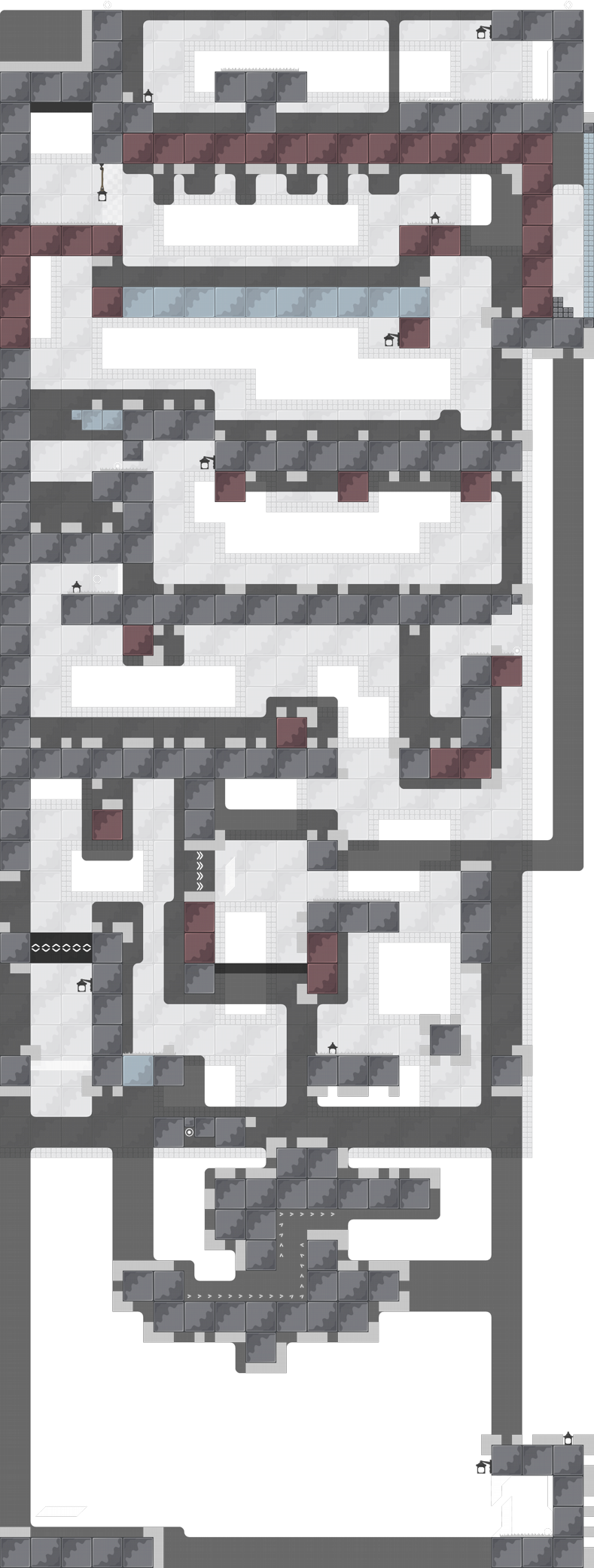
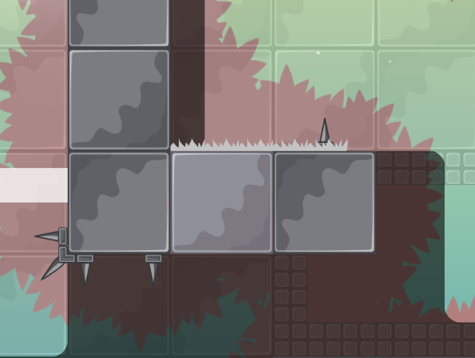
Creative design but It’s short af
short but hard
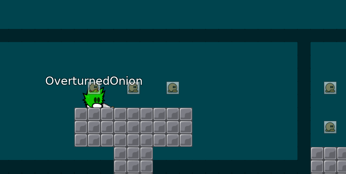
why 2 start lines?
i dont know what to say about this map, its too tight and extremly faily
there are more kill tiles than room to play
For me this map is too short, there are only 3 parts on the whole map. However the parts you created show that you have imagination. If the map had fewer killtiles and was longer it would have a potential. Now I think it's much too short to hope to do anything with it. I'm not going to decline it right away so I can read other opinions before I make a decision
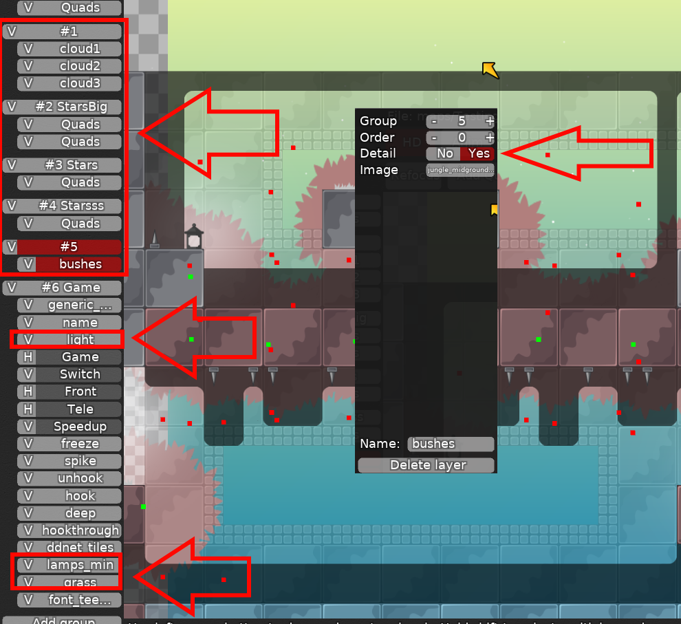
if it will not get declined, you should put most of design as HD, aka cluds, stars, bushes, lamps and generic bg
Interesting map, I am not really a fan of how precise some of the tricks seem to be but maybe it is more fun to more skilled players. I personally felt a little frustrated XD
Map looks really good and once you get down to ninja part (from stacking wall) it was quite amusing to me too XD
Alright lets go over the issues I had:
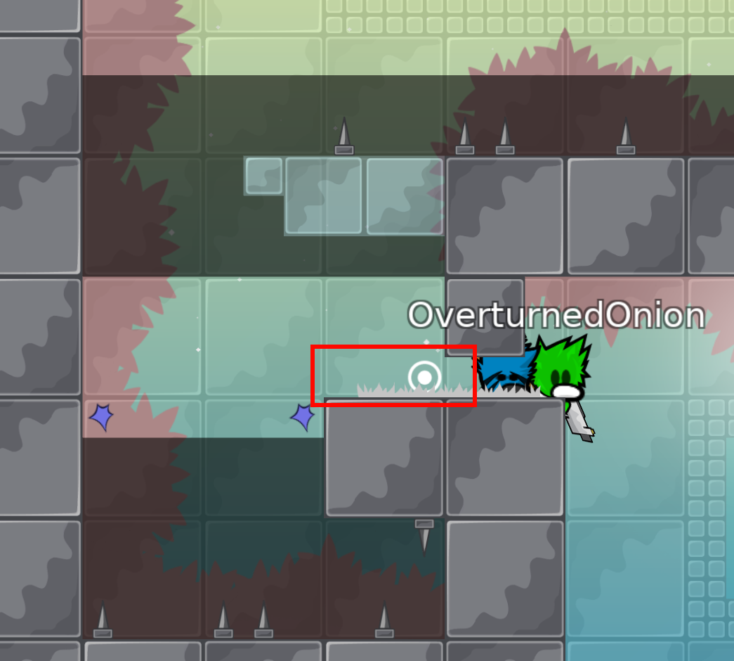
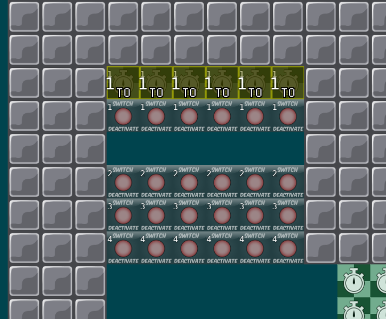
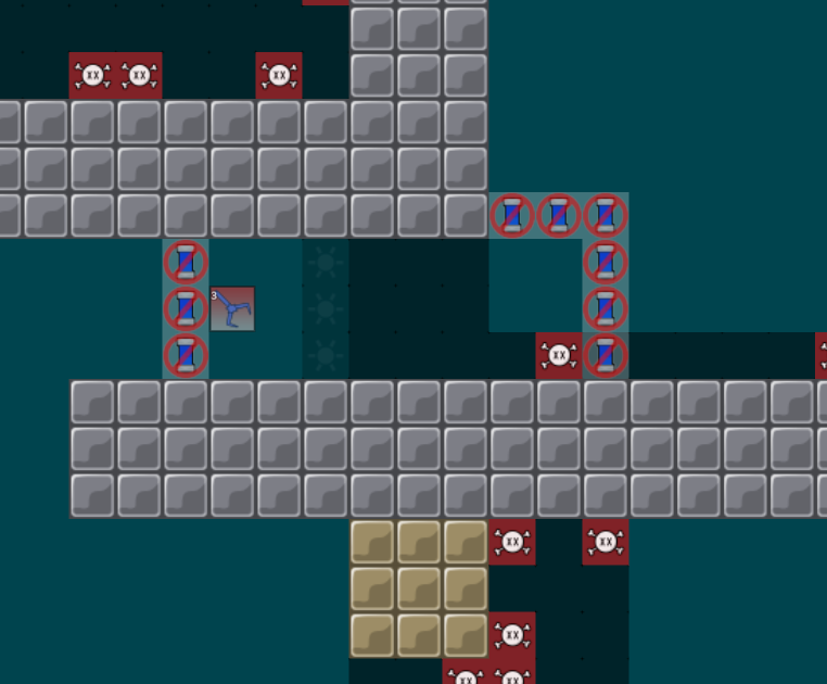
can easily jump through this so hitting switch isn't really required? I thought you could make the whole platform there stun and let the puller throw you straight to the swing instead? Might need to adjust the hook for it but it did feel weirdly easy in comparison to rest of the map. Not serious issue though.
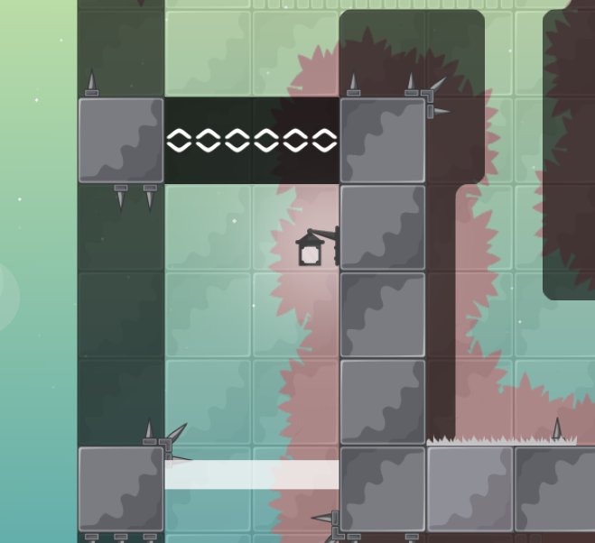
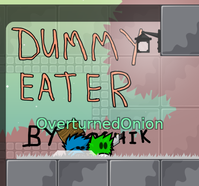
You have a lamp over your maps logo? I would suggest a slightly larger start area and ensure the maps logo isn't obscured by lamps XD (Also I think moving logo in front of the lamps light might look nicer) Another thing you could do is add a turn off entities sign by your logo to remind players in entities to take a look at your map design.
$waiting
I don't want to go back to this map right now, and it seemed pretty small, so maybe when I get some ideas, I'll add something and improve it
maybe I shouldn't have posted it so early
So you want this declined?
yes
$decline
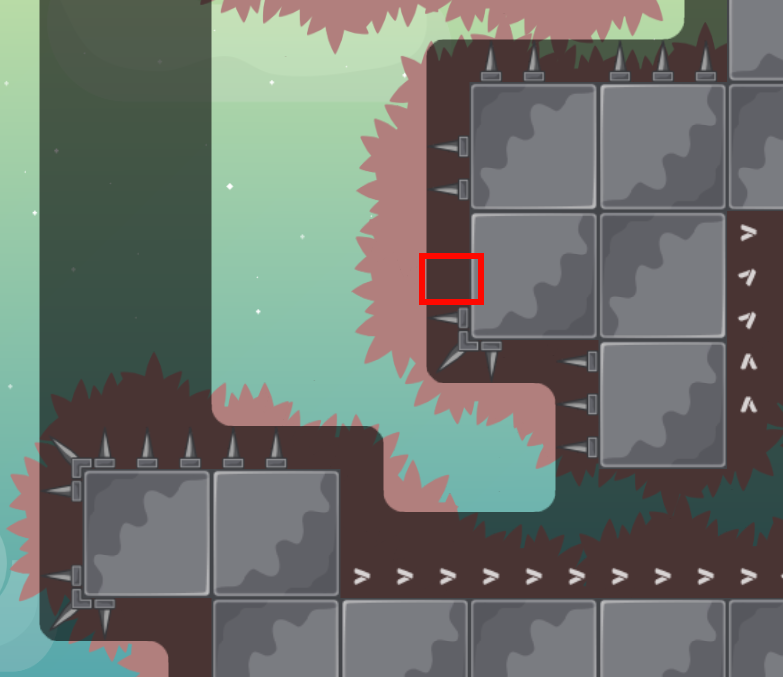
ofcourse you are allowed to re-submit this map when you came up with more parts. I also suggest you to ask some other players for feedback before uploading, because this map was kinda weird from what i saw (i didn't play it too much). E.g. the first drag was kinda tight and it seemed like you didn't plan it to be like this. It rather seemed like it was tight because it's your first map and you didn't think about it that much.
