#Ancient_Ruins
"Ancient Ruins" by ♂S1mple♂ [Novice]
DDNet 03/09/2023 2:17 PM
@F0rtishka

this is your map's testing channel! Post map updates here and remember to follow our mapper rules: https://ddnet.org/rules

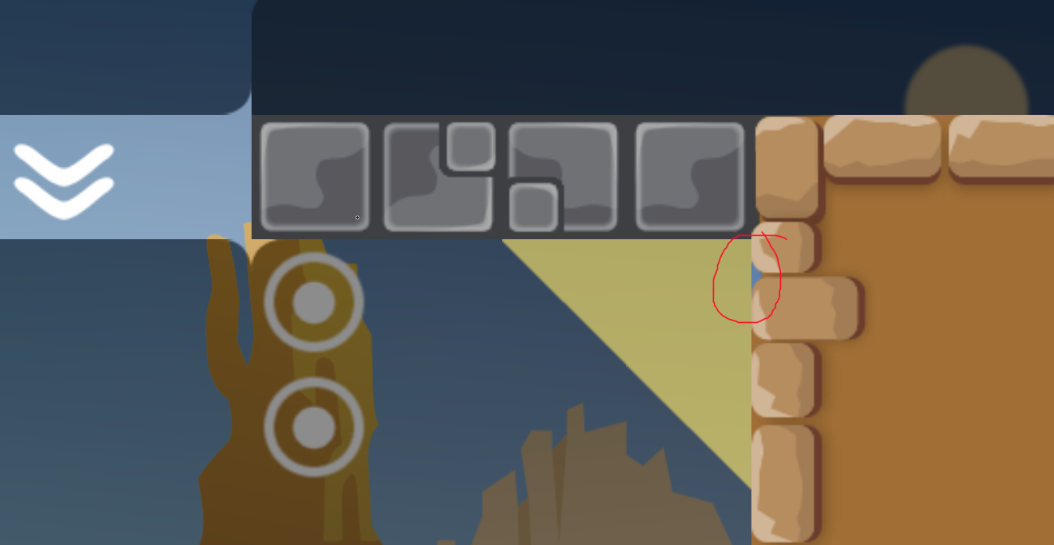
PopCorn181 03/09/2023 4:34 PM

Corner

F0rtishka 03/09/2023 4:48 PM
  • Corners
I.K.U 03/09/2023 8:08 PM

why would you fix corners on a oldschool map

I.K.U 03/09/2023 8:08 PM

unless its not actually oldschool

PopCorn181 03/09/2023 8:12 PM
F0rtishka 03/09/2023 8:12 PM
F0rtishka 03/09/2023 8:14 PM

you mean my map counts as oldschool?

I.K.U 03/09/2023 8:15 PM

when was this map made?

F0rtishka 03/09/2023 8:15 PM

month ago ig

I.K.U 03/09/2023 8:15 PM

oldschool maps are about 7 years old minimum

F0rtishka 03/09/2023 8:16 PM

so why you considering my map as oldschool?

I.K.U 03/09/2023 8:18 PM

OH

I.K.U 03/09/2023 8:18 PM

i tought the baby face was 👴

I.K.U 03/09/2023 8:18 PM

my bad

Raks 03/10/2023 10:10 AM

When i play through on this map, i just wanted to end it. Most of the parts was boring and really oldschool. The drag parts doesnt have any special hook even if its novice. Those things just my opinion

F0rtishka 03/10/2023 10:16 AM

Thanks for the review! Could you say what parts was most boring so i can rework dem?

Raks 03/10/2023 10:16 AM

I will take a look soon and show you

Raks 03/10/2023 10:53 AM

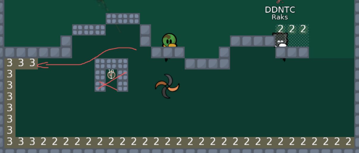
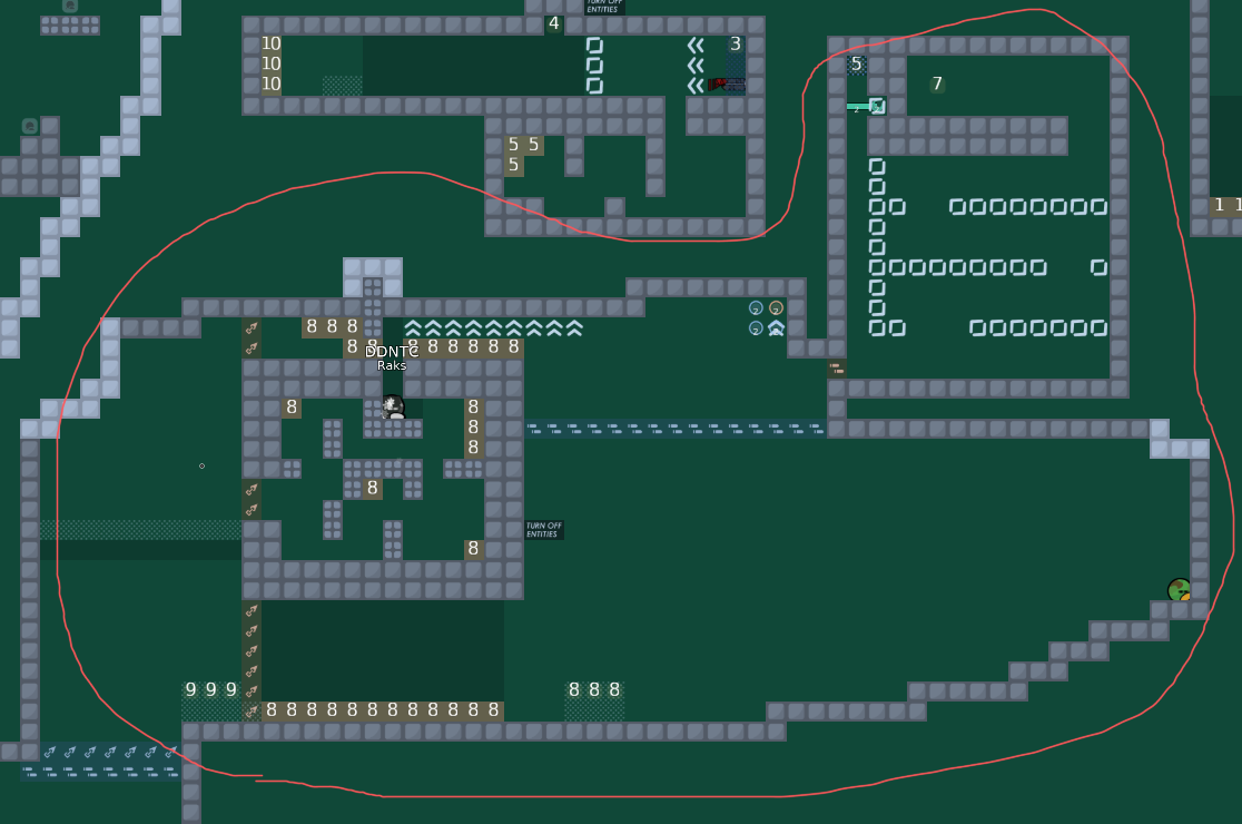
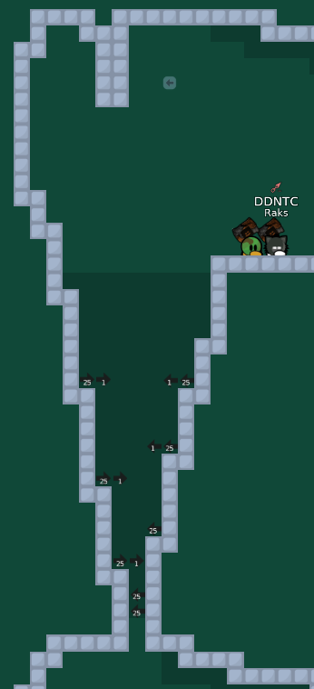
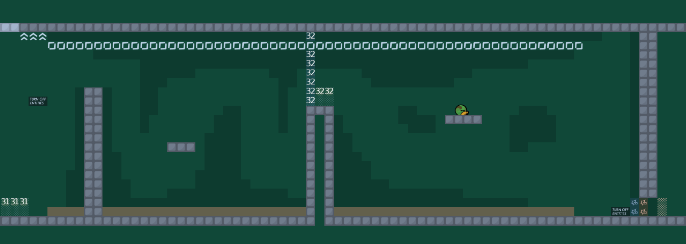
This is the first part of the map, in my opinion in t0 there is not enought space. The drawed arrow like when p1 drag the p2, there is a chance they miss open the door. The drag part is simple and using the oldschool drags

Raks 03/10/2023 10:55 AM

This part is also missing more space for t0. U could fix it like u remove the livefreeze and make more space for the players.

Raks 03/10/2023 10:56 AM

IMO this gores have to removed, i think it's bit difficulty for novice players.

Raks 03/10/2023 10:59 AM

This part looks messy and the novice player's maybe get lost by how to make it or something. i would rework it.

Raks 03/10/2023 11:00 AM

And also breaks the flow

Raks 03/10/2023 11:00 AM

The next part with jetpack and endlesshook should have more space

Raks 03/10/2023 11:03 AM

At this part please make checkpoint and u can fail here if there is no player up in the freeze.

F0rtishka 03/10/2023 11:03 AM

Will rework parts you said when i'll be home, but what should i do with this drag?

Raks 03/10/2023 11:04 AM

Checkout the new novice maps to see what kind of drag the are using

Raks 03/10/2023 11:04 AM

And use something like them

Raks 03/10/2023 11:04 AM

But not just copy, u should rework them to something new

F0rtishka 03/10/2023 11:06 AM

About that part i thought people would think that they have jetpack and can boost themselves, but because players can't then i'll just do as you said

Raks 03/10/2023 11:07 AM

Change this part too. Rework the drag bc its boring, long etc...

Raks 03/10/2023 11:08 AM

Short and awkward hooks and no space

Raks 03/10/2023 11:10 AM

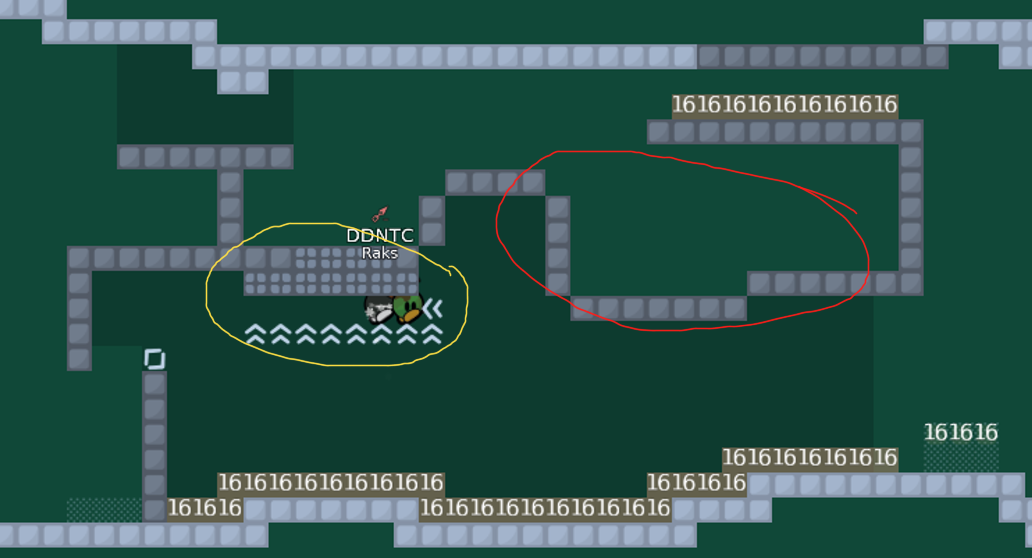
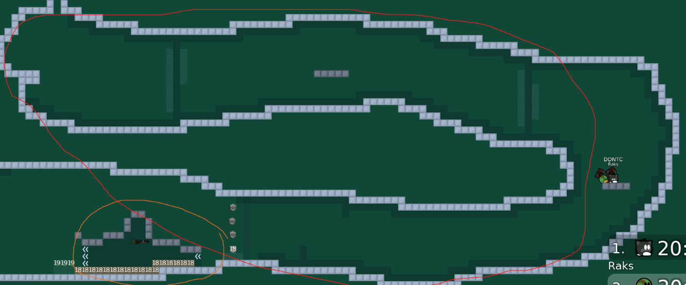
For example, the red marked drags are oldschool and boring. The yellow marked drag teaches more new movements in drags and also cool.

Raks 03/10/2023 11:11 AM

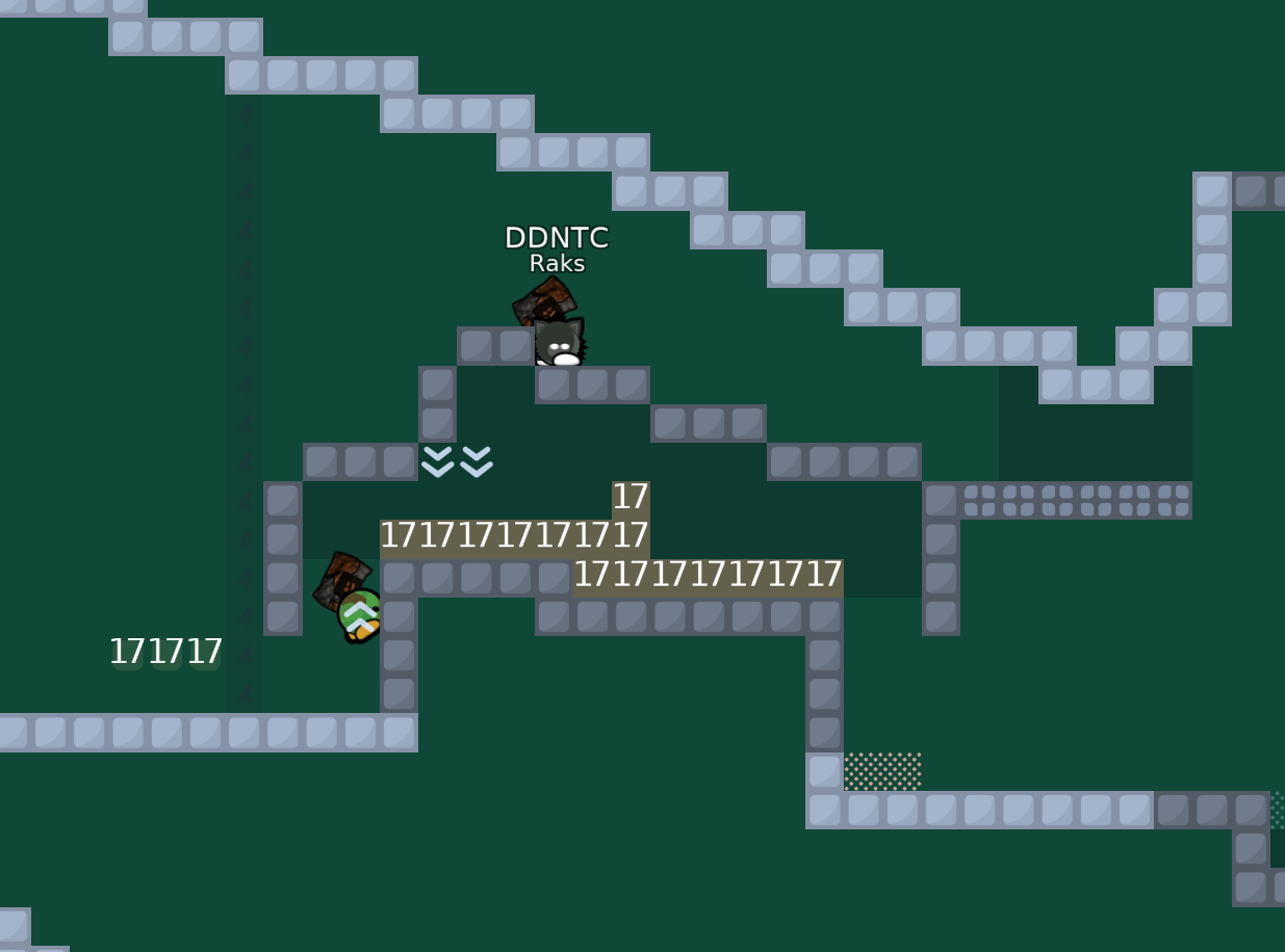
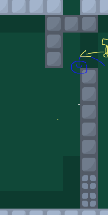
You dont even have to jump to the wall. The speed ups automatically put you middle

Raks 03/10/2023 11:11 AM

Useless speed ups or useless wall

Raks 03/10/2023 11:13 AM

The red marked part (gores) is too faily for novice players. You could make something else here. The yellow marked part is have the same problem as the teleport 17 part.

Raks 03/10/2023 11:17 AM

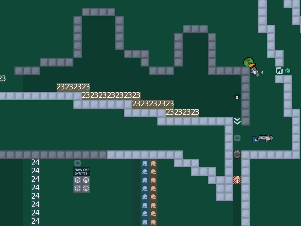
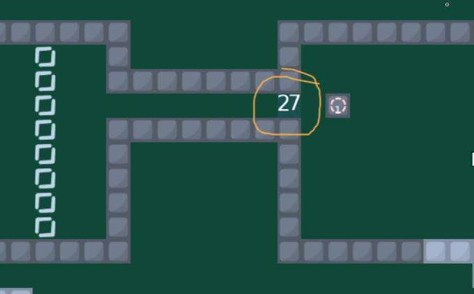
At this part if they by accident fall down and there is a chance they walk backwards and go in tele 18 they lose the shotgun again. Maybe but the to 19 teleport away from 18, also make more space for the players.

Raks 03/10/2023 11:20 AM

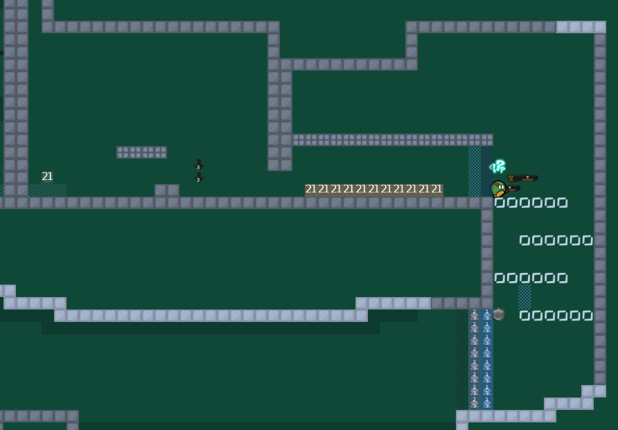
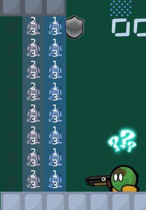
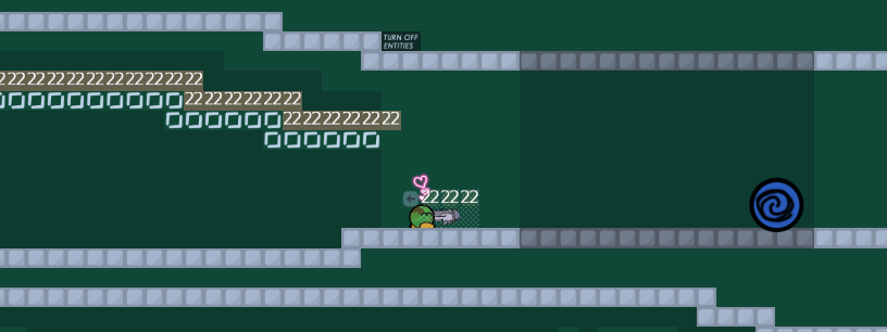
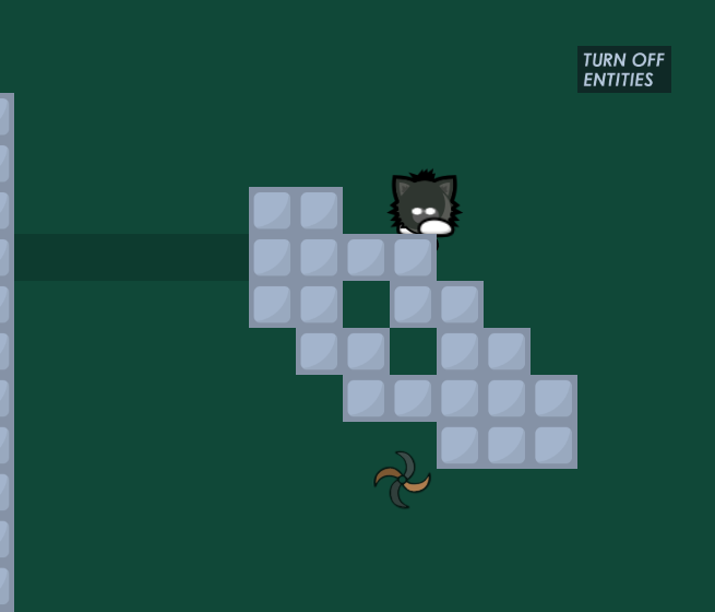
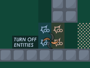
The entities are really stacked up and cannot really see what do i lose what do i get etc... And without entities i cant really see what is that white line bc the bg too bright

Raks 03/10/2023 11:22 AM

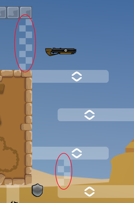
Invisible speed up without entities. U could just make it without it. On the second picture there is an example

Raks 03/10/2023 11:23 AM

This part is boring, u can lose the flow, and useless. remove it or put something more intresting part here.

Raks 03/10/2023 11:24 AM

Great idea but i would make it in other way with more space.

Raks 03/10/2023 11:25 AM

Stacking the entities again

Raks 03/10/2023 11:27 AM

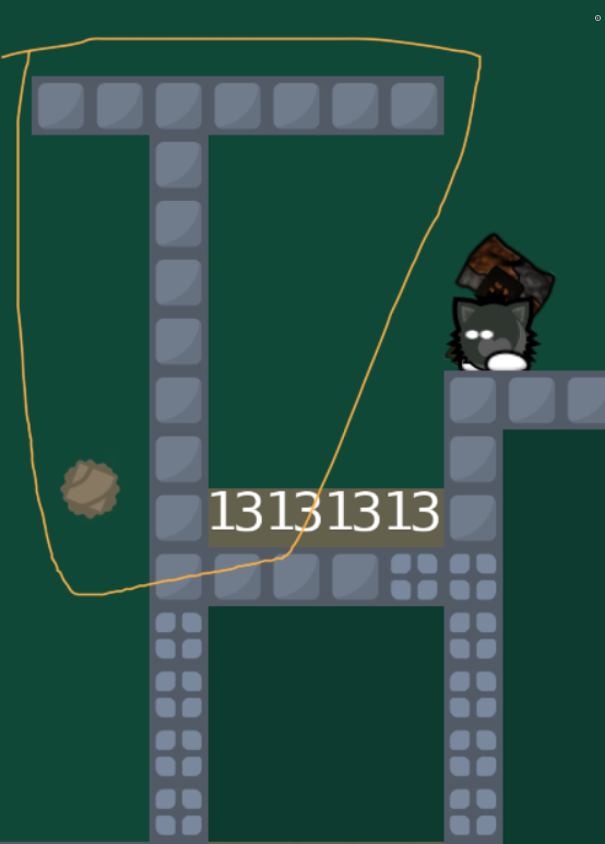
At this part u can just do like this without fall in. Blue = p1 Yellow = p2.

Raks 03/10/2023 11:27 AM

U just put more freeze like cover the edge and done.

Raks 03/10/2023 11:27 AM

and more space...

Raks 03/10/2023 11:29 AM

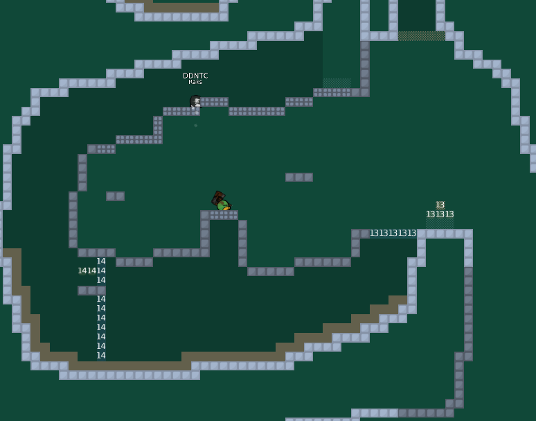
Where im standing on the picture, there is no enought space between the 2 part. Make it larger.

Raks 03/10/2023 11:30 AM

You can skip the deep part

Raks 03/10/2023 11:32 AM

After u skip the deep part its aint a help but this drag again.. Rework...

Raks 03/10/2023 11:35 AM

This whole telegun part would make the novice player confused. Also i think its bit difficulty. The telegun can be used on the novice maps, but with easyer moves.

Raks 03/10/2023 11:36 AM

All kind of drags like this one should be reworked

Raks 03/10/2023 11:37 AM

This part just a little difficult

Raks 03/10/2023 11:37 AM

Very long and boring gores...

Raks 03/10/2023 11:40 AM

The end parts are a good idea like u can choose 2 way to finish. But change the parts for the novice players. The hammerfly part can be little bit harder.

Raks 03/10/2023 11:40 AM

About the design. IMO everything should be different.

Raks 03/10/2023 11:41 AM

The map too bright, sometimes the blocker tiles seems like unfreeze etc...

F0rtishka 03/10/2023 12:48 PM

Wrong screenshot whoops

NeZoX 03/10/2023 12:48 PM

If it was the way I see it, it would be cool, but what you did doesn't work

F0rtishka 03/10/2023 12:49 PM

can you describe what should i change in it i'm new to mapping and don't really know tho

NeZoX 03/10/2023 12:51 PM

Upload the changes im need to see this in game

F0rtishka 03/10/2023 12:52 PM

it will be messy tho should i?

F0rtishka 03/10/2023 12:55 PM
  • Deleted 1 part
  • Reworked 1 part P.S. Not finished design & gameplay on deleted part
DDNet 03/10/2023 12:55 PM
F0rtishka 03/10/2023 12:56 PM
DDNet 03/10/2023 12:56 PM
F0rtishka 03/10/2023 12:56 PM

jeez

F0rtishka 03/10/2023 12:58 PM

fix?

DDNet 03/10/2023 12:58 PM
F0rtishka 03/10/2023 12:58 PM

bro tf

F0rtishka 03/10/2023 12:59 PM
F0rtishka 03/10/2023 1:00 PM

my god finally

NeZoX 03/10/2023 1:39 PM

idk you can make something like this but this is just an idea, do something better than this

NeZoX 03/10/2023 1:46 PM
NeZoX 03/10/2023 2:15 PM

or this one

NeZoX 03/10/2023 2:15 PM

say, you like this one?

F0rtishka 03/10/2023 2:31 PM

Woah this one looks great

NeZoX 03/10/2023 2:32 PM

and make it a little easier and it will be a novice part

F0rtishka 03/10/2023 2:33 PM

Thanks for the idea!

F0rtishka 03/10/2023 5:33 PM
  • Reworked two parts
F0rtishka 03/10/2023 5:36 PM
  • Corners + design
F0rtishka 03/10/2023 9:02 PM
  • Reworked 2 more parts
F0rtishka 03/11/2023 1:10 PM
  • Reworked 3-4 parts
  • Fixed some bugs & design problems
F0rtishka 03/11/2023 7:13 PM
  • Reworked 1 part
  • Bug fixes
F0rtishka 03/12/2023 12:21 PM
  • Reworked 2 parts
  • Bug fixes
F0rtishka 03/12/2023 12:22 PM
@Raks

is this map got better so far?

Raks 03/12/2023 12:46 PM

I will take a look later

Raks 03/13/2023 3:25 PM

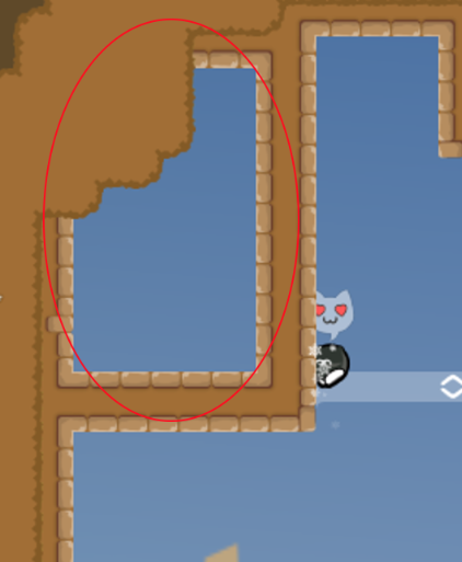
Can u fill it up please? There is 2 hole in the hookable

Raks 03/13/2023 3:41 PM

This pillar useless

Raks 03/13/2023 3:41 PM

No need

Raks 03/13/2023 3:48 PM

hole

Raks 03/13/2023 3:50 PM

Why not filled up?

Raks 03/13/2023 3:51 PM

Make this part as a checkpoint

Raks 03/13/2023 3:52 PM

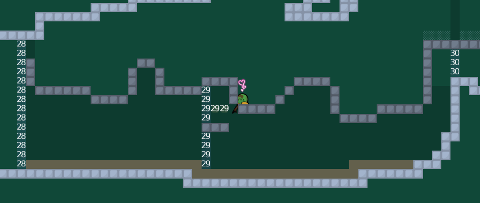
more holes. check the whole map like does it have holes like this or not

Raks 03/13/2023 3:54 PM

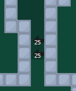
The speed up dont need, if they jump to the wall all of the players will be on left wall.

Raks 03/13/2023 3:57 PM

You could move the blue marked shotgun part to left and there will be more space, and just rework the red marked part

Voxel 03/13/2023 3:57 PM

papota

Raks 03/13/2023 3:57 PM

No im aint look at the corners only

Raks 03/13/2023 3:58 PM

I would use other tile for mark the livefreeze. This one just looks like start and end line

Raks 03/13/2023 4:01 PM

The red marked peace is just looks weird IMO. And put more sign of the blue marked mark.

Raks 03/13/2023 4:04 PM

There is no mark for removing inf jump

Raks 03/13/2023 4:04 PM
F0rtishka 03/13/2023 4:24 PM

Nah now i'm thinking that i can make new map, better than this. Anyway it was first experience with editor, now i can move on and veto this map. $decline

F0rtishka 03/13/2023 4:25 PM

Big thanks to

@Raks

and

@NeZoX

!

Arrow 03/14/2023 10:35 PM

$decline