
this is your map's testing channel! Post map updates here and remember to follow our mapper rules: https://ddnet.tw/rules


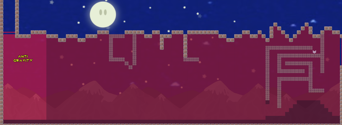
the design of this map its ugly
2012 design xd
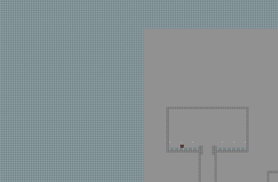
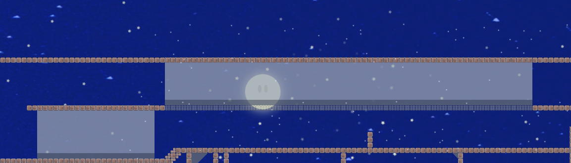
bad image to bg , look.
what I think of this map;
1 - the design is very old and nobody likes it anymore, play new novice maps for more experience
2 - the map puts new objectives, but it was placed in a boring way, right at the beginning of the map it becomes very boring for a newbie, maybe it will pass like nothing, but we have to think about newbies when we go to make new maps
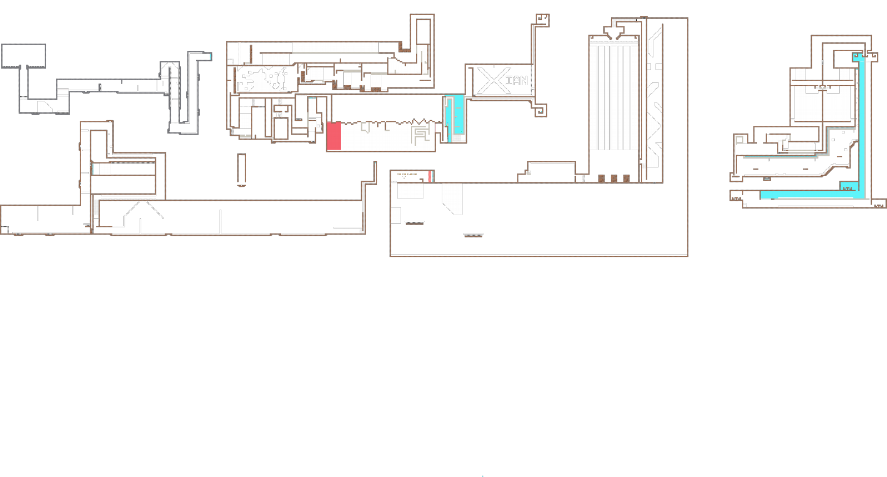
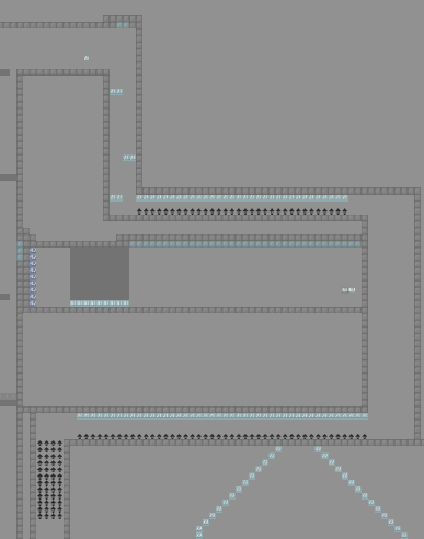
3 - the background is very poorly done, excluding snow and stars, the bg is a badly enlarged png.
4 - The freeze for those who don't play with “show details”, is practically invisible, this is horrible for those who have a bad PC.
5 - the map does not have a good gameplay, full of boring or repetitive parts.
6 - the drag pieces are also very boring and have an ugly design.
7 - the map is full of messy difficulty, whenever you make a map balance the difficulty.
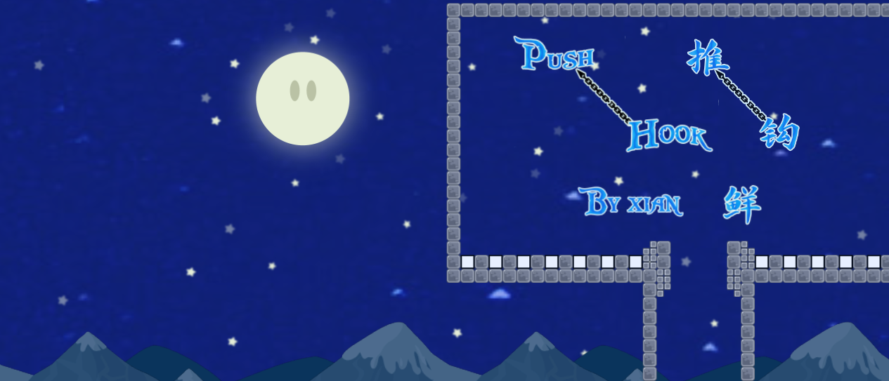
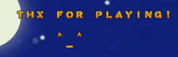
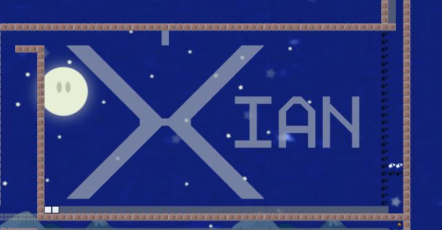
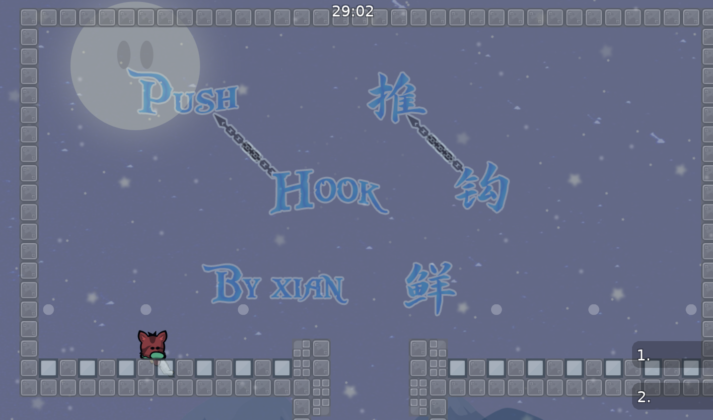
8 - the map logo is cute, but at the end of the map, the message from thx reminds me of 2010.
9 - the tile hook is very ugly, and nothing to do, the hook and the hook must be at least the same mapre.
10 - the map has a lot of problems, if you can't fix all the errors, it will be rejected.
11 - Play more new maps in the novice style, have more experience in drawing and in the map itself, I see that if you gain experience, you will make incredible projects! Continue, don't stand still, don't make a quick map, or too lazy, pay attention to each mistake to succeed.
11 pointed things and half of them still irrelevant to 1


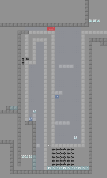
this map is way too hard for a novice map
decline or you want to stay for a while?
why look
hard for a noob

hmmmm
wtf moderate part , did you see?

bad and boring part

ddmax design = bad

boring and repetitive part

hard + ddmax design + boring = very bad part
horrible part

2010 , thx message
hard part
horrible design

Play more new maps in the novice style, have more experience in drawing and in the map itself, I see that if you gain experience, you will make incredible projects! Continue, don't stand still, don't make a quick map, or too lazy, pay attention to each mistake to succeed.
decline or leave it for longer?

ill look latrer

ddmaxish


when i play this i get vibes from several months ago when i was nobo, and was playing kobra 3 and struggling on gores parts
Thanks for advices! I misestimated the difficulties, and maybe i should make some changes then resubmit it to moderate server
No need, we can change server

wow that's uhhh
Very Good Feedback
whenever I finish my map I want you to gimme feedback
You Are Very to the point
ok
As Maluco's feedback was 70% about design, i'll try to give my useless feedback too.
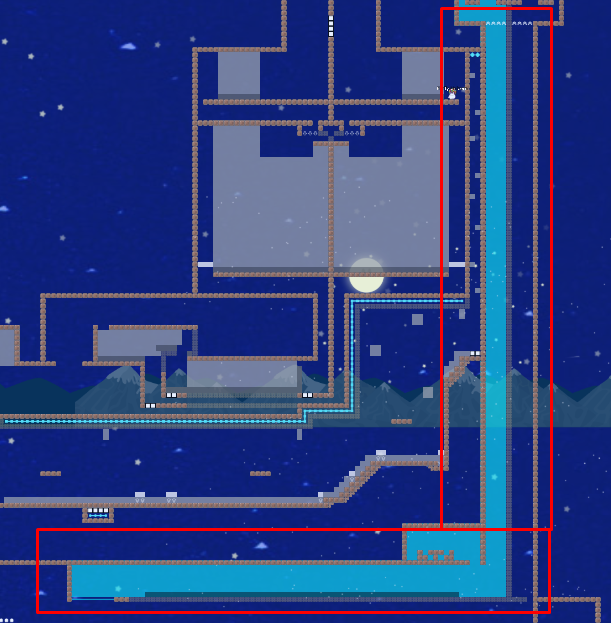
Seems like you used "Border" function in editor, nut sure what was your intentions about that but it doesn't have to be used most of the times, because:
- your map is already closed and the border doesn't make sense at all
- it gives extra size to map file for nothing, even if it's really low, still should be considered
- looks ugly af in entities for this kind of design
because we have a lot of players with entities, in order for them to see your logo, placing "turn off entities" sign in entities became a must as it lets them know that there is something behind that sign.
everything non irrelevant to gameplay > should be HD. you put everything under HD but you forgot mountains also :D
The only thing which can be an exception is the logo, as players with HD off wouldn't see it and that kinda sux
(HD - High Detail)
it's nice that you tried to respect all mapping rules, though spawn tiles in solo parts would be better if they are grounded (placed on ground) because:
- no one will bounce from same spawn tile as you are in solo
- it's slightly faster to spawn in ground and feels cozier
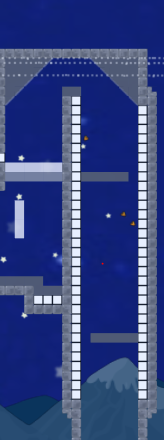
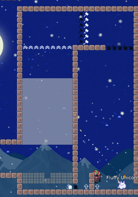
so, here we begin with noobfilter. I feel like this part is impossible to do, maybe because i play like trash. But it's really really hard, tried it for like 10 mins and still can't pass it. Maybe moving the wall a a bit to right might be a great solution for it, so it's easier to do
(finally got it but still hard omfg)
if you have design which helps you to understand the part better, you should place "turn off entities" under it or mark it with game layer arrows

alright i'm finally done with nobofiltered and it did filter me well. It feels quite unbalanced
also, if you are planning to map novice maps in future (i know this definitely isn't a novice map) try to avoid making noobfilters or make it easy af
Why?
Well, first of, the map is dedicated for nobos, and making a noobfilter to filter them on a novice map makes no sense to me. Why would you filter someone for who you did the map? (nobos)
^this is just my personal opinion
 2
2

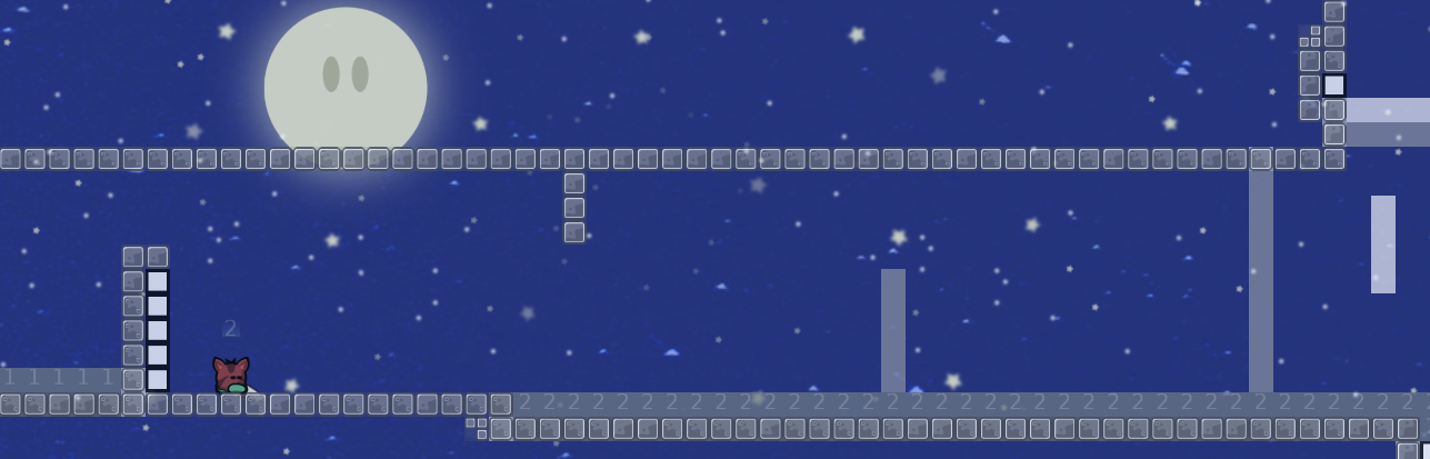
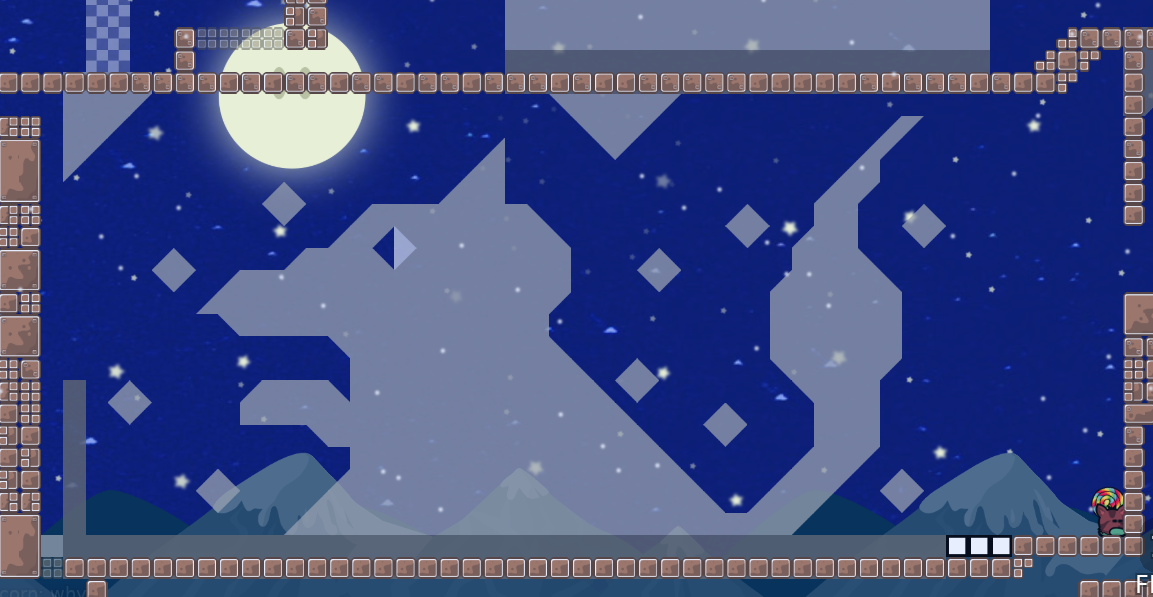
Great design
the map started cool, but then next part... made me almost rq. It's really really long and boring af, and the obstacle at middle.... awfull
the idea behind that part is nice. But it's kinda bad executed and feels randomish because of the arrows.

you could use stoppers there to improve the part and make it more interesting, for example you could put diagonal stoppers in right side of part and it will also became as an novice part (not counting first half of that part) because it wouldn't be that randomish and you don't have to be carefull af that you can push him back to previous part. And the tele down there feels only for troll pruposes
as example, something like this might work

try to be a bit more creative in such cases and don't force to do same thing 3 times in a row, it gets boring and a lot of player might just rq as there also is lacking cp, which basically force to do same things million times. Once again, not a bad idea but bad executed
this one is actually a good part, pretty aswell. Not annoyng, not boring and not that bad executed. Thought i would bulli you because there is no unfreeze in toteles

this part is not bad and feels also like it fits the map dedication. Only thing what sucks about it there is that you can get stuck in stoppers which means you are dead (forget that, didn't knew you can jump while in stoppers XDDD)

also why is there speedups? if you say to pass the wall then why is there a nonsense wall?
if you will make a new map, this should be kept imo. Nice one and not that terryfying like the parts from start

not sure why you wanted to combine a good part with trash there

this part is fun, though i would make the unfreeze bigger. And plz plz plz, don't make trash parts like this one where you have to hook ground to pas speeders. It's random af and annoyng + garbage (sorry if that felts rude, but that's a fax)
the idea behind this part is not bad, but again, it is really bad executed. It has a lot of potential if you would thought on this one , as i got sure than you are able for creative and fun parts

might be a good part if it wouldnt be poorly mapped with willing to annoy people

this is something i would love to see in your solo parts. The part before it and after it are really annoyng and poorly made comparatively to this one. The next one is hard to understand and is located at almost end of the map, basically it will be end point for the most of players bcs of map difficulty
this one is a bit crowded for groups, but it's a cool part
avoid making way too long parts like that. you could make it way shorter and this would end as not a bad part, because the idea behind it is nice in my opinion
That's all i can say about this map, don't wanna touch and other parts bcs they have same problems as pointed above so i don't have to repeat myself. It has really cool parts and really bad ones. If you could extract all the good parts you have on this map and work on a new one that would be great. Fixing this map is just not worth it as it would take way too much time and a lot of parts will be needed to be rebalanced. Easyer would be to start over from an newer project featuring decent parts from this map, but for now I'm pretty sure it will lead into a decline. Idk why Paluco said it's repetitive as i don't find it like that.
About design - it's not terrible and not good also. I kinda think you can improve quickly in design wise as you seems to know editor well. For this kind of design i would say to take a look into "Orion" map by Ravie, it has similar concept of design and looks amazing. A more poor version of "Orion" design and easyer one might work "Deino", as it is not too complex in design wise, and I find them similar in design concept based of floating platforms.
The map is felt like you put a lot of effort into it, which deffinetely is feelable
~I'm pretty sure your next map will be way better than this one, half of map i did already enjoy + had fun to play, and beside that I discovered some nice part concepts which i never saw before <3
Keep it up!
@xian#2272 I also did forget to mention that you should make spawn rooms with more space, because:
- annoyng to spawn and get into noobfilter, as everyone will try to do and this will lead into a lot of beggining blocking, which will make players rq (unfittable for a lot of players)
Hope you find time to read what i wrote
@xian#2272
He left server?

r u alive man
no progress
$decline